mirror of
https://github.com/DayuanJiang/next-ai-draw-io.git
synced 2026-10-12 12:39:52 +08:00
Compare commits
1
Commits
| Author | SHA1 | Date | |
|---|---|---|---|
 Dayuan Jiang Dayuan Jiang
|
4dbda5ba8e |
@@ -0,0 +1,3 @@
|
||||
{
|
||||
"extends": ["next/core-web-vitals", "next/typescript"]
|
||||
}
|
||||
+3
-49
@@ -20,61 +20,15 @@ npm run lint # Check lint errors
|
||||
npm run check # Run all checks (CI)
|
||||
```
|
||||
|
||||
Git hooks via Husky run automatically:
|
||||
- **Pre-commit**: Biome (format/lint) + TypeScript type check
|
||||
- **Pre-push**: Unit tests
|
||||
Pre-commit hooks via Husky will run Biome automatically on staged files.
|
||||
|
||||
For a better experience, install the [Biome VS Code extension](https://marketplace.visualstudio.com/items?itemName=biomejs.biome) for real-time linting and format-on-save.
|
||||
|
||||
## Testing
|
||||
|
||||
Run tests before submitting PRs:
|
||||
|
||||
```bash
|
||||
npm run test # Unit tests (Vitest)
|
||||
npm run test:e2e # E2E tests (Playwright)
|
||||
```
|
||||
|
||||
E2E tests use mocked API responses - no AI provider needed. Tests are in `tests/e2e/`.
|
||||
|
||||
To run a specific test file:
|
||||
```bash
|
||||
npx playwright test tests/e2e/diagram-generation.spec.ts
|
||||
```
|
||||
|
||||
To run tests with UI mode:
|
||||
```bash
|
||||
npx playwright test --ui
|
||||
```
|
||||
|
||||
## Before You Start
|
||||
|
||||
For **significant changes** (new features, architecture changes, large refactors, etc.), please **open an issue first** to discuss your proposal before writing code. This helps avoid wasted effort and ensures alignment with the project direction. Small bug fixes and minor improvements can go straight to a PR.
|
||||
|
||||
## Pull Requests
|
||||
|
||||
1. Create a feature branch
|
||||
2. Make changes (pre-commit runs lint + type check automatically)
|
||||
3. Run E2E tests with `npm run test:e2e`
|
||||
4. Push (pre-push runs unit tests automatically)
|
||||
5. Submit PR against `main` with a clear description
|
||||
|
||||
CI will run the full test suite on your PR.
|
||||
|
||||
## Using AI Tools
|
||||
|
||||
AI-assisted contributions are welcome. But please **review the output before opening a PR**:
|
||||
|
||||
1. **Review the code** — understand what was generated, don't just commit blindly
|
||||
2. **Write a PR description** — explain what changed and why
|
||||
3. **Rebase on latest `main`** — AI tools often work on stale branches, run `git rebase origin/main` before pushing
|
||||
4. **Clean up artifacts** — remove IDE configs (`.idea/`, `.kiro/`), env files, scratch notes, and throwaway test scripts that AI tools leave behind
|
||||
|
||||
## Code Review
|
||||
|
||||
This project uses GitHub Copilot for automated code review. If you receive review comments from Copilot on your PR:
|
||||
- **Valid suggestions**: Please address them in your code.
|
||||
- **Invalid or irrelevant suggestions**: Feel free to click "Resolve" to dismiss them.
|
||||
2. Make changes and ensure `npm run check` passes
|
||||
3. Submit PR against `main` with a clear description
|
||||
|
||||
## Issues
|
||||
|
||||
|
||||
@@ -1,24 +0,0 @@
|
||||
---
|
||||
name: Enhancement
|
||||
about: Suggest an improvement to existing functionality
|
||||
title: '[Enhancement] '
|
||||
labels: enhancement
|
||||
assignees: ''
|
||||
---
|
||||
|
||||
> **Note**: This template is just a guide. Feel free to ignore the format entirely - any feedback is welcome! Don't let the template stop you from sharing your ideas.
|
||||
|
||||
## Current Behavior
|
||||
Describe how the feature currently works.
|
||||
|
||||
## Proposed Enhancement
|
||||
How you'd like this to be improved.
|
||||
|
||||
## Motivation
|
||||
Why this enhancement would be beneficial.
|
||||
|
||||
## Screenshots / Mockups
|
||||
If applicable, add screenshots or mockups to illustrate the proposed changes.
|
||||
|
||||
## Additional Context
|
||||
Any other information about the enhancement request.
|
||||
@@ -1,46 +0,0 @@
|
||||
{
|
||||
"$schema": "https://docs.renovatebot.com/renovate-schema.json",
|
||||
"extends": ["config:recommended"],
|
||||
"schedule": ["after 10am on the first day of the month"],
|
||||
"timezone": "Asia/Tokyo",
|
||||
"packageRules": [
|
||||
{
|
||||
"matchUpdateTypes": ["minor", "patch"],
|
||||
"matchPackagePatterns": ["*"],
|
||||
"groupName": "minor and patch dependencies",
|
||||
"automerge": true
|
||||
},
|
||||
{
|
||||
"matchUpdateTypes": ["major"],
|
||||
"matchPackagePatterns": ["*"],
|
||||
"groupName": "major dependencies",
|
||||
"automerge": false
|
||||
},
|
||||
{
|
||||
"matchPackagePatterns": ["@ai-sdk/*"],
|
||||
"groupName": "AI SDK packages"
|
||||
},
|
||||
{
|
||||
"matchPackagePatterns": ["@radix-ui/*"],
|
||||
"groupName": "Radix UI packages"
|
||||
},
|
||||
{
|
||||
"matchPackagePatterns": ["electron", "electron-builder"],
|
||||
"groupName": "Electron packages",
|
||||
"automerge": false
|
||||
},
|
||||
{
|
||||
"matchPackagePatterns": ["@ai-sdk/*", "ai", "next"],
|
||||
"groupName": "Core framework packages",
|
||||
"automerge": false
|
||||
},
|
||||
{
|
||||
"matchPackageNames": ["@biomejs/biome"],
|
||||
"groupName": "Biome",
|
||||
"automerge": false
|
||||
}
|
||||
],
|
||||
"vulnerabilityAlerts": {
|
||||
"enabled": true
|
||||
}
|
||||
}
|
||||
@@ -12,20 +12,21 @@ jobs:
|
||||
runs-on: ubuntu-latest
|
||||
steps:
|
||||
- name: Checkout
|
||||
uses: actions/checkout@v6
|
||||
uses: actions/checkout@v4
|
||||
with:
|
||||
ref: ${{ github.event.pull_request.head.sha }}
|
||||
ref: ${{ github.head_ref }}
|
||||
token: ${{ secrets.GITHUB_TOKEN }}
|
||||
|
||||
- name: Setup Node.js
|
||||
uses: actions/setup-node@v6
|
||||
uses: actions/setup-node@v4
|
||||
with:
|
||||
node-version: '24'
|
||||
node-version: '20'
|
||||
|
||||
- name: Install Biome
|
||||
run: npm install --save-dev @biomejs/biome
|
||||
|
||||
- name: Run Biome format
|
||||
# Pin to the version in package.json so CI matches local/pre-commit
|
||||
# (npx @latest drifts — e.g. 2.5.0 broke this job on unrelated PRs).
|
||||
run: npx @biomejs/[email protected] check --write --no-errors-on-unmatched .
|
||||
run: npx @biomejs/biome check --write --no-errors-on-unmatched .
|
||||
|
||||
- name: Check for changes
|
||||
id: changes
|
||||
@@ -36,21 +37,11 @@ jobs:
|
||||
echo "has_changes=true" >> $GITHUB_OUTPUT
|
||||
fi
|
||||
|
||||
# For fork PRs, just fail if formatting is needed (can't push to forks)
|
||||
- name: Fail if fork PR needs formatting
|
||||
if: steps.changes.outputs.has_changes == 'true' && github.event.pull_request.head.repo.full_name != github.repository
|
||||
run: |
|
||||
echo "::error::This PR has formatting issues. Please run 'npx @biomejs/biome check --write .' locally and push the changes."
|
||||
git diff --stat
|
||||
exit 1
|
||||
|
||||
# For same-repo PRs, commit and push the changes
|
||||
- name: Commit changes
|
||||
if: steps.changes.outputs.has_changes == 'true' && github.event.pull_request.head.repo.full_name == github.repository
|
||||
if: steps.changes.outputs.has_changes == 'true'
|
||||
run: |
|
||||
git config --global user.name "github-actions[bot]"
|
||||
git config --global user.email "github-actions[bot]@users.noreply.github.com"
|
||||
git remote set-url origin https://x-access-token:${{ secrets.GITHUB_TOKEN }}@github.com/${{ github.repository }}
|
||||
git add .
|
||||
git commit -m "style: auto-format with Biome"
|
||||
git push origin HEAD:${{ github.head_ref }}
|
||||
git push
|
||||
|
||||
@@ -4,11 +4,14 @@ on:
|
||||
push:
|
||||
branches:
|
||||
- main
|
||||
- master
|
||||
- dev
|
||||
tags:
|
||||
- 'v*'
|
||||
pull_request:
|
||||
branches:
|
||||
- main
|
||||
- master
|
||||
|
||||
env:
|
||||
REGISTRY: ghcr.io
|
||||
@@ -23,7 +26,7 @@ jobs:
|
||||
|
||||
steps:
|
||||
- name: Checkout repository
|
||||
uses: actions/checkout@v6
|
||||
uses: actions/checkout@v4
|
||||
|
||||
- name: Set up Docker Buildx
|
||||
uses: docker/setup-buildx-action@v3
|
||||
@@ -51,12 +54,10 @@ jobs:
|
||||
type=raw,value=latest,enable={{is_default_branch}}
|
||||
|
||||
- name: Build and push Docker image
|
||||
uses: docker/build-push-action@v6
|
||||
uses: docker/build-push-action@v5
|
||||
with:
|
||||
context: .
|
||||
push: ${{ github.event_name != 'pull_request' }}
|
||||
provenance: mode=max
|
||||
sbom: true
|
||||
tags: ${{ steps.meta.outputs.tags }}
|
||||
labels: ${{ steps.meta.outputs.labels }}
|
||||
cache-from: type=gha
|
||||
@@ -68,7 +69,7 @@ jobs:
|
||||
# Push to AWS ECR for App Runner auto-deploy
|
||||
- name: Configure AWS credentials
|
||||
if: github.event_name != 'pull_request' && github.ref == 'refs/heads/main'
|
||||
uses: aws-actions/configure-aws-credentials@v5
|
||||
uses: aws-actions/configure-aws-credentials@v4
|
||||
with:
|
||||
aws-access-key-id: ${{ secrets.AWS_ACCESS_KEY_ID }}
|
||||
aws-secret-access-key: ${{ secrets.AWS_SECRET_ACCESS_KEY }}
|
||||
@@ -88,3 +89,4 @@ jobs:
|
||||
docker pull ghcr.io/${REPO_LOWER}:latest
|
||||
docker tag ghcr.io/${REPO_LOWER}:latest ${{ secrets.AWS_ACCOUNT_ID }}.dkr.ecr.ap-northeast-1.amazonaws.com/next-ai-draw-io:latest
|
||||
docker push ${{ secrets.AWS_ACCOUNT_ID }}.dkr.ecr.ap-northeast-1.amazonaws.com/next-ai-draw-io:latest
|
||||
|
||||
|
||||
@@ -11,8 +11,7 @@ on:
|
||||
required: false
|
||||
|
||||
jobs:
|
||||
# Mac and Linux: Build and publish directly (no signing needed)
|
||||
build-mac-linux:
|
||||
build:
|
||||
permissions:
|
||||
contents: write
|
||||
strategy:
|
||||
@@ -21,79 +20,27 @@ jobs:
|
||||
include:
|
||||
- os: macos-latest
|
||||
platform: mac
|
||||
- os: windows-latest
|
||||
platform: win
|
||||
- os: ubuntu-latest
|
||||
platform: linux
|
||||
|
||||
runs-on: ${{ matrix.os }}
|
||||
|
||||
steps:
|
||||
- name: Checkout code
|
||||
uses: actions/checkout@v6
|
||||
uses: actions/checkout@v4
|
||||
|
||||
- name: Setup Node.js
|
||||
uses: actions/setup-node@v6
|
||||
uses: actions/setup-node@v4
|
||||
with:
|
||||
node-version: 24
|
||||
node-version: 20
|
||||
cache: "npm"
|
||||
|
||||
# npm run build downloads draw.io first (prebuild)
|
||||
- name: Install dependencies
|
||||
run: npm install
|
||||
run: npm ci
|
||||
|
||||
- name: Build and publish
|
||||
- name: Build and publish Electron app
|
||||
run: npm run dist:${{ matrix.platform }}
|
||||
env:
|
||||
GH_TOKEN: ${{ secrets.GITHUB_TOKEN }}
|
||||
|
||||
# Windows: Build, sign with SignPath, then publish
|
||||
build-windows:
|
||||
permissions:
|
||||
contents: write
|
||||
runs-on: windows-latest
|
||||
steps:
|
||||
- name: Checkout code
|
||||
uses: actions/checkout@v6
|
||||
|
||||
- name: Setup Node.js
|
||||
uses: actions/setup-node@v6
|
||||
with:
|
||||
node-version: 24
|
||||
cache: "npm"
|
||||
|
||||
# npm run build downloads draw.io first (prebuild)
|
||||
- name: Install dependencies
|
||||
run: npm install
|
||||
|
||||
# Build WITHOUT publishing
|
||||
- name: Build Windows app
|
||||
run: npm run dist:win:build
|
||||
env:
|
||||
GH_TOKEN: ${{ secrets.GITHUB_TOKEN }}
|
||||
|
||||
- name: Upload unsigned artifacts for signing
|
||||
uses: actions/upload-artifact@v6
|
||||
id: upload-unsigned
|
||||
with:
|
||||
name: windows-unsigned
|
||||
path: release/*.exe
|
||||
retention-days: 1
|
||||
|
||||
- name: Sign with SignPath
|
||||
uses: signpath/github-action-submit-signing-request@v2
|
||||
with:
|
||||
api-token: ${{ secrets.SIGNPATH_API_TOKEN }}
|
||||
organization-id: '880a211d-2cd3-4e7b-8d04-3d1f8eb39df5'
|
||||
project-slug: 'next-ai-draw-io'
|
||||
signing-policy-slug: 'release-signing'
|
||||
artifact-configuration-slug: 'windows-exe'
|
||||
github-artifact-id: ${{ steps.upload-unsigned.outputs.artifact-id }}
|
||||
wait-for-completion: true
|
||||
# The release-signing policy needs a manual approval in SignPath;
|
||||
# the default 600 s wait made the job fail before anyone could approve.
|
||||
wait-for-completion-timeout-in-seconds: 3600
|
||||
output-artifact-directory: release-signed
|
||||
|
||||
- name: Upload signed artifacts to release
|
||||
uses: softprops/action-gh-release@v2
|
||||
with:
|
||||
files: release-signed/*.exe
|
||||
env:
|
||||
GITHUB_TOKEN: ${{ secrets.GITHUB_TOKEN }}
|
||||
|
||||
@@ -1,94 +0,0 @@
|
||||
name: Publish MCP Server
|
||||
|
||||
# Publishes @next-ai-drawio/mcp-server to npm via OIDC trusted publishing
|
||||
# (no token, no OTP). Triggers when packages/mcp-server or the web app code
|
||||
# bundled into the canvas shell (scripts/build-shell.mjs) changes on main;
|
||||
# skips silently if the package.json version is already on npm — so a
|
||||
# release is just "bump the version in a PR and merge".
|
||||
on:
|
||||
push:
|
||||
branches:
|
||||
- main
|
||||
paths:
|
||||
- "packages/mcp-server/**"
|
||||
# The canvas shell is bundled from these with the root's lockfile
|
||||
- "components/**"
|
||||
- "contexts/**"
|
||||
- "hooks/**"
|
||||
- "lib/**"
|
||||
- "stores/**"
|
||||
- "app/globals.css"
|
||||
- "package-lock.json"
|
||||
# The package's build scripts import the root's scripts/drawio-zip.mjs
|
||||
- "scripts/**"
|
||||
workflow_dispatch:
|
||||
|
||||
permissions:
|
||||
contents: read
|
||||
id-token: write # OIDC token for npm trusted publishing
|
||||
|
||||
concurrency:
|
||||
group: publish-mcp
|
||||
cancel-in-progress: false
|
||||
|
||||
jobs:
|
||||
publish:
|
||||
runs-on: ubuntu-latest
|
||||
defaults:
|
||||
run:
|
||||
working-directory: packages/mcp-server
|
||||
steps:
|
||||
- name: Checkout
|
||||
uses: actions/checkout@v6
|
||||
|
||||
- name: Setup Node.js
|
||||
uses: actions/setup-node@v6
|
||||
with:
|
||||
node-version: 24
|
||||
cache: "npm"
|
||||
cache-dependency-path: |
|
||||
package-lock.json
|
||||
packages/mcp-server/package-lock.json
|
||||
registry-url: "https://registry.npmjs.org"
|
||||
|
||||
# Trusted publishing requires npm >= 11.5.1
|
||||
- name: Update npm
|
||||
run: npm install -g npm@latest
|
||||
|
||||
- name: Check if version is already published
|
||||
id: version
|
||||
run: |
|
||||
LOCAL=$(node -p "require('./package.json').version")
|
||||
if npm view "@next-ai-drawio/mcp-server@${LOCAL}" version >/dev/null 2>&1; then
|
||||
echo "Version ${LOCAL} already on npm - nothing to publish"
|
||||
echo "publish=false" >> "$GITHUB_OUTPUT"
|
||||
else
|
||||
echo "Version ${LOCAL} not on npm - publishing"
|
||||
echo "publish=true" >> "$GITHUB_OUTPUT"
|
||||
fi
|
||||
|
||||
# The canvas shell (scripts/build-shell.mjs) is bundled from the web
|
||||
# app's components with the root's esbuild, Tailwind and React
|
||||
- name: Install repository dependencies
|
||||
if: steps.version.outputs.publish == 'true'
|
||||
working-directory: .
|
||||
run: npm ci
|
||||
|
||||
- name: Install dependencies
|
||||
if: steps.version.outputs.publish == 'true'
|
||||
run: npm ci
|
||||
|
||||
- name: Test
|
||||
if: steps.version.outputs.publish == 'true'
|
||||
run: npm test
|
||||
|
||||
# The build downloads the pinned draw.war from GitHub releases
|
||||
# (scripts/fetch-drawio.mjs) and bundles a trimmed draw.io into
|
||||
# dist/drawio; check-package confirms it is in the tarball
|
||||
- name: Build and check package contents
|
||||
if: steps.version.outputs.publish == 'true'
|
||||
run: npm run build && npm run check-package
|
||||
|
||||
- name: Publish to npm
|
||||
if: steps.version.outputs.publish == 'true'
|
||||
run: npm publish
|
||||
@@ -1,189 +0,0 @@
|
||||
name: Test
|
||||
|
||||
on:
|
||||
pull_request:
|
||||
branches: [main]
|
||||
push:
|
||||
branches: [main]
|
||||
|
||||
concurrency:
|
||||
group: ${{ github.workflow }}-${{ github.ref }}
|
||||
cancel-in-progress: true
|
||||
|
||||
permissions:
|
||||
contents: read
|
||||
|
||||
jobs:
|
||||
lint-and-unit:
|
||||
name: Lint & Unit Tests
|
||||
runs-on: ubuntu-latest
|
||||
steps:
|
||||
- uses: actions/checkout@v6
|
||||
|
||||
- name: Setup Node.js
|
||||
uses: actions/setup-node@v6
|
||||
with:
|
||||
node-version: "24"
|
||||
cache: "npm"
|
||||
|
||||
- name: Install dependencies
|
||||
run: npm ci
|
||||
|
||||
- name: Type check
|
||||
run: npx tsc --noEmit
|
||||
|
||||
- name: Run lint
|
||||
run: npm run check
|
||||
|
||||
- name: Run unit tests
|
||||
run: npm run test -- --run
|
||||
|
||||
# The MCP server package: its own vitest (its DOM polyfill, linkedom, needs
|
||||
# `environment: node`, while the root vitest uses jsdom for the Next.js
|
||||
# app), the npm package as it is built, the draw.io file list, and the
|
||||
# canvas shell in a browser.
|
||||
mcp-shell:
|
||||
name: MCP Server & Shell
|
||||
runs-on: ubuntu-latest
|
||||
steps:
|
||||
- uses: actions/checkout@v6
|
||||
with:
|
||||
# HEAD^1 is the base branch for the version bump reminder below
|
||||
fetch-depth: 2
|
||||
|
||||
- name: Setup Node.js
|
||||
uses: actions/setup-node@v6
|
||||
with:
|
||||
node-version: "20"
|
||||
cache: "npm"
|
||||
cache-dependency-path: |
|
||||
package-lock.json
|
||||
packages/mcp-server/package-lock.json
|
||||
|
||||
# The shell is bundled from the web app's components with the root's
|
||||
# esbuild, Tailwind and React; Playwright comes from the root too
|
||||
- name: Install dependencies
|
||||
run: npm ci
|
||||
|
||||
- name: Install MCP server dependencies
|
||||
run: npm --prefix packages/mcp-server ci
|
||||
|
||||
- name: Cache Playwright browsers
|
||||
uses: actions/cache@v5
|
||||
id: playwright-cache
|
||||
with:
|
||||
path: ~/.cache/ms-playwright
|
||||
key: playwright-${{ runner.os }}-${{ hashFiles('**/package-lock.json') }}
|
||||
|
||||
- name: Install Playwright browsers
|
||||
if: steps.playwright-cache.outputs.cache-hit != 'true'
|
||||
run: npx playwright install chromium --with-deps
|
||||
|
||||
- name: Install Playwright deps (cached)
|
||||
if: steps.playwright-cache.outputs.cache-hit == 'true'
|
||||
run: npx playwright install-deps chromium
|
||||
|
||||
- name: Run MCP server unit tests
|
||||
run: npm --prefix packages/mcp-server test
|
||||
|
||||
# Tests run from src/, so check the built npm package separately. The
|
||||
# build downloads the pinned draw.war and bundles a trimmed draw.io.
|
||||
- name: Build MCP server and check package contents
|
||||
run: npm --prefix packages/mcp-server run build && npm --prefix packages/mcp-server run check-package
|
||||
|
||||
# The trimmed draw.io is cut from this list; the guard drives the full
|
||||
# copy (public/drawio) in Chromium and fails when the editor requests a
|
||||
# file the list does not have
|
||||
- name: Download the full draw.io
|
||||
run: node scripts/fetch-drawio.mjs
|
||||
|
||||
- name: Check the MCP draw.io file list
|
||||
run: npm --prefix packages/mcp-server run check-drawio
|
||||
|
||||
# The canvas shell in a browser, from the package as npm installs it:
|
||||
# the packed tarball goes into an empty directory, its dist/index.js is
|
||||
# started over stdio and headless Chromium opens the URL start_session
|
||||
# returns (packages/mcp-server/tests/e2e)
|
||||
- name: Run the MCP shell E2E tests on the packed tarball
|
||||
run: |
|
||||
mkdir -p "$RUNNER_TEMP/mcp-pack" "$RUNNER_TEMP/mcp-install"
|
||||
npm pack ./packages/mcp-server --pack-destination "$RUNNER_TEMP/mcp-pack"
|
||||
npm --prefix "$RUNNER_TEMP/mcp-install" install "$RUNNER_TEMP"/mcp-pack/*.tgz
|
||||
MCP_SERVER_ENTRY="$RUNNER_TEMP/mcp-install/node_modules/@next-ai-drawio/mcp-server/dist/index.js" \
|
||||
npm --prefix packages/mcp-server run test:e2e
|
||||
env:
|
||||
CI: true
|
||||
|
||||
# The shell bundles the web app's canvas and the root's dependencies,
|
||||
# so a change under these paths (the ones publish-mcp.yml triggers on)
|
||||
# reaches users with the next MCP release, and publish-mcp.yml only
|
||||
# publishes a new version number
|
||||
- name: Remind to bump the MCP version when bundled code changed
|
||||
if: github.event_name == 'pull_request'
|
||||
run: |
|
||||
changed=$(git diff --name-only HEAD^1 HEAD -- components contexts hooks lib stores app/globals.css package-lock.json scripts packages/mcp-server)
|
||||
base_version=$(git show HEAD^1:packages/mcp-server/package.json | node -p "JSON.parse(require('fs').readFileSync(0, 'utf8')).version")
|
||||
head_version=$(node -p "require('./packages/mcp-server/package.json').version")
|
||||
if [ -n "$changed" ] && [ "$base_version" = "$head_version" ]; then
|
||||
echo "::warning::Code bundled into the MCP server changed without a version bump in packages/mcp-server/package.json (still ${head_version}). Bump it if the change should be published."
|
||||
fi
|
||||
|
||||
- name: Upload test results
|
||||
uses: actions/upload-artifact@v6
|
||||
if: always()
|
||||
with:
|
||||
name: playwright-report-mcp-shell
|
||||
path: packages/mcp-server/test-results/
|
||||
retention-days: 7
|
||||
|
||||
e2e:
|
||||
# Six jobs at once, each with a sixth of the tests and one worker: the
|
||||
# same conditions per test, a fraction of the time
|
||||
name: E2E Tests (${{ matrix.shard }}/6)
|
||||
runs-on: ubuntu-latest
|
||||
strategy:
|
||||
fail-fast: false
|
||||
matrix:
|
||||
shard: [1, 2, 3, 4, 5, 6]
|
||||
steps:
|
||||
- uses: actions/checkout@v6
|
||||
|
||||
- name: Setup Node.js
|
||||
uses: actions/setup-node@v6
|
||||
with:
|
||||
node-version: "24"
|
||||
cache: "npm"
|
||||
|
||||
- name: Install dependencies
|
||||
run: npm ci
|
||||
|
||||
- name: Cache Playwright browsers
|
||||
uses: actions/cache@v5
|
||||
id: playwright-cache
|
||||
with:
|
||||
path: ~/.cache/ms-playwright
|
||||
key: playwright-${{ runner.os }}-${{ hashFiles('**/package-lock.json') }}
|
||||
|
||||
- name: Install Playwright browsers
|
||||
if: steps.playwright-cache.outputs.cache-hit != 'true'
|
||||
run: npx playwright install chromium --with-deps
|
||||
|
||||
- name: Install Playwright deps (cached)
|
||||
if: steps.playwright-cache.outputs.cache-hit == 'true'
|
||||
run: npx playwright install-deps chromium
|
||||
|
||||
- name: Build app
|
||||
run: npm run build
|
||||
|
||||
- name: Run E2E tests
|
||||
run: npm run test:e2e -- --shard=${{ matrix.shard }}/6
|
||||
env:
|
||||
CI: true
|
||||
|
||||
- name: Upload test results
|
||||
uses: actions/upload-artifact@v6
|
||||
if: always()
|
||||
with:
|
||||
name: playwright-report-${{ matrix.shard }}
|
||||
path: playwright-report/
|
||||
retention-days: 7
|
||||
@@ -1,55 +0,0 @@
|
||||
# Issues labelled "wait for confrim" are waiting for the reporter. After 15
|
||||
# days without activity the issue gets a reminder and the "no response"
|
||||
# label; after 15 more days it is closed. A reply from the reporter removes
|
||||
# both labels, so the issue shows up as needing the maintainer again.
|
||||
name: Wait for confirmation
|
||||
|
||||
on:
|
||||
schedule:
|
||||
- cron: "17 3 * * *"
|
||||
workflow_dispatch:
|
||||
issue_comment:
|
||||
types: [created]
|
||||
|
||||
permissions:
|
||||
issues: write
|
||||
|
||||
jobs:
|
||||
remind-and-close:
|
||||
if: github.event_name != 'issue_comment'
|
||||
runs-on: ubuntu-latest
|
||||
steps:
|
||||
- uses: actions/stale@v9
|
||||
with:
|
||||
only-issue-labels: "wait for confrim"
|
||||
days-before-issue-stale: 15
|
||||
days-before-issue-close: 15
|
||||
days-before-pr-stale: -1
|
||||
days-before-pr-close: -1
|
||||
stale-issue-label: "no response"
|
||||
stale-issue-message: >-
|
||||
Still there? We asked for more information 15 days ago. A reply
|
||||
would help; if we hear nothing in another 15 days this issue will
|
||||
be closed. It can be reopened any time.
|
||||
close-issue-message: >-
|
||||
No reply in 30 days, so this issue is closed for now. If the
|
||||
problem is still there, reply or reopen it.
|
||||
close-issue-reason: not_planned
|
||||
remove-stale-when-updated: true
|
||||
|
||||
reporter-replied:
|
||||
if: >-
|
||||
github.event_name == 'issue_comment' &&
|
||||
contains(github.event.issue.labels.*.name, 'wait for confrim') &&
|
||||
github.event.comment.user.type != 'Bot' &&
|
||||
!contains(fromJSON('["OWNER","MEMBER","COLLABORATOR"]'), github.event.comment.author_association)
|
||||
runs-on: ubuntu-latest
|
||||
steps:
|
||||
- name: The reporter answered, so the issue is the maintainer's again
|
||||
run: >-
|
||||
gh issue edit "$NUMBER" --repo "$REPO"
|
||||
--remove-label "wait for confrim" --remove-label "no response"
|
||||
env:
|
||||
GH_TOKEN: ${{ github.token }}
|
||||
NUMBER: ${{ github.event.issue.number }}
|
||||
REPO: ${{ github.repository }}
|
||||
+1
-19
@@ -14,10 +14,6 @@ packages/*/dist
|
||||
|
||||
# testing
|
||||
/coverage
|
||||
/playwright-report/
|
||||
/test-results/
|
||||
packages/*/playwright-report/
|
||||
packages/*/test-results/
|
||||
|
||||
# next.js
|
||||
/.next/
|
||||
@@ -58,8 +54,6 @@ push-via-ec2.sh
|
||||
/dist-electron/
|
||||
/release/
|
||||
/electron-standalone/
|
||||
# Draw.io static files (downloaded during CI build)
|
||||
public/drawio/
|
||||
*.dmg
|
||||
*.exe
|
||||
*.AppImage
|
||||
@@ -68,16 +62,4 @@ public/drawio/
|
||||
*.snap
|
||||
|
||||
CLAUDE.md
|
||||
.spec-workflow
|
||||
|
||||
# edgeone
|
||||
.edgeone
|
||||
opencode.json
|
||||
ai-models.json
|
||||
|
||||
# local backups
|
||||
*.bak
|
||||
.gstack/
|
||||
|
||||
# admin panel settings (contains secrets)
|
||||
data/
|
||||
.spec-workflow
|
||||
@@ -1,2 +1 @@
|
||||
npx lint-staged
|
||||
npx tsc --noEmit
|
||||
|
||||
@@ -1,4 +0,0 @@
|
||||
# Skip if node_modules not installed (e.g., on EC2 push server)
|
||||
if [ -d "node_modules" ]; then
|
||||
npm run test -- --run
|
||||
fi
|
||||
+6
-20
@@ -1,7 +1,7 @@
|
||||
# Multi-stage Dockerfile for Next.js
|
||||
|
||||
# Stage 1: Install dependencies
|
||||
FROM node:24-alpine AS deps
|
||||
FROM node:20-alpine AS deps
|
||||
RUN apk add --no-cache libc6-compat
|
||||
WORKDIR /app
|
||||
|
||||
@@ -9,11 +9,10 @@ WORKDIR /app
|
||||
COPY package.json package-lock.json* ./
|
||||
|
||||
# Install dependencies
|
||||
ARG ELECTRON_SKIP_BINARY_DOWNLOAD=1
|
||||
RUN npm install
|
||||
RUN npm ci
|
||||
|
||||
# Stage 2: Build application
|
||||
FROM node:24-alpine AS builder
|
||||
FROM node:20-alpine AS builder
|
||||
WORKDIR /app
|
||||
|
||||
# Copy node_modules from deps stage
|
||||
@@ -23,29 +22,19 @@ COPY . .
|
||||
# Disable Next.js telemetry during build
|
||||
ENV NEXT_TELEMETRY_DISABLED=1
|
||||
|
||||
# Build-time argument for an external draw.io URL. Leave empty to use the
|
||||
# copy bundled into public/drawio (downloaded by `npm run build`)
|
||||
ARG NEXT_PUBLIC_DRAWIO_BASE_URL=""
|
||||
# Build-time argument for self-hosted draw.io URL
|
||||
ARG NEXT_PUBLIC_DRAWIO_BASE_URL=https://embed.diagrams.net
|
||||
ENV NEXT_PUBLIC_DRAWIO_BASE_URL=${NEXT_PUBLIC_DRAWIO_BASE_URL}
|
||||
|
||||
# Build-time argument to show About link and Notice icon
|
||||
ARG NEXT_PUBLIC_SHOW_ABOUT_AND_NOTICE=false
|
||||
ENV NEXT_PUBLIC_SHOW_ABOUT_AND_NOTICE=${NEXT_PUBLIC_SHOW_ABOUT_AND_NOTICE}
|
||||
|
||||
# Build-time argument for subdirectory deployment (e.g., /nextaidrawio)
|
||||
ARG NEXT_PUBLIC_BASE_PATH=""
|
||||
ENV NEXT_PUBLIC_BASE_PATH=${NEXT_PUBLIC_BASE_PATH}
|
||||
|
||||
# Control sponsorship and self-hosting messaging in quota notifications.
|
||||
# Set NEXT_PUBLIC_SELFHOSTED="true" in self-hosted deployments to hide sponsorship/self-host links and related text in quota popups.
|
||||
ARG NEXT_PUBLIC_SELFHOSTED=""
|
||||
ENV NEXT_PUBLIC_SELFHOSTED="${NEXT_PUBLIC_SELFHOSTED}"
|
||||
|
||||
# Build Next.js application (standalone mode)
|
||||
RUN npm run build
|
||||
|
||||
# Stage 3: Production runtime
|
||||
FROM node:24-alpine AS runner
|
||||
FROM node:20-alpine AS runner
|
||||
WORKDIR /app
|
||||
|
||||
ENV NODE_ENV=production
|
||||
@@ -62,9 +51,6 @@ COPY --from=builder /app/public ./public
|
||||
COPY --from=builder --chown=nextjs:nodejs /app/.next/standalone ./
|
||||
COPY --from=builder --chown=nextjs:nodejs /app/.next/static ./.next/static
|
||||
|
||||
# Writable dir for admin panel settings (data/settings.json)
|
||||
RUN mkdir -p /app/data && chown nextjs:nodejs /app/data
|
||||
|
||||
USER nextjs
|
||||
|
||||
EXPOSE 3000
|
||||
|
||||
@@ -1,98 +1,104 @@
|
||||
<div align="center">
|
||||
|
||||
# Next AI Draw.io
|
||||
|
||||
**Draw and edit draw.io diagrams by chatting with an AI.**
|
||||
<div align="center">
|
||||
|
||||
English | [中文](./docs/cn/README_CN.md) | [日本語](./docs/ja/README_JA.md)
|
||||
**AI-Powered Diagram Creation Tool - Chat, Draw, Visualize**
|
||||
|
||||
English | [中文](./docs/README_CN.md) | [日本語](./docs/README_JA.md)
|
||||
|
||||
[](https://next-ai-drawio.jiang.jp/)
|
||||
|
||||
[](https://opensource.org/licenses/Apache-2.0)
|
||||
[](https://nextjs.org/)
|
||||
[](https://react.dev/)
|
||||
[](https://github.com/sponsors/DayuanJiang)
|
||||
|
||||
[**Live Demo**](https://next-ai-drawio.jiang.jp/) · [**Desktop App**](https://github.com/DayuanJiang/next-ai-draw-io/releases) · [**MCP Server**](#in-your-ai-agent-mcp)
|
||||
[](https://next-ai-drawio.jiang.jp/)
|
||||
|
||||
</div>
|
||||
|
||||
https://github.com/user-attachments/assets/66b9f12f-219f-4d62-acc0-0725e6850eec
|
||||
A Next.js web application that integrates AI capabilities with draw.io diagrams. Create, modify, and enhance diagrams through natural language commands and AI-assisted visualization.
|
||||
|
||||
Describe a diagram in a sentence and the AI draws it on a real draw.io canvas. Edit it by hand like any draw.io file, or select a few shapes and tell the AI what to change. Every AI change is a version you can compare, restore or undo, and the result exports as `.drawio`, `.png` or `.svg`.
|
||||
|
||||
Available as a web app, a desktop app for Windows, macOS and Linux, and an MCP server for AI agents such as Claude Code, Cursor and VS Code.
|
||||
|
||||
## Highlights
|
||||
https://github.com/user-attachments/assets/9d60a3e8-4a1c-4b5e-acbb-26af2d3eabd1
|
||||
|
||||
**Draw**
|
||||
|
||||
- Architecture diagrams, flowcharts, sequence diagrams and more from one sentence, with built-in AWS, Azure, GCP and Kubernetes icon libraries
|
||||
- Connectors can carry a flowing animation
|
||||
- Upload a screenshot or a sketch and the AI redraws it; upload PDF, Markdown, code and other text files and get a diagram of their content
|
||||
|
||||
**Edit**
|
||||
|
||||
- Edit by chat: changes stream onto the canvas and the shapes the AI just changed are highlighted
|
||||
- Ask about a selection: select shapes on the canvas and the AI changes only those
|
||||
- Versions and undo: every AI change is a version card with a thumbnail; compare it with the canvas, restore it or undo it, and Ctrl+Z on the canvas also takes back an AI change in one step
|
||||
- It is a normal draw.io diagram: double-click to rename, drag, restyle, use several pages, and export as `.drawio`, `.png`, `.svg` or `.drawio.svg` at any time
|
||||
|
||||
**Use**
|
||||
|
||||
- 24 model providers; enter your own API key in the browser and it stays on your machine
|
||||
- Models that reason show their thinking
|
||||
- Dark mode; the interface is available in English, Simplified Chinese, Traditional Chinese and Japanese
|
||||
## Table of Contents
|
||||
- [Next AI Draw.io ](#next-ai-drawio-)
|
||||
- [Table of Contents](#table-of-contents)
|
||||
- [Examples](#examples)
|
||||
- [Features](#features)
|
||||
- [MCP Server (Preview)](#mcp-server-preview)
|
||||
- [Getting Started](#getting-started)
|
||||
- [Try it Online](#try-it-online)
|
||||
- [Desktop Application](#desktop-application)
|
||||
- [Run with Docker (Recommended)](#run-with-docker-recommended)
|
||||
- [Installation](#installation)
|
||||
- [Deployment](#deployment)
|
||||
- [Multi-Provider Support](#multi-provider-support)
|
||||
- [How It Works](#how-it-works)
|
||||
- [Project Structure](#project-structure)
|
||||
- [Support \& Contact](#support--contact)
|
||||
- [Star History](#star-history)
|
||||
|
||||
## Examples
|
||||
|
||||
Here are some example prompts and their generated diagrams:
|
||||
|
||||
<div align="center">
|
||||
<table width="100%">
|
||||
<tr>
|
||||
<td colspan="2" valign="top" align="center">
|
||||
<strong>Transformer architecture with animated connectors</strong><br />
|
||||
<p><strong>Prompt:</strong> Give me a <strong>animated connector</strong> diagram of transformer's architecture.</p>
|
||||
<img src="./public/animated_connectors.svg" alt="Transformer architecture with animated connectors" width="440" />
|
||||
<strong>Animated transformer connectors</strong><br />
|
||||
<p><strong>Prompt:</strong> Give me a **animated connector** diagram of transformer's architecture.</p>
|
||||
<img src="./public/animated_connectors.svg" alt="Transformer Architecture with Animated Connectors" width="480" />
|
||||
</td>
|
||||
</tr>
|
||||
<tr>
|
||||
<td width="50%" valign="top">
|
||||
<strong>RAG architecture</strong><br />
|
||||
<p><strong>Prompt:</strong> Generate a RAG architecture diagram for <strong>chat application</strong>. Use connected diagram for data ingestion</p>
|
||||
<img src="./public/rag_prod.svg" alt="RAG architecture diagram" width="400" />
|
||||
<strong>GCP architecture diagram</strong><br />
|
||||
<p><strong>Prompt:</strong> Generate a GCP architecture diagram with **GCP icons**. In this diagram, users connect to a frontend hosted on an instance.</p>
|
||||
<img src="./public/gcp_demo.svg" alt="GCP Architecture Diagram" width="480" />
|
||||
</td>
|
||||
<td width="50%" valign="top">
|
||||
<strong>Authentication with React and AWS</strong><br />
|
||||
<p><strong>Prompt:</strong> Generate authentication process using React with <strong>AWS</strong>. Use Serverless architecture.</p>
|
||||
<img src="./public/auth.svg" alt="Authentication architecture diagram" width="400" />
|
||||
<strong>AWS architecture diagram</strong><br />
|
||||
<p><strong>Prompt:</strong> Generate a AWS architecture diagram with **AWS icons**. In this diagram, users connect to a frontend hosted on an instance.</p>
|
||||
<img src="./public/aws_demo.svg" alt="AWS Architecture Diagram" width="480" />
|
||||
</td>
|
||||
</tr>
|
||||
<tr>
|
||||
<td width="50%" valign="top">
|
||||
<strong>Open Innovation model</strong><br />
|
||||
<p><strong>Prompt:</strong> Create visualization of Henry Chesbrough's Open Innovation model.</p>
|
||||
<img src="./public/inno.svg" alt="Open Innovation diagram" width="400" />
|
||||
<strong>Azure architecture diagram</strong><br />
|
||||
<p><strong>Prompt:</strong> Generate a Azure architecture diagram with **Azure icons**. In this diagram, users connect to a frontend hosted on an instance.</p>
|
||||
<img src="./public/azure_demo.svg" alt="Azure Architecture Diagram" width="480" />
|
||||
</td>
|
||||
<td width="50%" valign="top">
|
||||
<strong>Cat sketch</strong><br />
|
||||
<strong>Cat sketch prompt</strong><br />
|
||||
<p><strong>Prompt:</strong> Draw a cute cat for me.</p>
|
||||
<img src="./public/cat_demo.svg" alt="Cat drawing" width="200" />
|
||||
<img src="./public/cat_demo.svg" alt="Cat Drawing" width="240" />
|
||||
</td>
|
||||
</tr>
|
||||
</table>
|
||||
</div>
|
||||
|
||||
## Use it
|
||||
## Features
|
||||
|
||||
### Online demo
|
||||
- **LLM-Powered Diagram Creation**: Leverage Large Language Models to create and manipulate draw.io diagrams directly through natural language commands
|
||||
- **Image-Based Diagram Replication**: Upload existing diagrams or images and have the AI replicate and enhance them automatically
|
||||
- **PDF & Text File Upload**: Upload PDF documents and text files to extract content and generate diagrams from existing documents
|
||||
- **AI Reasoning Display**: View the AI's thinking process for supported models (OpenAI o1/o3, Gemini, Claude, etc.)
|
||||
- **Diagram History**: Comprehensive version control that tracks all changes, allowing you to view and restore previous versions of your diagrams before the AI editing.
|
||||
- **Interactive Chat Interface**: Communicate with AI to refine your diagrams in real-time
|
||||
- **Cloud Architecture Diagram Support**: Specialized support for generating cloud architecture diagrams (AWS, GCP, Azure)
|
||||
- **Animated Connectors**: Create dynamic and animated connectors between diagram elements for better visualization
|
||||
|
||||
Open [next-ai-drawio.jiang.jp](https://next-ai-drawio.jiang.jp/), nothing to install. The demo has a usage limit; click the settings icon in the chat panel and enter your own provider and API key to lift it. The key stays in your browser and is never sent to the server for storage.
|
||||
## MCP Server (Preview)
|
||||
|
||||
### Desktop app
|
||||
> **Preview Feature**: This feature is experimental and may not stable.
|
||||
|
||||
Download the Windows, macOS or Linux installer from the [Releases page](https://github.com/DayuanJiang/next-ai-draw-io/releases).
|
||||
|
||||
### In your AI agent (MCP)
|
||||
|
||||
Through MCP (Model Context Protocol, the protocol AI agents use to call outside tools), Claude Desktop, Cursor, VS Code and others can draw draw.io diagrams directly. Add this to your client's MCP configuration:
|
||||
Use Next AI Draw.io with AI agents like Claude Desktop, Cursor, and VS Code via MCP (Model Context Protocol).
|
||||
|
||||
```json
|
||||
{
|
||||
@@ -105,64 +111,198 @@ Through MCP (Model Context Protocol, the protocol AI agents use to call outside
|
||||
}
|
||||
```
|
||||
|
||||
For Claude Code, one command does it:
|
||||
### Claude Code CLI
|
||||
|
||||
```bash
|
||||
claude mcp add drawio -- npx @next-ai-drawio/mcp-server@latest
|
||||
```
|
||||
|
||||
Then ask the AI for "a flowchart of user authentication with login, MFA and session management" and the diagram appears in your browser as it is drawn. The MCP server has most of the web app's drawing features:
|
||||
Then ask Claude to create diagrams:
|
||||
> "Create a flowchart showing user authentication with login, MFA, and session management"
|
||||
|
||||
- The same drawing rules and icon libraries (AWS, Azure, GCP, Kubernetes and more)
|
||||
- The preview is the same canvas as the web app: the AI's changes are outlined, one Ctrl+Z takes them back, and the AI can read the shapes you select
|
||||
- The draw.io editor ships inside the package, so after install the preview works offline (`DRAWIO_BASE_URL` points it at an external draw.io instead)
|
||||
- A screenshot tool, so the AI can look at the rendered diagram and fix it
|
||||
- Version history, multi-page diagrams, and download as `.drawio`, `.png`, `.svg` or `.drawio.svg`
|
||||
- Auto-save to `~/.next-ai-drawio/`, so a diagram survives a restart
|
||||
- Ask the AI to undo, and keep your own drawing rules in `~/.next-ai-drawio/instructions.md`
|
||||
The diagram appears in your browser in real-time!
|
||||
|
||||
See the [MCP server README](./packages/mcp-server/README.md) for VS Code, Cursor and other client configurations.
|
||||
See the [MCP Server README](./packages/mcp-server/README.md) for VS Code, Cursor, and other client configurations.
|
||||
|
||||
## Self-host
|
||||
## Getting Started
|
||||
|
||||
### Run locally
|
||||
### Try it Online
|
||||
|
||||
No installation needed! Try the app directly on our demo site:
|
||||
|
||||
[](https://next-ai-drawio.jiang.jp/)
|
||||
|
||||
> Note: Due to high traffic, the demo site currently uses minimax-m2. For best results, we recommend self-hosting with Claude Sonnet 4.5 or Claude Opus 4.5.
|
||||
|
||||
> **Bring Your Own API Key**: You can use your own API key to bypass usage limits on the demo site. Click the Settings icon in the chat panel to configure your provider and API key. Your key is stored locally in your browser and is never stored on the server.
|
||||
|
||||
### Desktop Application
|
||||
|
||||
Download the native desktop app for your platform from the [Releases page](https://github.com/DayuanJiang/next-ai-draw-io/releases):
|
||||
|
||||
| Platform | Download |
|
||||
|----------|----------|
|
||||
| macOS | `.dmg` (Intel & Apple Silicon) |
|
||||
| Windows | `.exe` installer (x64 & ARM64) |
|
||||
| Linux | `.AppImage` or `.deb` (x64 & ARM64) |
|
||||
|
||||
**Features:**
|
||||
- **Secure API key storage**: Credentials encrypted using OS keychain
|
||||
- **Configuration presets**: Save and switch between AI providers via menu
|
||||
- **Native file dialogs**: Open/save `.drawio` files directly
|
||||
- **Offline capable**: Works without internet after first launch
|
||||
|
||||
**Quick Setup:**
|
||||
1. Download and install for your platform
|
||||
2. Open the app → **Menu → Configuration → Manage Presets**
|
||||
3. Add your AI provider credentials
|
||||
4. Start creating diagrams!
|
||||
|
||||
### Run with Docker (Recommended)
|
||||
|
||||
If you just want to run it locally, the best way is to use Docker.
|
||||
|
||||
First, install Docker if you haven't already: [Get Docker](https://docs.docker.com/get-docker/)
|
||||
|
||||
Then run:
|
||||
|
||||
```bash
|
||||
docker run -d -p 3000:3000 \
|
||||
-e AI_PROVIDER=openai \
|
||||
-e AI_MODEL=gpt-4o \
|
||||
-e OPENAI_API_KEY=your_api_key \
|
||||
ghcr.io/dayuanjiang/next-ai-draw-io:latest
|
||||
```
|
||||
|
||||
Or use an env file:
|
||||
|
||||
```bash
|
||||
cp env.example .env
|
||||
# Edit .env with your configuration
|
||||
docker run -d -p 3000:3000 --env-file .env ghcr.io/dayuanjiang/next-ai-draw-io:latest
|
||||
```
|
||||
|
||||
Open [http://localhost:3000](http://localhost:3000) in your browser.
|
||||
|
||||
Replace the environment variables with your preferred AI provider configuration. See [Multi-Provider Support](#multi-provider-support) for available options.
|
||||
|
||||
> **Offline Deployment:** If `embed.diagrams.net` is blocked, see [Offline Deployment](./docs/offline-deployment.md) for configuration options.
|
||||
|
||||
### Installation
|
||||
|
||||
1. Clone the repository:
|
||||
|
||||
```bash
|
||||
git clone https://github.com/DayuanJiang/next-ai-draw-io
|
||||
cd next-ai-draw-io
|
||||
```
|
||||
|
||||
2. Install dependencies:
|
||||
|
||||
```bash
|
||||
npm install
|
||||
cp env.example .env.local # add your provider and API key, see "Models and providers" below
|
||||
```
|
||||
|
||||
3. Configure your AI provider:
|
||||
|
||||
Create a `.env.local` file in the root directory:
|
||||
|
||||
```bash
|
||||
cp env.example .env.local
|
||||
```
|
||||
|
||||
Edit `.env.local` and configure your chosen provider:
|
||||
|
||||
- Set `AI_PROVIDER` to your chosen provider (bedrock, openai, anthropic, google, azure, ollama, openrouter, deepseek, siliconflow)
|
||||
- Set `AI_MODEL` to the specific model you want to use
|
||||
- Add the required API keys for your provider
|
||||
- `TEMPERATURE`: Optional temperature setting (e.g., `0` for deterministic output). Leave unset for models that don't support it (e.g., reasoning models).
|
||||
- `ACCESS_CODE_LIST`: Optional access password(s), can be comma-separated for multiple passwords.
|
||||
|
||||
> Warning: If you do not set `ACCESS_CODE_LIST`, anyone can access your deployed site directly, which may lead to rapid depletion of your token. It is recommended to set this option.
|
||||
|
||||
See the [Provider Configuration Guide](./docs/ai-providers.md) for detailed setup instructions for each provider.
|
||||
|
||||
4. Run the development server:
|
||||
|
||||
```bash
|
||||
npm run dev
|
||||
```
|
||||
|
||||
Open [http://localhost:6002](http://localhost:6002).
|
||||
5. Open [http://localhost:3000](http://localhost:3000) in your browser to see the application.
|
||||
|
||||
### One-click deploy
|
||||
## Deployment
|
||||
|
||||
| Platform | How |
|
||||
| --- | --- |
|
||||
| Tencent EdgeOne Pages | [](https://edgeone.ai/pages/new?repository-url=https%3A%2F%2Fgithub.com%2FDayuanJiang%2Fnext-ai-draw-io) Deploying there also gives you a [daily free quota for DeepSeek models](https://pages.edgeone.ai/document/edge-ai) |
|
||||
| Vercel | [](https://vercel.com/new/clone?repository-url=https%3A%2F%2Fgithub.com%2FDayuanJiang%2Fnext-ai-draw-io) Set the same environment variables in the Vercel dashboard as in your `.env.local` |
|
||||
| Cloudflare Workers | [Cloudflare deploy guide](./docs/en/cloudflare-deploy.md) |
|
||||
| Docker | [Docker guide](./docs/en/docker.md) |
|
||||
| Offline or intranet | [Offline deployment](./docs/en/offline-deployment.md) |
|
||||
The easiest way to deploy your Next.js app is to use the [Vercel Platform](https://vercel.com/new) from the creators of Next.js.
|
||||
|
||||
### Models and providers
|
||||
Check out the [Next.js deployment documentation](https://nextjs.org/docs/app/building-your-application/deploying) for more details.
|
||||
|
||||
24 providers are supported: AWS Bedrock (default), OpenAI, Anthropic, Google AI, Google Vertex AI, Azure OpenAI, Ollama, OpenRouter, AIHubMix, DeepSeek, SiliconFlow, SGLang, Vercel AI Gateway, Tencent EdgeOne, ByteDance Doubao, ModelScope, Zhipu GLM, Qwen, Qiniu, Kimi, MiniMax, Novita, Xiaomi MiMo and Atlas Cloud. The environment variables and notes for each are in the [provider configuration guide](./docs/en/ai-providers.md).
|
||||
Or you can deploy by this button.
|
||||
[](https://vercel.com/new/clone?repository-url=https%3A%2F%2Fgithub.com%2FDayuanJiang%2Fnext-ai-draw-io)
|
||||
|
||||
**Which model**: the task is to produce long text in a strict format (draw.io XML), so pick a capable model; small models tend to produce broken diagrams.
|
||||
Be sure to **set the environment variables** in the Vercel dashboard as you did in your local `.env.local` file.
|
||||
|
||||
**Several models and the admin panel**: list several model IDs in `AI_MODEL` separated by commas, or configure models from several providers with the `AI_MODELS_CONFIG` environment variable or an `ai-models.json` file, and every user can use them without a key of their own. Set `ADMIN_PASSWORD` and open `/admin` to manage models, access codes, feature switches, observability and quotas from a web page; see the [admin panel guide](./docs/en/admin-panel.md).
|
||||
|
||||
## Support
|
||||
## Multi-Provider Support
|
||||
|
||||
- Questions and ideas: open a [GitHub issue](https://github.com/DayuanJiang/next-ai-draw-io/issues) or email me[at]jiang.jp
|
||||
- Common problems: [FAQ](./docs/en/FAQ.md)
|
||||
- If the project is useful to you, consider [sponsoring](https://github.com/sponsors/DayuanJiang) to help keep the demo site running
|
||||
- AWS Bedrock (default)
|
||||
- OpenAI
|
||||
- Anthropic
|
||||
- Google AI
|
||||
- Azure OpenAI
|
||||
- Ollama
|
||||
- OpenRouter
|
||||
- DeepSeek
|
||||
- SiliconFlow
|
||||
|
||||
<div align="center">
|
||||
All providers except AWS Bedrock and OpenRouter support custom endpoints.
|
||||
|
||||
📖 **[Detailed Provider Configuration Guide](./docs/ai-providers.md)** - See setup instructions for each provider.
|
||||
|
||||
**Model Requirements**: This task requires strong model capabilities for generating long-form text with strict formatting constraints (draw.io XML). Recommended models include Claude Sonnet 4.5, GPT-5.1, Gemini 3 Pro, and DeepSeek V3.2/R1.
|
||||
|
||||
Note that `claude` series has trained on draw.io diagrams with cloud architecture logos like AWS, Azure, GCP. So if you want to create cloud architecture diagrams, this is the best choice.
|
||||
|
||||
|
||||
## How It Works
|
||||
|
||||
The application uses the following technologies:
|
||||
|
||||
- **Next.js**: For the frontend framework and routing
|
||||
- **Vercel AI SDK** (`ai` + `@ai-sdk/*`): For streaming AI responses and multi-provider support
|
||||
- **react-drawio**: For diagram representation and manipulation
|
||||
|
||||
Diagrams are represented as XML that can be rendered in draw.io. The AI processes your commands and generates or modifies this XML accordingly.
|
||||
|
||||
## Project Structure
|
||||
|
||||
```
|
||||
app/ # Next.js App Router
|
||||
api/chat/ # Chat API endpoint with AI tools
|
||||
page.tsx # Main page with DrawIO embed
|
||||
components/ # React components
|
||||
chat-panel.tsx # Chat interface with diagram control
|
||||
chat-input.tsx # User input component with file upload
|
||||
history-dialog.tsx # Diagram version history viewer
|
||||
ui/ # UI components (buttons, cards, etc.)
|
||||
contexts/ # React context providers
|
||||
diagram-context.tsx # Global diagram state management
|
||||
lib/ # Utility functions and helpers
|
||||
ai-providers.ts # Multi-provider AI configuration
|
||||
utils.ts # XML processing and conversion utilities
|
||||
public/ # Static assets including example images
|
||||
```
|
||||
|
||||
## Support & Contact
|
||||
|
||||
If you find this project useful, please consider [sponsoring](https://github.com/sponsors/DayuanJiang) to help me host the live demo site!
|
||||
|
||||
For support or inquiries, please open an issue on the GitHub repository or contact the maintainer at:
|
||||
|
||||
- Email: me[at]jiang.jp
|
||||
|
||||
## Star History
|
||||
|
||||
[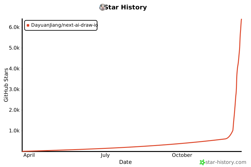](https://www.star-history.com/#DayuanJiang/next-ai-draw-io&type=date&legend=top-left)
|
||||
|
||||
</div>
|
||||
---
|
||||
|
||||
@@ -0,0 +1,457 @@
|
||||
import type { Metadata } from "next"
|
||||
import Image from "next/image"
|
||||
import Link from "next/link"
|
||||
import { FaGithub } from "react-icons/fa"
|
||||
|
||||
export const metadata: Metadata = {
|
||||
title: "关于 - Next AI Draw.io",
|
||||
description:
|
||||
"AI驱动的图表创建工具 - 对话、绘制、可视化。使用自然语言创建AWS、GCP和Azure架构图。",
|
||||
keywords: ["AI图表", "draw.io", "AWS架构", "GCP图表", "Azure图表", "LLM"],
|
||||
}
|
||||
|
||||
function formatNumber(num: number): string {
|
||||
if (num >= 1000) {
|
||||
return `${num / 1000}k`
|
||||
}
|
||||
return num.toString()
|
||||
}
|
||||
|
||||
export default function AboutCN() {
|
||||
const dailyRequestLimit = Number(process.env.DAILY_REQUEST_LIMIT) || 20
|
||||
const dailyTokenLimit = Number(process.env.DAILY_TOKEN_LIMIT) || 500000
|
||||
const tpmLimit = Number(process.env.TPM_LIMIT) || 50000
|
||||
|
||||
return (
|
||||
<div className="min-h-screen bg-gray-50">
|
||||
{/* Navigation */}
|
||||
<header className="bg-white border-b border-gray-200">
|
||||
<div className="max-w-4xl mx-auto px-4 sm:px-6 lg:px-8 py-4">
|
||||
<div className="flex items-center justify-between">
|
||||
<Link
|
||||
href="/"
|
||||
className="text-xl font-bold text-gray-900 hover:text-gray-700"
|
||||
>
|
||||
Next AI Draw.io
|
||||
</Link>
|
||||
<nav className="flex items-center gap-6 text-sm">
|
||||
<Link
|
||||
href="/"
|
||||
className="text-gray-600 hover:text-gray-900 transition-colors"
|
||||
>
|
||||
编辑器
|
||||
</Link>
|
||||
<Link
|
||||
href="/about/cn"
|
||||
className="text-blue-600 font-semibold"
|
||||
>
|
||||
关于
|
||||
</Link>
|
||||
<a
|
||||
href="https://github.com/DayuanJiang/next-ai-draw-io"
|
||||
target="_blank"
|
||||
rel="noopener noreferrer"
|
||||
className="text-gray-600 hover:text-gray-900 transition-colors"
|
||||
aria-label="在GitHub上查看"
|
||||
>
|
||||
<FaGithub className="w-5 h-5" />
|
||||
</a>
|
||||
</nav>
|
||||
</div>
|
||||
</div>
|
||||
</header>
|
||||
|
||||
{/* Main Content */}
|
||||
<main className="max-w-4xl mx-auto px-4 sm:px-6 lg:px-8 py-12">
|
||||
<article className="prose prose-lg max-w-none">
|
||||
{/* Title */}
|
||||
<div className="text-center mb-8">
|
||||
<h1 className="text-4xl font-bold text-gray-900 mb-2">
|
||||
Next AI Draw.io
|
||||
</h1>
|
||||
<p className="text-xl text-gray-600 font-medium">
|
||||
AI驱动的图表创建工具 - 对话、绘制、可视化
|
||||
</p>
|
||||
<div className="flex justify-center gap-4 mt-4 text-sm">
|
||||
<Link
|
||||
href="/about"
|
||||
className="text-gray-600 hover:text-blue-600"
|
||||
>
|
||||
English
|
||||
</Link>
|
||||
<span className="text-gray-400">|</span>
|
||||
<Link
|
||||
href="/about/cn"
|
||||
className="text-blue-600 font-semibold"
|
||||
>
|
||||
中文
|
||||
</Link>
|
||||
<span className="text-gray-400">|</span>
|
||||
<Link
|
||||
href="/about/ja"
|
||||
className="text-gray-600 hover:text-blue-600"
|
||||
>
|
||||
日本語
|
||||
</Link>
|
||||
</div>
|
||||
</div>
|
||||
|
||||
<div className="relative mb-8 rounded-2xl bg-gradient-to-br from-amber-50 via-orange-50 to-rose-50 p-[1px] shadow-lg">
|
||||
<div className="absolute inset-0 rounded-2xl bg-gradient-to-br from-amber-400 via-orange-400 to-rose-400 opacity-20" />
|
||||
<div className="relative rounded-2xl bg-white/80 backdrop-blur-sm p-6">
|
||||
{/* Header */}
|
||||
<div className="mb-4">
|
||||
<h3 className="text-lg font-bold text-gray-900 tracking-tight">
|
||||
模型变更与用量限制{" "}
|
||||
<span className="text-sm text-amber-600 font-medium italic font-normal">
|
||||
(或者说:我的钱包顶不住了)
|
||||
</span>
|
||||
</h3>
|
||||
</div>
|
||||
|
||||
{/* Story */}
|
||||
<div className="space-y-3 text-sm text-gray-700 leading-relaxed mb-5">
|
||||
<p>
|
||||
大家对这个项目的热情太高了——看来大家都真的很喜欢画图!但这也带来了一个幸福的烦恼:我们经常触发出上游
|
||||
AI 接口的频率限制
|
||||
(TPS/TPM)。一旦超限,系统就会暂停,导致请求失败。
|
||||
</p>
|
||||
<p>
|
||||
由于使用量过高,我已将模型从 Opus 4.5 更换为{" "}
|
||||
<span className="font-semibold text-amber-700">
|
||||
Haiku 4.5
|
||||
</span>
|
||||
,以降低成本。
|
||||
</p>
|
||||
<p>
|
||||
作为一个
|
||||
<span className="font-semibold text-amber-700">
|
||||
独立开发者
|
||||
</span>
|
||||
,目前的 API
|
||||
费用全是我自己在掏腰包(纯属为爱发电)。为了保证服务能细水长流,同时也为了避免我个人陷入财务危机,我还设置了以下临时用量限制:
|
||||
</p>
|
||||
</div>
|
||||
|
||||
{/* Limits Cards */}
|
||||
<div className="grid grid-cols-2 gap-3 mb-5">
|
||||
<div className="rounded-xl bg-gradient-to-br from-amber-100 to-orange-100 p-4 text-center">
|
||||
<div className="text-xs font-medium text-amber-700 uppercase tracking-wide mb-1">
|
||||
Token 用量
|
||||
</div>
|
||||
<div className="text-lg font-bold text-gray-900">
|
||||
{formatNumber(tpmLimit)}
|
||||
<span className="text-sm font-normal text-gray-600">
|
||||
/分钟
|
||||
</span>
|
||||
</div>
|
||||
<div className="text-lg font-bold text-gray-900">
|
||||
{formatNumber(dailyTokenLimit)}
|
||||
<span className="text-sm font-normal text-gray-600">
|
||||
/天
|
||||
</span>
|
||||
</div>
|
||||
</div>
|
||||
<div className="rounded-xl bg-gradient-to-br from-amber-100 to-orange-100 p-4 text-center">
|
||||
<div className="text-xs font-medium text-amber-700 uppercase tracking-wide mb-1">
|
||||
每日请求数
|
||||
</div>
|
||||
<div className="text-2xl font-bold text-gray-900">
|
||||
{dailyRequestLimit}
|
||||
</div>
|
||||
<div className="text-sm text-gray-600">
|
||||
次
|
||||
</div>
|
||||
</div>
|
||||
</div>
|
||||
|
||||
{/* Divider */}
|
||||
<div className="flex items-center gap-3 my-5">
|
||||
<div className="flex-1 h-px bg-gradient-to-r from-transparent via-amber-300 to-transparent" />
|
||||
</div>
|
||||
|
||||
{/* Bring Your Own Key */}
|
||||
<div className="text-center mb-5">
|
||||
<h4 className="text-base font-bold text-gray-900 mb-2">
|
||||
使用自己的 API Key
|
||||
</h4>
|
||||
<p className="text-sm text-gray-600 mb-2 max-w-md mx-auto">
|
||||
您可以使用自己的 API Key
|
||||
来绕过这些限制。点击聊天面板中的设置图标即可配置您的
|
||||
Provider 和 API Key。
|
||||
</p>
|
||||
<p className="text-xs text-gray-500 max-w-md mx-auto">
|
||||
您的 Key
|
||||
仅保存在浏览器本地,不会被存储在服务器上。
|
||||
</p>
|
||||
</div>
|
||||
|
||||
{/* Divider */}
|
||||
<div className="flex items-center gap-3 mb-5">
|
||||
<div className="flex-1 h-px bg-gradient-to-r from-transparent via-amber-300 to-transparent" />
|
||||
</div>
|
||||
|
||||
{/* Sponsorship CTA */}
|
||||
<div className="text-center">
|
||||
<h4 className="text-base font-bold text-gray-900 mb-2">
|
||||
寻求赞助 (求大佬捞一把)
|
||||
</h4>
|
||||
<p className="text-sm text-gray-600 mb-4 max-w-md mx-auto">
|
||||
要想彻底解除这些限制,扩容后端是唯一的办法。我正在积极寻求
|
||||
AI API 提供商或云平台的赞助。
|
||||
</p>
|
||||
<p className="text-sm text-gray-600 mb-4 max-w-md mx-auto">
|
||||
作为回报(无论是额度支持还是资金支持),我将在
|
||||
GitHub 仓库和 Live Demo
|
||||
网站的显眼位置展示贵公司的 Logo
|
||||
作为平台赞助商。
|
||||
</p>
|
||||
<a
|
||||
href="mailto:[email protected]"
|
||||
className="inline-flex items-center gap-2 px-5 py-2.5 rounded-full bg-gradient-to-r from-amber-500 to-orange-500 text-white font-medium text-sm shadow-md hover:shadow-lg hover:scale-105 transition-all duration-200"
|
||||
>
|
||||
联系我
|
||||
</a>
|
||||
</div>
|
||||
</div>
|
||||
</div>
|
||||
|
||||
<p className="text-gray-700">
|
||||
一个集成了AI功能的Next.js网页应用,与draw.io图表无缝结合。通过自然语言命令和AI辅助可视化来创建、修改和增强图表。
|
||||
</p>
|
||||
|
||||
{/* Features */}
|
||||
<h2 className="text-2xl font-semibold text-gray-900 mt-10 mb-4">
|
||||
功能特性
|
||||
</h2>
|
||||
<ul className="list-disc pl-6 text-gray-700 space-y-2">
|
||||
<li>
|
||||
<strong>LLM驱动的图表创建</strong>
|
||||
:利用大语言模型通过自然语言命令直接创建和操作draw.io图表
|
||||
</li>
|
||||
<li>
|
||||
<strong>基于图像的图表复制</strong>
|
||||
:上传现有图表或图像,让AI自动复制和增强
|
||||
</li>
|
||||
<li>
|
||||
<strong>图表历史记录</strong>
|
||||
:全面的版本控制,跟踪所有更改,允许您查看和恢复AI编辑前的图表版本
|
||||
</li>
|
||||
<li>
|
||||
<strong>交互式聊天界面</strong>
|
||||
:与AI实时对话来完善您的图表
|
||||
</li>
|
||||
<li>
|
||||
<strong>AWS架构图支持</strong>
|
||||
:专门支持生成AWS架构图
|
||||
</li>
|
||||
<li>
|
||||
<strong>动画连接器</strong>
|
||||
:在图表元素之间创建动态动画连接器,实现更好的可视化效果
|
||||
</li>
|
||||
</ul>
|
||||
|
||||
{/* Examples */}
|
||||
<h2 className="text-2xl font-semibold text-gray-900 mt-10 mb-4">
|
||||
示例
|
||||
</h2>
|
||||
<p className="text-gray-700 mb-6">
|
||||
以下是一些示例提示词及其生成的图表:
|
||||
</p>
|
||||
|
||||
<div className="space-y-8">
|
||||
{/* Animated Transformer */}
|
||||
<div className="text-center">
|
||||
<h3 className="text-lg font-semibold text-gray-900 mb-2">
|
||||
动画Transformer连接器
|
||||
</h3>
|
||||
<p className="text-gray-600 mb-4">
|
||||
<strong>提示词:</strong> 给我一个带有
|
||||
<strong>动画连接器</strong>的Transformer架构图。
|
||||
</p>
|
||||
<Image
|
||||
src="/animated_connectors.svg"
|
||||
alt="带动画连接器的Transformer架构"
|
||||
width={480}
|
||||
height={360}
|
||||
className="mx-auto"
|
||||
/>
|
||||
</div>
|
||||
|
||||
{/* Cloud Architecture Grid */}
|
||||
<div className="grid md:grid-cols-2 gap-6">
|
||||
<div className="text-center">
|
||||
<h3 className="text-lg font-semibold text-gray-900 mb-2">
|
||||
GCP架构图
|
||||
</h3>
|
||||
<p className="text-gray-600 text-sm mb-4">
|
||||
<strong>提示词:</strong> 使用
|
||||
<strong>GCP图标</strong>
|
||||
生成一个GCP架构图。用户连接到托管在实例上的前端。
|
||||
</p>
|
||||
<Image
|
||||
src="/gcp_demo.svg"
|
||||
alt="GCP架构图"
|
||||
width={400}
|
||||
height={300}
|
||||
className="mx-auto"
|
||||
/>
|
||||
</div>
|
||||
<div className="text-center">
|
||||
<h3 className="text-lg font-semibold text-gray-900 mb-2">
|
||||
AWS架构图
|
||||
</h3>
|
||||
<p className="text-gray-600 text-sm mb-4">
|
||||
<strong>提示词:</strong> 使用
|
||||
<strong>AWS图标</strong>
|
||||
生成一个AWS架构图。用户连接到托管在实例上的前端。
|
||||
</p>
|
||||
<Image
|
||||
src="/aws_demo.svg"
|
||||
alt="AWS架构图"
|
||||
width={400}
|
||||
height={300}
|
||||
className="mx-auto"
|
||||
/>
|
||||
</div>
|
||||
<div className="text-center">
|
||||
<h3 className="text-lg font-semibold text-gray-900 mb-2">
|
||||
Azure架构图
|
||||
</h3>
|
||||
<p className="text-gray-600 text-sm mb-4">
|
||||
<strong>提示词:</strong> 使用
|
||||
<strong>Azure图标</strong>
|
||||
生成一个Azure架构图。用户连接到托管在实例上的前端。
|
||||
</p>
|
||||
<Image
|
||||
src="/azure_demo.svg"
|
||||
alt="Azure架构图"
|
||||
width={400}
|
||||
height={300}
|
||||
className="mx-auto"
|
||||
/>
|
||||
</div>
|
||||
<div className="text-center">
|
||||
<h3 className="text-lg font-semibold text-gray-900 mb-2">
|
||||
猫咪素描
|
||||
</h3>
|
||||
<p className="text-gray-600 text-sm mb-4">
|
||||
<strong>提示词:</strong>{" "}
|
||||
给我画一只可爱的猫。
|
||||
</p>
|
||||
<Image
|
||||
src="/cat_demo.svg"
|
||||
alt="猫咪绘图"
|
||||
width={240}
|
||||
height={240}
|
||||
className="mx-auto"
|
||||
/>
|
||||
</div>
|
||||
</div>
|
||||
</div>
|
||||
|
||||
{/* How It Works */}
|
||||
<h2 className="text-2xl font-semibold text-gray-900 mt-10 mb-4">
|
||||
工作原理
|
||||
</h2>
|
||||
<p className="text-gray-700 mb-4">本应用使用以下技术:</p>
|
||||
<ul className="list-disc pl-6 text-gray-700 space-y-2">
|
||||
<li>
|
||||
<strong>Next.js</strong>:用于前端框架和路由
|
||||
</li>
|
||||
<li>
|
||||
<strong>Vercel AI SDK</strong>(<code>ai</code> +{" "}
|
||||
<code>@ai-sdk/*</code>
|
||||
):用于流式AI响应和多提供商支持
|
||||
</li>
|
||||
<li>
|
||||
<strong>react-drawio</strong>:用于图表表示和操作
|
||||
</li>
|
||||
</ul>
|
||||
<p className="text-gray-700 mt-4">
|
||||
图表以XML格式表示,可在draw.io中渲染。AI处理您的命令并相应地生成或修改此XML。
|
||||
</p>
|
||||
|
||||
{/* Multi-Provider Support */}
|
||||
<h2 className="text-2xl font-semibold text-gray-900 mt-10 mb-4">
|
||||
多提供商支持
|
||||
</h2>
|
||||
<ul className="list-disc pl-6 text-gray-700 space-y-1">
|
||||
<li>AWS Bedrock(默认)</li>
|
||||
<li>
|
||||
OpenAI / OpenAI兼容API(通过{" "}
|
||||
<code>OPENAI_BASE_URL</code>)
|
||||
</li>
|
||||
<li>Anthropic</li>
|
||||
<li>Google AI</li>
|
||||
<li>Azure OpenAI</li>
|
||||
<li>Ollama</li>
|
||||
<li>OpenRouter</li>
|
||||
<li>DeepSeek</li>
|
||||
</ul>
|
||||
<p className="text-gray-700 mt-4">
|
||||
注意:<code>claude-sonnet-4-5</code>{" "}
|
||||
已在带有AWS标志的draw.io图表上进行训练,因此如果您想创建AWS架构图,这是最佳选择。
|
||||
</p>
|
||||
|
||||
{/* Support */}
|
||||
<div className="flex items-center gap-4 mt-10 mb-4">
|
||||
<h2 className="text-2xl font-semibold text-gray-900">
|
||||
支持与联系
|
||||
</h2>
|
||||
<iframe
|
||||
src="https://github.com/sponsors/DayuanJiang/button"
|
||||
title="Sponsor DayuanJiang"
|
||||
height="32"
|
||||
width="114"
|
||||
style={{ border: 0, borderRadius: 6 }}
|
||||
/>
|
||||
</div>
|
||||
<p className="text-gray-700">
|
||||
如果您觉得这个项目有用,请考虑{" "}
|
||||
<a
|
||||
href="https://github.com/sponsors/DayuanJiang"
|
||||
target="_blank"
|
||||
rel="noopener noreferrer"
|
||||
className="text-blue-600 hover:underline"
|
||||
>
|
||||
赞助
|
||||
</a>{" "}
|
||||
来帮助托管在线演示站点!
|
||||
</p>
|
||||
<p className="text-gray-700 mt-2">
|
||||
如需支持或咨询,请在{" "}
|
||||
<a
|
||||
href="https://github.com/DayuanJiang/next-ai-draw-io"
|
||||
target="_blank"
|
||||
rel="noopener noreferrer"
|
||||
className="text-blue-600 hover:underline"
|
||||
>
|
||||
GitHub仓库
|
||||
</a>{" "}
|
||||
上提交issue或联系:me[at]jiang.jp
|
||||
</p>
|
||||
|
||||
{/* CTA */}
|
||||
<div className="mt-12 text-center">
|
||||
<Link
|
||||
href="/"
|
||||
className="inline-block bg-blue-600 text-white px-8 py-3 rounded-lg font-semibold hover:bg-blue-700 transition-colors"
|
||||
>
|
||||
打开编辑器
|
||||
</Link>
|
||||
</div>
|
||||
</article>
|
||||
</main>
|
||||
|
||||
{/* Footer */}
|
||||
<footer className="bg-white border-t border-gray-200 mt-16">
|
||||
<div className="max-w-4xl mx-auto px-4 sm:px-6 lg:px-8 py-6">
|
||||
<p className="text-center text-gray-600 text-sm">
|
||||
Next AI Draw.io - 开源AI驱动的图表生成器
|
||||
</p>
|
||||
</div>
|
||||
</footer>
|
||||
</div>
|
||||
)
|
||||
}
|
||||
@@ -0,0 +1,472 @@
|
||||
import type { Metadata } from "next"
|
||||
import Image from "next/image"
|
||||
import Link from "next/link"
|
||||
import { FaGithub } from "react-icons/fa"
|
||||
|
||||
export const metadata: Metadata = {
|
||||
title: "概要 - Next AI Draw.io",
|
||||
description:
|
||||
"AI搭載のダイアグラム作成ツール - チャット、描画、可視化。自然言語でAWS、GCP、Azureアーキテクチャ図を作成。",
|
||||
keywords: [
|
||||
"AIダイアグラム",
|
||||
"draw.io",
|
||||
"AWSアーキテクチャ",
|
||||
"GCPダイアグラム",
|
||||
"Azureダイアグラム",
|
||||
"LLM",
|
||||
],
|
||||
}
|
||||
|
||||
function formatNumber(num: number): string {
|
||||
if (num >= 1000) {
|
||||
return `${num / 1000}k`
|
||||
}
|
||||
return num.toString()
|
||||
}
|
||||
|
||||
export default function AboutJA() {
|
||||
const dailyRequestLimit = Number(process.env.DAILY_REQUEST_LIMIT) || 20
|
||||
const dailyTokenLimit = Number(process.env.DAILY_TOKEN_LIMIT) || 500000
|
||||
const tpmLimit = Number(process.env.TPM_LIMIT) || 50000
|
||||
|
||||
return (
|
||||
<div className="min-h-screen bg-gray-50">
|
||||
{/* Navigation */}
|
||||
<header className="bg-white border-b border-gray-200">
|
||||
<div className="max-w-4xl mx-auto px-4 sm:px-6 lg:px-8 py-4">
|
||||
<div className="flex items-center justify-between">
|
||||
<Link
|
||||
href="/"
|
||||
className="text-xl font-bold text-gray-900 hover:text-gray-700"
|
||||
>
|
||||
Next AI Draw.io
|
||||
</Link>
|
||||
<nav className="flex items-center gap-6 text-sm">
|
||||
<Link
|
||||
href="/"
|
||||
className="text-gray-600 hover:text-gray-900 transition-colors"
|
||||
>
|
||||
エディタ
|
||||
</Link>
|
||||
<Link
|
||||
href="/about/ja"
|
||||
className="text-blue-600 font-semibold"
|
||||
>
|
||||
概要
|
||||
</Link>
|
||||
<a
|
||||
href="https://github.com/DayuanJiang/next-ai-draw-io"
|
||||
target="_blank"
|
||||
rel="noopener noreferrer"
|
||||
className="text-gray-600 hover:text-gray-900 transition-colors"
|
||||
aria-label="GitHubで見る"
|
||||
>
|
||||
<FaGithub className="w-5 h-5" />
|
||||
</a>
|
||||
</nav>
|
||||
</div>
|
||||
</div>
|
||||
</header>
|
||||
|
||||
{/* Main Content */}
|
||||
<main className="max-w-4xl mx-auto px-4 sm:px-6 lg:px-8 py-12">
|
||||
<article className="prose prose-lg max-w-none">
|
||||
{/* Title */}
|
||||
<div className="text-center mb-8">
|
||||
<h1 className="text-4xl font-bold text-gray-900 mb-2">
|
||||
Next AI Draw.io
|
||||
</h1>
|
||||
<p className="text-xl text-gray-600 font-medium">
|
||||
AI搭載のダイアグラム作成ツール -
|
||||
チャット、描画、可視化
|
||||
</p>
|
||||
<div className="flex justify-center gap-4 mt-4 text-sm">
|
||||
<Link
|
||||
href="/about"
|
||||
className="text-gray-600 hover:text-blue-600"
|
||||
>
|
||||
English
|
||||
</Link>
|
||||
<span className="text-gray-400">|</span>
|
||||
<Link
|
||||
href="/about/cn"
|
||||
className="text-gray-600 hover:text-blue-600"
|
||||
>
|
||||
中文
|
||||
</Link>
|
||||
<span className="text-gray-400">|</span>
|
||||
<Link
|
||||
href="/about/ja"
|
||||
className="text-blue-600 font-semibold"
|
||||
>
|
||||
日本語
|
||||
</Link>
|
||||
</div>
|
||||
</div>
|
||||
|
||||
<div className="relative mb-8 rounded-2xl bg-gradient-to-br from-amber-50 via-orange-50 to-rose-50 p-[1px] shadow-lg">
|
||||
<div className="absolute inset-0 rounded-2xl bg-gradient-to-br from-amber-400 via-orange-400 to-rose-400 opacity-20" />
|
||||
<div className="relative rounded-2xl bg-white/80 backdrop-blur-sm p-6">
|
||||
{/* Header */}
|
||||
<div className="mb-4">
|
||||
<h3 className="text-lg font-bold text-gray-900 tracking-tight">
|
||||
モデル変更と利用制限について{" "}
|
||||
<span className="text-sm text-amber-600 font-medium italic font-normal">
|
||||
(別名:お財布が悲鳴を上げています)
|
||||
</span>
|
||||
</h3>
|
||||
</div>
|
||||
|
||||
{/* Story */}
|
||||
<div className="space-y-3 text-sm text-gray-700 leading-relaxed mb-5">
|
||||
<p>
|
||||
予想以上の反響をいただき、ありがとうございます!皆様にダイアグラム作成を楽しんでいただいているのは嬉しい限りですが、その熱量により
|
||||
AI API のレート制限 (TPS/TPM)
|
||||
に頻繁に引っかかってしまっています。制限に達するとシステムが一時停止し、エラーが発生してしまいます。
|
||||
</p>
|
||||
<p>
|
||||
利用量の増加に伴い、コスト削減のためモデルを
|
||||
Opus 4.5 から{" "}
|
||||
<span className="font-semibold text-amber-700">
|
||||
Haiku 4.5
|
||||
</span>{" "}
|
||||
に変更しました。
|
||||
</p>
|
||||
<p>
|
||||
私は現在、
|
||||
<span className="font-semibold text-amber-700">
|
||||
個人開発者
|
||||
</span>
|
||||
として API
|
||||
費用を全額自腹で負担しています。サービスを継続し、かつ私自身が借金を背負わないようにするため(笑)、一時的に以下の利用制限も設けさせていただきました。
|
||||
</p>
|
||||
</div>
|
||||
|
||||
{/* Limits Cards */}
|
||||
<div className="grid grid-cols-2 gap-3 mb-5">
|
||||
<div className="rounded-xl bg-gradient-to-br from-amber-100 to-orange-100 p-4 text-center">
|
||||
<div className="text-xs font-medium text-amber-700 uppercase tracking-wide mb-1">
|
||||
トークン使用量
|
||||
</div>
|
||||
<div className="text-lg font-bold text-gray-900">
|
||||
{formatNumber(tpmLimit)}
|
||||
<span className="text-sm font-normal text-gray-600">
|
||||
/分
|
||||
</span>
|
||||
</div>
|
||||
<div className="text-lg font-bold text-gray-900">
|
||||
{formatNumber(dailyTokenLimit)}
|
||||
<span className="text-sm font-normal text-gray-600">
|
||||
/日
|
||||
</span>
|
||||
</div>
|
||||
</div>
|
||||
<div className="rounded-xl bg-gradient-to-br from-amber-100 to-orange-100 p-4 text-center">
|
||||
<div className="text-xs font-medium text-amber-700 uppercase tracking-wide mb-1">
|
||||
1日のリクエスト数
|
||||
</div>
|
||||
<div className="text-2xl font-bold text-gray-900">
|
||||
{dailyRequestLimit}
|
||||
</div>
|
||||
<div className="text-sm text-gray-600">
|
||||
回
|
||||
</div>
|
||||
</div>
|
||||
</div>
|
||||
|
||||
{/* Divider */}
|
||||
<div className="flex items-center gap-3 my-5">
|
||||
<div className="flex-1 h-px bg-gradient-to-r from-transparent via-amber-300 to-transparent" />
|
||||
</div>
|
||||
|
||||
{/* Bring Your Own Key */}
|
||||
<div className="text-center mb-5">
|
||||
<h4 className="text-base font-bold text-gray-900 mb-2">
|
||||
自分のAPIキーを使用
|
||||
</h4>
|
||||
<p className="text-sm text-gray-600 mb-2 max-w-md mx-auto">
|
||||
自分のAPIキーを使用することで、これらの制限を回避できます。チャットパネルの設定アイコンをクリックして、プロバイダーとAPIキーを設定してください。
|
||||
</p>
|
||||
<p className="text-xs text-gray-500 max-w-md mx-auto">
|
||||
キーはブラウザのローカルに保存され、サーバーには保存されません。
|
||||
</p>
|
||||
</div>
|
||||
|
||||
{/* Divider */}
|
||||
<div className="flex items-center gap-3 mb-5">
|
||||
<div className="flex-1 h-px bg-gradient-to-r from-transparent via-amber-300 to-transparent" />
|
||||
</div>
|
||||
|
||||
{/* Sponsorship CTA */}
|
||||
<div className="text-center">
|
||||
<h4 className="text-base font-bold text-gray-900 mb-2">
|
||||
スポンサー募集
|
||||
</h4>
|
||||
<p className="text-sm text-gray-600 mb-4 max-w-md mx-auto">
|
||||
これらの制限を取り払い、バックエンドをスケールさせるには皆様の支援が必要です。現在、AI
|
||||
API
|
||||
プロバイダー様やクラウドプラットフォーム様からのスポンサー支援を積極的に募集しています。
|
||||
</p>
|
||||
<p className="text-sm text-gray-600 mb-4 max-w-md mx-auto">
|
||||
ご支援(クレジット提供や資金援助)をいただける場合、GitHub
|
||||
リポジトリおよびデモサイトにて、プラットフォームスポンサーとして貴社を大々的にご紹介させていただきます。
|
||||
</p>
|
||||
<a
|
||||
href="mailto:[email protected]"
|
||||
className="inline-flex items-center gap-2 px-5 py-2.5 rounded-full bg-gradient-to-r from-amber-500 to-orange-500 text-white font-medium text-sm shadow-md hover:shadow-lg hover:scale-105 transition-all duration-200"
|
||||
>
|
||||
お問い合わせ
|
||||
</a>
|
||||
</div>
|
||||
</div>
|
||||
</div>
|
||||
|
||||
<p className="text-gray-700">
|
||||
AI機能とdraw.ioダイアグラムを統合したNext.jsウェブアプリケーションです。自然言語コマンドとAI支援の可視化により、ダイアグラムを作成、修正、強化できます。
|
||||
</p>
|
||||
|
||||
{/* Features */}
|
||||
<h2 className="text-2xl font-semibold text-gray-900 mt-10 mb-4">
|
||||
機能
|
||||
</h2>
|
||||
<ul className="list-disc pl-6 text-gray-700 space-y-2">
|
||||
<li>
|
||||
<strong>LLM搭載のダイアグラム作成</strong>
|
||||
:大規模言語モデルを活用して、自然言語コマンドで直接draw.ioダイアグラムを作成・操作
|
||||
</li>
|
||||
<li>
|
||||
<strong>画像ベースのダイアグラム複製</strong>
|
||||
:既存のダイアグラムや画像をアップロードし、AIが自動的に複製・強化
|
||||
</li>
|
||||
<li>
|
||||
<strong>ダイアグラム履歴</strong>
|
||||
:すべての変更を追跡する包括的なバージョン管理。AI編集前のダイアグラムの以前のバージョンを表示・復元可能
|
||||
</li>
|
||||
<li>
|
||||
<strong>
|
||||
インタラクティブなチャットインターフェース
|
||||
</strong>
|
||||
:AIとリアルタイムでコミュニケーションしてダイアグラムを改善
|
||||
</li>
|
||||
<li>
|
||||
<strong>
|
||||
AWSアーキテクチャダイアグラムサポート
|
||||
</strong>
|
||||
:AWSアーキテクチャダイアグラムの生成を専門的にサポート
|
||||
</li>
|
||||
<li>
|
||||
<strong>アニメーションコネクタ</strong>
|
||||
:より良い可視化のためにダイアグラム要素間に動的でアニメーション化されたコネクタを作成
|
||||
</li>
|
||||
</ul>
|
||||
|
||||
{/* Examples */}
|
||||
<h2 className="text-2xl font-semibold text-gray-900 mt-10 mb-4">
|
||||
例
|
||||
</h2>
|
||||
<p className="text-gray-700 mb-6">
|
||||
以下はいくつかのプロンプト例と生成されたダイアグラムです:
|
||||
</p>
|
||||
|
||||
<div className="space-y-8">
|
||||
{/* Animated Transformer */}
|
||||
<div className="text-center">
|
||||
<h3 className="text-lg font-semibold text-gray-900 mb-2">
|
||||
アニメーションTransformerコネクタ
|
||||
</h3>
|
||||
<p className="text-gray-600 mb-4">
|
||||
<strong>プロンプト:</strong>{" "}
|
||||
<strong>アニメーションコネクタ</strong>
|
||||
付きのTransformerアーキテクチャ図を作成してください。
|
||||
</p>
|
||||
<Image
|
||||
src="/animated_connectors.svg"
|
||||
alt="アニメーションコネクタ付きTransformerアーキテクチャ"
|
||||
width={480}
|
||||
height={360}
|
||||
className="mx-auto"
|
||||
/>
|
||||
</div>
|
||||
|
||||
{/* Cloud Architecture Grid */}
|
||||
<div className="grid md:grid-cols-2 gap-6">
|
||||
<div className="text-center">
|
||||
<h3 className="text-lg font-semibold text-gray-900 mb-2">
|
||||
GCPアーキテクチャ図
|
||||
</h3>
|
||||
<p className="text-gray-600 text-sm mb-4">
|
||||
<strong>プロンプト:</strong>{" "}
|
||||
<strong>GCPアイコン</strong>
|
||||
を使用してGCPアーキテクチャ図を生成してください。ユーザーがインスタンス上でホストされているフロントエンドに接続します。
|
||||
</p>
|
||||
<Image
|
||||
src="/gcp_demo.svg"
|
||||
alt="GCPアーキテクチャ図"
|
||||
width={400}
|
||||
height={300}
|
||||
className="mx-auto"
|
||||
/>
|
||||
</div>
|
||||
<div className="text-center">
|
||||
<h3 className="text-lg font-semibold text-gray-900 mb-2">
|
||||
AWSアーキテクチャ図
|
||||
</h3>
|
||||
<p className="text-gray-600 text-sm mb-4">
|
||||
<strong>プロンプト:</strong>{" "}
|
||||
<strong>AWSアイコン</strong>
|
||||
を使用してAWSアーキテクチャ図を生成してください。ユーザーがインスタンス上でホストされているフロントエンドに接続します。
|
||||
</p>
|
||||
<Image
|
||||
src="/aws_demo.svg"
|
||||
alt="AWSアーキテクチャ図"
|
||||
width={400}
|
||||
height={300}
|
||||
className="mx-auto"
|
||||
/>
|
||||
</div>
|
||||
<div className="text-center">
|
||||
<h3 className="text-lg font-semibold text-gray-900 mb-2">
|
||||
Azureアーキテクチャ図
|
||||
</h3>
|
||||
<p className="text-gray-600 text-sm mb-4">
|
||||
<strong>プロンプト:</strong>{" "}
|
||||
<strong>Azureアイコン</strong>
|
||||
を使用してAzureアーキテクチャ図を生成してください。ユーザーがインスタンス上でホストされているフロントエンドに接続します。
|
||||
</p>
|
||||
<Image
|
||||
src="/azure_demo.svg"
|
||||
alt="Azureアーキテクチャ図"
|
||||
width={400}
|
||||
height={300}
|
||||
className="mx-auto"
|
||||
/>
|
||||
</div>
|
||||
<div className="text-center">
|
||||
<h3 className="text-lg font-semibold text-gray-900 mb-2">
|
||||
猫のスケッチ
|
||||
</h3>
|
||||
<p className="text-gray-600 text-sm mb-4">
|
||||
<strong>プロンプト:</strong>{" "}
|
||||
かわいい猫を描いてください。
|
||||
</p>
|
||||
<Image
|
||||
src="/cat_demo.svg"
|
||||
alt="猫の絵"
|
||||
width={240}
|
||||
height={240}
|
||||
className="mx-auto"
|
||||
/>
|
||||
</div>
|
||||
</div>
|
||||
</div>
|
||||
|
||||
{/* How It Works */}
|
||||
<h2 className="text-2xl font-semibold text-gray-900 mt-10 mb-4">
|
||||
仕組み
|
||||
</h2>
|
||||
<p className="text-gray-700 mb-4">
|
||||
本アプリケーションは以下の技術を使用しています:
|
||||
</p>
|
||||
<ul className="list-disc pl-6 text-gray-700 space-y-2">
|
||||
<li>
|
||||
<strong>Next.js</strong>
|
||||
:フロントエンドフレームワークとルーティング
|
||||
</li>
|
||||
<li>
|
||||
<strong>Vercel AI SDK</strong>(<code>ai</code> +{" "}
|
||||
<code>@ai-sdk/*</code>
|
||||
):ストリーミングAIレスポンスとマルチプロバイダーサポート
|
||||
</li>
|
||||
<li>
|
||||
<strong>react-drawio</strong>
|
||||
:ダイアグラムの表現と操作
|
||||
</li>
|
||||
</ul>
|
||||
<p className="text-gray-700 mt-4">
|
||||
ダイアグラムはdraw.ioでレンダリングできるXMLとして表現されます。AIがコマンドを処理し、それに応じてこのXMLを生成または変更します。
|
||||
</p>
|
||||
|
||||
{/* Multi-Provider Support */}
|
||||
<h2 className="text-2xl font-semibold text-gray-900 mt-10 mb-4">
|
||||
マルチプロバイダーサポート
|
||||
</h2>
|
||||
<ul className="list-disc pl-6 text-gray-700 space-y-1">
|
||||
<li>AWS Bedrock(デフォルト)</li>
|
||||
<li>
|
||||
OpenAI / OpenAI互換API(<code>OPENAI_BASE_URL</code>
|
||||
経由)
|
||||
</li>
|
||||
<li>Anthropic</li>
|
||||
<li>Google AI</li>
|
||||
<li>Azure OpenAI</li>
|
||||
<li>Ollama</li>
|
||||
<li>OpenRouter</li>
|
||||
<li>DeepSeek</li>
|
||||
</ul>
|
||||
<p className="text-gray-700 mt-4">
|
||||
注:<code>claude-sonnet-4-5</code>
|
||||
はAWSロゴ付きのdraw.ioダイアグラムで学習されているため、AWSアーキテクチャダイアグラムを作成したい場合は最適な選択です。
|
||||
</p>
|
||||
|
||||
{/* Support */}
|
||||
<div className="flex items-center gap-4 mt-10 mb-4">
|
||||
<h2 className="text-2xl font-semibold text-gray-900">
|
||||
サポート&お問い合わせ
|
||||
</h2>
|
||||
<iframe
|
||||
src="https://github.com/sponsors/DayuanJiang/button"
|
||||
title="Sponsor DayuanJiang"
|
||||
height="32"
|
||||
width="114"
|
||||
style={{ border: 0, borderRadius: 6 }}
|
||||
/>
|
||||
</div>
|
||||
<p className="text-gray-700">
|
||||
このプロジェクトが役に立ったら、ライブデモサイトのホスティングを支援するために{" "}
|
||||
<a
|
||||
href="https://github.com/sponsors/DayuanJiang"
|
||||
target="_blank"
|
||||
rel="noopener noreferrer"
|
||||
className="text-blue-600 hover:underline"
|
||||
>
|
||||
スポンサー
|
||||
</a>{" "}
|
||||
をご検討ください!
|
||||
</p>
|
||||
<p className="text-gray-700 mt-2">
|
||||
サポートやお問い合わせについては、{" "}
|
||||
<a
|
||||
href="https://github.com/DayuanJiang/next-ai-draw-io"
|
||||
target="_blank"
|
||||
rel="noopener noreferrer"
|
||||
className="text-blue-600 hover:underline"
|
||||
>
|
||||
GitHubリポジトリ
|
||||
</a>{" "}
|
||||
でissueを開くか、ご連絡ください:me[at]jiang.jp
|
||||
</p>
|
||||
|
||||
{/* CTA */}
|
||||
<div className="mt-12 text-center">
|
||||
<Link
|
||||
href="/"
|
||||
className="inline-block bg-blue-600 text-white px-8 py-3 rounded-lg font-semibold hover:bg-blue-700 transition-colors"
|
||||
>
|
||||
エディタを開く
|
||||
</Link>
|
||||
</div>
|
||||
</article>
|
||||
</main>
|
||||
|
||||
{/* Footer */}
|
||||
<footer className="bg-white border-t border-gray-200 mt-16">
|
||||
<div className="max-w-4xl mx-auto px-4 sm:px-6 lg:px-8 py-6">
|
||||
<p className="text-center text-gray-600 text-sm">
|
||||
Next AI Draw.io -
|
||||
オープンソースAI搭載ダイアグラムジェネレーター
|
||||
</p>
|
||||
</div>
|
||||
</footer>
|
||||
</div>
|
||||
)
|
||||
}
|
||||
+344
-505
@@ -1,419 +1,33 @@
|
||||
import type { Metadata } from "next"
|
||||
import Image from "next/image"
|
||||
import Link from "next/link"
|
||||
import type { ReactNode } from "react"
|
||||
import { GitHubIcon } from "@/components/icons/github"
|
||||
import Image from "@/components/image-with-basepath"
|
||||
import type { Locale } from "@/lib/i18n/config"
|
||||
import { hasLocale } from "@/lib/i18n/dictionaries"
|
||||
import { FaGithub } from "react-icons/fa"
|
||||
|
||||
type ExampleId = "resnet50" | "rag" | "auth" | "scrum" | "inno"
|
||||
|
||||
type AboutTexts = {
|
||||
title: string
|
||||
description: string
|
||||
keywords: string[]
|
||||
nav: { editor: string; about: string; github: string }
|
||||
tagline: string
|
||||
byok: { title: string; body: string; note: string }
|
||||
intro: string
|
||||
// Punctuation differs between Latin and CJK text
|
||||
colon: string
|
||||
parenOpen: string
|
||||
parenClose: string
|
||||
featuresHeading: string
|
||||
features: { title: string; text: string }[]
|
||||
examplesHeading: string
|
||||
examplesIntro: string
|
||||
examples: Record<ExampleId, { title: string; alt: string }>
|
||||
howHeading: string
|
||||
howIntro: string
|
||||
tech: { nextjs: string; aiSdk: string; drawio: string }
|
||||
howOutro: string
|
||||
providersHeading: string
|
||||
doubao: string
|
||||
bedrock: string
|
||||
// Text around the OPENAI_BASE_URL code span
|
||||
openai: { before: string; after: string }
|
||||
// Text around the claude-sonnet-4-5 code span
|
||||
modelNote: { before: string; after: string }
|
||||
supportHeading: string
|
||||
// Text around the sponsor link
|
||||
sponsor: { before: string; link: string; after: string }
|
||||
// Text around the GitHub repository link
|
||||
contact: { before: string; link: string; after: string }
|
||||
openEditor: string
|
||||
footer: string
|
||||
export const metadata: Metadata = {
|
||||
title: "About - Next AI Draw.io",
|
||||
description:
|
||||
"AI-Powered Diagram Creation Tool - Chat, Draw, Visualize. Create AWS, GCP, and Azure architecture diagrams with natural language.",
|
||||
keywords: [
|
||||
"AI diagram",
|
||||
"draw.io",
|
||||
"AWS architecture",
|
||||
"GCP diagram",
|
||||
"Azure diagram",
|
||||
"LLM",
|
||||
],
|
||||
}
|
||||
|
||||
const texts: Record<"en" | "zh" | "ja", AboutTexts> = {
|
||||
en: {
|
||||
title: "About - Next AI Draw.io",
|
||||
description:
|
||||
"AI-Powered Diagram Creation Tool - Chat, Draw, Visualize. Create AWS, GCP, and Azure architecture diagrams with natural language.",
|
||||
keywords: [
|
||||
"AI diagram",
|
||||
"draw.io",
|
||||
"AWS architecture",
|
||||
"GCP diagram",
|
||||
"Azure diagram",
|
||||
"LLM",
|
||||
],
|
||||
nav: { editor: "Editor", about: "About", github: "View on GitHub" },
|
||||
tagline: "AI-Powered Diagram Creation Tool - Chat, Draw, Visualize",
|
||||
byok: {
|
||||
title: "Bring Your Own API Key",
|
||||
body: "You can also use your own API key with any supported provider. Click the Settings icon in the chat panel to configure your provider and API key.",
|
||||
note: "Your key is stored locally in your browser and is never stored on the server.",
|
||||
},
|
||||
intro: "A Next.js web application that integrates AI capabilities with draw.io diagrams. Create, modify, and enhance diagrams through natural language commands and AI-assisted visualization.",
|
||||
colon: ": ",
|
||||
parenOpen: " (",
|
||||
parenClose: ")",
|
||||
featuresHeading: "Features",
|
||||
features: [
|
||||
{
|
||||
title: "LLM-Powered Diagram Creation",
|
||||
text: "Leverage Large Language Models to create and manipulate draw.io diagrams directly through natural language commands",
|
||||
},
|
||||
{
|
||||
title: "Image-Based Diagram Replication",
|
||||
text: "Upload existing diagrams or images and have the AI replicate and enhance them automatically",
|
||||
},
|
||||
{
|
||||
title: "Versions and Undo",
|
||||
text: "Every AI change becomes a version in the chat that you can compare, restore or undo; Ctrl+Z on the canvas takes it back too",
|
||||
},
|
||||
{
|
||||
title: "Interactive Chat Interface",
|
||||
text: "Communicate with AI to refine your diagrams in real-time",
|
||||
},
|
||||
{
|
||||
title: "AWS Architecture Diagram Support",
|
||||
text: "Specialized support for generating AWS architecture diagrams",
|
||||
},
|
||||
{
|
||||
title: "Animated Connectors",
|
||||
text: "Create dynamic and animated connectors between diagram elements for better visualization",
|
||||
},
|
||||
],
|
||||
examplesHeading: "Examples",
|
||||
examplesIntro:
|
||||
"Here are some example prompts and their generated diagrams:",
|
||||
examples: {
|
||||
resnet50: {
|
||||
title: "Animated ResNet50 Model Architecture",
|
||||
alt: "Architecture diagram for ResNet50 model",
|
||||
},
|
||||
rag: {
|
||||
title: "RAG Technique Diagram",
|
||||
alt: "RAG Architecture Diagram",
|
||||
},
|
||||
auth: {
|
||||
title: "Authentication using React and AWS",
|
||||
alt: "Authentication Architecture Diagram",
|
||||
},
|
||||
scrum: { title: "Agile Scrum Process", alt: "Agile Scrum Diagram" },
|
||||
inno: { title: "Open Innovation", alt: "Open Innovation Diagram" },
|
||||
},
|
||||
howHeading: "How It Works",
|
||||
howIntro: "The application uses the following technologies:",
|
||||
tech: {
|
||||
nextjs: "For the frontend framework and routing",
|
||||
aiSdk: "For streaming AI responses and multi-provider support",
|
||||
drawio: "The editor, bundled with the app so it can be driven directly",
|
||||
},
|
||||
howOutro:
|
||||
"Diagrams are represented as XML that can be rendered in draw.io. The AI processes your commands and generates or modifies this XML accordingly.",
|
||||
providersHeading: "Multi-Provider Support",
|
||||
doubao: "ByteDance Doubao",
|
||||
bedrock: "AWS Bedrock (default)",
|
||||
openai: { before: "OpenAI / OpenAI-compatible APIs (via ", after: ")" },
|
||||
modelNote: {
|
||||
before: "Note that ",
|
||||
after: " has trained on draw.io diagrams with AWS logos, so if you want to create AWS architecture diagrams, this is the best choice.",
|
||||
},
|
||||
supportHeading: "Support & Contact",
|
||||
sponsor: {
|
||||
before: "If you find this project useful, please consider",
|
||||
link: "sponsoring",
|
||||
after: "to help host the live demo site!",
|
||||
},
|
||||
contact: {
|
||||
before: "For support or inquiries, please open an issue on the",
|
||||
link: "GitHub repository",
|
||||
after: "or contact: me[at]jiang.jp",
|
||||
},
|
||||
openEditor: "Open Editor",
|
||||
footer: "Next AI Draw.io - Open Source AI-Powered Diagram Generator",
|
||||
},
|
||||
zh: {
|
||||
title: "关于 - Next AI Draw.io",
|
||||
description:
|
||||
"AI驱动的图表创建工具 - 对话、绘制、可视化。使用自然语言创建AWS、GCP和Azure架构图。",
|
||||
keywords: [
|
||||
"AI图表",
|
||||
"draw.io",
|
||||
"AWS架构",
|
||||
"GCP图表",
|
||||
"Azure图表",
|
||||
"LLM",
|
||||
],
|
||||
nav: { editor: "编辑器", about: "关于", github: "在GitHub上查看" },
|
||||
tagline: "AI驱动的图表创建工具 - 对话、绘制、可视化",
|
||||
byok: {
|
||||
title: "使用自己的 API Key",
|
||||
body: "您也可以使用自己的 API Key,支持多种服务商。点击聊天面板中的设置图标即可配置。",
|
||||
note: "您的 Key 仅保存在浏览器本地,不会被存储在服务器上。",
|
||||
},
|
||||
intro: "一个集成了AI功能的Next.js网页应用,与draw.io图表无缝结合。通过自然语言命令和AI辅助可视化来创建、修改和增强图表。",
|
||||
colon: ":",
|
||||
parenOpen: "(",
|
||||
parenClose: ")",
|
||||
featuresHeading: "功能特性",
|
||||
features: [
|
||||
{
|
||||
title: "LLM驱动的图表创建",
|
||||
text: "利用大语言模型通过自然语言命令直接创建和操作draw.io图表",
|
||||
},
|
||||
{
|
||||
title: "基于图像的图表复制",
|
||||
text: "上传现有图表或图像,让AI自动复制和增强",
|
||||
},
|
||||
{
|
||||
title: "版本与撤销",
|
||||
text: "AI 的每次修改都会成为聊天里的一个版本,可以对比、恢复或撤销;在画布上按 Ctrl+Z 也能撤回",
|
||||
},
|
||||
{
|
||||
title: "交互式聊天界面",
|
||||
text: "与AI实时对话来完善您的图表",
|
||||
},
|
||||
{ title: "AWS架构图支持", text: "专门支持生成AWS架构图" },
|
||||
{
|
||||
title: "动画连接器",
|
||||
text: "在图表元素之间创建动态动画连接器,实现更好的可视化效果",
|
||||
},
|
||||
],
|
||||
examplesHeading: "示例",
|
||||
examplesIntro: "以下是一些示例提示词及其生成的图表:",
|
||||
examples: {
|
||||
resnet50: {
|
||||
title: "ResNet50模型架构动画",
|
||||
alt: "ResNet50模型架构图",
|
||||
},
|
||||
rag: { title: "RAG技术图", alt: "RAG架构图" },
|
||||
auth: { title: "React和AWS认证流程", alt: "认证架构图" },
|
||||
scrum: { title: "敏捷Scrum流程", alt: "敏捷Scrum流程图" },
|
||||
inno: { title: "开放式创新", alt: "开放式创新图" },
|
||||
},
|
||||
howHeading: "工作原理",
|
||||
howIntro: "本应用使用以下技术:",
|
||||
tech: {
|
||||
nextjs: "用于前端框架和路由",
|
||||
aiSdk: "用于流式AI响应和多提供商支持",
|
||||
drawio: "内置在应用里的编辑器,应用可以直接控制它",
|
||||
},
|
||||
howOutro:
|
||||
"图表以XML格式表示,可在draw.io中渲染。AI处理您的命令并相应地生成或修改此XML。",
|
||||
providersHeading: "多提供商支持",
|
||||
doubao: "字节跳动豆包",
|
||||
bedrock: "AWS Bedrock(默认)",
|
||||
openai: { before: "OpenAI / OpenAI兼容API(通过 ", after: ")" },
|
||||
modelNote: {
|
||||
before: "注意:",
|
||||
after: " 已在带有AWS标志的draw.io图表上进行训练,因此如果您想创建AWS架构图,这是最佳选择。",
|
||||
},
|
||||
supportHeading: "支持与联系",
|
||||
sponsor: {
|
||||
before: "如果您觉得这个项目有用,请考虑",
|
||||
link: "赞助",
|
||||
after: "来帮助托管在线演示站点!",
|
||||
},
|
||||
contact: {
|
||||
before: "如需支持或咨询,请在",
|
||||
link: "GitHub仓库",
|
||||
after: "上提交issue或联系:me[at]jiang.jp",
|
||||
},
|
||||
openEditor: "打开编辑器",
|
||||
footer: "Next AI Draw.io - 开源AI驱动的图表生成器",
|
||||
},
|
||||
ja: {
|
||||
title: "概要 - Next AI Draw.io",
|
||||
description:
|
||||
"AI搭載のダイアグラム作成ツール - チャット、描画、可視化。自然言語でAWS、GCP、Azureアーキテクチャ図を作成。",
|
||||
keywords: [
|
||||
"AIダイアグラム",
|
||||
"draw.io",
|
||||
"AWSアーキテクチャ",
|
||||
"GCPダイアグラム",
|
||||
"Azureダイアグラム",
|
||||
"LLM",
|
||||
],
|
||||
nav: { editor: "エディタ", about: "概要", github: "GitHubで見る" },
|
||||
tagline: "AI搭載のダイアグラム作成ツール - チャット、描画、可視化",
|
||||
byok: {
|
||||
title: "自分のAPIキーを使用",
|
||||
body: "お好みのプロバイダーで自分のAPIキーを使用することもできます。チャットパネルの設定アイコンをクリックして設定してください。",
|
||||
note: "キーはブラウザのローカルに保存され、サーバーには保存されません。",
|
||||
},
|
||||
intro: "AI機能とdraw.ioダイアグラムを統合したNext.jsウェブアプリケーションです。自然言語コマンドとAI支援の可視化により、ダイアグラムを作成、修正、強化できます。",
|
||||
colon: ":",
|
||||
parenOpen: "(",
|
||||
parenClose: ")",
|
||||
featuresHeading: "機能",
|
||||
features: [
|
||||
{
|
||||
title: "LLM搭載のダイアグラム作成",
|
||||
text: "大規模言語モデルを活用して、自然言語コマンドで直接draw.ioダイアグラムを作成・操作",
|
||||
},
|
||||
{
|
||||
title: "画像ベースのダイアグラム複製",
|
||||
text: "既存のダイアグラムや画像をアップロードし、AIが自動的に複製・強化",
|
||||
},
|
||||
{
|
||||
title: "バージョンと取り消し",
|
||||
text: "AI の変更はそれぞれチャット内のバージョンになり、比較・復元・取り消しができます。キャンバスで Ctrl+Z を押しても元に戻せます",
|
||||
},
|
||||
{
|
||||
title: "インタラクティブなチャットインターフェース",
|
||||
text: "AIとリアルタイムでコミュニケーションしてダイアグラムを改善",
|
||||
},
|
||||
{
|
||||
title: "AWSアーキテクチャダイアグラムサポート",
|
||||
text: "AWSアーキテクチャダイアグラムの生成を専門的にサポート",
|
||||
},
|
||||
{
|
||||
title: "アニメーションコネクタ",
|
||||
text: "より良い可視化のためにダイアグラム要素間に動的でアニメーション化されたコネクタを作成",
|
||||
},
|
||||
],
|
||||
examplesHeading: "例",
|
||||
examplesIntro:
|
||||
"以下はいくつかのプロンプト例と生成されたダイアグラムです:",
|
||||
examples: {
|
||||
resnet50: {
|
||||
title: "ResNet50モデルアーキテクチャアニメーション",
|
||||
alt: "ResNet50モデルアーキテクチャ図",
|
||||
},
|
||||
rag: { title: "RAG技術ダイアグラム", alt: "RAGアーキテクチャ図" },
|
||||
auth: {
|
||||
title: "ReactとAWSによる認証",
|
||||
alt: "認証アーキテクチャ図",
|
||||
},
|
||||
scrum: {
|
||||
title: "アジャイルスクラムプロセス",
|
||||
alt: "アジャイルスクラム図",
|
||||
},
|
||||
inno: {
|
||||
title: "オープンイノベーション",
|
||||
alt: "オープンイノベーション図",
|
||||
},
|
||||
},
|
||||
howHeading: "仕組み",
|
||||
howIntro: "本アプリケーションは以下の技術を使用しています:",
|
||||
tech: {
|
||||
nextjs: "フロントエンドフレームワークとルーティング",
|
||||
aiSdk: "ストリーミングAIレスポンスとマルチプロバイダーサポート",
|
||||
drawio: "アプリに同梱されたエディター。アプリから直接操作できます",
|
||||
},
|
||||
howOutro:
|
||||
"ダイアグラムはdraw.ioでレンダリングできるXMLとして表現されます。AIがコマンドを処理し、それに応じてこのXMLを生成または変更します。",
|
||||
providersHeading: "マルチプロバイダーサポート",
|
||||
doubao: "ByteDance Doubao",
|
||||
bedrock: "AWS Bedrock(デフォルト)",
|
||||
openai: { before: "OpenAI / OpenAI互換API(", after: "経由)" },
|
||||
modelNote: {
|
||||
before: "注:",
|
||||
after: "はAWSロゴ付きのdraw.ioダイアグラムで学習されているため、AWSアーキテクチャダイアグラムを作成したい場合は最適な選択です。",
|
||||
},
|
||||
supportHeading: "サポート&お問い合わせ",
|
||||
sponsor: {
|
||||
before: "このプロジェクトが役に立ったら、ライブデモサイトのホスティングを支援するために",
|
||||
link: "スポンサー",
|
||||
after: "をご検討ください!",
|
||||
},
|
||||
contact: {
|
||||
before: "サポートやお問い合わせについては、",
|
||||
link: "GitHubリポジトリ",
|
||||
after: "でissueを開くか、ご連絡ください:me[at]jiang.jp",
|
||||
},
|
||||
openEditor: "エディタを開く",
|
||||
footer: "Next AI Draw.io - オープンソースAI搭載ダイアグラムジェネレーター",
|
||||
},
|
||||
function formatNumber(num: number): string {
|
||||
if (num >= 1000) {
|
||||
return `${num / 1000}k`
|
||||
}
|
||||
return num.toString()
|
||||
}
|
||||
|
||||
// The example prompts stay in English in every language
|
||||
const examples: { id: ExampleId; src: string; prompt: ReactNode }[] = [
|
||||
{
|
||||
id: "resnet50",
|
||||
src: "/resnet50.svg",
|
||||
prompt: (
|
||||
<>
|
||||
Give me an <strong>animated</strong> architecture diagram of the
|
||||
ResNet50 model.
|
||||
</>
|
||||
),
|
||||
},
|
||||
{
|
||||
id: "rag",
|
||||
src: "/rag_prod.svg",
|
||||
prompt: (
|
||||
<>
|
||||
Generate a RAG architecture diagram for{" "}
|
||||
<strong>chat application</strong>. Use connected diagram for
|
||||
data ingestion
|
||||
</>
|
||||
),
|
||||
},
|
||||
{
|
||||
id: "auth",
|
||||
src: "/auth.svg",
|
||||
prompt: (
|
||||
<>
|
||||
Generate authentication process using React with{" "}
|
||||
<strong>AWS</strong>. Use Serverless architecture.
|
||||
</>
|
||||
),
|
||||
},
|
||||
{
|
||||
id: "scrum",
|
||||
src: "/agile_scrum.svg",
|
||||
prompt: (
|
||||
<>
|
||||
Generate agile scrum workflow diagram for software development
|
||||
team.
|
||||
</>
|
||||
),
|
||||
},
|
||||
{
|
||||
id: "inno",
|
||||
src: "/inno.svg",
|
||||
prompt: (
|
||||
<>
|
||||
Create visualization of Henry Chesbrough's Open Innovation
|
||||
model.
|
||||
</>
|
||||
),
|
||||
},
|
||||
]
|
||||
|
||||
// Traditional Chinese has no About text of its own and shows the Simplified one
|
||||
function textsFor(rawLang: string): AboutTexts {
|
||||
const lang: Locale = hasLocale(rawLang) ? rawLang : "en"
|
||||
return texts[lang === "zh-Hant" ? "zh" : lang]
|
||||
}
|
||||
|
||||
type Props = { params: Promise<{ lang: string }> }
|
||||
|
||||
export async function generateMetadata({ params }: Props): Promise<Metadata> {
|
||||
const { lang } = await params
|
||||
const t = textsFor(lang)
|
||||
return { title: t.title, description: t.description, keywords: t.keywords }
|
||||
}
|
||||
|
||||
export default async function About({ params }: Props) {
|
||||
const { lang } = await params
|
||||
const t = textsFor(lang)
|
||||
const [hero, ...grid] = examples
|
||||
export default function About() {
|
||||
const dailyRequestLimit = Number(process.env.DAILY_REQUEST_LIMIT) || 20
|
||||
const dailyTokenLimit = Number(process.env.DAILY_TOKEN_LIMIT) || 500000
|
||||
const tpmLimit = Number(process.env.TPM_LIMIT) || 50000
|
||||
|
||||
return (
|
||||
<div className="min-h-screen bg-gray-50">
|
||||
@@ -422,32 +36,32 @@ export default async function About({ params }: Props) {
|
||||
<div className="max-w-4xl mx-auto px-4 sm:px-6 lg:px-8 py-4">
|
||||
<div className="flex items-center justify-between">
|
||||
<Link
|
||||
href={`/${lang}`}
|
||||
href="/"
|
||||
className="text-xl font-bold text-gray-900 hover:text-gray-700"
|
||||
>
|
||||
Next AI Draw.io
|
||||
</Link>
|
||||
<nav className="flex items-center gap-6 text-sm">
|
||||
<Link
|
||||
href={`/${lang}`}
|
||||
href="/"
|
||||
className="text-gray-600 hover:text-gray-900 transition-colors"
|
||||
>
|
||||
{t.nav.editor}
|
||||
Editor
|
||||
</Link>
|
||||
<Link
|
||||
href={`/${lang}/about`}
|
||||
href="/about"
|
||||
className="text-blue-600 font-semibold"
|
||||
>
|
||||
{t.nav.about}
|
||||
About
|
||||
</Link>
|
||||
<a
|
||||
href="https://github.com/DayuanJiang/next-ai-draw-io"
|
||||
target="_blank"
|
||||
rel="noopener noreferrer"
|
||||
className="text-gray-600 hover:text-gray-900 transition-colors"
|
||||
aria-label={t.nav.github}
|
||||
aria-label="View on GitHub"
|
||||
>
|
||||
<GitHubIcon className="w-5 h-5" />
|
||||
<FaGithub className="w-5 h-5" />
|
||||
</a>
|
||||
</nav>
|
||||
</div>
|
||||
@@ -463,186 +77,410 @@ export default async function About({ params }: Props) {
|
||||
Next AI Draw.io
|
||||
</h1>
|
||||
<p className="text-xl text-gray-600 font-medium">
|
||||
{t.tagline}
|
||||
AI-Powered Diagram Creation Tool - Chat, Draw,
|
||||
Visualize
|
||||
</p>
|
||||
<div className="flex justify-center gap-4 mt-4 text-sm">
|
||||
<Link
|
||||
href="/about"
|
||||
className="text-blue-600 font-semibold"
|
||||
>
|
||||
English
|
||||
</Link>
|
||||
<span className="text-gray-400">|</span>
|
||||
<Link
|
||||
href="/about/cn"
|
||||
className="text-gray-600 hover:text-blue-600"
|
||||
>
|
||||
中文
|
||||
</Link>
|
||||
<span className="text-gray-400">|</span>
|
||||
<Link
|
||||
href="/about/ja"
|
||||
className="text-gray-600 hover:text-blue-600"
|
||||
>
|
||||
日本語
|
||||
</Link>
|
||||
</div>
|
||||
</div>
|
||||
|
||||
<div className="relative mb-8 rounded-2xl bg-gradient-to-br from-amber-50 via-orange-50 to-yellow-50 p-[1px] shadow-lg">
|
||||
<div className="absolute inset-0 rounded-2xl bg-gradient-to-br from-amber-400 via-orange-400 to-yellow-400 opacity-20" />
|
||||
<div className="relative mb-8 rounded-2xl bg-gradient-to-br from-amber-50 via-orange-50 to-rose-50 p-[1px] shadow-lg">
|
||||
<div className="absolute inset-0 rounded-2xl bg-gradient-to-br from-amber-400 via-orange-400 to-rose-400 opacity-20" />
|
||||
<div className="relative rounded-2xl bg-white/80 backdrop-blur-sm p-6">
|
||||
{/* Header */}
|
||||
<div className="mb-4">
|
||||
<h3 className="text-lg font-bold text-gray-900 tracking-tight">
|
||||
Model Change & Usage Limits{" "}
|
||||
<span className="text-sm text-amber-600 font-medium italic font-normal">
|
||||
(Or: Why My Wallet is Crying)
|
||||
</span>
|
||||
</h3>
|
||||
</div>
|
||||
|
||||
{/* Story */}
|
||||
<div className="space-y-3 text-sm text-gray-700 leading-relaxed mb-5">
|
||||
<p>
|
||||
The response to this project has been
|
||||
incredible—you all love making diagrams!
|
||||
However, this enthusiasm means we are
|
||||
frequently hitting the AI API rate limits
|
||||
(TPS/TPM). When this happens, the system
|
||||
pauses, leading to failed requests.
|
||||
</p>
|
||||
<p>
|
||||
Due to the high usage, I have changed the
|
||||
model from Opus 4.5 to{" "}
|
||||
<span className="font-semibold text-amber-700">
|
||||
Haiku 4.5
|
||||
</span>
|
||||
, which is more cost-effective.
|
||||
</p>
|
||||
<p>
|
||||
As an{" "}
|
||||
<span className="font-semibold text-amber-700">
|
||||
indie developer
|
||||
</span>
|
||||
, I am currently footing the entire API
|
||||
bill. To keep the lights on and ensure the
|
||||
service remains available to everyone
|
||||
without sending me into debt, I have also
|
||||
implemented the following temporary caps:
|
||||
</p>
|
||||
</div>
|
||||
|
||||
{/* Limits Cards */}
|
||||
<div className="grid grid-cols-2 gap-3 mb-5">
|
||||
<div className="rounded-xl bg-gradient-to-br from-amber-100 to-orange-100 p-4 text-center">
|
||||
<div className="text-xs font-medium text-amber-700 uppercase tracking-wide mb-1">
|
||||
Token Usage
|
||||
</div>
|
||||
<div className="text-lg font-bold text-gray-900">
|
||||
{formatNumber(tpmLimit)}
|
||||
<span className="text-sm font-normal text-gray-600">
|
||||
/min
|
||||
</span>
|
||||
</div>
|
||||
<div className="text-lg font-bold text-gray-900">
|
||||
{formatNumber(dailyTokenLimit)}
|
||||
<span className="text-sm font-normal text-gray-600">
|
||||
/day
|
||||
</span>
|
||||
</div>
|
||||
</div>
|
||||
<div className="rounded-xl bg-gradient-to-br from-amber-100 to-orange-100 p-4 text-center">
|
||||
<div className="text-xs font-medium text-amber-700 uppercase tracking-wide mb-1">
|
||||
Daily Requests
|
||||
</div>
|
||||
<div className="text-2xl font-bold text-gray-900">
|
||||
{dailyRequestLimit}
|
||||
</div>
|
||||
<div className="text-sm text-gray-600">
|
||||
requests
|
||||
</div>
|
||||
</div>
|
||||
</div>
|
||||
|
||||
{/* Divider */}
|
||||
<div className="flex items-center gap-3 my-5">
|
||||
<div className="flex-1 h-px bg-gradient-to-r from-transparent via-amber-300 to-transparent" />
|
||||
</div>
|
||||
|
||||
{/* Bring Your Own Key */}
|
||||
<div className="text-center">
|
||||
<div className="text-center mb-5">
|
||||
<h4 className="text-base font-bold text-gray-900 mb-2">
|
||||
{t.byok.title}
|
||||
Bring Your Own API Key
|
||||
</h4>
|
||||
<p className="text-sm text-gray-600 mb-2 max-w-md mx-auto">
|
||||
{t.byok.body}
|
||||
You can use your own API key to bypass these
|
||||
limits. Click the Settings icon in the chat
|
||||
panel to configure your provider and API
|
||||
key.
|
||||
</p>
|
||||
<p className="text-xs text-gray-500 max-w-md mx-auto">
|
||||
{t.byok.note}
|
||||
Your key is stored locally in your browser
|
||||
and is never stored on the server.
|
||||
</p>
|
||||
</div>
|
||||
|
||||
{/* Divider */}
|
||||
<div className="flex items-center gap-3 mb-5">
|
||||
<div className="flex-1 h-px bg-gradient-to-r from-transparent via-amber-300 to-transparent" />
|
||||
</div>
|
||||
|
||||
{/* Sponsorship CTA */}
|
||||
<div className="text-center">
|
||||
<h4 className="text-base font-bold text-gray-900 mb-2">
|
||||
Call for Sponsorship
|
||||
</h4>
|
||||
<p className="text-sm text-gray-600 mb-4 max-w-md mx-auto">
|
||||
Scaling the backend is the only way to
|
||||
remove these limits. I am actively seeking
|
||||
sponsorship from AI API providers or Cloud
|
||||
Platforms.
|
||||
</p>
|
||||
<p className="text-sm text-gray-600 mb-4 max-w-md mx-auto">
|
||||
In return for support (credits or funding),
|
||||
I will prominently feature your company as a
|
||||
platform sponsor on both the GitHub
|
||||
repository and the live demo site.
|
||||
</p>
|
||||
<a
|
||||
href="mailto:[email protected]"
|
||||
className="inline-flex items-center gap-2 px-5 py-2.5 rounded-full bg-gradient-to-r from-amber-500 to-orange-500 text-white font-medium text-sm shadow-md hover:shadow-lg hover:scale-105 transition-all duration-200"
|
||||
>
|
||||
Contact Me
|
||||
</a>
|
||||
</div>
|
||||
</div>
|
||||
</div>
|
||||
|
||||
<p className="text-gray-700">{t.intro}</p>
|
||||
<p className="text-gray-700">
|
||||
A Next.js web application that integrates AI
|
||||
capabilities with draw.io diagrams. Create, modify, and
|
||||
enhance diagrams through natural language commands and
|
||||
AI-assisted visualization.
|
||||
</p>
|
||||
|
||||
{/* Features */}
|
||||
<h2 className="text-2xl font-semibold text-gray-900 mt-10 mb-4">
|
||||
{t.featuresHeading}
|
||||
Features
|
||||
</h2>
|
||||
<ul className="list-disc pl-6 text-gray-700 space-y-2">
|
||||
{t.features.map((feature) => (
|
||||
<li key={feature.title}>
|
||||
<strong>{feature.title}</strong>
|
||||
{t.colon}
|
||||
{feature.text}
|
||||
</li>
|
||||
))}
|
||||
<li>
|
||||
<strong>LLM-Powered Diagram Creation</strong>:
|
||||
Leverage Large Language Models to create and
|
||||
manipulate draw.io diagrams directly through natural
|
||||
language commands
|
||||
</li>
|
||||
<li>
|
||||
<strong>Image-Based Diagram Replication</strong>:
|
||||
Upload existing diagrams or images and have the AI
|
||||
replicate and enhance them automatically
|
||||
</li>
|
||||
<li>
|
||||
<strong>Diagram History</strong>: Comprehensive
|
||||
version control that tracks all changes, allowing
|
||||
you to view and restore previous versions of your
|
||||
diagrams before the AI editing
|
||||
</li>
|
||||
<li>
|
||||
<strong>Interactive Chat Interface</strong>:
|
||||
Communicate with AI to refine your diagrams in
|
||||
real-time
|
||||
</li>
|
||||
<li>
|
||||
<strong>AWS Architecture Diagram Support</strong>:
|
||||
Specialized support for generating AWS architecture
|
||||
diagrams
|
||||
</li>
|
||||
<li>
|
||||
<strong>Animated Connectors</strong>: Create dynamic
|
||||
and animated connectors between diagram elements for
|
||||
better visualization
|
||||
</li>
|
||||
</ul>
|
||||
|
||||
{/* Examples */}
|
||||
<h2 className="text-2xl font-semibold text-gray-900 mt-10 mb-4">
|
||||
{t.examplesHeading}
|
||||
Examples
|
||||
</h2>
|
||||
<p className="text-gray-700 mb-6">{t.examplesIntro}</p>
|
||||
<p className="text-gray-700 mb-6">
|
||||
Here are some example prompts and their generated
|
||||
diagrams:
|
||||
</p>
|
||||
|
||||
<div className="space-y-8">
|
||||
{/* First example on its own */}
|
||||
{/* Animated Transformer */}
|
||||
<div className="text-center">
|
||||
<h3 className="text-lg font-semibold text-gray-900 mb-2">
|
||||
{t.examples[hero.id].title}
|
||||
Animated Transformer Connectors
|
||||
</h3>
|
||||
<p className="text-gray-600 mb-4">
|
||||
<strong>Prompt:</strong> {hero.prompt}
|
||||
<strong>Prompt:</strong> Give me an{" "}
|
||||
<strong>animated connector</strong> diagram of
|
||||
transformer's architecture.
|
||||
</p>
|
||||
<div className="bg-neutral-950 rounded-lg p-4 inline-block">
|
||||
<Image
|
||||
src="/animated_connectors.svg"
|
||||
alt="Transformer Architecture with Animated Connectors"
|
||||
width={480}
|
||||
height={360}
|
||||
className="mx-auto"
|
||||
/>
|
||||
</div>
|
||||
|
||||
{/* Cloud Architecture Grid */}
|
||||
<div className="grid md:grid-cols-2 gap-6">
|
||||
<div className="text-center">
|
||||
<h3 className="text-lg font-semibold text-gray-900 mb-2">
|
||||
GCP Architecture Diagram
|
||||
</h3>
|
||||
<p className="text-gray-600 text-sm mb-4">
|
||||
<strong>Prompt:</strong> Generate a GCP
|
||||
architecture diagram with{" "}
|
||||
<strong>GCP icons</strong>. Users connect to
|
||||
a frontend hosted on an instance.
|
||||
</p>
|
||||
<Image
|
||||
src={hero.src}
|
||||
alt={t.examples[hero.id].alt}
|
||||
width={480}
|
||||
height={360}
|
||||
src="/gcp_demo.svg"
|
||||
alt="GCP Architecture Diagram"
|
||||
width={400}
|
||||
height={300}
|
||||
className="mx-auto"
|
||||
/>
|
||||
</div>
|
||||
<div className="text-center">
|
||||
<h3 className="text-lg font-semibold text-gray-900 mb-2">
|
||||
AWS Architecture Diagram
|
||||
</h3>
|
||||
<p className="text-gray-600 text-sm mb-4">
|
||||
<strong>Prompt:</strong> Generate an AWS
|
||||
architecture diagram with{" "}
|
||||
<strong>AWS icons</strong>. Users connect to
|
||||
a frontend hosted on an instance.
|
||||
</p>
|
||||
<Image
|
||||
src="/aws_demo.svg"
|
||||
alt="AWS Architecture Diagram"
|
||||
width={400}
|
||||
height={300}
|
||||
className="mx-auto"
|
||||
/>
|
||||
</div>
|
||||
<div className="text-center">
|
||||
<h3 className="text-lg font-semibold text-gray-900 mb-2">
|
||||
Azure Architecture Diagram
|
||||
</h3>
|
||||
<p className="text-gray-600 text-sm mb-4">
|
||||
<strong>Prompt:</strong> Generate an Azure
|
||||
architecture diagram with{" "}
|
||||
<strong>Azure icons</strong>. Users connect
|
||||
to a frontend hosted on an instance.
|
||||
</p>
|
||||
<Image
|
||||
src="/azure_demo.svg"
|
||||
alt="Azure Architecture Diagram"
|
||||
width={400}
|
||||
height={300}
|
||||
className="mx-auto"
|
||||
/>
|
||||
</div>
|
||||
<div className="text-center">
|
||||
<h3 className="text-lg font-semibold text-gray-900 mb-2">
|
||||
Cat Sketch
|
||||
</h3>
|
||||
<p className="text-gray-600 text-sm mb-4">
|
||||
<strong>Prompt:</strong> Draw a cute cat for
|
||||
me.
|
||||
</p>
|
||||
<Image
|
||||
src="/cat_demo.svg"
|
||||
alt="Cat Drawing"
|
||||
width={240}
|
||||
height={240}
|
||||
className="mx-auto"
|
||||
/>
|
||||
</div>
|
||||
</div>
|
||||
|
||||
{/* Diagram Grid */}
|
||||
<div className="grid md:grid-cols-2 gap-6">
|
||||
{grid.map((example) => (
|
||||
<div key={example.id} className="text-center">
|
||||
<h3 className="text-lg font-semibold text-gray-900 mb-2">
|
||||
{t.examples[example.id].title}
|
||||
</h3>
|
||||
<p className="text-gray-600 text-sm mb-4">
|
||||
<strong>Prompt:</strong>{" "}
|
||||
{example.prompt}
|
||||
</p>
|
||||
<div className="bg-neutral-950 rounded-lg p-4 flex items-center justify-center w-full h-[400px]">
|
||||
<Image
|
||||
src={example.src}
|
||||
alt={t.examples[example.id].alt}
|
||||
width={480}
|
||||
height={360}
|
||||
className="max-w-full max-h-full object-contain"
|
||||
/>
|
||||
</div>
|
||||
</div>
|
||||
))}
|
||||
</div>
|
||||
</div>
|
||||
|
||||
{/* How It Works */}
|
||||
<h2 className="text-2xl font-semibold text-gray-900 mt-10 mb-4">
|
||||
{t.howHeading}
|
||||
How It Works
|
||||
</h2>
|
||||
<p className="text-gray-700 mb-4">{t.howIntro}</p>
|
||||
<p className="text-gray-700 mb-4">
|
||||
The application uses the following technologies:
|
||||
</p>
|
||||
<ul className="list-disc pl-6 text-gray-700 space-y-2">
|
||||
<li>
|
||||
<strong>Next.js</strong>
|
||||
{t.colon}
|
||||
{t.tech.nextjs}
|
||||
<strong>Next.js</strong>: For the frontend framework
|
||||
and routing
|
||||
</li>
|
||||
<li>
|
||||
<strong>Vercel AI SDK</strong>
|
||||
{t.parenOpen}
|
||||
<code>ai</code> + <code>@ai-sdk/*</code>
|
||||
{t.parenClose}
|
||||
{t.colon}
|
||||
{t.tech.aiSdk}
|
||||
<strong>Vercel AI SDK</strong> (<code>ai</code> +{" "}
|
||||
<code>@ai-sdk/*</code>): For streaming AI responses
|
||||
and multi-provider support
|
||||
</li>
|
||||
<li>
|
||||
<strong>draw.io</strong>
|
||||
{t.colon}
|
||||
{t.tech.drawio}
|
||||
<strong>react-drawio</strong>: For diagram
|
||||
representation and manipulation
|
||||
</li>
|
||||
</ul>
|
||||
<p className="text-gray-700 mt-4">{t.howOutro}</p>
|
||||
<p className="text-gray-700 mt-4">
|
||||
Diagrams are represented as XML that can be rendered in
|
||||
draw.io. The AI processes your commands and generates or
|
||||
modifies this XML accordingly.
|
||||
</p>
|
||||
|
||||
{/* Multi-Provider Support */}
|
||||
<h2 className="text-2xl font-semibold text-gray-900 mt-10 mb-4">
|
||||
{t.providersHeading}
|
||||
Multi-Provider Support
|
||||
</h2>
|
||||
<ul className="list-disc pl-6 text-gray-700 space-y-1">
|
||||
<li>{t.doubao}</li>
|
||||
<li>{t.bedrock}</li>
|
||||
<li>AWS Bedrock (default)</li>
|
||||
<li>
|
||||
{t.openai.before}
|
||||
<code>OPENAI_BASE_URL</code>
|
||||
{t.openai.after}
|
||||
OpenAI / OpenAI-compatible APIs (via{" "}
|
||||
<code>OPENAI_BASE_URL</code>)
|
||||
</li>
|
||||
<li>Anthropic</li>
|
||||
<li>Google AI</li>
|
||||
<li>Google Vertex AI</li>
|
||||
<li>Azure OpenAI</li>
|
||||
<li>Ollama</li>
|
||||
<li>OpenRouter</li>
|
||||
<li>DeepSeek</li>
|
||||
<li>SiliconFlow</li>
|
||||
<li>ModelScope</li>
|
||||
</ul>
|
||||
<p className="text-gray-700 mt-4">
|
||||
{t.modelNote.before}
|
||||
<code>claude-sonnet-4-5</code>
|
||||
{t.modelNote.after}
|
||||
Note that <code>claude-sonnet-4-5</code> has trained on
|
||||
draw.io diagrams with AWS logos, so if you want to
|
||||
create AWS architecture diagrams, this is the best
|
||||
choice.
|
||||
</p>
|
||||
|
||||
{/* Support */}
|
||||
<h2 className="text-2xl font-semibold text-gray-900 mt-10 mb-4">
|
||||
{t.supportHeading}
|
||||
</h2>
|
||||
<div className="flex items-center gap-4 mt-10 mb-4">
|
||||
<h2 className="text-2xl font-semibold text-gray-900">
|
||||
Support & Contact
|
||||
</h2>
|
||||
<iframe
|
||||
src="https://github.com/sponsors/DayuanJiang/button"
|
||||
title="Sponsor DayuanJiang"
|
||||
height="32"
|
||||
width="114"
|
||||
style={{ border: 0, borderRadius: 6 }}
|
||||
/>
|
||||
</div>
|
||||
<p className="text-gray-700">
|
||||
{t.sponsor.before}{" "}
|
||||
If you find this project useful, please consider{" "}
|
||||
<a
|
||||
href="https://github.com/sponsors/DayuanJiang"
|
||||
target="_blank"
|
||||
rel="noopener noreferrer"
|
||||
className="text-blue-600 hover:underline"
|
||||
>
|
||||
{t.sponsor.link}
|
||||
sponsoring
|
||||
</a>{" "}
|
||||
{t.sponsor.after}
|
||||
to help host the live demo site!
|
||||
</p>
|
||||
<p className="text-gray-700 mt-2">
|
||||
{t.contact.before}{" "}
|
||||
For support or inquiries, please open an issue on the{" "}
|
||||
<a
|
||||
href="https://github.com/DayuanJiang/next-ai-draw-io"
|
||||
target="_blank"
|
||||
rel="noopener noreferrer"
|
||||
className="text-blue-600 hover:underline"
|
||||
>
|
||||
{t.contact.link}
|
||||
GitHub repository
|
||||
</a>{" "}
|
||||
{t.contact.after}
|
||||
or contact: me[at]jiang.jp
|
||||
</p>
|
||||
|
||||
{/* CTA */}
|
||||
<div className="mt-12 text-center">
|
||||
<Link
|
||||
href={`/${lang}`}
|
||||
href="/"
|
||||
className="inline-block bg-blue-600 text-white px-8 py-3 rounded-lg font-semibold hover:bg-blue-700 transition-colors"
|
||||
>
|
||||
{t.openEditor}
|
||||
Open Editor
|
||||
</Link>
|
||||
</div>
|
||||
</article>
|
||||
@@ -652,7 +490,8 @@ export default async function About({ params }: Props) {
|
||||
<footer className="bg-white border-t border-gray-200 mt-16">
|
||||
<div className="max-w-4xl mx-auto px-4 sm:px-6 lg:px-8 py-6">
|
||||
<p className="text-center text-gray-600 text-sm">
|
||||
{t.footer}
|
||||
Next AI Draw.io - Open Source AI-Powered Diagram
|
||||
Generator
|
||||
</p>
|
||||
</div>
|
||||
</footer>
|
||||
|
||||
@@ -1,54 +0,0 @@
|
||||
import type { MaskedSecret as SecretValue } from "@/lib/admin/auth"
|
||||
import type { AdminProviderInput as AdminProvider } from "@/lib/admin/providers"
|
||||
import { getApiEndpoint } from "@/lib/base-path"
|
||||
import type { ProviderName } from "@/lib/types/model-config"
|
||||
|
||||
export const SESSION_PASSWORD_KEY = "next-ai-draw-io-admin-password"
|
||||
|
||||
// ── Shared types ─────────────────────────────────────────────────────
|
||||
|
||||
// The same shapes the admin API validates and returns. Secret fields of a
|
||||
// provider hold either a masked marker (unchanged) or a plaintext string
|
||||
// (new value).
|
||||
export type { AdminProvider, SecretValue }
|
||||
|
||||
export function isSecretValue(v: unknown): v is SecretValue {
|
||||
return typeof v === "object" && v !== null && "isSet" in v
|
||||
}
|
||||
|
||||
export interface SettingState {
|
||||
key: string
|
||||
source: "file" | "env" | "default"
|
||||
value: string | SecretValue | null
|
||||
}
|
||||
|
||||
export type SettingsMap = Record<string, SettingState>
|
||||
|
||||
// Editable text of a saved setting; secrets have none (write-only)
|
||||
export function savedTextOf(state: SettingState | undefined): string {
|
||||
return state && !isSecretValue(state.value) ? (state.value ?? "") : ""
|
||||
}
|
||||
|
||||
// Provider defined in AI_MODELS_CONFIG / ai-models.json — shown read-only
|
||||
export interface EnvProvider {
|
||||
name: string
|
||||
provider: ProviderName
|
||||
models: string[]
|
||||
isDefault: boolean
|
||||
}
|
||||
|
||||
export async function adminFetch(path: string, pw: string, init?: RequestInit) {
|
||||
const res = await fetch(getApiEndpoint(path), {
|
||||
...init,
|
||||
headers: {
|
||||
...init?.headers,
|
||||
"x-admin-password": pw,
|
||||
...(init?.body ? { "Content-Type": "application/json" } : {}),
|
||||
},
|
||||
})
|
||||
const data = await res.json().catch(() => ({}))
|
||||
if (!res.ok) {
|
||||
throw new Error(data.error || `Request failed (${res.status})`)
|
||||
}
|
||||
return data
|
||||
}
|
||||
@@ -1,627 +0,0 @@
|
||||
import {
|
||||
AlertCircle,
|
||||
Check,
|
||||
Loader2,
|
||||
Plus,
|
||||
Star,
|
||||
Trash2,
|
||||
X,
|
||||
Zap,
|
||||
} from "lucide-react"
|
||||
import { useState } from "react"
|
||||
import { ProviderCredentialsFields } from "@/components/provider-credentials-fields"
|
||||
import { ProviderLogo } from "@/components/provider-logo"
|
||||
import {
|
||||
AlertDialog,
|
||||
AlertDialogAction,
|
||||
AlertDialogCancel,
|
||||
AlertDialogContent,
|
||||
AlertDialogDescription,
|
||||
AlertDialogFooter,
|
||||
AlertDialogHeader,
|
||||
AlertDialogTitle,
|
||||
} from "@/components/ui/alert-dialog"
|
||||
import { Button } from "@/components/ui/button"
|
||||
import { Input } from "@/components/ui/input"
|
||||
import { Label } from "@/components/ui/label"
|
||||
import {
|
||||
Select,
|
||||
SelectContent,
|
||||
SelectItem,
|
||||
SelectTrigger,
|
||||
} from "@/components/ui/select"
|
||||
import { Switch } from "@/components/ui/switch"
|
||||
import { useDictionary } from "@/hooks/use-dictionary"
|
||||
import { formatMessage } from "@/lib/i18n/utils"
|
||||
import { STORAGE_KEYS } from "@/lib/storage"
|
||||
import {
|
||||
FIXED_CRED_PROVIDERS,
|
||||
generateId,
|
||||
PROVIDER_INFO,
|
||||
type ProviderName,
|
||||
SUGGESTED_MODELS,
|
||||
} from "@/lib/types/model-config"
|
||||
import { cn } from "@/lib/utils"
|
||||
import {
|
||||
type AdminProvider,
|
||||
adminFetch,
|
||||
type EnvProvider,
|
||||
} from "./admin-shared"
|
||||
import { SecretInput } from "./setting-field"
|
||||
|
||||
// ── Models section (mirrors the user ModelConfigDialog) ──────────────
|
||||
|
||||
function ProviderDetail({
|
||||
provider,
|
||||
disabled,
|
||||
password,
|
||||
onUpdate,
|
||||
onDelete,
|
||||
}: {
|
||||
provider: AdminProvider
|
||||
disabled: boolean
|
||||
password: string
|
||||
onUpdate: (patch: Partial<AdminProvider>) => void
|
||||
onDelete: () => void
|
||||
}) {
|
||||
const dict = useDictionary()
|
||||
const [modelInput, setModelInput] = useState("")
|
||||
const [deleteOpen, setDeleteOpen] = useState(false)
|
||||
const [testing, setTesting] = useState<string | null>(null)
|
||||
const [testResults, setTestResults] = useState<
|
||||
Record<string, { ok: boolean; message: string }>
|
||||
>({})
|
||||
|
||||
const info = PROVIDER_INFO[provider.provider]
|
||||
const suggestions = (SUGGESTED_MODELS[provider.provider] || []).filter(
|
||||
(m) => !provider.models.includes(m),
|
||||
)
|
||||
|
||||
const addModel = (modelId: string) => {
|
||||
const trimmed = modelId.trim()
|
||||
if (!trimmed || provider.models.includes(trimmed)) return
|
||||
onUpdate({ models: [...provider.models, trimmed] })
|
||||
setModelInput("")
|
||||
}
|
||||
|
||||
const testModel = async (modelId: string) => {
|
||||
setTesting(modelId)
|
||||
try {
|
||||
const data = await adminFetch("/api/admin/test-model", password, {
|
||||
method: "POST",
|
||||
// EdgeOne's function also checks the access code
|
||||
headers: {
|
||||
"x-access-code":
|
||||
localStorage.getItem(STORAGE_KEYS.accessCode) || "",
|
||||
},
|
||||
body: JSON.stringify({ provider, modelId }),
|
||||
})
|
||||
setTestResults((prev) => ({
|
||||
...prev,
|
||||
[modelId]: data.valid
|
||||
? {
|
||||
ok: true,
|
||||
message: formatMessage(dict.admin.testOk, {
|
||||
ms: data.responseTime,
|
||||
}),
|
||||
}
|
||||
: {
|
||||
ok: false,
|
||||
message: data.error || dict.admin.testFailed,
|
||||
},
|
||||
}))
|
||||
} catch (err) {
|
||||
setTestResults((prev) => ({
|
||||
...prev,
|
||||
[modelId]: {
|
||||
ok: false,
|
||||
message:
|
||||
err instanceof Error
|
||||
? err.message
|
||||
: dict.admin.testFailed,
|
||||
},
|
||||
}))
|
||||
} finally {
|
||||
setTesting(null)
|
||||
}
|
||||
}
|
||||
|
||||
return (
|
||||
<div className="space-y-6">
|
||||
<div className="flex items-center gap-3">
|
||||
<div className="flex h-10 w-10 items-center justify-center rounded-lg bg-muted">
|
||||
<ProviderLogo
|
||||
provider={provider.provider}
|
||||
className="size-5"
|
||||
/>
|
||||
</div>
|
||||
<div className="min-w-0 flex-1">
|
||||
<h3 className="font-semibold">{info.label}</h3>
|
||||
<p className="text-xs text-muted-foreground">
|
||||
{provider.models.length === 0
|
||||
? dict.admin.noModelsConfigured
|
||||
: formatMessage(
|
||||
provider.models.length === 1
|
||||
? dict.admin.modelCount
|
||||
: dict.admin.modelCountPlural,
|
||||
{ count: provider.models.length },
|
||||
)}
|
||||
</p>
|
||||
</div>
|
||||
<label className="flex cursor-pointer items-center gap-1.5 text-xs text-muted-foreground">
|
||||
<Star
|
||||
className={cn(
|
||||
"h-3.5 w-3.5",
|
||||
provider.isDefault &&
|
||||
"fill-amber-400 text-amber-400",
|
||||
)}
|
||||
aria-hidden="true"
|
||||
/>
|
||||
{dict.admin.default}
|
||||
<Switch
|
||||
checked={!!provider.isDefault}
|
||||
disabled={disabled}
|
||||
aria-label={dict.admin.setAsDefault}
|
||||
onCheckedChange={(checked) =>
|
||||
onUpdate({ isDefault: checked })
|
||||
}
|
||||
/>
|
||||
</label>
|
||||
<Button
|
||||
type="button"
|
||||
variant="ghost"
|
||||
size="sm"
|
||||
disabled={disabled}
|
||||
className="text-destructive hover:bg-destructive/10 hover:text-destructive"
|
||||
onClick={() => setDeleteOpen(true)}
|
||||
>
|
||||
<Trash2 className="mr-1.5 h-4 w-4" aria-hidden="true" />
|
||||
{dict.admin.delete}
|
||||
</Button>
|
||||
</div>
|
||||
|
||||
{/* Credentials (shared with the user ModelConfigDialog) */}
|
||||
<ProviderCredentialsFields
|
||||
provider={provider.provider}
|
||||
name={provider.name}
|
||||
baseUrl={provider.baseUrl}
|
||||
awsRegion={provider.awsRegion}
|
||||
disabled={disabled}
|
||||
onChange={(field, value) => onUpdate({ [field]: value })}
|
||||
renderSecret={({ field, id }) => (
|
||||
// Bare id keeps the shared component's <Label htmlFor={id}>
|
||||
// associated; only one ProviderDetail is mounted at a time.
|
||||
<SecretInput
|
||||
id={id}
|
||||
keepOnEmpty
|
||||
value={provider[field]}
|
||||
disabled={disabled}
|
||||
onChange={(v) => onUpdate({ [field]: v })}
|
||||
/>
|
||||
)}
|
||||
/>
|
||||
|
||||
{/* Models */}
|
||||
<div>
|
||||
<div className="mb-2 flex flex-wrap items-center justify-between gap-2">
|
||||
<Label className="text-xs font-medium uppercase tracking-wider text-muted-foreground">
|
||||
{dict.admin.models}
|
||||
</Label>
|
||||
<div className="flex items-center gap-1.5">
|
||||
<Input
|
||||
value={modelInput}
|
||||
disabled={disabled}
|
||||
placeholder={dict.admin.modelIdPlaceholder}
|
||||
spellCheck={false}
|
||||
className="h-8 w-48 font-mono text-xs"
|
||||
onChange={(e) => setModelInput(e.target.value)}
|
||||
onKeyDown={(e) => {
|
||||
if (e.key === "Enter") addModel(modelInput)
|
||||
}}
|
||||
/>
|
||||
<Button
|
||||
type="button"
|
||||
variant="outline"
|
||||
size="sm"
|
||||
className="h-8"
|
||||
disabled={disabled || !modelInput.trim()}
|
||||
aria-label={dict.admin.addModel}
|
||||
onClick={() => addModel(modelInput)}
|
||||
>
|
||||
<Plus className="h-3.5 w-3.5" aria-hidden="true" />
|
||||
</Button>
|
||||
{suggestions.length > 0 && (
|
||||
<Select
|
||||
value=""
|
||||
disabled={disabled}
|
||||
onValueChange={(v) => addModel(v)}
|
||||
>
|
||||
<SelectTrigger className="h-8 w-28 text-xs">
|
||||
{dict.admin.suggested}
|
||||
</SelectTrigger>
|
||||
<SelectContent className="max-h-72">
|
||||
{suggestions.map((m) => (
|
||||
<SelectItem
|
||||
key={m}
|
||||
value={m}
|
||||
className="font-mono text-xs"
|
||||
>
|
||||
{m}
|
||||
</SelectItem>
|
||||
))}
|
||||
</SelectContent>
|
||||
</Select>
|
||||
)}
|
||||
</div>
|
||||
</div>
|
||||
<div className="overflow-hidden rounded-lg border">
|
||||
{provider.models.length === 0 ? (
|
||||
<p className="p-5 text-center text-sm text-muted-foreground">
|
||||
{dict.admin.addProviderToOfferModels}
|
||||
</p>
|
||||
) : (
|
||||
<ul className="divide-y">
|
||||
{provider.models.map((modelId, index) => {
|
||||
const result = testResults[modelId]
|
||||
return (
|
||||
<li
|
||||
key={modelId}
|
||||
className="flex items-center gap-2 px-3 py-2"
|
||||
>
|
||||
<span className="min-w-0 flex-1 truncate font-mono text-xs">
|
||||
{modelId}
|
||||
{provider.isDefault &&
|
||||
index === 0 && (
|
||||
<span className="ml-2 rounded bg-amber-500/10 px-1.5 py-0.5 text-[10px] font-medium uppercase text-amber-600 dark:text-amber-400">
|
||||
{
|
||||
dict.admin
|
||||
.defaultModel
|
||||
}
|
||||
</span>
|
||||
)}
|
||||
</span>
|
||||
{result && (
|
||||
<span
|
||||
className={cn(
|
||||
"flex items-center gap-1 text-xs",
|
||||
result.ok
|
||||
? "text-green-600 dark:text-green-400"
|
||||
: "text-destructive",
|
||||
)}
|
||||
>
|
||||
{result.ok ? (
|
||||
<Check
|
||||
className="h-3.5 w-3.5"
|
||||
aria-hidden="true"
|
||||
/>
|
||||
) : (
|
||||
<AlertCircle
|
||||
className="h-3.5 w-3.5"
|
||||
aria-hidden="true"
|
||||
/>
|
||||
)}
|
||||
<span className="max-w-48 truncate">
|
||||
{result.message}
|
||||
</span>
|
||||
</span>
|
||||
)}
|
||||
<Button
|
||||
type="button"
|
||||
variant="ghost"
|
||||
size="sm"
|
||||
className="h-7 px-2 text-xs"
|
||||
disabled={
|
||||
disabled || testing !== null
|
||||
}
|
||||
onClick={() =>
|
||||
void testModel(modelId)
|
||||
}
|
||||
>
|
||||
{testing === modelId ? (
|
||||
<Loader2
|
||||
className="h-3.5 w-3.5 animate-spin motion-reduce:animate-none"
|
||||
aria-hidden="true"
|
||||
/>
|
||||
) : (
|
||||
<Zap
|
||||
className="h-3.5 w-3.5"
|
||||
aria-hidden="true"
|
||||
/>
|
||||
)}
|
||||
<span className="ml-1">
|
||||
{dict.admin.test}
|
||||
</span>
|
||||
</Button>
|
||||
<Button
|
||||
type="button"
|
||||
variant="ghost"
|
||||
size="icon"
|
||||
className="h-7 w-7"
|
||||
disabled={disabled}
|
||||
aria-label={formatMessage(
|
||||
dict.admin.removeModel,
|
||||
{ model: modelId },
|
||||
)}
|
||||
onClick={() =>
|
||||
onUpdate({
|
||||
models: provider.models.filter(
|
||||
(m) => m !== modelId,
|
||||
),
|
||||
})
|
||||
}
|
||||
>
|
||||
<X
|
||||
className="h-3.5 w-3.5"
|
||||
aria-hidden="true"
|
||||
/>
|
||||
</Button>
|
||||
</li>
|
||||
)
|
||||
})}
|
||||
</ul>
|
||||
)}
|
||||
</div>
|
||||
</div>
|
||||
|
||||
<AlertDialog open={deleteOpen} onOpenChange={setDeleteOpen}>
|
||||
<AlertDialogContent>
|
||||
<AlertDialogHeader>
|
||||
<AlertDialogTitle>
|
||||
{formatMessage(dict.admin.deleteProviderTitle, {
|
||||
name: provider.name || info.label,
|
||||
})}
|
||||
</AlertDialogTitle>
|
||||
<AlertDialogDescription>
|
||||
{dict.admin.deleteProviderDesc}
|
||||
</AlertDialogDescription>
|
||||
</AlertDialogHeader>
|
||||
<AlertDialogFooter>
|
||||
<AlertDialogCancel>
|
||||
{dict.admin.cancel}
|
||||
</AlertDialogCancel>
|
||||
<AlertDialogAction
|
||||
className="bg-destructive text-destructive-foreground hover:bg-destructive/90"
|
||||
onClick={() => {
|
||||
setDeleteOpen(false)
|
||||
onDelete()
|
||||
}}
|
||||
>
|
||||
{dict.admin.delete}
|
||||
</AlertDialogAction>
|
||||
</AlertDialogFooter>
|
||||
</AlertDialogContent>
|
||||
</AlertDialog>
|
||||
</div>
|
||||
)
|
||||
}
|
||||
|
||||
export function ModelsSection({
|
||||
providers,
|
||||
envProviders,
|
||||
envHasDefaultModel,
|
||||
disabled,
|
||||
password,
|
||||
onChange,
|
||||
}: {
|
||||
providers: AdminProvider[]
|
||||
envProviders: EnvProvider[]
|
||||
envHasDefaultModel: boolean
|
||||
disabled: boolean
|
||||
password: string
|
||||
onChange: (providers: AdminProvider[]) => void
|
||||
}) {
|
||||
const dict = useDictionary()
|
||||
const [selectedId, setSelectedId] = useState<string | null>(
|
||||
providers[0]?.id ?? null,
|
||||
)
|
||||
const selected = providers.find((p) => p.id === selectedId)
|
||||
const selectedEnv = envProviders.find((p) => `env:${p.name}` === selectedId)
|
||||
|
||||
const addProvider = (provider: ProviderName) => {
|
||||
const newProvider: AdminProvider = {
|
||||
// generateId works over plain HTTP; crypto.randomUUID needs HTTPS
|
||||
id: generateId(),
|
||||
provider,
|
||||
models: [],
|
||||
// Only the very first provider becomes the default, and only when
|
||||
// the env config has no default that it would replace on save
|
||||
isDefault:
|
||||
providers.length === 0 &&
|
||||
!envProviders.some((p) => p.isDefault) &&
|
||||
!envHasDefaultModel,
|
||||
}
|
||||
onChange([...providers, newProvider])
|
||||
setSelectedId(newProvider.id)
|
||||
}
|
||||
|
||||
const updateProvider = (id: string, patch: Partial<AdminProvider>) => {
|
||||
onChange(
|
||||
providers.map((p) => {
|
||||
if (p.id !== id) {
|
||||
// Only one default at a time
|
||||
return patch.isDefault ? { ...p, isDefault: false } : p
|
||||
}
|
||||
return { ...p, ...patch }
|
||||
}),
|
||||
)
|
||||
}
|
||||
|
||||
const deleteProvider = (id: string) => {
|
||||
const next = providers.filter((p) => p.id !== id)
|
||||
onChange(next)
|
||||
setSelectedId(next[0]?.id ?? null)
|
||||
}
|
||||
|
||||
return (
|
||||
<div className="flex min-h-72 flex-col sm:flex-row">
|
||||
{/* Provider list */}
|
||||
<div className="flex w-full shrink-0 flex-col border-b sm:w-52 sm:border-b-0 sm:border-r">
|
||||
<div className="flex-1 space-y-1 p-2">
|
||||
{providers.length === 0 && envProviders.length === 0 && (
|
||||
<p className="px-2 py-6 text-center text-xs text-muted-foreground">
|
||||
{dict.admin.addProviderHint}
|
||||
</p>
|
||||
)}
|
||||
{envProviders.map((p) => (
|
||||
<button
|
||||
key={`env:${p.name}`}
|
||||
type="button"
|
||||
onClick={() => setSelectedId(`env:${p.name}`)}
|
||||
className={cn(
|
||||
"flex w-full items-center gap-2 rounded-md px-2.5 py-2 text-left text-sm hover:bg-muted/60 focus-visible:outline-none focus-visible:ring-2 focus-visible:ring-ring",
|
||||
selectedId === `env:${p.name}` &&
|
||||
"bg-muted font-medium",
|
||||
)}
|
||||
>
|
||||
<ProviderLogo provider={p.provider} />
|
||||
<span className="min-w-0 flex-1 truncate">
|
||||
{p.name}
|
||||
</span>
|
||||
<span className="rounded bg-muted px-1 py-0.5 text-[10px] font-medium uppercase text-muted-foreground">
|
||||
{dict.admin.sourceEnv}
|
||||
</span>
|
||||
{p.isDefault && (
|
||||
<Star
|
||||
className="h-3.5 w-3.5 shrink-0 fill-amber-400 text-amber-400"
|
||||
aria-label={dict.admin.defaultProvider}
|
||||
/>
|
||||
)}
|
||||
</button>
|
||||
))}
|
||||
{providers.map((p) => (
|
||||
<button
|
||||
key={p.id}
|
||||
type="button"
|
||||
onClick={() => setSelectedId(p.id)}
|
||||
className={cn(
|
||||
"flex w-full items-center gap-2 rounded-md px-2.5 py-2 text-left text-sm hover:bg-muted/60 focus-visible:outline-none focus-visible:ring-2 focus-visible:ring-ring",
|
||||
selectedId === p.id && "bg-muted font-medium",
|
||||
)}
|
||||
>
|
||||
<ProviderLogo provider={p.provider} />
|
||||
<span className="min-w-0 flex-1 truncate">
|
||||
{p.name || PROVIDER_INFO[p.provider].label}
|
||||
</span>
|
||||
{p.isDefault && (
|
||||
<Star
|
||||
className="h-3.5 w-3.5 shrink-0 fill-amber-400 text-amber-400"
|
||||
aria-label={dict.admin.defaultProvider}
|
||||
/>
|
||||
)}
|
||||
</button>
|
||||
))}
|
||||
</div>
|
||||
<div className="border-t p-2">
|
||||
{/* Always empty so picking the same type again still fires */}
|
||||
<Select
|
||||
value=""
|
||||
disabled={disabled}
|
||||
onValueChange={(v) => addProvider(v as ProviderName)}
|
||||
>
|
||||
<SelectTrigger className="w-full">
|
||||
<Plus
|
||||
className="mr-1 h-4 w-4 text-muted-foreground"
|
||||
aria-hidden="true"
|
||||
/>
|
||||
{dict.modelConfig.addProvider}
|
||||
</SelectTrigger>
|
||||
<SelectContent className="max-h-72">
|
||||
{(Object.keys(PROVIDER_INFO) as ProviderName[]).map(
|
||||
(p) => {
|
||||
// Global-credential providers already in
|
||||
// the env config can't be added here —
|
||||
// panel credentials would override theirs
|
||||
const envBlocked =
|
||||
FIXED_CRED_PROVIDERS.includes(p) &&
|
||||
envProviders.some(
|
||||
(e) => e.provider === p,
|
||||
)
|
||||
return (
|
||||
<SelectItem
|
||||
key={p}
|
||||
value={p}
|
||||
disabled={envBlocked}
|
||||
>
|
||||
<div className="flex items-center gap-2">
|
||||
<ProviderLogo provider={p} />
|
||||
{PROVIDER_INFO[p].label}
|
||||
{envBlocked && (
|
||||
<span className="text-xs text-muted-foreground">
|
||||
{
|
||||
dict.admin
|
||||
.managedViaEnv
|
||||
}
|
||||
</span>
|
||||
)}
|
||||
</div>
|
||||
</SelectItem>
|
||||
)
|
||||
},
|
||||
)}
|
||||
</SelectContent>
|
||||
</Select>
|
||||
</div>
|
||||
</div>
|
||||
|
||||
{/* Detail */}
|
||||
<div className="min-w-0 flex-1 p-4">
|
||||
{selected ? (
|
||||
<ProviderDetail
|
||||
key={selected.id}
|
||||
provider={selected}
|
||||
disabled={disabled}
|
||||
password={password}
|
||||
onUpdate={(patch) => updateProvider(selected.id, patch)}
|
||||
onDelete={() => deleteProvider(selected.id)}
|
||||
/>
|
||||
) : selectedEnv ? (
|
||||
<div className="space-y-4">
|
||||
<div className="flex items-center gap-3">
|
||||
<div className="flex h-10 w-10 items-center justify-center rounded-lg bg-muted">
|
||||
<ProviderLogo
|
||||
provider={selectedEnv.provider}
|
||||
className="size-5"
|
||||
/>
|
||||
</div>
|
||||
<div className="min-w-0 flex-1">
|
||||
<h3 className="font-semibold">
|
||||
{selectedEnv.name}
|
||||
</h3>
|
||||
<p className="text-xs text-muted-foreground">
|
||||
{dict.admin.envReadOnly}
|
||||
</p>
|
||||
</div>
|
||||
</div>
|
||||
<div className="overflow-hidden rounded-lg border">
|
||||
<ul className="divide-y">
|
||||
{selectedEnv.models.map((modelId, index) => (
|
||||
<li
|
||||
key={modelId}
|
||||
className="flex items-center gap-2 px-3 py-2"
|
||||
>
|
||||
<span className="min-w-0 flex-1 truncate font-mono text-xs">
|
||||
{modelId}
|
||||
{selectedEnv.isDefault &&
|
||||
index === 0 && (
|
||||
<span className="ml-2 rounded bg-amber-500/10 px-1.5 py-0.5 text-[10px] font-medium uppercase text-amber-600 dark:text-amber-400">
|
||||
{
|
||||
dict.admin
|
||||
.defaultModel
|
||||
}
|
||||
</span>
|
||||
)}
|
||||
</span>
|
||||
</li>
|
||||
))}
|
||||
</ul>
|
||||
</div>
|
||||
</div>
|
||||
) : (
|
||||
<p className="py-12 text-center text-sm text-muted-foreground">
|
||||
{dict.admin.selectProviderHint}
|
||||
</p>
|
||||
)}
|
||||
</div>
|
||||
</div>
|
||||
)
|
||||
}
|
||||
@@ -1,645 +0,0 @@
|
||||
"use client"
|
||||
|
||||
import {
|
||||
AlertTriangle,
|
||||
Check,
|
||||
Loader2,
|
||||
LockKeyhole,
|
||||
ShieldCheck,
|
||||
} from "lucide-react"
|
||||
import { useCallback, useEffect, useState } from "react"
|
||||
import { Button } from "@/components/ui/button"
|
||||
import { Input } from "@/components/ui/input"
|
||||
import { Label } from "@/components/ui/label"
|
||||
import { Switch } from "@/components/ui/switch"
|
||||
import { useDictionary } from "@/hooks/use-dictionary"
|
||||
import {
|
||||
SETTING_GROUPS,
|
||||
SETTINGS_BY_GROUP,
|
||||
} from "@/lib/admin/settings-registry"
|
||||
import { getApiEndpoint } from "@/lib/base-path"
|
||||
import { formatMessage } from "@/lib/i18n/utils"
|
||||
import { cn } from "@/lib/utils"
|
||||
import {
|
||||
type AdminProvider,
|
||||
adminFetch,
|
||||
type EnvProvider,
|
||||
isSecretValue,
|
||||
SESSION_PASSWORD_KEY,
|
||||
type SettingState,
|
||||
type SettingsMap,
|
||||
savedTextOf,
|
||||
} from "./admin-shared"
|
||||
import { ModelsSection } from "./models-section"
|
||||
import { SettingField } from "./setting-field"
|
||||
|
||||
// ── Page ─────────────────────────────────────────────────────────────
|
||||
|
||||
const NAV_GROUP_IDS = ["models", ...SETTING_GROUPS.map((g) => g.id)]
|
||||
|
||||
// For each toggleable group, whether any of its settings has a value (from
|
||||
// the settings file or the environment)
|
||||
function groupsWithValues(map: SettingsMap): Record<string, boolean> {
|
||||
const result: Record<string, boolean> = {}
|
||||
for (const group of SETTING_GROUPS) {
|
||||
if (!group.toggleable) continue
|
||||
result[group.id] = !!SETTINGS_BY_GROUP.get(group.id)?.some(
|
||||
(d) => map[d.key]?.source !== "default",
|
||||
)
|
||||
}
|
||||
return result
|
||||
}
|
||||
|
||||
export default function AdminPage() {
|
||||
const dict = useDictionary()
|
||||
// Localized group title/description, keyed by group id
|
||||
const groupText = (id: string) =>
|
||||
(
|
||||
dict.admin.groups as Record<
|
||||
string,
|
||||
{ title: string; description: string } | undefined
|
||||
>
|
||||
)[id]
|
||||
const navItems = NAV_GROUP_IDS.map((id) => ({
|
||||
id,
|
||||
title:
|
||||
id === "models" ? dict.admin.models : (groupText(id)?.title ?? id),
|
||||
}))
|
||||
const [password, setPassword] = useState("")
|
||||
const [authedPassword, setAuthedPassword] = useState<string | null>(null)
|
||||
const [authError, setAuthError] = useState("")
|
||||
const [authLoading, setAuthLoading] = useState(false)
|
||||
|
||||
const [writable, setWritable] = useState(true)
|
||||
|
||||
// Models section state
|
||||
const [providers, setProviders] = useState<AdminProvider[]>([])
|
||||
const [envProviders, setEnvProviders] = useState<EnvProvider[]>([])
|
||||
// Whether .env itself sets AI_MODEL (a default the panel would override)
|
||||
const [envHasDefaultModel, setEnvHasDefaultModel] = useState(false)
|
||||
const [savedProviders, setSavedProviders] = useState<string>("[]")
|
||||
const providersDirty = JSON.stringify(providers) !== savedProviders
|
||||
|
||||
// General settings state
|
||||
const [settings, setSettings] = useState<SettingsMap>({})
|
||||
const [pending, setPending] = useState<Record<string, string | null>>({})
|
||||
const [errors, setErrors] = useState<Record<string, string>>({})
|
||||
const [enabledGroups, setEnabledGroups] = useState<Record<string, boolean>>(
|
||||
{},
|
||||
)
|
||||
|
||||
const [saving, setSaving] = useState(false)
|
||||
const [saveMessage, setSaveMessage] = useState<{
|
||||
ok: boolean
|
||||
text: string
|
||||
} | null>(null)
|
||||
const [activeGroup, setActiveGroup] = useState("models")
|
||||
|
||||
const dirtyCount = Object.keys(pending).length + (providersDirty ? 1 : 0)
|
||||
|
||||
const applySettingsResponse = useCallback(
|
||||
(data: { writable: boolean; settings: SettingState[] }) => {
|
||||
setWritable(data.writable)
|
||||
const map: SettingsMap = {}
|
||||
for (const s of data.settings) map[s.key] = s
|
||||
setSettings(map)
|
||||
// A group stays on while it still has values (e.g. from env vars
|
||||
// that saving can't remove); a user's explicit "on" for a group
|
||||
// with no values yet is kept across saves
|
||||
setEnabledGroups((prev) => {
|
||||
const next = groupsWithValues(map)
|
||||
for (const id of Object.keys(next)) {
|
||||
next[id] = next[id] || !!prev[id]
|
||||
}
|
||||
return next
|
||||
})
|
||||
},
|
||||
[],
|
||||
)
|
||||
|
||||
const applyProvidersResponse = useCallback(
|
||||
(data: {
|
||||
providers: AdminProvider[]
|
||||
envProviders?: EnvProvider[]
|
||||
envHasDefaultModel?: boolean
|
||||
}) => {
|
||||
setProviders(data.providers)
|
||||
setSavedProviders(JSON.stringify(data.providers))
|
||||
setEnvProviders(data.envProviders ?? [])
|
||||
setEnvHasDefaultModel(!!data.envHasDefaultModel)
|
||||
},
|
||||
[],
|
||||
)
|
||||
|
||||
const login = useCallback(
|
||||
async (pw: string) => {
|
||||
setAuthLoading(true)
|
||||
setAuthError("")
|
||||
try {
|
||||
const [settingsData, providersData] = await Promise.all([
|
||||
adminFetch("/api/admin/settings", pw),
|
||||
adminFetch("/api/admin/providers", pw),
|
||||
])
|
||||
applySettingsResponse(settingsData)
|
||||
applyProvidersResponse(providersData)
|
||||
setAuthedPassword(pw)
|
||||
sessionStorage.setItem(SESSION_PASSWORD_KEY, pw)
|
||||
} catch (err) {
|
||||
setAuthError(
|
||||
err instanceof Error ? err.message : dict.admin.loginFailed,
|
||||
)
|
||||
} finally {
|
||||
setAuthLoading(false)
|
||||
}
|
||||
},
|
||||
[applySettingsResponse, applyProvidersResponse, dict],
|
||||
)
|
||||
|
||||
// Restore session on mount
|
||||
useEffect(() => {
|
||||
const stored = sessionStorage.getItem(SESSION_PASSWORD_KEY)
|
||||
if (stored) void login(stored)
|
||||
}, [login])
|
||||
|
||||
// Warn before leaving with unsaved changes
|
||||
const hasDirty = dirtyCount > 0
|
||||
useEffect(() => {
|
||||
if (!hasDirty) return
|
||||
const handler = (e: BeforeUnloadEvent) => {
|
||||
e.preventDefault()
|
||||
// Some browsers only show the prompt when returnValue is set
|
||||
e.returnValue = ""
|
||||
}
|
||||
window.addEventListener("beforeunload", handler)
|
||||
return () => window.removeEventListener("beforeunload", handler)
|
||||
}, [hasDirty])
|
||||
|
||||
// Highlight the section currently in view in the sidebar
|
||||
useEffect(() => {
|
||||
if (!authedPassword) return
|
||||
const observer = new IntersectionObserver(
|
||||
(entries) => {
|
||||
const visible = entries
|
||||
.filter((e) => e.isIntersecting)
|
||||
.sort(
|
||||
(a, b) =>
|
||||
a.boundingClientRect.top - b.boundingClientRect.top,
|
||||
)
|
||||
if (visible[0]) setActiveGroup(visible[0].target.id)
|
||||
},
|
||||
{ rootMargin: "-10% 0px -50% 0px" },
|
||||
)
|
||||
for (const id of NAV_GROUP_IDS) {
|
||||
const el = document.getElementById(id)
|
||||
if (el) observer.observe(el)
|
||||
}
|
||||
return () => observer.disconnect()
|
||||
}, [authedPassword])
|
||||
|
||||
// value undefined drops the pending change (back to the saved value)
|
||||
const handleChange = useCallback(
|
||||
(key: string, value: string | null | undefined) => {
|
||||
setSaveMessage(null)
|
||||
setErrors((prev) => {
|
||||
if (!(key in prev)) return prev
|
||||
const next = { ...prev }
|
||||
delete next[key]
|
||||
return next
|
||||
})
|
||||
setPending((prev) => {
|
||||
const state = settings[key]
|
||||
const isRevert =
|
||||
value !== null &&
|
||||
state?.source === "file" &&
|
||||
!isSecretValue(state?.value) &&
|
||||
value === savedTextOf(state)
|
||||
const isNoop =
|
||||
value === "" &&
|
||||
(!state || state.source !== "file") &&
|
||||
!isSecretValue(state?.value)
|
||||
if (value === undefined || isRevert || isNoop) {
|
||||
const next = { ...prev }
|
||||
delete next[key]
|
||||
return next
|
||||
}
|
||||
return { ...prev, [key]: value === "" ? null : value }
|
||||
})
|
||||
},
|
||||
[settings],
|
||||
)
|
||||
|
||||
// Toggling a group off stages deletion of its saved values so the
|
||||
// feature actually turns off on save; toggling on drops those deletions.
|
||||
const handleGroupToggle = useCallback(
|
||||
(groupId: string, enabled: boolean) => {
|
||||
setSaveMessage(null)
|
||||
setEnabledGroups((prev) => ({ ...prev, [groupId]: enabled }))
|
||||
const keys = (SETTINGS_BY_GROUP.get(groupId) ?? []).map(
|
||||
(d) => d.key,
|
||||
)
|
||||
setPending((prev) => {
|
||||
const next = { ...prev }
|
||||
for (const key of keys) {
|
||||
if (!enabled) {
|
||||
// Stage deletion of saved values; drop unsaved input
|
||||
if (settings[key]?.source === "default")
|
||||
delete next[key]
|
||||
else next[key] = null
|
||||
} else if (next[key] === null) {
|
||||
delete next[key]
|
||||
}
|
||||
}
|
||||
return next
|
||||
})
|
||||
},
|
||||
[settings],
|
||||
)
|
||||
|
||||
const handleSave = useCallback(async () => {
|
||||
if (!authedPassword || dirtyCount === 0) return
|
||||
setSaving(true)
|
||||
setSaveMessage(null)
|
||||
setErrors({})
|
||||
try {
|
||||
if (providersDirty) {
|
||||
const data = await adminFetch(
|
||||
"/api/admin/providers",
|
||||
authedPassword,
|
||||
{ method: "PUT", body: JSON.stringify({ providers }) },
|
||||
)
|
||||
applyProvidersResponse(data)
|
||||
}
|
||||
if (Object.keys(pending).length > 0) {
|
||||
const res = await fetch(getApiEndpoint("/api/admin/settings"), {
|
||||
method: "PUT",
|
||||
headers: {
|
||||
"Content-Type": "application/json",
|
||||
"x-admin-password": authedPassword,
|
||||
},
|
||||
body: JSON.stringify({ values: pending }),
|
||||
})
|
||||
const data = await res.json().catch(() => ({}))
|
||||
if (!res.ok) {
|
||||
// Per-field validation errors come back as {errors: {...}}
|
||||
if (data.errors) {
|
||||
setErrors(data.errors)
|
||||
const firstKey = Object.keys(data.errors)[0]
|
||||
document.getElementById(`setting-${firstKey}`)?.focus()
|
||||
throw new Error(dict.admin.invalidSettings)
|
||||
}
|
||||
throw new Error(
|
||||
data.error || `Request failed (${res.status})`,
|
||||
)
|
||||
}
|
||||
applySettingsResponse(data)
|
||||
setPending({})
|
||||
}
|
||||
setSaveMessage({
|
||||
ok: true,
|
||||
text: dict.admin.saved,
|
||||
})
|
||||
setTimeout(() => setSaveMessage(null), 4000)
|
||||
} catch (err) {
|
||||
setSaveMessage({
|
||||
ok: false,
|
||||
text:
|
||||
err instanceof Error ? err.message : dict.admin.saveFailed,
|
||||
})
|
||||
} finally {
|
||||
setSaving(false)
|
||||
}
|
||||
}, [
|
||||
authedPassword,
|
||||
pending,
|
||||
providers,
|
||||
providersDirty,
|
||||
dirtyCount,
|
||||
applySettingsResponse,
|
||||
applyProvidersResponse,
|
||||
dict,
|
||||
])
|
||||
|
||||
// ── Login screen ─────────────────────────────────────────────────
|
||||
if (!authedPassword) {
|
||||
return (
|
||||
<div className="flex min-h-screen items-center justify-center bg-background p-4">
|
||||
<form
|
||||
className="w-full max-w-sm space-y-4 rounded-lg border bg-card p-6 shadow-sm"
|
||||
onSubmit={(e) => {
|
||||
e.preventDefault()
|
||||
void login(password)
|
||||
}}
|
||||
>
|
||||
<div className="flex items-center gap-2">
|
||||
<LockKeyhole
|
||||
className="h-5 w-5 text-muted-foreground"
|
||||
aria-hidden="true"
|
||||
/>
|
||||
<h1 className="text-lg font-semibold">
|
||||
{dict.admin.title}
|
||||
</h1>
|
||||
</div>
|
||||
<p className="text-sm text-muted-foreground">
|
||||
{dict.admin.loginPrompt}
|
||||
</p>
|
||||
<div className="space-y-1.5">
|
||||
<Label htmlFor="admin-password">
|
||||
{dict.admin.password}
|
||||
</Label>
|
||||
<Input
|
||||
id="admin-password"
|
||||
name="admin-password"
|
||||
type="password"
|
||||
value={password}
|
||||
autoComplete="current-password"
|
||||
spellCheck={false}
|
||||
onChange={(e) => setPassword(e.target.value)}
|
||||
/>
|
||||
</div>
|
||||
<p
|
||||
className={cn(
|
||||
"text-sm text-destructive",
|
||||
!authError && "sr-only",
|
||||
)}
|
||||
aria-live="polite"
|
||||
>
|
||||
{authError}
|
||||
</p>
|
||||
<Button
|
||||
type="submit"
|
||||
className="w-full"
|
||||
disabled={authLoading}
|
||||
>
|
||||
{authLoading ? (
|
||||
<>
|
||||
<Loader2
|
||||
className="mr-2 h-4 w-4 animate-spin motion-reduce:animate-none"
|
||||
aria-hidden="true"
|
||||
/>
|
||||
{dict.admin.signingIn}
|
||||
</>
|
||||
) : (
|
||||
dict.admin.signIn
|
||||
)}
|
||||
</Button>
|
||||
</form>
|
||||
</div>
|
||||
)
|
||||
}
|
||||
|
||||
// ── Settings screen ──────────────────────────────────────────────
|
||||
return (
|
||||
<div className="min-h-screen bg-background">
|
||||
<header className="sticky top-0 z-20 border-b bg-background/95 backdrop-blur">
|
||||
<div className="mx-auto flex max-w-6xl items-center justify-between px-4 py-3">
|
||||
<div className="flex items-center gap-2">
|
||||
<ShieldCheck
|
||||
className="h-5 w-5 text-primary"
|
||||
aria-hidden="true"
|
||||
/>
|
||||
<h1 className="text-lg font-semibold">
|
||||
{dict.admin.title}
|
||||
</h1>
|
||||
</div>
|
||||
<p className="text-xs text-muted-foreground">
|
||||
{dict.admin.precedence}
|
||||
</p>
|
||||
</div>
|
||||
</header>
|
||||
|
||||
{!writable && (
|
||||
<div className="border-b bg-amber-500/10">
|
||||
<div className="mx-auto flex max-w-6xl items-center gap-2 px-4 py-3 text-sm text-amber-700 dark:text-amber-400">
|
||||
<AlertTriangle
|
||||
className="h-4 w-4 shrink-0"
|
||||
aria-hidden="true"
|
||||
/>
|
||||
{dict.admin.notWritable}
|
||||
</div>
|
||||
</div>
|
||||
)}
|
||||
|
||||
<div className="mx-auto flex max-w-6xl gap-8 px-4 py-6">
|
||||
<nav
|
||||
aria-label={dict.admin.settingGroups}
|
||||
className="sticky top-20 hidden h-fit w-44 shrink-0 md:block"
|
||||
>
|
||||
<ul className="space-y-1">
|
||||
{navItems.map((item) => (
|
||||
<li key={item.id}>
|
||||
<a
|
||||
href={`#${item.id}`}
|
||||
aria-current={
|
||||
activeGroup === item.id
|
||||
? "true"
|
||||
: undefined
|
||||
}
|
||||
className={cn(
|
||||
"block rounded-md px-3 py-1.5 text-sm hover:bg-muted hover:text-foreground focus-visible:outline-none focus-visible:ring-2 focus-visible:ring-ring",
|
||||
activeGroup === item.id
|
||||
? "bg-muted font-medium text-foreground"
|
||||
: "text-muted-foreground",
|
||||
)}
|
||||
>
|
||||
{item.title}
|
||||
</a>
|
||||
</li>
|
||||
))}
|
||||
</ul>
|
||||
</nav>
|
||||
|
||||
<main className="min-w-0 flex-1 pb-24">
|
||||
{/* Models section */}
|
||||
<section aria-labelledby="models" className="mb-10">
|
||||
<h2
|
||||
id="models"
|
||||
className="scroll-mt-20 text-base font-semibold"
|
||||
>
|
||||
{dict.admin.models}
|
||||
</h2>
|
||||
<p className="mb-3 mt-1 text-sm text-muted-foreground text-pretty">
|
||||
{dict.admin.modelsDescription}
|
||||
</p>
|
||||
<div className="overflow-hidden rounded-lg border bg-card">
|
||||
<ModelsSection
|
||||
providers={providers}
|
||||
envProviders={envProviders}
|
||||
envHasDefaultModel={envHasDefaultModel}
|
||||
disabled={!writable || saving}
|
||||
password={authedPassword}
|
||||
onChange={(next) => {
|
||||
setSaveMessage(null)
|
||||
setProviders(next)
|
||||
}}
|
||||
/>
|
||||
</div>
|
||||
</section>
|
||||
|
||||
{/* Registry-driven groups */}
|
||||
{SETTING_GROUPS.map((group) => {
|
||||
const defs = SETTINGS_BY_GROUP.get(group.id) ?? []
|
||||
const groupOff =
|
||||
group.toggleable && !enabledGroups[group.id]
|
||||
// Values from env vars can't be removed here, so the
|
||||
// group can't be turned off from the panel
|
||||
const envLocked = defs.some(
|
||||
(d) => settings[d.key]?.source === "env",
|
||||
)
|
||||
const fieldsDisabled = !writable || saving || !!groupOff
|
||||
const gt = groupText(group.id)
|
||||
const title = gt?.title ?? group.title
|
||||
return (
|
||||
<section
|
||||
key={group.id}
|
||||
aria-labelledby={group.id}
|
||||
className="mb-10"
|
||||
>
|
||||
<div className="flex items-center justify-between gap-4">
|
||||
<h2
|
||||
id={group.id}
|
||||
className="scroll-mt-20 text-base font-semibold"
|
||||
>
|
||||
{title}
|
||||
</h2>
|
||||
{group.toggleable && (
|
||||
<label
|
||||
title={
|
||||
envLocked
|
||||
? dict.admin.sourceEnvTitle
|
||||
: undefined
|
||||
}
|
||||
className={cn(
|
||||
"flex cursor-pointer items-center gap-2 rounded-full border px-3 py-1.5 text-xs font-medium transition-colors motion-reduce:transition-none",
|
||||
enabledGroups[group.id]
|
||||
? "border-primary/30 bg-primary/5 text-primary"
|
||||
: "border-border bg-muted/50 text-muted-foreground hover:border-foreground/30 hover:text-foreground",
|
||||
)}
|
||||
>
|
||||
{enabledGroups[group.id]
|
||||
? dict.admin.enabled
|
||||
: dict.admin.disabled}
|
||||
<Switch
|
||||
checked={
|
||||
!!enabledGroups[group.id]
|
||||
}
|
||||
disabled={
|
||||
!writable ||
|
||||
saving ||
|
||||
envLocked
|
||||
}
|
||||
aria-label={formatMessage(
|
||||
dict.admin.enableGroup,
|
||||
{ group: title },
|
||||
)}
|
||||
onCheckedChange={(checked) =>
|
||||
handleGroupToggle(
|
||||
group.id,
|
||||
checked,
|
||||
)
|
||||
}
|
||||
/>
|
||||
</label>
|
||||
)}
|
||||
</div>
|
||||
<p className="mb-3 mt-1 text-sm text-muted-foreground text-pretty">
|
||||
{gt?.description ?? group.description}
|
||||
</p>
|
||||
<div
|
||||
className={cn(
|
||||
"rounded-lg border bg-card px-4",
|
||||
groupOff &&
|
||||
"pointer-events-none opacity-50",
|
||||
)}
|
||||
>
|
||||
{defs.map((def) => (
|
||||
<SettingField
|
||||
key={def.key}
|
||||
def={def}
|
||||
state={settings[def.key]}
|
||||
pendingValue={pending[def.key]}
|
||||
error={errors[def.key]}
|
||||
disabled={fieldsDisabled}
|
||||
onChange={(v) =>
|
||||
handleChange(def.key, v)
|
||||
}
|
||||
/>
|
||||
))}
|
||||
</div>
|
||||
</section>
|
||||
)
|
||||
})}
|
||||
</main>
|
||||
</div>
|
||||
|
||||
{/* Always-mounted live region so save results are announced */}
|
||||
<p aria-live="polite" className="sr-only">
|
||||
{saveMessage?.text ?? ""}
|
||||
</p>
|
||||
|
||||
{(dirtyCount > 0 || saveMessage) && (
|
||||
<div className="fixed inset-x-0 bottom-0 z-30 border-t bg-background/95 backdrop-blur">
|
||||
<div className="mx-auto flex max-w-6xl items-center justify-between gap-4 px-4 py-3">
|
||||
<p
|
||||
className={cn(
|
||||
"flex min-w-0 items-center gap-1.5 truncate text-sm",
|
||||
saveMessage?.ok
|
||||
? "text-green-600 dark:text-green-400"
|
||||
: saveMessage
|
||||
? "text-destructive"
|
||||
: "text-muted-foreground",
|
||||
)}
|
||||
>
|
||||
{saveMessage?.ok && (
|
||||
<Check
|
||||
className="h-4 w-4 shrink-0"
|
||||
aria-hidden="true"
|
||||
/>
|
||||
)}
|
||||
{saveMessage && !saveMessage.ok
|
||||
? saveMessage.text
|
||||
: dirtyCount > 0
|
||||
? dict.admin.unsavedChanges
|
||||
: saveMessage?.text}
|
||||
</p>
|
||||
{dirtyCount > 0 && (
|
||||
<div className="flex shrink-0 gap-2">
|
||||
<Button
|
||||
type="button"
|
||||
variant="outline"
|
||||
disabled={saving}
|
||||
onClick={() => {
|
||||
setPending({})
|
||||
setErrors({})
|
||||
setProviders(JSON.parse(savedProviders))
|
||||
setEnabledGroups(
|
||||
groupsWithValues(settings),
|
||||
)
|
||||
}}
|
||||
>
|
||||
{dict.admin.discard}
|
||||
</Button>
|
||||
<Button
|
||||
type="button"
|
||||
disabled={saving || !writable}
|
||||
onClick={() => void handleSave()}
|
||||
>
|
||||
{saving ? (
|
||||
<>
|
||||
<Loader2
|
||||
className="mr-2 h-4 w-4 animate-spin motion-reduce:animate-none"
|
||||
aria-hidden="true"
|
||||
/>
|
||||
{dict.admin.saving}
|
||||
</>
|
||||
) : (
|
||||
dict.admin.saveChanges
|
||||
)}
|
||||
</Button>
|
||||
</div>
|
||||
)}
|
||||
</div>
|
||||
</div>
|
||||
)}
|
||||
</div>
|
||||
)
|
||||
}
|
||||
@@ -1,290 +0,0 @@
|
||||
import { Eye, EyeOff, X } from "lucide-react"
|
||||
import { useState } from "react"
|
||||
import { Button } from "@/components/ui/button"
|
||||
import { Input } from "@/components/ui/input"
|
||||
import { Label } from "@/components/ui/label"
|
||||
import { Switch } from "@/components/ui/switch"
|
||||
import { useDictionary } from "@/hooks/use-dictionary"
|
||||
import type { SettingDef } from "@/lib/admin/settings-registry"
|
||||
import { formatMessage } from "@/lib/i18n/utils"
|
||||
import { cn } from "@/lib/utils"
|
||||
import {
|
||||
isSecretValue,
|
||||
type SecretValue,
|
||||
type SettingState,
|
||||
savedTextOf,
|
||||
} from "./admin-shared"
|
||||
|
||||
// ── Small shared UI bits ─────────────────────────────────────────────
|
||||
|
||||
export function SourceChip({ source }: { source: "file" | "env" | "default" }) {
|
||||
const dict = useDictionary()
|
||||
if (source === "default") return null
|
||||
return (
|
||||
<span
|
||||
className={cn(
|
||||
"rounded px-1.5 py-0.5 text-[10px] font-medium uppercase tracking-wide",
|
||||
source === "file"
|
||||
? "bg-primary/10 text-primary"
|
||||
: "bg-muted text-muted-foreground",
|
||||
)}
|
||||
title={
|
||||
source === "file"
|
||||
? dict.admin.sourceSavedTitle
|
||||
: dict.admin.sourceEnvTitle
|
||||
}
|
||||
>
|
||||
{source === "file" ? dict.admin.sourceSaved : dict.admin.sourceEnv}
|
||||
</span>
|
||||
)
|
||||
}
|
||||
|
||||
export function RestartBadge() {
|
||||
const dict = useDictionary()
|
||||
return (
|
||||
<span className="rounded bg-amber-500/10 px-1.5 py-0.5 text-[10px] font-medium uppercase tracking-wide text-amber-600 dark:text-amber-400">
|
||||
{dict.admin.restartRequired}
|
||||
</span>
|
||||
)
|
||||
}
|
||||
|
||||
// Secret input: shows masked hint as placeholder, typing replaces.
|
||||
// With keepOnEmpty, clearing the field reverts to the stored value
|
||||
// ("keep") instead of deleting it — explicit deletion is via the X button.
|
||||
export function SecretInput({
|
||||
id,
|
||||
value,
|
||||
disabled,
|
||||
keepOnEmpty,
|
||||
onChange,
|
||||
}: {
|
||||
id: string
|
||||
value: string | SecretValue | undefined
|
||||
disabled?: boolean
|
||||
keepOnEmpty?: boolean
|
||||
onChange: (value: string | SecretValue) => void
|
||||
}) {
|
||||
const dict = useDictionary()
|
||||
const [show, setShow] = useState(false)
|
||||
// The stored marker to revert to on empty. Refreshed whenever the parent
|
||||
// passes server state (a marker or nothing), e.g. after a save.
|
||||
const [original, setOriginal] = useState(value)
|
||||
if (typeof value !== "string" && value !== original) setOriginal(value)
|
||||
const hadStored = isSecretValue(original)
|
||||
const text = typeof value === "string" ? value : ""
|
||||
const placeholder = isSecretValue(value)
|
||||
? formatMessage(dict.admin.savedReplace, { hint: value.hint })
|
||||
: dict.admin.notSet
|
||||
const handleText = (t: string) => {
|
||||
if (t === "" && keepOnEmpty && hadStored && original) {
|
||||
onChange(original)
|
||||
} else {
|
||||
onChange(t)
|
||||
}
|
||||
}
|
||||
return (
|
||||
<div className="flex items-center gap-1">
|
||||
<Input
|
||||
id={id}
|
||||
type={show ? "text" : "password"}
|
||||
value={text}
|
||||
disabled={disabled}
|
||||
spellCheck={false}
|
||||
autoComplete="off"
|
||||
placeholder={placeholder}
|
||||
className="h-9 font-mono text-xs"
|
||||
onChange={(e) => handleText(e.target.value)}
|
||||
/>
|
||||
<Button
|
||||
type="button"
|
||||
variant="ghost"
|
||||
size="icon"
|
||||
className="shrink-0"
|
||||
aria-label={show ? dict.admin.hideValue : dict.admin.showValue}
|
||||
onClick={() => setShow((s) => !s)}
|
||||
>
|
||||
{show ? (
|
||||
<EyeOff className="h-4 w-4" aria-hidden="true" />
|
||||
) : (
|
||||
<Eye className="h-4 w-4" aria-hidden="true" />
|
||||
)}
|
||||
</Button>
|
||||
{keepOnEmpty && (hadStored || text) && !disabled && (
|
||||
<Button
|
||||
type="button"
|
||||
variant="ghost"
|
||||
size="icon"
|
||||
className="shrink-0"
|
||||
aria-label={dict.admin.removeValue}
|
||||
title={dict.admin.removeValueTitle}
|
||||
onClick={() => onChange("")}
|
||||
>
|
||||
<X className="h-4 w-4" aria-hidden="true" />
|
||||
</Button>
|
||||
)}
|
||||
</div>
|
||||
)
|
||||
}
|
||||
|
||||
// ── General settings field (registry-driven) ─────────────────────────
|
||||
|
||||
export function SettingField({
|
||||
def,
|
||||
state,
|
||||
pendingValue,
|
||||
error,
|
||||
disabled,
|
||||
onChange,
|
||||
}: {
|
||||
def: SettingDef
|
||||
state: SettingState | undefined
|
||||
pendingValue: string | null | undefined
|
||||
error?: string
|
||||
disabled: boolean
|
||||
// undefined drops the pending change (back to the saved value)
|
||||
onChange: (value: string | null | undefined) => void
|
||||
}) {
|
||||
const dict = useDictionary()
|
||||
const isDirty = pendingValue !== undefined
|
||||
const source = state?.source ?? "default"
|
||||
const currentValue = isDirty ? (pendingValue ?? "") : savedTextOf(state)
|
||||
const secretState = state && isSecretValue(state.value) ? state.value : null
|
||||
|
||||
// Localized label/description keyed by env var name, falling back to the
|
||||
// registry's English (the registry stays canonical for the server).
|
||||
const t = (
|
||||
dict.admin.settings as Record<
|
||||
string,
|
||||
{ label?: string; description?: string } | undefined
|
||||
>
|
||||
)[def.key]
|
||||
const label = t?.label ?? def.label
|
||||
const description = t?.description ?? def.description
|
||||
|
||||
const inputId = `setting-${def.key}`
|
||||
const errorId = `${inputId}-error`
|
||||
|
||||
let control: React.ReactNode
|
||||
switch (def.type) {
|
||||
case "boolean": {
|
||||
// When unset, reflect the built-in runtime default so the toggle
|
||||
// matches actual behavior (e.g. ALLOW_PRIVATE_URLS defaults on).
|
||||
const effective =
|
||||
currentValue !== "" ? currentValue : (def.default ?? "false")
|
||||
// A saved boolean can be cleared back to its env/default value.
|
||||
const canClear =
|
||||
(isDirty && pendingValue !== null) || source === "file"
|
||||
control = (
|
||||
<div className="flex items-center gap-3">
|
||||
<Switch
|
||||
id={inputId}
|
||||
checked={effective === "true"}
|
||||
disabled={disabled}
|
||||
onCheckedChange={(checked) =>
|
||||
onChange(checked ? "true" : "false")
|
||||
}
|
||||
/>
|
||||
{canClear && !disabled && (
|
||||
<Button
|
||||
type="button"
|
||||
variant="ghost"
|
||||
size="sm"
|
||||
className="h-7 px-2 text-xs text-muted-foreground"
|
||||
onClick={() => onChange(null)}
|
||||
>
|
||||
{dict.admin.resetToDefault}
|
||||
</Button>
|
||||
)}
|
||||
</div>
|
||||
)
|
||||
break
|
||||
}
|
||||
case "secret":
|
||||
control = (
|
||||
<div className="w-full max-w-md">
|
||||
{/* Clearing a saved secret reverts to it; the X button deletes */}
|
||||
<SecretInput
|
||||
id={inputId}
|
||||
keepOnEmpty={source === "file"}
|
||||
value={
|
||||
isDirty
|
||||
? (pendingValue ?? "")
|
||||
: (secretState ?? undefined)
|
||||
}
|
||||
disabled={disabled}
|
||||
onChange={(v) =>
|
||||
onChange(typeof v === "string" ? v : undefined)
|
||||
}
|
||||
/>
|
||||
</div>
|
||||
)
|
||||
break
|
||||
case "number":
|
||||
control = (
|
||||
<Input
|
||||
id={inputId}
|
||||
type="number"
|
||||
inputMode="numeric"
|
||||
min={def.min}
|
||||
max={def.max}
|
||||
value={currentValue}
|
||||
disabled={disabled}
|
||||
placeholder={def.placeholder ?? dict.admin.notSet}
|
||||
className="w-full max-w-xs tabular-nums"
|
||||
aria-invalid={!!error}
|
||||
aria-describedby={error ? errorId : undefined}
|
||||
onChange={(e) => onChange(e.target.value)}
|
||||
/>
|
||||
)
|
||||
break
|
||||
default:
|
||||
control = (
|
||||
<Input
|
||||
id={inputId}
|
||||
type="text"
|
||||
value={currentValue}
|
||||
disabled={disabled}
|
||||
spellCheck={false}
|
||||
autoComplete="off"
|
||||
placeholder={def.placeholder ?? dict.admin.notSet}
|
||||
className="w-full max-w-md"
|
||||
aria-invalid={!!error}
|
||||
aria-describedby={error ? errorId : undefined}
|
||||
onChange={(e) => onChange(e.target.value)}
|
||||
/>
|
||||
)
|
||||
}
|
||||
|
||||
return (
|
||||
<div className="border-b border-border/60 py-4 last:border-b-0">
|
||||
<div className="mb-1.5 flex flex-wrap items-center gap-2">
|
||||
<Label htmlFor={inputId} className="text-sm font-medium">
|
||||
{label}
|
||||
</Label>
|
||||
<SourceChip source={source} />
|
||||
{def.restartRequired && <RestartBadge />}
|
||||
{isDirty && (
|
||||
<span className="rounded bg-blue-500/10 px-1.5 py-0.5 text-[10px] font-medium uppercase tracking-wide text-blue-600 dark:text-blue-400">
|
||||
{dict.admin.modified}
|
||||
</span>
|
||||
)}
|
||||
</div>
|
||||
{description && (
|
||||
<p className="mb-2 max-w-prose text-xs text-muted-foreground">
|
||||
{description}
|
||||
</p>
|
||||
)}
|
||||
{control}
|
||||
<p
|
||||
id={errorId}
|
||||
className={cn(
|
||||
"text-xs text-destructive",
|
||||
error ? "mt-1.5" : "sr-only",
|
||||
)}
|
||||
aria-live="polite"
|
||||
>
|
||||
{error ?? ""}
|
||||
</p>
|
||||
</div>
|
||||
)
|
||||
}
|
||||
+12
-36
@@ -1,26 +1,19 @@
|
||||
import { GoogleAnalytics } from "@next/third-parties/google"
|
||||
import type { Metadata, Viewport } from "next"
|
||||
import { Instrument_Sans, JetBrains_Mono } from "next/font/google"
|
||||
import { JetBrains_Mono, Plus_Jakarta_Sans } from "next/font/google"
|
||||
import { notFound } from "next/navigation"
|
||||
import Script from "next/script"
|
||||
import { LocaleProvider } from "@/components/canvas/locale-context"
|
||||
import { AppToaster } from "@/components/workspace/app-toaster"
|
||||
import { DiagramProvider } from "@/contexts/diagram-context"
|
||||
import { DictionaryProvider } from "@/hooks/use-dictionary"
|
||||
import type { Locale } from "@/lib/i18n/config"
|
||||
import { i18n } from "@/lib/i18n/config"
|
||||
import { getDictionary, hasLocale } from "@/lib/i18n/dictionaries"
|
||||
import { THEME_INIT_SCRIPT } from "@/stores/settings-store"
|
||||
|
||||
import "../globals.css"
|
||||
|
||||
const instrumentSans = Instrument_Sans({
|
||||
variable: "--font-latin",
|
||||
const plusJakarta = Plus_Jakarta_Sans({
|
||||
variable: "--font-sans",
|
||||
subsets: ["latin"],
|
||||
weight: ["400", "500", "600", "700"],
|
||||
// Chinese and Japanese text falls through to system fonts, in the
|
||||
// order globals.css picks for the page's language
|
||||
fallback: [],
|
||||
})
|
||||
|
||||
const jetbrainsMono = JetBrains_Mono({
|
||||
@@ -41,13 +34,6 @@ export async function generateStaticParams() {
|
||||
return i18n.locales.map((locale) => ({ lang: locale }))
|
||||
}
|
||||
|
||||
const OG_LOCALE: Record<Locale, string> = {
|
||||
en: "en_US",
|
||||
zh: "zh_CN",
|
||||
ja: "ja_JP",
|
||||
"zh-Hant": "zh_HK",
|
||||
}
|
||||
|
||||
// Generate metadata per locale
|
||||
export async function generateMetadata({
|
||||
params,
|
||||
@@ -55,21 +41,19 @@ export async function generateMetadata({
|
||||
params: Promise<{ lang: string }>
|
||||
}): Promise<Metadata> {
|
||||
const { lang: rawLang } = await params
|
||||
const lang: Locale = hasLocale(rawLang) ? rawLang : i18n.defaultLocale
|
||||
const lang = (rawLang in { en: 1, zh: 1, ja: 1 } ? rawLang : "en") as Locale
|
||||
|
||||
// Default to English metadata
|
||||
const titles: Record<Locale, string> = {
|
||||
en: "Next AI Draw.io - AI-Powered Diagram Generator",
|
||||
zh: "Next AI Draw.io - AI 驱动的图表生成器",
|
||||
ja: "Next AI Draw.io - AI 搭載ダイアグラム生成ツール",
|
||||
"zh-Hant": "Next AI Draw.io - AI 驅動的圖表產生器",
|
||||
zh: "Next AI Draw.io - AI powered diagram generator",
|
||||
ja: "Next AI Draw.io - AI-powered diagram generator",
|
||||
}
|
||||
|
||||
const descriptions: Record<Locale, string> = {
|
||||
en: "Create AWS architecture diagrams, flowcharts, and technical diagrams using AI. Free online tool integrating draw.io with AI assistance for professional diagram creation.",
|
||||
zh: "使用 AI 创建 AWS 架构图、流程图和技术图表。免费在线工具,整合 draw.io 与 AI 辅助,轻松创建专业图表。",
|
||||
ja: "AI で AWS アーキテクチャ図、フローチャート、技術図を作成。draw.io と AI アシスタントを統合した無料オンラインツールで、プロ品質の図を簡単に作成できます。",
|
||||
"zh-Hant":
|
||||
"使用 AI 建立 AWS 架構圖、流程圖和技術圖表。免費線上工具整合 draw.io 與 AI 輔助,輕鬆建立專業圖表。",
|
||||
zh: "Use AI to create AWS architecture diagrams, flowcharts, and technical diagrams. Free online tool integrated with draw.io and AI assistance for professional diagram creation.",
|
||||
ja: "Create AWS architecture diagrams, flowcharts, and technical diagrams using AI. Create professional diagrams with a free online tool that integrates draw.io with an AI assistant.",
|
||||
}
|
||||
|
||||
return {
|
||||
@@ -96,7 +80,7 @@ export async function generateMetadata({
|
||||
type: "website",
|
||||
url: "https://next-ai-drawio.jiang.jp",
|
||||
siteName: "Next AI Draw.io",
|
||||
locale: OG_LOCALE[lang],
|
||||
locale: lang === "zh" ? "zh_CN" : lang === "ja" ? "ja_JP" : "en_US",
|
||||
images: [
|
||||
{
|
||||
url: "/architecture.png",
|
||||
@@ -131,7 +115,6 @@ export async function generateMetadata({
|
||||
en: "/en",
|
||||
zh: "/zh",
|
||||
ja: "/ja",
|
||||
"zh-Hant": "/zh-Hant",
|
||||
},
|
||||
},
|
||||
}
|
||||
@@ -169,24 +152,17 @@ export default async function RootLayout({
|
||||
return (
|
||||
<html lang={validLang} suppressHydrationWarning>
|
||||
<head>
|
||||
{/* Apply dark mode before the first paint (no white flash) */}
|
||||
<Script id="theme-init" strategy="beforeInteractive">
|
||||
{THEME_INIT_SCRIPT}
|
||||
</Script>
|
||||
<script
|
||||
type="application/ld+json"
|
||||
dangerouslySetInnerHTML={{ __html: JSON.stringify(jsonLd) }}
|
||||
/>
|
||||
</head>
|
||||
<body
|
||||
className={`${instrumentSans.variable} ${jetbrainsMono.variable} antialiased`}
|
||||
className={`${plusJakarta.variable} ${jetbrainsMono.variable} antialiased`}
|
||||
>
|
||||
<DictionaryProvider dictionary={dictionary}>
|
||||
<LocaleProvider locale={validLang}>
|
||||
<DiagramProvider>{children}</DiagramProvider>
|
||||
</LocaleProvider>
|
||||
<DiagramProvider>{children}</DiagramProvider>
|
||||
</DictionaryProvider>
|
||||
<AppToaster />
|
||||
</body>
|
||||
{process.env.NEXT_PUBLIC_GA_ID && (
|
||||
<GoogleAnalytics gaId={process.env.NEXT_PUBLIC_GA_ID} />
|
||||
|
||||
+244
-6
@@ -1,11 +1,249 @@
|
||||
import { Suspense } from "react"
|
||||
import { Workspace } from "@/components/workspace/workspace"
|
||||
"use client"
|
||||
import { useCallback, useEffect, useRef, useState } from "react"
|
||||
import { DrawIoEmbed } from "react-drawio"
|
||||
import type { ImperativePanelHandle } from "react-resizable-panels"
|
||||
import ChatPanel from "@/components/chat-panel"
|
||||
import { STORAGE_CLOSE_PROTECTION_KEY } from "@/components/settings-dialog"
|
||||
import {
|
||||
ResizableHandle,
|
||||
ResizablePanel,
|
||||
ResizablePanelGroup,
|
||||
} from "@/components/ui/resizable"
|
||||
import { useDiagram } from "@/contexts/diagram-context"
|
||||
|
||||
const drawioBaseUrl =
|
||||
process.env.NEXT_PUBLIC_DRAWIO_BASE_URL || "https://embed.diagrams.net"
|
||||
|
||||
export default function Home() {
|
||||
// The workspace reads ?session= from the URL, which needs a Suspense boundary
|
||||
const {
|
||||
drawioRef,
|
||||
handleDiagramExport,
|
||||
onDrawioLoad,
|
||||
resetDrawioReady,
|
||||
saveDiagramToStorage,
|
||||
showSaveDialog,
|
||||
setShowSaveDialog,
|
||||
} = useDiagram()
|
||||
const [isMobile, setIsMobile] = useState(false)
|
||||
const [isChatVisible, setIsChatVisible] = useState(true)
|
||||
const [drawioUi, setDrawioUi] = useState<"min" | "sketch">("min")
|
||||
const [darkMode, setDarkMode] = useState(false)
|
||||
const [isLoaded, setIsLoaded] = useState(false)
|
||||
const [closeProtection, setCloseProtection] = useState(false)
|
||||
|
||||
const chatPanelRef = useRef<ImperativePanelHandle>(null)
|
||||
const isSavingRef = useRef(false)
|
||||
const mouseOverDrawioRef = useRef(false)
|
||||
const isMobileRef = useRef(false)
|
||||
|
||||
// Reset saving flag when dialog closes (with delay to ignore lingering save events from draw.io)
|
||||
useEffect(() => {
|
||||
if (!showSaveDialog) {
|
||||
const timeout = setTimeout(() => {
|
||||
isSavingRef.current = false
|
||||
}, 1000)
|
||||
return () => clearTimeout(timeout)
|
||||
}
|
||||
}, [showSaveDialog])
|
||||
|
||||
// Handle save from draw.io's built-in save button
|
||||
// Note: draw.io sends save events for various reasons (focus changes, etc.)
|
||||
// We use mouse position to determine if the user is interacting with draw.io
|
||||
const handleDrawioSave = useCallback(() => {
|
||||
if (!mouseOverDrawioRef.current) return
|
||||
if (isSavingRef.current) return
|
||||
isSavingRef.current = true
|
||||
setShowSaveDialog(true)
|
||||
}, [setShowSaveDialog])
|
||||
|
||||
// Load preferences from localStorage after mount
|
||||
useEffect(() => {
|
||||
const savedUi = localStorage.getItem("drawio-theme")
|
||||
if (savedUi === "min" || savedUi === "sketch") {
|
||||
setDrawioUi(savedUi)
|
||||
}
|
||||
|
||||
const savedDarkMode = localStorage.getItem("next-ai-draw-io-dark-mode")
|
||||
if (savedDarkMode !== null) {
|
||||
const isDark = savedDarkMode === "true"
|
||||
setDarkMode(isDark)
|
||||
document.documentElement.classList.toggle("dark", isDark)
|
||||
} else {
|
||||
const prefersDark = window.matchMedia(
|
||||
"(prefers-color-scheme: dark)",
|
||||
).matches
|
||||
setDarkMode(prefersDark)
|
||||
document.documentElement.classList.toggle("dark", prefersDark)
|
||||
}
|
||||
|
||||
const savedCloseProtection = localStorage.getItem(
|
||||
STORAGE_CLOSE_PROTECTION_KEY,
|
||||
)
|
||||
if (savedCloseProtection === "true") {
|
||||
setCloseProtection(true)
|
||||
}
|
||||
|
||||
setIsLoaded(true)
|
||||
}, [])
|
||||
|
||||
const handleDarkModeChange = async () => {
|
||||
await saveDiagramToStorage()
|
||||
const newValue = !darkMode
|
||||
setDarkMode(newValue)
|
||||
localStorage.setItem("next-ai-draw-io-dark-mode", String(newValue))
|
||||
document.documentElement.classList.toggle("dark", newValue)
|
||||
resetDrawioReady()
|
||||
}
|
||||
|
||||
const handleDrawioUiChange = async () => {
|
||||
await saveDiagramToStorage()
|
||||
const newUi = drawioUi === "min" ? "sketch" : "min"
|
||||
localStorage.setItem("drawio-theme", newUi)
|
||||
setDrawioUi(newUi)
|
||||
resetDrawioReady()
|
||||
}
|
||||
|
||||
// Check mobile - save diagram and reset draw.io before crossing breakpoint
|
||||
const isInitialRenderRef = useRef(true)
|
||||
useEffect(() => {
|
||||
const checkMobile = () => {
|
||||
const newIsMobile = window.innerWidth < 768
|
||||
if (
|
||||
!isInitialRenderRef.current &&
|
||||
newIsMobile !== isMobileRef.current
|
||||
) {
|
||||
saveDiagramToStorage().catch(() => {})
|
||||
resetDrawioReady()
|
||||
}
|
||||
isMobileRef.current = newIsMobile
|
||||
isInitialRenderRef.current = false
|
||||
setIsMobile(newIsMobile)
|
||||
}
|
||||
|
||||
checkMobile()
|
||||
window.addEventListener("resize", checkMobile)
|
||||
return () => window.removeEventListener("resize", checkMobile)
|
||||
}, [saveDiagramToStorage, resetDrawioReady])
|
||||
|
||||
const toggleChatPanel = () => {
|
||||
const panel = chatPanelRef.current
|
||||
if (panel) {
|
||||
if (panel.isCollapsed()) {
|
||||
panel.expand()
|
||||
setIsChatVisible(true)
|
||||
} else {
|
||||
panel.collapse()
|
||||
setIsChatVisible(false)
|
||||
}
|
||||
}
|
||||
}
|
||||
|
||||
// Keyboard shortcut for toggling chat panel
|
||||
useEffect(() => {
|
||||
const handleKeyDown = (event: KeyboardEvent) => {
|
||||
if ((event.ctrlKey || event.metaKey) && event.key === "b") {
|
||||
event.preventDefault()
|
||||
toggleChatPanel()
|
||||
}
|
||||
}
|
||||
|
||||
window.addEventListener("keydown", handleKeyDown)
|
||||
return () => window.removeEventListener("keydown", handleKeyDown)
|
||||
}, [])
|
||||
|
||||
// Show confirmation dialog when user tries to leave the page
|
||||
useEffect(() => {
|
||||
if (!closeProtection) return
|
||||
|
||||
const handleBeforeUnload = (event: BeforeUnloadEvent) => {
|
||||
event.preventDefault()
|
||||
return ""
|
||||
}
|
||||
|
||||
window.addEventListener("beforeunload", handleBeforeUnload)
|
||||
return () =>
|
||||
window.removeEventListener("beforeunload", handleBeforeUnload)
|
||||
}, [closeProtection])
|
||||
|
||||
return (
|
||||
<Suspense fallback={<div className="fixed inset-0 bg-canvas" />}>
|
||||
<Workspace />
|
||||
</Suspense>
|
||||
<div className="h-screen bg-background relative overflow-hidden">
|
||||
<ResizablePanelGroup
|
||||
id="main-panel-group"
|
||||
direction={isMobile ? "vertical" : "horizontal"}
|
||||
className="h-full"
|
||||
>
|
||||
<ResizablePanel
|
||||
id="drawio-panel"
|
||||
defaultSize={isMobile ? 50 : 67}
|
||||
minSize={20}
|
||||
>
|
||||
<div
|
||||
className={`h-full relative ${
|
||||
isMobile ? "p-1" : "p-2"
|
||||
}`}
|
||||
onMouseEnter={() => {
|
||||
mouseOverDrawioRef.current = true
|
||||
}}
|
||||
onMouseLeave={() => {
|
||||
mouseOverDrawioRef.current = false
|
||||
}}
|
||||
>
|
||||
<div className="h-full rounded-xl overflow-hidden shadow-soft-lg border border-border/30">
|
||||
{isLoaded ? (
|
||||
<DrawIoEmbed
|
||||
key={`${drawioUi}-${darkMode}`}
|
||||
ref={drawioRef}
|
||||
onExport={handleDiagramExport}
|
||||
onLoad={onDrawioLoad}
|
||||
onSave={handleDrawioSave}
|
||||
baseUrl={drawioBaseUrl}
|
||||
urlParameters={{
|
||||
ui: drawioUi,
|
||||
spin: true,
|
||||
libraries: false,
|
||||
saveAndExit: false,
|
||||
noExitBtn: true,
|
||||
dark: darkMode,
|
||||
}}
|
||||
/>
|
||||
) : (
|
||||
<div className="h-full w-full flex items-center justify-center bg-background">
|
||||
<div className="animate-spin h-8 w-8 border-4 border-primary border-t-transparent rounded-full" />
|
||||
</div>
|
||||
)}
|
||||
</div>
|
||||
</div>
|
||||
</ResizablePanel>
|
||||
|
||||
<ResizableHandle withHandle />
|
||||
|
||||
{/* Chat Panel */}
|
||||
<ResizablePanel
|
||||
key={isMobile ? "mobile" : "desktop"}
|
||||
id="chat-panel"
|
||||
ref={chatPanelRef}
|
||||
defaultSize={isMobile ? 50 : 33}
|
||||
minSize={isMobile ? 20 : 15}
|
||||
maxSize={isMobile ? 80 : 50}
|
||||
collapsible={!isMobile}
|
||||
collapsedSize={isMobile ? 0 : 3}
|
||||
onCollapse={() => setIsChatVisible(false)}
|
||||
onExpand={() => setIsChatVisible(true)}
|
||||
>
|
||||
<div className={`h-full ${isMobile ? "p-1" : "py-2 pr-2"}`}>
|
||||
<ChatPanel
|
||||
isVisible={isChatVisible}
|
||||
onToggleVisibility={toggleChatPanel}
|
||||
drawioUi={drawioUi}
|
||||
onToggleDrawioUi={handleDrawioUiChange}
|
||||
darkMode={darkMode}
|
||||
onToggleDarkMode={handleDarkModeChange}
|
||||
isMobile={isMobile}
|
||||
onCloseProtectionChange={setCloseProtection}
|
||||
/>
|
||||
</div>
|
||||
</ResizablePanel>
|
||||
</ResizablePanelGroup>
|
||||
</div>
|
||||
)
|
||||
}
|
||||
|
||||
@@ -1,96 +0,0 @@
|
||||
import { checkAdminAuth } from "@/lib/admin/auth"
|
||||
import {
|
||||
AdminProvidersSchema,
|
||||
deriveEnvUpdates,
|
||||
loadAdminProviders,
|
||||
maskAdminProviders,
|
||||
mergeSecrets,
|
||||
validateAdminProviders,
|
||||
} from "@/lib/admin/providers"
|
||||
import {
|
||||
getEnvFallback,
|
||||
isSettingsWritable,
|
||||
saveSettings,
|
||||
} from "@/lib/admin/settings"
|
||||
import { loadEnvServerModelsConfig } from "@/lib/server-model-config"
|
||||
|
||||
export const runtime = "nodejs"
|
||||
export const dynamic = "force-dynamic"
|
||||
|
||||
async function payload() {
|
||||
// Env-based providers (AI_MODELS_CONFIG / ai-models.json) are shown
|
||||
// read-only in the panel; their credentials live in the environment
|
||||
const envConfig = await loadEnvServerModelsConfig()
|
||||
const adminProviders = loadAdminProviders()
|
||||
// A panel default overrides any env default (matches the merge in
|
||||
// loadRawServerModelsConfig), so env stars must reflect that
|
||||
const adminHasDefault = adminProviders.some(
|
||||
(p) => p.isDefault && p.models.length > 0,
|
||||
)
|
||||
return {
|
||||
writable: isSettingsWritable(),
|
||||
providers: maskAdminProviders(adminProviders),
|
||||
envProviders:
|
||||
envConfig?.providers.map((p) => ({
|
||||
name: p.name,
|
||||
provider: p.provider,
|
||||
models: p.models,
|
||||
isDefault: !!p.default && !adminHasDefault,
|
||||
})) ?? [],
|
||||
// Whether .env sets a default model. getEnvFallback skips the value
|
||||
// the panel overlays onto process.env, so a panel default doesn't count.
|
||||
envHasDefaultModel: !!getEnvFallback("AI_MODEL"),
|
||||
}
|
||||
}
|
||||
|
||||
export async function GET(req: Request) {
|
||||
const authError = checkAdminAuth(req)
|
||||
if (authError) return authError
|
||||
return Response.json(await payload())
|
||||
}
|
||||
|
||||
export async function PUT(req: Request) {
|
||||
const authError = checkAdminAuth(req)
|
||||
if (authError) return authError
|
||||
|
||||
if (!isSettingsWritable()) {
|
||||
return Response.json(
|
||||
{
|
||||
error: "Settings file is not writable on this deployment. Configure via environment variables instead.",
|
||||
},
|
||||
{ status: 503 },
|
||||
)
|
||||
}
|
||||
|
||||
let body: unknown
|
||||
try {
|
||||
body = await req.json()
|
||||
} catch {
|
||||
return Response.json({ error: "Invalid JSON body" }, { status: 400 })
|
||||
}
|
||||
|
||||
const parsed = AdminProvidersSchema.safeParse(
|
||||
(body as { providers?: unknown })?.providers,
|
||||
)
|
||||
if (!parsed.success) {
|
||||
return Response.json(
|
||||
{
|
||||
error: `Invalid providers: ${parsed.error.issues[0]?.message ?? "schema mismatch"}`,
|
||||
},
|
||||
{ status: 400 },
|
||||
)
|
||||
}
|
||||
|
||||
const stored = loadAdminProviders()
|
||||
const merged = mergeSecrets(parsed.data, stored)
|
||||
|
||||
const envConfig = await loadEnvServerModelsConfig()
|
||||
const validationError = validateAdminProviders(merged, envConfig)
|
||||
if (validationError) {
|
||||
return Response.json({ error: validationError }, { status: 400 })
|
||||
}
|
||||
|
||||
saveSettings(deriveEnvUpdates(merged, stored))
|
||||
|
||||
return Response.json(await payload())
|
||||
}
|
||||
@@ -1,122 +0,0 @@
|
||||
import { checkAdminAuth, maskSecret } from "@/lib/admin/auth"
|
||||
import {
|
||||
getEnvFallback,
|
||||
getValueSource,
|
||||
isSettingsWritable,
|
||||
loadSettings,
|
||||
saveSettings,
|
||||
} from "@/lib/admin/settings"
|
||||
import {
|
||||
SETTINGS_BY_KEY,
|
||||
SETTINGS_REGISTRY,
|
||||
type SettingDef,
|
||||
} from "@/lib/admin/settings-registry"
|
||||
|
||||
export const runtime = "nodejs"
|
||||
export const dynamic = "force-dynamic"
|
||||
|
||||
function serializeSettings() {
|
||||
const fileValues = loadSettings()
|
||||
return SETTINGS_REGISTRY.map((def) => {
|
||||
const source = getValueSource(def.key)
|
||||
const raw =
|
||||
source === "file"
|
||||
? fileValues[def.key]
|
||||
: (getEnvFallback(def.key) ?? null)
|
||||
const value = def.type === "secret" && raw ? maskSecret(raw) : raw
|
||||
return { key: def.key, source, value }
|
||||
})
|
||||
}
|
||||
|
||||
export async function GET(req: Request) {
|
||||
const authError = checkAdminAuth(req)
|
||||
if (authError) return authError
|
||||
|
||||
return Response.json({
|
||||
writable: isSettingsWritable(),
|
||||
settings: serializeSettings(),
|
||||
})
|
||||
}
|
||||
|
||||
function validateValue(def: SettingDef, value: string): string | null {
|
||||
switch (def.type) {
|
||||
case "number": {
|
||||
const num = Number(value)
|
||||
if (!Number.isFinite(num)) return "Must be a number"
|
||||
if (def.min !== undefined && num < def.min)
|
||||
return `Must be at least ${def.min}`
|
||||
if (def.max !== undefined && num > def.max)
|
||||
return `Must be at most ${def.max}`
|
||||
return null
|
||||
}
|
||||
case "boolean":
|
||||
return value === "true" || value === "false"
|
||||
? null
|
||||
: 'Must be "true" or "false"'
|
||||
default:
|
||||
return null
|
||||
}
|
||||
}
|
||||
|
||||
export async function PUT(req: Request) {
|
||||
const authError = checkAdminAuth(req)
|
||||
if (authError) return authError
|
||||
|
||||
if (!isSettingsWritable()) {
|
||||
return Response.json(
|
||||
{
|
||||
error: "Settings file is not writable on this deployment. Configure via environment variables instead.",
|
||||
},
|
||||
{ status: 503 },
|
||||
)
|
||||
}
|
||||
|
||||
let body: { values?: Record<string, unknown> }
|
||||
try {
|
||||
body = await req.json()
|
||||
} catch {
|
||||
return Response.json({ error: "Invalid JSON body" }, { status: 400 })
|
||||
}
|
||||
if (!body.values || typeof body.values !== "object") {
|
||||
return Response.json(
|
||||
{ error: "Body must contain a values object" },
|
||||
{ status: 400 },
|
||||
)
|
||||
}
|
||||
|
||||
const updates: Record<string, string | null> = {}
|
||||
const errors: Record<string, string> = {}
|
||||
|
||||
for (const [key, value] of Object.entries(body.values)) {
|
||||
const def = SETTINGS_BY_KEY.get(key)
|
||||
if (!def) {
|
||||
errors[key] = "Unknown setting"
|
||||
continue
|
||||
}
|
||||
if (value === null || value === "") {
|
||||
updates[key] = null
|
||||
continue
|
||||
}
|
||||
if (typeof value !== "string") {
|
||||
errors[key] = "Value must be a string"
|
||||
continue
|
||||
}
|
||||
const error = validateValue(def, value)
|
||||
if (error) {
|
||||
errors[key] = error
|
||||
continue
|
||||
}
|
||||
updates[key] = value
|
||||
}
|
||||
|
||||
if (Object.keys(errors).length > 0) {
|
||||
return Response.json({ errors }, { status: 400 })
|
||||
}
|
||||
|
||||
saveSettings(updates)
|
||||
|
||||
return Response.json({
|
||||
writable: true,
|
||||
settings: serializeSettings(),
|
||||
})
|
||||
}
|
||||
@@ -1,71 +0,0 @@
|
||||
import { checkAdminAuth } from "@/lib/admin/auth"
|
||||
import {
|
||||
AdminProviderSchema,
|
||||
loadAdminProviders,
|
||||
mergeSecrets,
|
||||
} from "@/lib/admin/providers"
|
||||
import { globalBaseUrl } from "@/lib/ai-providers"
|
||||
import { testModelConnection } from "@/lib/test-model-connection"
|
||||
|
||||
export const runtime = "nodejs"
|
||||
export const dynamic = "force-dynamic"
|
||||
|
||||
// Test a model with the client's CURRENT provider state (which may be
|
||||
// unsaved). Secret fields arrive either as plaintext (newly typed) or as
|
||||
// masked {isSet} markers, which are resolved against settings.json — so
|
||||
// testing works both before and after saving.
|
||||
export async function POST(req: Request) {
|
||||
const authError = checkAdminAuth(req)
|
||||
if (authError) return authError
|
||||
|
||||
let body: { provider?: unknown; modelId?: string }
|
||||
try {
|
||||
body = await req.json()
|
||||
} catch {
|
||||
return Response.json({ error: "Invalid JSON body" }, { status: 400 })
|
||||
}
|
||||
|
||||
const parsed = AdminProviderSchema.safeParse(body.provider)
|
||||
if (!parsed.success || !body.modelId) {
|
||||
return Response.json(
|
||||
{ valid: false, error: "Invalid provider or model" },
|
||||
{ status: 400 },
|
||||
)
|
||||
}
|
||||
|
||||
// SECURITY: a stored secret is only resolved from an {isSet} marker if
|
||||
// the endpoint it would be sent to (provider + baseUrl) still matches
|
||||
// the stored entry. Otherwise a tampered baseUrl could exfiltrate the
|
||||
// stored key to an arbitrary host. Mismatches must re-supply plaintext.
|
||||
const stored = loadAdminProviders().find((p) => p.id === parsed.data.id)
|
||||
const sameEndpoint =
|
||||
stored &&
|
||||
stored.provider === parsed.data.provider &&
|
||||
(stored.baseUrl ?? "") === (parsed.data.baseUrl ?? "") &&
|
||||
(stored.awsRegion ?? "") === (parsed.data.awsRegion ?? "")
|
||||
const [resolved] = mergeSecrets(
|
||||
[parsed.data],
|
||||
sameEndpoint && stored ? [stored] : [],
|
||||
)
|
||||
|
||||
// Without a URL of its own, chat sends the entry's key to the server's
|
||||
// <P>_BASE_URL: test that endpoint, not another one. It is the server's
|
||||
// own, which chat uses without the checks for a URL a user typed.
|
||||
// The admin's own request supplies the EdgeOne endpoint, cookies and
|
||||
// access code, as a chat request would.
|
||||
const serverUrl = globalBaseUrl(resolved.provider)
|
||||
return testModelConnection(
|
||||
req,
|
||||
{
|
||||
provider: resolved.provider,
|
||||
apiKey: resolved.apiKey,
|
||||
baseUrl: resolved.baseUrl || serverUrl,
|
||||
modelId: body.modelId,
|
||||
awsAccessKeyId: resolved.awsAccessKeyId,
|
||||
awsSecretAccessKey: resolved.awsSecretAccessKey,
|
||||
awsRegion: resolved.awsRegion,
|
||||
vertexApiKey: resolved.vertexApiKey,
|
||||
},
|
||||
!resolved.baseUrl && !!serverUrl,
|
||||
)
|
||||
}
|
||||
+605
-396
File diff suppressed because it is too large
Load Diff
@@ -0,0 +1,321 @@
|
||||
# Draw.io XML Schema Guide
|
||||
|
||||
This guide explains the structure of draw.io (diagrams.net) XML files to help you understand and create diagrams programmatically.
|
||||
|
||||
## Basic Structure
|
||||
|
||||
A draw.io XML file has the following hierarchy:
|
||||
|
||||
```xml
|
||||
<mxfile>
|
||||
<diagram>
|
||||
<mxGraphModel>
|
||||
<root>
|
||||
<mxCell /> <!-- Cells that make up the diagram -->
|
||||
</root>
|
||||
</mxGraphModel>
|
||||
</diagram>
|
||||
</mxfile>
|
||||
```
|
||||
|
||||
## Root Element: `<mxfile>`
|
||||
|
||||
The root element of a draw.io file.
|
||||
|
||||
**Attributes:**
|
||||
|
||||
- `host`: The application that created the file (e.g., "app.diagrams.net")
|
||||
- `modified`: Last modification timestamp
|
||||
- `agent`: Browser / user agent information
|
||||
- `version`: Version of the application
|
||||
- `type`: File type (usually "device" or "google")
|
||||
|
||||
**Example:**
|
||||
|
||||
```xml
|
||||
<mxfile host="app.diagrams.net" modified="2023-07-14T10:20:30.123Z" agent="Mozilla/5.0" version="21.5.2" type="device">
|
||||
```
|
||||
|
||||
## Diagram Element: `<diagram>`
|
||||
|
||||
Each page in your draw.io document is represented by a `<diagram>` element.
|
||||
|
||||
**Attributes:**
|
||||
|
||||
- `id`: Unique identifier for the diagram
|
||||
- `name`: The name of the diagram / page
|
||||
|
||||
**Example:**
|
||||
|
||||
```xml
|
||||
<diagram id="pWHN0msd4Ud1ZK5cD-Hr" name="Page-1">
|
||||
```
|
||||
|
||||
## Graph Model: `<mxGraphModel>`
|
||||
|
||||
Contains the actual diagram data.
|
||||
|
||||
**Attributes:**
|
||||
|
||||
- `dx`: Grid size in x-direction (usually 1)
|
||||
- `dy`: Grid size in y-direction (usually 1)
|
||||
- `grid`: Whether grid is enabled (0 or 1)
|
||||
- `gridSize`: Grid cell size (usually 10)
|
||||
- `guides`: Whether guides are enabled (0 or 1)
|
||||
- `tooltips`: Whether tooltips are enabled (0 or 1)
|
||||
- `connect`: Whether connections are enabled (0 or 1)
|
||||
- `arrows`: Whether arrows are enabled (0 or 1)
|
||||
- `fold`: Whether folding is enabled (0 or 1)
|
||||
- `page`: Whether page view is enabled (0 or 1)
|
||||
- `pageScale`: Scale of the page (usually 1)
|
||||
- `pageWidth`: Width of the page (e.g., 850)
|
||||
- `pageHeight`: Height of the page (e.g., 1100)
|
||||
- `math`: Whether math typesetting is enabled (0 or 1)
|
||||
- `shadow`: Whether shadows are enabled (0 or 1)
|
||||
|
||||
**Example:**
|
||||
|
||||
```xml
|
||||
<mxGraphModel dx="1" dy="1" grid="1" gridSize="10" guides="1" tooltips="1" connect="1" arrows="1" fold="1" page="1" pageScale="1" pageWidth="850" pageHeight="1100" math="0" shadow="0">
|
||||
```
|
||||
|
||||
## Root Cell Container: `<root>`
|
||||
|
||||
Contains all the cells in the diagram. **Note:** When generating diagrams, you only need to provide the mxCell elements - the root container and root cells (id="0", id="1") are added automatically.
|
||||
|
||||
**Internal structure (auto-generated):**
|
||||
|
||||
```xml
|
||||
<root>
|
||||
<mxCell id="0"/> <!-- Auto-added -->
|
||||
<mxCell id="1" parent="0"/> <!-- Auto-added -->
|
||||
<!-- Your mxCell elements go here (start from id="2") -->
|
||||
</root>
|
||||
```
|
||||
|
||||
## Cell Elements: `<mxCell>`
|
||||
|
||||
The basic building block of diagrams. Cells represent shapes, connectors, text, etc.
|
||||
|
||||
**Attributes for all cells:**
|
||||
|
||||
- `id`: Unique identifier for the cell
|
||||
- `parent`: ID of the parent cell (typically "1" for most cells)
|
||||
- `value`: Text content of the cell
|
||||
- `style`: Styling information (see Style section below)
|
||||
|
||||
**Attributes for shapes (vertices):**
|
||||
|
||||
- `vertex`: Set to "1" for shapes
|
||||
- `connectable`: Whether the shape can be connected (0 or 1)
|
||||
|
||||
**Attributes for connectors (edges):**
|
||||
|
||||
- `edge`: Set to "1" for connectors
|
||||
- `source`: ID of the source cell
|
||||
- `target`: ID of the target cell
|
||||
|
||||
**Example (Rectangle shape):**
|
||||
|
||||
```xml
|
||||
<mxCell id="2" value="Hello World" style="rounded=0;whiteSpace=wrap;html=1;" vertex="1" parent="1">
|
||||
<mxGeometry x="350" y="190" width="120" height="60" as="geometry"/>
|
||||
</mxCell>
|
||||
```
|
||||
|
||||
**Example (Connector):**
|
||||
|
||||
```xml
|
||||
<mxCell id="3" value="" style="endArrow=classic;html=1;rounded=0;" edge="1" parent="1" source="2" target="4">
|
||||
<mxGeometry width="50" height="50" relative="1" as="geometry">
|
||||
<mxPoint x="400" y="430" as="sourcePoint"/>
|
||||
<mxPoint x="450" y="380" as="targetPoint"/>
|
||||
</mxGeometry>
|
||||
</mxCell>
|
||||
```
|
||||
|
||||
## Geometry: `<mxGeometry>`
|
||||
|
||||
Defines the position and dimensions of cells.
|
||||
|
||||
**Attributes for shapes:**
|
||||
|
||||
- `x`: The x-coordinate of the **top-left** point of the shape.
|
||||
- `y`: The y-coordinate of the **top-left** point of the shape.
|
||||
- `width`: The width of the shape.
|
||||
- `height`: The height of the shape.
|
||||
- `as`: Specifies the role of this geometry within its parent cell. Typically set to `"geometry"` for the main shape definition.
|
||||
|
||||
**Attributes for connectors:**
|
||||
|
||||
- `relative`: Set to "1" for relative geometry
|
||||
- `as`: Set to "geometry"
|
||||
|
||||
**Example for shapes:**
|
||||
|
||||
```xml
|
||||
<mxGeometry x="350" y="190" width="120" height="60" as="geometry"/>
|
||||
```
|
||||
|
||||
**Example for connectors:**
|
||||
|
||||
```xml
|
||||
<mxGeometry width="50" height="50" relative="1" as="geometry">
|
||||
<mxPoint x="400" y="430" as="sourcePoint"/>
|
||||
<mxPoint x="450" y="380" as="targetPoint"/>
|
||||
</mxGeometry>
|
||||
```
|
||||
|
||||
## Cell Style Reference
|
||||
|
||||
Styles are specified as semicolon-separated `key=value` pairs in the `style` attribute of `<mxCell>` elements.
|
||||
|
||||
### Shape-specific Styles
|
||||
|
||||
- Rectangle: `shape=rectangle`
|
||||
- Ellipse: `shape=ellipse`
|
||||
- Triangle: `shape=triangle`
|
||||
- Rhombus: `shape=rhombus`
|
||||
- Hexagon: `shape=hexagon`
|
||||
- Cloud: `shape=cloud`
|
||||
- Actor: `shape=actor`
|
||||
- Cylinder: `shape=cylinder`
|
||||
- Document: `shape=document`
|
||||
- Note: `shape=note`
|
||||
- Card: `shape=card`
|
||||
- Parallelogram: `shape=parallelogram`
|
||||
|
||||
### Connector Styles
|
||||
|
||||
- `endArrow=classic`: Arrow type at the end (classic, open, oval, diamond, block)
|
||||
- `startArrow=none`: Arrow type at the start (none, classic, open, oval, diamond)
|
||||
- `curved=1`: Curved connector (0 or 1)
|
||||
- `edgeStyle=orthogonalEdgeStyle`: Connector routing style
|
||||
- `elbow=vertical`: Elbow direction (vertical, horizontal)
|
||||
- `jumpStyle=arc`: Jump style for line crossing (arc, gap)
|
||||
- `jumpSize=10`: Size of the jump
|
||||
|
||||
## Special Cells
|
||||
|
||||
Draw.io files contain two special cells that are always present:
|
||||
|
||||
1. **Root Cell** (id = "0"): The parent of all cells
|
||||
2. **Default Parent Cell** (id = "1", parent = "0"): The default layer and parent for most cells
|
||||
|
||||
## Tips for Creating Draw.io XML
|
||||
|
||||
1. **Generate ONLY mxCell elements** - wrapper tags and root cells (id="0", id="1") are added automatically
|
||||
2. Start IDs from "2" (id="0" and id="1" are reserved for root cells)
|
||||
3. Assign unique and sequential IDs to all cells
|
||||
4. Define parent relationships correctly (use parent="1" for top-level shapes)
|
||||
5. Use `mxGeometry` elements to position shapes
|
||||
6. For connectors, specify `source` and `target` attributes
|
||||
7. **CRITICAL: All mxCell elements must be siblings. NEVER nest mxCell inside another mxCell.**
|
||||
|
||||
## Common Patterns
|
||||
|
||||
### Grouping Elements
|
||||
|
||||
To group elements, create a parent cell and set other cells' `parent` attribute to its ID:
|
||||
|
||||
```xml
|
||||
<!-- Group container -->
|
||||
<mxCell id="10" value="Group" style="group" vertex="1" connectable="0" parent="1">
|
||||
<mxGeometry x="200" y="200" width="200" height="100" as="geometry" />
|
||||
</mxCell>
|
||||
<!-- Elements inside the group -->
|
||||
<mxCell id="11" value="Element 1" style="rounded=0;whiteSpace=wrap;html=1;" vertex="1" parent="10">
|
||||
<mxGeometry width="90" height="40" as="geometry" />
|
||||
</mxCell>
|
||||
<mxCell id="12" value="Element 2" style="rounded=0;whiteSpace=wrap;html=1;" vertex="1" parent="10">
|
||||
<mxGeometry x="110" width="90" height="40" as="geometry" />
|
||||
</mxCell>
|
||||
```
|
||||
|
||||
### Swimlanes
|
||||
|
||||
Swimlanes use the `swimlane` shape style. **IMPORTANT: All mxCell elements (swimlanes, steps, and edges) must be siblings under `<root>`. Edges are NOT nested inside swimlanes or steps.**
|
||||
|
||||
```xml
|
||||
<root>
|
||||
<mxCell id="0"/>
|
||||
<mxCell id="1" parent="0"/>
|
||||
<!-- Swimlane 1 -->
|
||||
<mxCell id="lane1" value="Frontend" style="swimlane;startSize=30;" vertex="1" parent="1">
|
||||
<mxGeometry x="40" y="40" width="200" height="300" as="geometry"/>
|
||||
</mxCell>
|
||||
<!-- Swimlane 2 -->
|
||||
<mxCell id="lane2" value="Backend" style="swimlane;startSize=30;" vertex="1" parent="1">
|
||||
<mxGeometry x="280" y="40" width="200" height="300" as="geometry"/>
|
||||
</mxCell>
|
||||
<!-- Step inside lane1 (parent="lane1") -->
|
||||
<mxCell id="step1" value="Send Request" style="rounded=1;" vertex="1" parent="lane1">
|
||||
<mxGeometry x="20" y="60" width="160" height="40" as="geometry"/>
|
||||
</mxCell>
|
||||
<!-- Step inside lane2 (parent="lane2") -->
|
||||
<mxCell id="step2" value="Process" style="rounded=1;" vertex="1" parent="lane2">
|
||||
<mxGeometry x="20" y="60" width="160" height="40" as="geometry"/>
|
||||
</mxCell>
|
||||
<!-- Edge connecting step1 to step2 (sibling element, NOT nested inside steps) -->
|
||||
<mxCell id="edge1" style="edgeStyle=orthogonalEdgeStyle;endArrow=classic;" edge="1" parent="1" source="step1" target="step2">
|
||||
<mxGeometry relative="1" as="geometry"/>
|
||||
</mxCell>
|
||||
</root>
|
||||
```
|
||||
|
||||
### Tables
|
||||
|
||||
Tables use multiple cells with parent-child relationships:
|
||||
|
||||
```xml
|
||||
<mxCell id="30" value="Table" style="shape=table;startSize=30;container=1;collapsible=1;childLayout=tableLayout;fixedRows=1;rowLines=0;fontStyle=1;align=center;resizeLast=1;html=1;" vertex="1" parent="1">
|
||||
<mxGeometry x="200" y="200" width="180" height="120" as="geometry" />
|
||||
</mxCell>
|
||||
<mxCell id="31" value="" style="shape=tableRow;horizontal=0;startSize=0;swimlaneHead=0;swimlaneBody=0;fillColor=none;collapsible=0;dropTarget=0;points=[0,0.5,1,0.5];portConstraint=eastwest;top=0;left=0;right=0;bottom=1;" vertex="1" parent="30">
|
||||
<mxGeometry y="30" width="180" height="30" as="geometry" />
|
||||
</mxCell>
|
||||
```
|
||||
|
||||
## Advanced Features
|
||||
|
||||
### Custom Attributes
|
||||
|
||||
Draw.io allows adding custom attributes to cells:
|
||||
|
||||
```xml
|
||||
<mxCell id="40" value="Custom Element" style="rounded=0;whiteSpace=wrap;html=1;" vertex="1" parent="1">
|
||||
<mxGeometry x="200" y="200" width="120" height="60" as="geometry"/>
|
||||
<Object label="Custom Label" customAttr="value" />
|
||||
</mxCell>
|
||||
```
|
||||
|
||||
These custom attributes can store additional metadata or be used by plugins and custom behaviors.
|
||||
|
||||
### User-defined Styles
|
||||
|
||||
You can define custom styles for cells by combining various style attributes:
|
||||
|
||||
```xml
|
||||
<mxCell id="50" value="Custom Styled Cell"
|
||||
style="shape=hexagon;perimeter=hexagonPerimeter2;whiteSpace=wrap;html=1;fixedSize=1;fillColor=#f8cecc;strokeColor=#b85450;strokeWidth=2;fontSize=14;fontStyle=1"
|
||||
vertex="1" parent="1">
|
||||
<mxGeometry x="300" y="200" width="120" height="80" as="geometry"/>
|
||||
</mxCell>
|
||||
```
|
||||
|
||||
### Layers
|
||||
|
||||
You can create multiple layers in a diagram to organize complex diagrams:
|
||||
|
||||
```xml
|
||||
<!-- Default layer (always present) -->
|
||||
<mxCell id="1" parent="0"/>
|
||||
|
||||
<!-- Additional custom layer -->
|
||||
<mxCell id="60" value="Layer 2" style="locked=0;group=" parent="0"/>
|
||||
|
||||
<!-- Elements in Layer 2 -->
|
||||
<mxCell id="61" value="Element in Layer 2" style="rounded=0;whiteSpace=wrap;html=1;" vertex="1" parent="60">
|
||||
<mxGeometry x="200" y="300" width="120" height="60" as="geometry"/>
|
||||
</mxCell>
|
||||
```
|
||||
@@ -3,5 +3,8 @@ import { NextResponse } from "next/server"
|
||||
export async function GET() {
|
||||
return NextResponse.json({
|
||||
accessCodeRequired: !!process.env.ACCESS_CODE_LIST,
|
||||
dailyRequestLimit: Number(process.env.DAILY_REQUEST_LIMIT) || 0,
|
||||
dailyTokenLimit: Number(process.env.DAILY_TOKEN_LIMIT) || 0,
|
||||
tpmLimit: Number(process.env.TPM_LIMIT) || 0,
|
||||
})
|
||||
}
|
||||
|
||||
@@ -1,6 +1,6 @@
|
||||
import { randomUUID } from "crypto"
|
||||
import { z } from "zod"
|
||||
import { getLangfuseClient, scoreLatestTrace } from "@/lib/langfuse"
|
||||
import { getUserIdFromRequest } from "@/lib/user-id"
|
||||
import { getLangfuseClient } from "@/lib/langfuse"
|
||||
|
||||
const feedbackSchema = z.object({
|
||||
messageId: z.string().min(1).max(200),
|
||||
@@ -32,28 +32,84 @@ export async function POST(req: Request) {
|
||||
return Response.json({ success: true, logged: false })
|
||||
}
|
||||
|
||||
// Get user ID for tracking
|
||||
const userId = getUserIdFromRequest(req)
|
||||
// Get user IP for tracking (hashed for privacy)
|
||||
const forwardedFor = req.headers.get("x-forwarded-for")
|
||||
const rawIp = forwardedFor?.split(",")[0]?.trim() || "anonymous"
|
||||
const userId =
|
||||
rawIp === "anonymous"
|
||||
? rawIp
|
||||
: `user-${Buffer.from(rawIp).toString("base64url").slice(0, 8)}`
|
||||
|
||||
try {
|
||||
// Score the session's latest chat trace; without one, a standalone
|
||||
// feedback trace carries the score
|
||||
await scoreLatestTrace(langfuse, {
|
||||
// Find the most recent chat trace for this session to attach the score to
|
||||
const tracesResponse = await langfuse.api.trace.list({
|
||||
sessionId,
|
||||
name: "user-feedback",
|
||||
value: feedback === "good" ? 1 : 0,
|
||||
comment: `User gave ${feedback} feedback`,
|
||||
fallbackTrace: {
|
||||
name: "user-feedback",
|
||||
userId,
|
||||
input: { messageId, feedback },
|
||||
metadata: {
|
||||
source: "feedback-button",
|
||||
note: "standalone - no chat trace found",
|
||||
},
|
||||
},
|
||||
limit: 1,
|
||||
})
|
||||
|
||||
const traces = tracesResponse.data || []
|
||||
const latestTrace = traces[0]
|
||||
|
||||
if (!latestTrace) {
|
||||
// No trace found for this session - create a standalone feedback trace
|
||||
const traceId = randomUUID()
|
||||
const timestamp = new Date().toISOString()
|
||||
|
||||
await langfuse.api.ingestion.batch({
|
||||
batch: [
|
||||
{
|
||||
type: "trace-create",
|
||||
id: randomUUID(),
|
||||
timestamp,
|
||||
body: {
|
||||
id: traceId,
|
||||
name: "user-feedback",
|
||||
sessionId,
|
||||
userId,
|
||||
input: { messageId, feedback },
|
||||
metadata: {
|
||||
source: "feedback-button",
|
||||
note: "standalone - no chat trace found",
|
||||
},
|
||||
timestamp,
|
||||
},
|
||||
},
|
||||
{
|
||||
type: "score-create",
|
||||
id: randomUUID(),
|
||||
timestamp,
|
||||
body: {
|
||||
id: randomUUID(),
|
||||
traceId,
|
||||
name: "user-feedback",
|
||||
value: feedback === "good" ? 1 : 0,
|
||||
comment: `User gave ${feedback} feedback`,
|
||||
},
|
||||
},
|
||||
],
|
||||
})
|
||||
} else {
|
||||
// Attach score to the existing chat trace
|
||||
const timestamp = new Date().toISOString()
|
||||
|
||||
await langfuse.api.ingestion.batch({
|
||||
batch: [
|
||||
{
|
||||
type: "score-create",
|
||||
id: randomUUID(),
|
||||
timestamp,
|
||||
body: {
|
||||
id: randomUUID(),
|
||||
traceId: latestTrace.id,
|
||||
name: "user-feedback",
|
||||
value: feedback === "good" ? 1 : 0,
|
||||
comment: `User gave ${feedback} feedback`,
|
||||
},
|
||||
},
|
||||
],
|
||||
})
|
||||
}
|
||||
|
||||
return Response.json({ success: true, logged: true })
|
||||
} catch (error) {
|
||||
console.error("Langfuse feedback error:", error)
|
||||
|
||||
@@ -1,9 +1,10 @@
|
||||
import { randomUUID } from "crypto"
|
||||
import { z } from "zod"
|
||||
import { getLangfuseClient, scoreLatestTrace } from "@/lib/langfuse"
|
||||
import { getLangfuseClient } from "@/lib/langfuse"
|
||||
|
||||
const saveSchema = z.object({
|
||||
filename: z.string().min(1).max(255),
|
||||
format: z.enum(["drawio", "png", "svg", "xmlsvg"]),
|
||||
format: z.enum(["drawio", "png", "svg"]),
|
||||
sessionId: z.string().min(1).max(200).optional(),
|
||||
})
|
||||
|
||||
@@ -32,16 +33,39 @@ export async function POST(req: Request) {
|
||||
}
|
||||
|
||||
try {
|
||||
// Flag the session's latest chat trace as saved; a session without a
|
||||
// trace (no chat yet) is skipped
|
||||
const logged = await scoreLatestTrace(langfuse, {
|
||||
const timestamp = new Date().toISOString()
|
||||
|
||||
// Find the most recent chat trace for this session to attach the save flag
|
||||
const tracesResponse = await langfuse.api.trace.list({
|
||||
sessionId,
|
||||
name: "diagram-saved",
|
||||
value: 1,
|
||||
comment: `User saved diagram as ${filename}.${format}`,
|
||||
limit: 1,
|
||||
})
|
||||
|
||||
return Response.json({ success: true, logged })
|
||||
const traces = tracesResponse.data || []
|
||||
const latestTrace = traces[0]
|
||||
|
||||
if (latestTrace) {
|
||||
// Add a score to the existing trace to flag that user saved
|
||||
await langfuse.api.ingestion.batch({
|
||||
batch: [
|
||||
{
|
||||
type: "score-create",
|
||||
id: randomUUID(),
|
||||
timestamp,
|
||||
body: {
|
||||
id: randomUUID(),
|
||||
traceId: latestTrace.id,
|
||||
name: "diagram-saved",
|
||||
value: 1,
|
||||
comment: `User saved diagram as ${filename}.${format}`,
|
||||
},
|
||||
},
|
||||
],
|
||||
})
|
||||
}
|
||||
// If no trace found, skip logging (user hasn't chatted yet)
|
||||
|
||||
return Response.json({ success: true, logged: !!latestTrace })
|
||||
} catch (error) {
|
||||
console.error("Langfuse save error:", error)
|
||||
return Response.json(
|
||||
|
||||
@@ -1,188 +0,0 @@
|
||||
import { extractFromHtml } from "@extractus/article-extractor"
|
||||
import { NextResponse } from "next/server"
|
||||
import TurndownService from "turndown"
|
||||
import { checkAccessCode, rejectCrossSite } from "@/lib/access-code"
|
||||
import { readLimitedBody } from "@/lib/read-limited-body"
|
||||
import { isPrivateUrl } from "@/lib/ssrf-protection"
|
||||
|
||||
const MAX_CONTENT_LENGTH = 150000 // Match PDF limit
|
||||
const MAX_RESPONSE_BYTES = 5 * 1024 * 1024
|
||||
const EXTRACT_TIMEOUT_MS = 15000
|
||||
const USER_AGENT = "Mozilla/5.0 (compatible; NextAIDrawio/1.0)"
|
||||
|
||||
// Detect the page's charset so non-UTF-8 pages (Shift_JIS/GBK/EUC/Big5, common
|
||||
// on CJK sites) are decoded correctly. Response.text() always assumes UTF-8 and
|
||||
// would produce mojibake; the article-extractor library does the same detection
|
||||
// when it fetches the page itself, which we no longer rely on.
|
||||
function detectCharset(
|
||||
contentType: string | null,
|
||||
buffer: ArrayBuffer,
|
||||
): string {
|
||||
// 1. HTTP Content-Type header charset (most authoritative).
|
||||
const headerCharset = contentType?.match(/charset=([^;]+)/i)?.[1]?.trim()
|
||||
// 2. <meta charset> / <meta http-equiv> in the first bytes of the document.
|
||||
const head = new TextDecoder("utf-8").decode(buffer.slice(0, 4096))
|
||||
const metaCharset =
|
||||
head.match(/<meta[^>]+charset=["']?\s*([\w-]+)/i)?.[1] ||
|
||||
head.match(/<meta[^>]+content=["'][^"']*charset=([\w-]+)/i)?.[1]
|
||||
const charset = (headerCharset || metaCharset || "utf-8").toLowerCase()
|
||||
// TextDecoder throws on unknown encoding labels; fall back to UTF-8.
|
||||
try {
|
||||
new TextDecoder(charset)
|
||||
return charset
|
||||
} catch {
|
||||
return "utf-8"
|
||||
}
|
||||
}
|
||||
|
||||
export async function POST(req: Request) {
|
||||
const crossSite = rejectCrossSite(req)
|
||||
if (crossSite) return crossSite
|
||||
const accessError = checkAccessCode(req)
|
||||
if (accessError) return accessError
|
||||
|
||||
try {
|
||||
const { url } = await req.json()
|
||||
|
||||
if (!url || typeof url !== "string") {
|
||||
return NextResponse.json(
|
||||
{ error: "URL is required" },
|
||||
{ status: 400 },
|
||||
)
|
||||
}
|
||||
|
||||
// Validate URL format
|
||||
try {
|
||||
new URL(url)
|
||||
} catch {
|
||||
return NextResponse.json(
|
||||
{ error: "Invalid URL format" },
|
||||
{ status: 400 },
|
||||
)
|
||||
}
|
||||
|
||||
// SSRF protection: parse-url has no use case for fetching internal
|
||||
// hosts, so private URLs are always rejected. ALLOW_PRIVATE_URLS only
|
||||
// governs LLM provider baseUrl overrides (validate-model, chat).
|
||||
if (await isPrivateUrl(url)) {
|
||||
return NextResponse.json(
|
||||
{ error: "Cannot access private/internal URLs" },
|
||||
{ status: 400 },
|
||||
)
|
||||
}
|
||||
// Fetch the page ourselves so we control redirect handling. The
|
||||
// article-extractor library follows redirects internally and ignores a
|
||||
// `redirect` option, which would let a public URL 302 to an internal
|
||||
// host and bypass the SSRF check above. `redirect: "error"` rejects any
|
||||
// redirect outright.
|
||||
const controller = new AbortController()
|
||||
const timeoutId = setTimeout(() => {
|
||||
controller.abort()
|
||||
}, EXTRACT_TIMEOUT_MS)
|
||||
|
||||
let html: string
|
||||
try {
|
||||
const response = await fetch(url, {
|
||||
headers: { "User-Agent": USER_AGENT },
|
||||
redirect: "error",
|
||||
signal: controller.signal,
|
||||
})
|
||||
|
||||
const contentType = response.headers.get("content-type")
|
||||
if (contentType?.includes("application/pdf")) {
|
||||
return NextResponse.json(
|
||||
{
|
||||
error: "PDF URLs are not supported. Please download and upload the PDF file directly",
|
||||
},
|
||||
{ status: 422 },
|
||||
)
|
||||
}
|
||||
|
||||
if (!response.ok) {
|
||||
return NextResponse.json(
|
||||
{ error: "Could not fetch URL content" },
|
||||
{ status: 400 },
|
||||
)
|
||||
}
|
||||
|
||||
const buffer = await readLimitedBody(response, MAX_RESPONSE_BYTES)
|
||||
if (!buffer) {
|
||||
return NextResponse.json(
|
||||
{
|
||||
error: `Page exceeds the ${MAX_RESPONSE_BYTES / 1024 / 1024} MB download limit`,
|
||||
},
|
||||
{ status: 413 },
|
||||
)
|
||||
}
|
||||
const charset = detectCharset(contentType, buffer)
|
||||
html = new TextDecoder(charset).decode(buffer)
|
||||
} catch (err: any) {
|
||||
if (err?.name === "AbortError") {
|
||||
return NextResponse.json(
|
||||
{ error: "Timed out while fetching URL content" },
|
||||
{ status: 504 },
|
||||
)
|
||||
}
|
||||
// Redirects are rejected with a TypeError ("failed to fetch" /
|
||||
// "unexpected redirect") when redirect: "error" is set.
|
||||
return NextResponse.json(
|
||||
{ error: "Could not fetch URL content" },
|
||||
{ status: 400 },
|
||||
)
|
||||
} finally {
|
||||
clearTimeout(timeoutId)
|
||||
// Ends a download left unread (too large, PDF, error status);
|
||||
// a body already read is not affected
|
||||
controller.abort()
|
||||
}
|
||||
|
||||
// extractFromHtml throws (not returns null) on empty/non-HTML bodies,
|
||||
// so map any parse error to the same 400 as the no-content case.
|
||||
let article: Awaited<ReturnType<typeof extractFromHtml>>
|
||||
try {
|
||||
article = await extractFromHtml(html, url)
|
||||
} catch {
|
||||
article = null
|
||||
}
|
||||
|
||||
if (!article || !article.content) {
|
||||
return NextResponse.json(
|
||||
{ error: "Could not extract content from URL" },
|
||||
{ status: 400 },
|
||||
)
|
||||
}
|
||||
|
||||
// Convert HTML to Markdown
|
||||
const turndownService = new TurndownService({
|
||||
headingStyle: "atx",
|
||||
codeBlockStyle: "fenced",
|
||||
})
|
||||
|
||||
// Remove unwanted elements before conversion
|
||||
turndownService.remove(["script", "style", "iframe", "noscript"])
|
||||
|
||||
const markdown = turndownService.turndown(article.content)
|
||||
|
||||
// Check content length
|
||||
if (markdown.length > MAX_CONTENT_LENGTH) {
|
||||
return NextResponse.json(
|
||||
{
|
||||
error: `Content exceeds ${MAX_CONTENT_LENGTH / 1000}k character limit (${(markdown.length / 1000).toFixed(1)}k chars)`,
|
||||
},
|
||||
{ status: 400 },
|
||||
)
|
||||
}
|
||||
|
||||
return NextResponse.json({
|
||||
title: article.title || "Untitled",
|
||||
content: markdown,
|
||||
charCount: markdown.length,
|
||||
})
|
||||
} catch (error) {
|
||||
console.error("URL extraction error:", error)
|
||||
return NextResponse.json(
|
||||
{ error: "Failed to fetch or parse URL content" },
|
||||
{ status: 500 },
|
||||
)
|
||||
}
|
||||
}
|
||||
@@ -1,79 +0,0 @@
|
||||
import { NextResponse } from "next/server"
|
||||
import { checkAccessCode, rejectCrossSite } from "@/lib/access-code"
|
||||
import { classifyLLMError } from "@/lib/llm-errors"
|
||||
import {
|
||||
canListModels,
|
||||
listProviderModels,
|
||||
ModelListError,
|
||||
} from "@/lib/provider-models"
|
||||
import {
|
||||
allowPrivateUrls,
|
||||
isPrivateUrl,
|
||||
RedirectRefusedError,
|
||||
redirectGuardedFetch,
|
||||
} from "@/lib/ssrf-protection"
|
||||
import type { ProviderName } from "@/lib/types/model-config"
|
||||
|
||||
export const runtime = "nodejs"
|
||||
|
||||
// Public lists need no key
|
||||
const NO_KEY_NEEDED = new Set<ProviderName>([
|
||||
"ollama",
|
||||
"openrouter",
|
||||
"aihubmix",
|
||||
])
|
||||
|
||||
/**
|
||||
* The models a provider offers, for the "Fetch models" button in model
|
||||
* settings. Answers { models: null } for providers that cannot list them,
|
||||
* so the dialog keeps its suggested models.
|
||||
*/
|
||||
export async function POST(req: Request) {
|
||||
const crossSite = rejectCrossSite(req)
|
||||
if (crossSite) return crossSite
|
||||
// Sends requests to a URL the client chose, so require the access code
|
||||
const accessError = checkAccessCode(req)
|
||||
if (accessError) return accessError
|
||||
|
||||
const { provider, apiKey, baseUrl } = (await req.json()) as {
|
||||
provider: ProviderName
|
||||
apiKey?: string
|
||||
baseUrl?: string
|
||||
}
|
||||
if (!canListModels(provider)) {
|
||||
return NextResponse.json({ models: null })
|
||||
}
|
||||
// SECURITY: Block SSRF attacks via custom baseUrl
|
||||
if (baseUrl && !allowPrivateUrls() && (await isPrivateUrl(baseUrl))) {
|
||||
return NextResponse.json({ error: "Invalid base URL" }, { status: 400 })
|
||||
}
|
||||
if (!apiKey && !NO_KEY_NEEDED.has(provider)) {
|
||||
return NextResponse.json(
|
||||
{ error: "API key is required" },
|
||||
{ status: 400 },
|
||||
)
|
||||
}
|
||||
|
||||
try {
|
||||
const models = await listProviderModels(
|
||||
provider,
|
||||
{ apiKey, baseUrl },
|
||||
(baseUrl && redirectGuardedFetch()) || fetch,
|
||||
)
|
||||
return NextResponse.json({ models })
|
||||
} catch (error) {
|
||||
console.warn("[provider-models] Listing failed:", error)
|
||||
// Only our own explanations go back: the URL may be an internal
|
||||
// address, whose answer or host names must not reach the caller.
|
||||
// The Gateway SDK wraps them, keeping ours as the cause.
|
||||
const isOwn = (e: unknown): e is Error =>
|
||||
e instanceof ModelListError || e instanceof RedirectRefusedError
|
||||
const cause = (error as { cause?: unknown })?.cause
|
||||
const own = isOwn(error) ? error : isOwn(cause) ? cause : null
|
||||
const { code } = classifyLLMError(own ?? error)
|
||||
return NextResponse.json({
|
||||
code,
|
||||
error: own?.message ?? "The model list request failed.",
|
||||
})
|
||||
}
|
||||
}
|
||||
@@ -1,11 +0,0 @@
|
||||
import { NextResponse } from "next/server"
|
||||
import { loadFlattenedServerModels } from "@/lib/server-model-config"
|
||||
|
||||
// Use dynamic rendering to read AI_MODEL/AI_PROVIDER env vars at runtime
|
||||
// This ensures Docker users can set these values when starting containers
|
||||
export const dynamic = "force-dynamic"
|
||||
|
||||
export async function GET() {
|
||||
const models = await loadFlattenedServerModels()
|
||||
return NextResponse.json({ models })
|
||||
}
|
||||
@@ -1,178 +0,0 @@
|
||||
/**
|
||||
* API endpoint for VLM-based diagram validation.
|
||||
* Accepts a PNG image and answers with the validation result as JSON.
|
||||
*/
|
||||
|
||||
import { generateText, Output } from "ai"
|
||||
import { checkAccessCode, rejectCrossSite } from "@/lib/access-code"
|
||||
import { getValidationModel } from "@/lib/ai-providers"
|
||||
import {
|
||||
checkAndIncrementRequest,
|
||||
isQuotaEnabled,
|
||||
recordTokenUsage,
|
||||
} from "@/lib/dynamo-quota-manager"
|
||||
import { getTelemetryConfig } from "@/lib/langfuse"
|
||||
import { getUserIdFromRequest } from "@/lib/user-id"
|
||||
import { VALIDATION_SYSTEM_PROMPT } from "@/lib/validation-prompts"
|
||||
import {
|
||||
type ValidationResult,
|
||||
ValidationResultSchema,
|
||||
} from "@/lib/validation-schema"
|
||||
|
||||
export const maxDuration = 30
|
||||
|
||||
// Data URL length cap (~3.75 MB of PNG), well above a normal diagram capture
|
||||
const MAX_IMAGE_DATA_LENGTH = 5 * 1024 * 1024
|
||||
|
||||
interface ValidateDiagramRequest {
|
||||
imageData: string // Base64 PNG data URL
|
||||
sessionId?: string
|
||||
}
|
||||
|
||||
// Default valid result for disabled/error cases
|
||||
const DEFAULT_VALID_RESULT: ValidationResult = {
|
||||
valid: true,
|
||||
issues: [],
|
||||
suggestions: [],
|
||||
}
|
||||
|
||||
export async function POST(req: Request): Promise<Response> {
|
||||
const crossSite = rejectCrossSite(req)
|
||||
if (crossSite) return crossSite
|
||||
// Uses the server's model credentials, so require the access code
|
||||
const accessError = checkAccessCode(req)
|
||||
if (accessError) return accessError
|
||||
|
||||
try {
|
||||
// Check if VLM validation is enabled (default: true)
|
||||
const enableValidation = process.env.ENABLE_VLM_VALIDATION !== "false"
|
||||
if (!enableValidation) {
|
||||
return Response.json(DEFAULT_VALID_RESULT)
|
||||
}
|
||||
|
||||
const body: ValidateDiagramRequest = await req.json()
|
||||
const { imageData, sessionId } = body
|
||||
|
||||
if (!imageData) {
|
||||
return Response.json(
|
||||
{ error: "Missing imageData" },
|
||||
{ status: 400 },
|
||||
)
|
||||
}
|
||||
|
||||
// Validate image data format
|
||||
if (
|
||||
!imageData.startsWith("data:image/png;base64,") &&
|
||||
!imageData.startsWith("data:image/")
|
||||
) {
|
||||
return Response.json(
|
||||
{ error: "Invalid image data format" },
|
||||
{ status: 400 },
|
||||
)
|
||||
}
|
||||
|
||||
if (imageData.length > MAX_IMAGE_DATA_LENGTH) {
|
||||
return Response.json(
|
||||
{ error: "Image data too large" },
|
||||
{ status: 413 },
|
||||
)
|
||||
}
|
||||
|
||||
// It runs the server's vision model: with the quota on, the daily
|
||||
// and per-minute token limits apply, and its tokens are counted. Not
|
||||
// the request limit, which is for chats: the day's last chat still
|
||||
// gets its check, and a check does not count as a chat.
|
||||
const userId = getUserIdFromRequest(req)
|
||||
const countsQuota = isQuotaEnabled() && userId !== "anonymous"
|
||||
if (countsQuota) {
|
||||
const quotaCheck = await checkAndIncrementRequest(
|
||||
userId,
|
||||
{
|
||||
requests: 0,
|
||||
tokens: Number(process.env.DAILY_TOKEN_LIMIT) || 200000,
|
||||
tpm: Number(process.env.TPM_LIMIT) || 20000,
|
||||
},
|
||||
0,
|
||||
)
|
||||
if (!quotaCheck.allowed) {
|
||||
return Response.json(
|
||||
{
|
||||
error: quotaCheck.error,
|
||||
type: quotaCheck.type,
|
||||
used: quotaCheck.used,
|
||||
limit: quotaCheck.limit,
|
||||
},
|
||||
{ status: 429 },
|
||||
)
|
||||
}
|
||||
}
|
||||
|
||||
// Get the validation model
|
||||
let model
|
||||
try {
|
||||
model = getValidationModel()
|
||||
} catch (error) {
|
||||
console.warn(
|
||||
"[validate-diagram] Validation model not available:",
|
||||
error,
|
||||
)
|
||||
// Return valid if no vision model is configured
|
||||
return Response.json(DEFAULT_VALID_RESULT)
|
||||
}
|
||||
|
||||
// Parse timeout with validation (minimum 1000ms, default 10000ms)
|
||||
const timeout =
|
||||
Math.max(
|
||||
1000,
|
||||
parseInt(process.env.VALIDATION_TIMEOUT || "10000", 10),
|
||||
) || 10000
|
||||
|
||||
const { output, totalUsage } = await generateText({
|
||||
model,
|
||||
output: Output.object({ schema: ValidationResultSchema }),
|
||||
system: VALIDATION_SYSTEM_PROMPT,
|
||||
messages: [
|
||||
{
|
||||
role: "user",
|
||||
content: [
|
||||
{
|
||||
type: "image",
|
||||
image: imageData,
|
||||
},
|
||||
{
|
||||
type: "text",
|
||||
text: "Please analyze this diagram for visual quality issues.",
|
||||
},
|
||||
],
|
||||
},
|
||||
],
|
||||
maxOutputTokens: 1024,
|
||||
// Ends with the request: the user pressed Stop, or left
|
||||
abortSignal: req.signal,
|
||||
timeout,
|
||||
// Its usage and cost show in Langfuse next to the chat's
|
||||
experimental_telemetry: getTelemetryConfig({
|
||||
functionId: "validate-diagram",
|
||||
sessionId,
|
||||
userId,
|
||||
}),
|
||||
})
|
||||
if (countsQuota) {
|
||||
await recordTokenUsage(userId, totalUsage.totalTokens ?? 0)
|
||||
}
|
||||
if (sessionId) {
|
||||
console.log(
|
||||
`[validate-diagram] Session ${sessionId}: valid=${output.valid}, issues=${output.issues?.length ?? 0}`,
|
||||
)
|
||||
}
|
||||
return Response.json(output)
|
||||
} catch (error) {
|
||||
// Log with session context if available
|
||||
const errorMessage =
|
||||
error instanceof Error ? error.message : String(error)
|
||||
console.error("[validate-diagram] Error:", errorMessage)
|
||||
|
||||
// On error, return valid to not block the user
|
||||
return Response.json(DEFAULT_VALID_RESULT)
|
||||
}
|
||||
}
|
||||
+271
-19
@@ -1,29 +1,281 @@
|
||||
import { createAmazonBedrock } from "@ai-sdk/amazon-bedrock"
|
||||
import { createAnthropic } from "@ai-sdk/anthropic"
|
||||
import { createDeepSeek, deepseek } from "@ai-sdk/deepseek"
|
||||
import { createGateway } from "@ai-sdk/gateway"
|
||||
import { createGoogleGenerativeAI } from "@ai-sdk/google"
|
||||
import { createOpenAI } from "@ai-sdk/openai"
|
||||
import { createOpenRouter } from "@openrouter/ai-sdk-provider"
|
||||
import { generateText } from "ai"
|
||||
import { NextResponse } from "next/server"
|
||||
import { checkAccessCode, rejectCrossSite } from "@/lib/access-code"
|
||||
import {
|
||||
type TestModelRequest,
|
||||
testModelConnection,
|
||||
} from "@/lib/test-model-connection"
|
||||
import { createOllama } from "ollama-ai-provider-v2"
|
||||
|
||||
export const runtime = "nodejs"
|
||||
|
||||
// The Settings dialog's Test button: a model on the user's own credentials
|
||||
export async function POST(req: Request) {
|
||||
const crossSite = rejectCrossSite(req)
|
||||
if (crossSite) return crossSite
|
||||
// Lets the server send requests to arbitrary URLs, so require the access code
|
||||
const accessError = checkAccessCode(req)
|
||||
if (accessError) return accessError
|
||||
|
||||
let body: TestModelRequest
|
||||
/**
|
||||
* SECURITY: Check if URL points to private/internal network (SSRF protection)
|
||||
* Blocks: localhost, private IPs, link-local, AWS metadata service
|
||||
*/
|
||||
function isPrivateUrl(urlString: string): boolean {
|
||||
try {
|
||||
body = await req.json()
|
||||
const url = new URL(urlString)
|
||||
const hostname = url.hostname.toLowerCase()
|
||||
|
||||
// Block localhost
|
||||
if (
|
||||
hostname === "localhost" ||
|
||||
hostname === "127.0.0.1" ||
|
||||
hostname === "::1"
|
||||
) {
|
||||
return true
|
||||
}
|
||||
|
||||
// Block AWS/cloud metadata endpoints
|
||||
if (
|
||||
hostname === "169.254.169.254" ||
|
||||
hostname === "metadata.google.internal"
|
||||
) {
|
||||
return true
|
||||
}
|
||||
|
||||
// Check for private IPv4 ranges
|
||||
const ipv4Match = hostname.match(
|
||||
/^(\d{1,3})\.(\d{1,3})\.(\d{1,3})\.(\d{1,3})$/,
|
||||
)
|
||||
if (ipv4Match) {
|
||||
const [, a, b] = ipv4Match.map(Number)
|
||||
// 10.0.0.0/8
|
||||
if (a === 10) return true
|
||||
// 172.16.0.0/12
|
||||
if (a === 172 && b >= 16 && b <= 31) return true
|
||||
// 192.168.0.0/16
|
||||
if (a === 192 && b === 168) return true
|
||||
// 169.254.0.0/16 (link-local)
|
||||
if (a === 169 && b === 254) return true
|
||||
// 127.0.0.0/8 (loopback)
|
||||
if (a === 127) return true
|
||||
}
|
||||
|
||||
// Block common internal hostnames
|
||||
if (
|
||||
hostname.endsWith(".local") ||
|
||||
hostname.endsWith(".internal") ||
|
||||
hostname.endsWith(".localhost")
|
||||
) {
|
||||
return true
|
||||
}
|
||||
|
||||
return false
|
||||
} catch {
|
||||
// Invalid URL - block it
|
||||
return true
|
||||
}
|
||||
}
|
||||
|
||||
interface ValidateRequest {
|
||||
provider: string
|
||||
apiKey: string
|
||||
baseUrl?: string
|
||||
modelId: string
|
||||
// AWS Bedrock specific
|
||||
awsAccessKeyId?: string
|
||||
awsSecretAccessKey?: string
|
||||
awsRegion?: string
|
||||
}
|
||||
|
||||
export async function POST(req: Request) {
|
||||
try {
|
||||
const body: ValidateRequest = await req.json()
|
||||
const {
|
||||
provider,
|
||||
apiKey,
|
||||
baseUrl,
|
||||
modelId,
|
||||
awsAccessKeyId,
|
||||
awsSecretAccessKey,
|
||||
awsRegion,
|
||||
} = body
|
||||
|
||||
if (!provider || !modelId) {
|
||||
return NextResponse.json(
|
||||
{ valid: false, error: "Provider and model ID are required" },
|
||||
{ status: 400 },
|
||||
)
|
||||
}
|
||||
|
||||
// SECURITY: Block SSRF attacks via custom baseUrl
|
||||
if (baseUrl && isPrivateUrl(baseUrl)) {
|
||||
return NextResponse.json(
|
||||
{ valid: false, error: "Invalid base URL" },
|
||||
{ status: 400 },
|
||||
)
|
||||
}
|
||||
|
||||
// Validate credentials based on provider
|
||||
if (provider === "bedrock") {
|
||||
if (!awsAccessKeyId || !awsSecretAccessKey || !awsRegion) {
|
||||
return NextResponse.json(
|
||||
{
|
||||
valid: false,
|
||||
error: "AWS credentials (Access Key ID, Secret Access Key, Region) are required",
|
||||
},
|
||||
{ status: 400 },
|
||||
)
|
||||
}
|
||||
} else if (provider !== "ollama" && !apiKey) {
|
||||
return NextResponse.json(
|
||||
{ valid: false, error: "API key is required" },
|
||||
{ status: 400 },
|
||||
)
|
||||
}
|
||||
|
||||
let model: any
|
||||
|
||||
switch (provider) {
|
||||
case "openai": {
|
||||
const openai = createOpenAI({
|
||||
apiKey,
|
||||
...(baseUrl && { baseURL: baseUrl }),
|
||||
})
|
||||
model = openai.chat(modelId)
|
||||
break
|
||||
}
|
||||
|
||||
case "anthropic": {
|
||||
const anthropic = createAnthropic({
|
||||
apiKey,
|
||||
baseURL: baseUrl || "https://api.anthropic.com/v1",
|
||||
})
|
||||
model = anthropic(modelId)
|
||||
break
|
||||
}
|
||||
|
||||
case "google": {
|
||||
const google = createGoogleGenerativeAI({
|
||||
apiKey,
|
||||
...(baseUrl && { baseURL: baseUrl }),
|
||||
})
|
||||
model = google(modelId)
|
||||
break
|
||||
}
|
||||
|
||||
case "azure": {
|
||||
const azure = createOpenAI({
|
||||
apiKey,
|
||||
baseURL: baseUrl,
|
||||
})
|
||||
model = azure.chat(modelId)
|
||||
break
|
||||
}
|
||||
|
||||
case "bedrock": {
|
||||
const bedrock = createAmazonBedrock({
|
||||
accessKeyId: awsAccessKeyId,
|
||||
secretAccessKey: awsSecretAccessKey,
|
||||
region: awsRegion,
|
||||
})
|
||||
model = bedrock(modelId)
|
||||
break
|
||||
}
|
||||
|
||||
case "openrouter": {
|
||||
const openrouter = createOpenRouter({
|
||||
apiKey,
|
||||
...(baseUrl && { baseURL: baseUrl }),
|
||||
})
|
||||
model = openrouter(modelId)
|
||||
break
|
||||
}
|
||||
|
||||
case "deepseek": {
|
||||
if (baseUrl || apiKey) {
|
||||
const ds = createDeepSeek({
|
||||
apiKey,
|
||||
...(baseUrl && { baseURL: baseUrl }),
|
||||
})
|
||||
model = ds(modelId)
|
||||
} else {
|
||||
model = deepseek(modelId)
|
||||
}
|
||||
break
|
||||
}
|
||||
|
||||
case "siliconflow": {
|
||||
const sf = createOpenAI({
|
||||
apiKey,
|
||||
baseURL: baseUrl || "https://api.siliconflow.com/v1",
|
||||
})
|
||||
model = sf.chat(modelId)
|
||||
break
|
||||
}
|
||||
|
||||
case "ollama": {
|
||||
const ollama = createOllama({
|
||||
baseURL: baseUrl || "http://localhost:11434",
|
||||
})
|
||||
model = ollama(modelId)
|
||||
break
|
||||
}
|
||||
|
||||
case "gateway": {
|
||||
const gw = createGateway({
|
||||
apiKey,
|
||||
...(baseUrl && { baseURL: baseUrl }),
|
||||
})
|
||||
model = gw(modelId)
|
||||
break
|
||||
}
|
||||
|
||||
default:
|
||||
return NextResponse.json(
|
||||
{ valid: false, error: `Unknown provider: ${provider}` },
|
||||
{ status: 400 },
|
||||
)
|
||||
}
|
||||
|
||||
// Make a minimal test request
|
||||
const startTime = Date.now()
|
||||
await generateText({
|
||||
model,
|
||||
prompt: "Say 'OK'",
|
||||
maxOutputTokens: 20,
|
||||
})
|
||||
const responseTime = Date.now() - startTime
|
||||
|
||||
return NextResponse.json({
|
||||
valid: true,
|
||||
responseTime,
|
||||
})
|
||||
} catch (error) {
|
||||
console.error("[validate-model] Error:", error)
|
||||
|
||||
let errorMessage = "Validation failed"
|
||||
if (error instanceof Error) {
|
||||
// Extract meaningful error message
|
||||
if (
|
||||
error.message.includes("401") ||
|
||||
error.message.includes("Unauthorized")
|
||||
) {
|
||||
errorMessage = "Invalid API key"
|
||||
} else if (
|
||||
error.message.includes("404") ||
|
||||
error.message.includes("not found")
|
||||
) {
|
||||
errorMessage = "Model not found"
|
||||
} else if (
|
||||
error.message.includes("429") ||
|
||||
error.message.includes("rate limit")
|
||||
) {
|
||||
errorMessage = "Rate limited - try again later"
|
||||
} else if (error.message.includes("ECONNREFUSED")) {
|
||||
errorMessage = "Cannot connect to server"
|
||||
} else {
|
||||
errorMessage = error.message.slice(0, 100)
|
||||
}
|
||||
}
|
||||
|
||||
return NextResponse.json(
|
||||
{ valid: false, error: "Invalid JSON body" },
|
||||
{ status: 400 },
|
||||
{ valid: false, error: errorMessage },
|
||||
{ status: 200 }, // Return 200 so client can read error message
|
||||
)
|
||||
}
|
||||
// A URL in the request is one the user typed, never the server's own
|
||||
return testModelConnection(req, body, false)
|
||||
}
|
||||
|
||||
@@ -1,9 +1,29 @@
|
||||
import { checkAccessCode } from "@/lib/access-code"
|
||||
|
||||
export async function POST(req: Request) {
|
||||
if (checkAccessCode(req)) {
|
||||
const accessCodes =
|
||||
process.env.ACCESS_CODE_LIST?.split(",")
|
||||
.map((code) => code.trim())
|
||||
.filter(Boolean) || []
|
||||
|
||||
// If no access codes configured, verification always passes
|
||||
if (accessCodes.length === 0) {
|
||||
return Response.json({
|
||||
valid: true,
|
||||
message: "No access code required",
|
||||
})
|
||||
}
|
||||
|
||||
const accessCodeHeader = req.headers.get("x-access-code")
|
||||
|
||||
if (!accessCodeHeader) {
|
||||
return Response.json(
|
||||
{ valid: false, message: "Invalid or missing access code" },
|
||||
{ valid: false, message: "Access code is required" },
|
||||
{ status: 401 },
|
||||
)
|
||||
}
|
||||
|
||||
if (!accessCodes.includes(accessCodeHeader)) {
|
||||
return Response.json(
|
||||
{ valid: false, message: "Invalid access code" },
|
||||
{ status: 401 },
|
||||
)
|
||||
}
|
||||
|
||||
Binary file not shown.
|
Before Width: | Height: | Size: 2.0 KiB After Width: | Height: | Size: 15 KiB |
+300
-207
@@ -8,8 +8,21 @@
|
||||
@theme inline {
|
||||
--color-background: var(--background);
|
||||
--color-foreground: var(--foreground);
|
||||
--font-sans: var(--font-latin), var(--font-cjk), system-ui, sans-serif;
|
||||
--font-sans: var(--font-sans);
|
||||
--font-mono: var(--font-mono);
|
||||
--color-sidebar-ring: var(--sidebar-ring);
|
||||
--color-sidebar-border: var(--sidebar-border);
|
||||
--color-sidebar-accent-foreground: var(--sidebar-accent-foreground);
|
||||
--color-sidebar-accent: var(--sidebar-accent);
|
||||
--color-sidebar-primary-foreground: var(--sidebar-primary-foreground);
|
||||
--color-sidebar-primary: var(--sidebar-primary);
|
||||
--color-sidebar-foreground: var(--sidebar-foreground);
|
||||
--color-sidebar: var(--sidebar);
|
||||
--color-chart-5: var(--chart-5);
|
||||
--color-chart-4: var(--chart-4);
|
||||
--color-chart-3: var(--chart-3);
|
||||
--color-chart-2: var(--chart-2);
|
||||
--color-chart-1: var(--chart-1);
|
||||
--color-ring: var(--ring);
|
||||
--color-input: var(--input);
|
||||
--color-border: var(--border);
|
||||
@@ -30,16 +43,161 @@
|
||||
--radius-md: calc(var(--radius) - 2px);
|
||||
--radius-lg: var(--radius);
|
||||
--radius-xl: calc(var(--radius) + 4px);
|
||||
}
|
||||
|
||||
/* App-specific tokens */
|
||||
--color-canvas: var(--canvas);
|
||||
--color-faint: var(--faint);
|
||||
--color-marker: var(--marker);
|
||||
--color-marker-soft: var(--marker-soft);
|
||||
--color-marker-ink: var(--marker-ink);
|
||||
:root {
|
||||
--radius: 0.75rem;
|
||||
|
||||
/* Clean Light Modern Palette */
|
||||
--background: oklch(0.985 0.002 240);
|
||||
--foreground: oklch(0.23 0.02 260);
|
||||
|
||||
--card: oklch(1 0 0);
|
||||
--card-foreground: oklch(0.23 0.02 260);
|
||||
|
||||
--popover: oklch(1 0 0);
|
||||
--popover-foreground: oklch(0.23 0.02 260);
|
||||
|
||||
/* Dark primary - slightly lighter */
|
||||
--primary: oklch(0.35 0.01 260);
|
||||
--primary-foreground: oklch(0.99 0 0);
|
||||
|
||||
/* Warm gray secondary */
|
||||
--secondary: oklch(0.96 0.005 260);
|
||||
--secondary-foreground: oklch(0.35 0.02 260);
|
||||
|
||||
/* Light muted tones */
|
||||
--muted: oklch(0.965 0.005 260);
|
||||
--muted-foreground: oklch(0.5 0.02 260);
|
||||
|
||||
/* Soft lavender accent */
|
||||
--accent: oklch(0.94 0.03 280);
|
||||
--accent-foreground: oklch(0.35 0.08 270);
|
||||
|
||||
/* Coral destructive */
|
||||
--destructive: oklch(0.6 0.2 25);
|
||||
|
||||
/* Subtle borders */
|
||||
--border: oklch(0.92 0.01 260);
|
||||
--input: oklch(0.94 0.01 260);
|
||||
--ring: oklch(0.25 0.01 260);
|
||||
|
||||
/* Chart colors - harmonious palette */
|
||||
--chart-1: oklch(0.55 0.18 265);
|
||||
--chart-2: oklch(0.65 0.15 170);
|
||||
--chart-3: oklch(0.7 0.18 45);
|
||||
--chart-4: oklch(0.6 0.2 330);
|
||||
--chart-5: oklch(0.5 0.15 200);
|
||||
|
||||
/* Sidebar */
|
||||
--sidebar: oklch(0.99 0.002 260);
|
||||
--sidebar-foreground: oklch(0.23 0.02 260);
|
||||
--sidebar-primary: oklch(0.55 0.18 265);
|
||||
--sidebar-primary-foreground: oklch(0.99 0 0);
|
||||
--sidebar-accent: oklch(0.96 0.02 270);
|
||||
--sidebar-accent-foreground: oklch(0.35 0.05 265);
|
||||
--sidebar-border: oklch(0.93 0.01 260);
|
||||
--sidebar-ring: oklch(0.55 0.18 265);
|
||||
}
|
||||
|
||||
.dark {
|
||||
--background: oklch(0.15 0.015 260);
|
||||
--foreground: oklch(0.95 0.01 260);
|
||||
|
||||
--card: oklch(0.2 0.015 260);
|
||||
--card-foreground: oklch(0.95 0.01 260);
|
||||
|
||||
--popover: oklch(0.2 0.015 260);
|
||||
--popover-foreground: oklch(0.95 0.01 260);
|
||||
|
||||
--primary: oklch(0.7 0.16 265);
|
||||
--primary-foreground: oklch(0.15 0.02 260);
|
||||
|
||||
--secondary: oklch(0.25 0.015 260);
|
||||
--secondary-foreground: oklch(0.9 0.01 260);
|
||||
|
||||
--muted: oklch(0.25 0.015 260);
|
||||
--muted-foreground: oklch(0.65 0.02 260);
|
||||
|
||||
--accent: oklch(0.3 0.04 280);
|
||||
--accent-foreground: oklch(0.9 0.03 270);
|
||||
|
||||
--destructive: oklch(0.65 0.22 25);
|
||||
|
||||
--border: oklch(0.28 0.015 260);
|
||||
--input: oklch(0.25 0.015 260);
|
||||
--ring: oklch(0.7 0.16 265);
|
||||
|
||||
--chart-1: oklch(0.7 0.16 265);
|
||||
--chart-2: oklch(0.7 0.13 170);
|
||||
--chart-3: oklch(0.75 0.16 45);
|
||||
--chart-4: oklch(0.7 0.18 330);
|
||||
--chart-5: oklch(0.6 0.13 200);
|
||||
|
||||
--sidebar: oklch(0.18 0.015 260);
|
||||
--sidebar-foreground: oklch(0.95 0.01 260);
|
||||
--sidebar-primary: oklch(0.7 0.16 265);
|
||||
--sidebar-primary-foreground: oklch(0.15 0.02 260);
|
||||
--sidebar-accent: oklch(0.25 0.03 270);
|
||||
--sidebar-accent-foreground: oklch(0.9 0.02 265);
|
||||
--sidebar-border: oklch(0.28 0.015 260);
|
||||
--sidebar-ring: oklch(0.7 0.16 265);
|
||||
}
|
||||
|
||||
/* ============================================
|
||||
REFINED MINIMAL DESIGN SYSTEM
|
||||
============================================ */
|
||||
|
||||
:root {
|
||||
/* Surface layers for depth */
|
||||
--surface-0: oklch(1 0 0);
|
||||
--surface-1: oklch(0.985 0.002 240);
|
||||
--surface-2: oklch(0.97 0.004 240);
|
||||
--surface-elevated: oklch(1 0 0);
|
||||
|
||||
/* Subtle borders */
|
||||
--border-subtle: oklch(0.94 0.008 260);
|
||||
--border-default: oklch(0.91 0.012 260);
|
||||
|
||||
/* Interactive states */
|
||||
--interactive-hover: oklch(0.96 0.015 260);
|
||||
--interactive-active: oklch(0.93 0.02 265);
|
||||
|
||||
/* Success state */
|
||||
--success: oklch(0.65 0.18 145);
|
||||
--success-muted: oklch(0.95 0.03 145);
|
||||
|
||||
/* Animation timing */
|
||||
--duration-fast: 120ms;
|
||||
--duration-normal: 200ms;
|
||||
--duration-slow: 300ms;
|
||||
--ease-out: cubic-bezier(0.16, 1, 0.3, 1);
|
||||
--ease-in-out: cubic-bezier(0.4, 0, 0.2, 1);
|
||||
--ease-spring: cubic-bezier(0.34, 1.56, 0.64, 1);
|
||||
}
|
||||
|
||||
.dark {
|
||||
--surface-0: oklch(0.15 0.015 260);
|
||||
--surface-1: oklch(0.18 0.015 260);
|
||||
--surface-2: oklch(0.22 0.015 260);
|
||||
--surface-elevated: oklch(0.25 0.015 260);
|
||||
|
||||
--border-subtle: oklch(0.25 0.012 260);
|
||||
--border-default: oklch(0.3 0.015 260);
|
||||
|
||||
--interactive-hover: oklch(0.25 0.02 265);
|
||||
--interactive-active: oklch(0.3 0.025 270);
|
||||
|
||||
--success: oklch(0.7 0.16 145);
|
||||
--success-muted: oklch(0.25 0.04 145);
|
||||
}
|
||||
|
||||
/* Expose surface colors to Tailwind */
|
||||
@theme inline {
|
||||
--color-surface-0: var(--surface-0);
|
||||
--color-surface-1: var(--surface-1);
|
||||
--color-surface-2: var(--surface-2);
|
||||
--color-surface-elevated: var(--surface-elevated);
|
||||
--color-border-subtle: var(--border-subtle);
|
||||
--color-border-default: var(--border-default);
|
||||
--color-interactive-hover: var(--interactive-hover);
|
||||
@@ -48,149 +206,12 @@
|
||||
--color-success-muted: var(--success-muted);
|
||||
}
|
||||
|
||||
/*
|
||||
* Light: a quiet light table. Ink for primary actions, a highlighter
|
||||
* yellow reserved for what the AI just changed.
|
||||
*/
|
||||
:root {
|
||||
--radius: 0.75rem;
|
||||
|
||||
--canvas: #f4f5f7;
|
||||
--background: #f4f5f7;
|
||||
--foreground: #14181d;
|
||||
|
||||
--card: #ffffff;
|
||||
--card-foreground: #14181d;
|
||||
--popover: #ffffff;
|
||||
--popover-foreground: #14181d;
|
||||
|
||||
--primary: #14181d;
|
||||
--primary-foreground: #ffffff;
|
||||
--secondary: #f1f3f5;
|
||||
--secondary-foreground: #14181d;
|
||||
--muted: #f1f3f5;
|
||||
--muted-foreground: #5d6672;
|
||||
--faint: #687180;
|
||||
--accent: #eef0f3;
|
||||
--accent-foreground: #14181d;
|
||||
--destructive: #c9372c;
|
||||
|
||||
--border: #e4e7eb;
|
||||
--input: #dfe3e8;
|
||||
--ring: #14181d;
|
||||
|
||||
--marker: #ffd84d;
|
||||
--marker-soft: #fff4bf;
|
||||
--marker-ink: #6b5200;
|
||||
|
||||
--surface-0: #ffffff;
|
||||
--surface-1: #f7f8fa;
|
||||
--surface-2: #f1f3f5;
|
||||
--border-subtle: #eceef1;
|
||||
--border-default: #e4e7eb;
|
||||
--interactive-hover: #f1f3f5;
|
||||
--interactive-active: #e7eaee;
|
||||
--success: #1f9e5a;
|
||||
--success-muted: #e3f5ea;
|
||||
|
||||
--shadow-float:
|
||||
0 1px 2px rgb(20 24 29 / 0.05), 0 10px 30px -8px rgb(20 24 29 / 0.14);
|
||||
--shadow-pop:
|
||||
0 1px 2px rgb(20 24 29 / 0.06), 0 18px 48px -12px rgb(20 24 29 / 0.22);
|
||||
|
||||
--ease-out: cubic-bezier(0.16, 1, 0.3, 1);
|
||||
}
|
||||
|
||||
/*
|
||||
* Han characters are drawn differently in Simplified Chinese, Traditional
|
||||
* Chinese and Japanese: each language lists its own system fonts first.
|
||||
*/
|
||||
:root {
|
||||
--font-cjk:
|
||||
"PingFang SC", "Hiragino Sans GB", "Noto Sans CJK SC",
|
||||
"Microsoft YaHei", "Hiragino Sans", "Meiryo";
|
||||
}
|
||||
:root:lang(ja) {
|
||||
--font-cjk:
|
||||
"Hiragino Sans", "Hiragino Kaku Gothic ProN", "Noto Sans CJK JP",
|
||||
"Yu Gothic UI", "Meiryo", "PingFang SC";
|
||||
}
|
||||
:root:lang(zh-Hant) {
|
||||
--font-cjk:
|
||||
"PingFang TC", "Noto Sans CJK TC", "Microsoft JhengHei",
|
||||
"Hiragino Sans", "PingFang SC";
|
||||
}
|
||||
|
||||
/*
|
||||
* Dark: a blueprint-blue table. Surfaces get lighter the higher they float.
|
||||
* The diagram stays on a white sheet so it looks the way it will export;
|
||||
* primary actions are paper-white, and amber only marks AI changes.
|
||||
*/
|
||||
.dark {
|
||||
/* Neutral greys: the canvas matches draw.io's own dark workspace */
|
||||
--canvas: #1b1d1e;
|
||||
--background: #1b1d1e;
|
||||
--foreground: #ececec;
|
||||
|
||||
--card: #242627;
|
||||
--card-foreground: #ececec;
|
||||
--popover: #2a2c2d;
|
||||
--popover-foreground: #ececec;
|
||||
|
||||
--primary: #ececec;
|
||||
--primary-foreground: #1b1d1e;
|
||||
--secondary: #2d2f30;
|
||||
--secondary-foreground: #ececec;
|
||||
--muted: #2d2f30;
|
||||
--muted-foreground: #a7a9aa;
|
||||
--faint: #8a8c8d;
|
||||
--accent: #353738;
|
||||
--accent-foreground: #ececec;
|
||||
--destructive: #f07167;
|
||||
|
||||
--border: rgb(255 255 255 / 0.1);
|
||||
--input: rgb(255 255 255 / 0.16);
|
||||
--ring: #ececec;
|
||||
|
||||
--marker: #f5b13d;
|
||||
--marker-soft: rgb(245 177 61 / 0.16);
|
||||
--marker-ink: #f7c46b;
|
||||
|
||||
--surface-0: #242627;
|
||||
--surface-1: #202223;
|
||||
--surface-2: #2d2f30;
|
||||
--border-subtle: rgb(255 255 255 / 0.08);
|
||||
--border-default: rgb(255 255 255 / 0.13);
|
||||
--interactive-hover: #353738;
|
||||
--interactive-active: #3c3e3f;
|
||||
--success: #4fd18b;
|
||||
--success-muted: rgb(79 209 139 / 0.14);
|
||||
|
||||
--shadow-float:
|
||||
0 0 0 1px rgb(255 255 255 / 0.07), 0 14px 34px -12px rgb(0 0 0 / 0.6);
|
||||
--shadow-pop:
|
||||
0 0 0 1px rgb(255 255 255 / 0.1), 0 22px 56px -14px rgb(0 0 0 / 0.7);
|
||||
}
|
||||
|
||||
@layer base {
|
||||
* {
|
||||
@apply border-border outline-ring/50;
|
||||
}
|
||||
html {
|
||||
color-scheme: light;
|
||||
}
|
||||
html.dark {
|
||||
color-scheme: dark;
|
||||
}
|
||||
body {
|
||||
@apply bg-background text-foreground font-sans;
|
||||
font-size: 14px;
|
||||
line-height: 1.55;
|
||||
-webkit-font-smoothing: antialiased;
|
||||
}
|
||||
::selection {
|
||||
background: var(--marker-soft);
|
||||
color: inherit;
|
||||
}
|
||||
}
|
||||
|
||||
@@ -200,59 +221,33 @@
|
||||
width: 100% !important;
|
||||
}
|
||||
|
||||
/* Custom scrollbar */
|
||||
@layer utilities {
|
||||
.scrollbar-thin {
|
||||
scrollbar-width: thin;
|
||||
scrollbar-color: color-mix(in oklab, var(--foreground) 18%, transparent)
|
||||
transparent;
|
||||
scrollbar-color: oklch(0.85 0.01 260) transparent;
|
||||
}
|
||||
|
||||
.scrollbar-thin::-webkit-scrollbar {
|
||||
width: 6px;
|
||||
}
|
||||
|
||||
.scrollbar-thin::-webkit-scrollbar-track {
|
||||
background: transparent;
|
||||
}
|
||||
|
||||
.scrollbar-thin::-webkit-scrollbar-thumb {
|
||||
background-color: color-mix(
|
||||
in oklab,
|
||||
var(--foreground) 18%,
|
||||
transparent
|
||||
);
|
||||
background-color: oklch(0.85 0.01 260);
|
||||
border-radius: 3px;
|
||||
}
|
||||
|
||||
.scrollbar-thin::-webkit-scrollbar-thumb:hover {
|
||||
background-color: color-mix(
|
||||
in oklab,
|
||||
var(--foreground) 30%,
|
||||
transparent
|
||||
);
|
||||
}
|
||||
|
||||
/* Diagram pictures always render as on paper, also in dark mode
|
||||
(draw.io SVGs use light-dark() colors) */
|
||||
.sheet-light {
|
||||
color-scheme: light;
|
||||
}
|
||||
.shadow-float {
|
||||
box-shadow: var(--shadow-float);
|
||||
}
|
||||
.shadow-pop {
|
||||
box-shadow: var(--shadow-pop);
|
||||
background-color: oklch(0.75 0.01 260);
|
||||
}
|
||||
}
|
||||
|
||||
/* Smooth page transitions */
|
||||
@keyframes fadeIn {
|
||||
from {
|
||||
opacity: 0;
|
||||
transform: translateY(6px);
|
||||
}
|
||||
to {
|
||||
opacity: 1;
|
||||
transform: translateY(0);
|
||||
}
|
||||
}
|
||||
|
||||
@keyframes messageIn {
|
||||
from {
|
||||
opacity: 0;
|
||||
transform: translateY(8px);
|
||||
@@ -263,46 +258,144 @@
|
||||
}
|
||||
}
|
||||
|
||||
/* The first prompt moves from the middle of the canvas into the panel */
|
||||
@keyframes panelIn {
|
||||
@keyframes slideInRight {
|
||||
from {
|
||||
opacity: 0;
|
||||
transform: translateX(12px) scale(0.985);
|
||||
transform: translateX(16px);
|
||||
}
|
||||
to {
|
||||
opacity: 1;
|
||||
transform: translateX(0) scale(1);
|
||||
}
|
||||
}
|
||||
|
||||
/* A highlight sweeps across "Thinking..." text (Shimmer) */
|
||||
@keyframes shimmer {
|
||||
from {
|
||||
background-position: 100% center;
|
||||
}
|
||||
to {
|
||||
background-position: 0% center;
|
||||
transform: translateX(0);
|
||||
}
|
||||
}
|
||||
|
||||
.animate-fade-in {
|
||||
animation: fadeIn 0.25s var(--ease-out) forwards;
|
||||
}
|
||||
.animate-message-in {
|
||||
animation: messageIn 0.22s var(--ease-out) forwards;
|
||||
}
|
||||
.animate-panel-in {
|
||||
animation: panelIn 0.32s var(--ease-out) both;
|
||||
}
|
||||
.animate-shimmer {
|
||||
animation: shimmer var(--shimmer-duration, 2s) linear infinite;
|
||||
animation: fadeIn 0.3s ease-out forwards;
|
||||
}
|
||||
|
||||
.animate-slide-in-right {
|
||||
animation: slideInRight 0.3s ease-out forwards;
|
||||
}
|
||||
|
||||
/* Message bubble animations */
|
||||
@keyframes messageIn {
|
||||
from {
|
||||
opacity: 0;
|
||||
transform: translateY(12px) scale(0.98);
|
||||
}
|
||||
to {
|
||||
opacity: 1;
|
||||
transform: translateY(0) scale(1);
|
||||
}
|
||||
}
|
||||
|
||||
.animate-message-in {
|
||||
animation: messageIn 0.25s ease-out forwards;
|
||||
}
|
||||
|
||||
/* Subtle floating shadow for cards */
|
||||
.shadow-soft {
|
||||
box-shadow:
|
||||
0 1px 2px oklch(0.23 0.02 260 / 0.04),
|
||||
0 4px 12px oklch(0.23 0.02 260 / 0.06),
|
||||
0 8px 24px oklch(0.23 0.02 260 / 0.04);
|
||||
}
|
||||
|
||||
.shadow-soft-lg {
|
||||
box-shadow:
|
||||
0 2px 4px oklch(0.23 0.02 260 / 0.04),
|
||||
0 8px 20px oklch(0.23 0.02 260 / 0.08),
|
||||
0 16px 40px oklch(0.23 0.02 260 / 0.06);
|
||||
}
|
||||
|
||||
/* Gradient text utility */
|
||||
.text-gradient-primary {
|
||||
background: linear-gradient(
|
||||
135deg,
|
||||
oklch(0.55 0.18 265),
|
||||
oklch(0.6 0.2 290)
|
||||
);
|
||||
-webkit-background-clip: text;
|
||||
-webkit-text-fill-color: transparent;
|
||||
background-clip: text;
|
||||
}
|
||||
|
||||
/* ============================================
|
||||
REFINED DIALOG STYLES
|
||||
============================================ */
|
||||
|
||||
/* Refined dialog shadow - multi-layer soft shadow */
|
||||
.shadow-dialog {
|
||||
box-shadow:
|
||||
0 0 0 1px oklch(0 0 0 / 0.03),
|
||||
0 2px 4px oklch(0 0 0 / 0.02),
|
||||
0 12px 24px oklch(0 0 0 / 0.06),
|
||||
0 24px 48px oklch(0 0 0 / 0.04);
|
||||
}
|
||||
|
||||
.dark .shadow-dialog {
|
||||
box-shadow:
|
||||
0 0 0 1px oklch(1 0 0 / 0.05),
|
||||
0 2px 4px oklch(0 0 0 / 0.2),
|
||||
0 12px 24px oklch(0 0 0 / 0.3),
|
||||
0 24px 48px oklch(0 0 0 / 0.2);
|
||||
}
|
||||
|
||||
/* Dialog animations */
|
||||
@keyframes dialog-in {
|
||||
from {
|
||||
opacity: 0;
|
||||
transform: translate(-50%, -48%) scale(0.96);
|
||||
}
|
||||
to {
|
||||
opacity: 1;
|
||||
transform: translate(-50%, -50%) scale(1);
|
||||
}
|
||||
}
|
||||
|
||||
@keyframes dialog-out {
|
||||
from {
|
||||
opacity: 1;
|
||||
transform: translate(-50%, -50%) scale(1);
|
||||
}
|
||||
to {
|
||||
opacity: 0;
|
||||
transform: translate(-50%, -48%) scale(0.96);
|
||||
}
|
||||
}
|
||||
|
||||
.animate-dialog-in {
|
||||
animation: dialog-in var(--duration-normal) var(--ease-out) forwards;
|
||||
}
|
||||
|
||||
.animate-dialog-out {
|
||||
animation: dialog-out 150ms var(--ease-out) forwards;
|
||||
}
|
||||
|
||||
/* Check pop animation for validation success */
|
||||
@keyframes check-pop {
|
||||
0% {
|
||||
transform: scale(0.8);
|
||||
opacity: 0;
|
||||
}
|
||||
50% {
|
||||
transform: scale(1.1);
|
||||
}
|
||||
100% {
|
||||
transform: scale(1);
|
||||
opacity: 1;
|
||||
}
|
||||
}
|
||||
|
||||
.animate-check-pop {
|
||||
animation: check-pop 0.25s var(--ease-spring) forwards;
|
||||
}
|
||||
|
||||
/* Reduced motion support */
|
||||
@media (prefers-reduced-motion: reduce) {
|
||||
.animate-fade-in,
|
||||
.animate-message-in,
|
||||
.animate-panel-in,
|
||||
.animate-shimmer {
|
||||
.animate-dialog-in,
|
||||
.animate-dialog-out,
|
||||
.animate-check-pop {
|
||||
animation: none;
|
||||
}
|
||||
}
|
||||
|
||||
+2
-9
@@ -1,19 +1,12 @@
|
||||
{
|
||||
"$schema": "https://biomejs.dev/schemas/2.4.14/schema.json",
|
||||
"$schema": "https://biomejs.dev/schemas/2.3.8/schema.json",
|
||||
"vcs": {
|
||||
"enabled": true,
|
||||
"clientKind": "git",
|
||||
"useIgnoreFile": true
|
||||
},
|
||||
"files": {
|
||||
"ignoreUnknown": false,
|
||||
"includes": [
|
||||
"**",
|
||||
"!public",
|
||||
"!packages/mcp-server/src/preview",
|
||||
"!packages/mcp-server/shell/index.html",
|
||||
"!lib/model-catalog.json"
|
||||
]
|
||||
"ignoreUnknown": false
|
||||
},
|
||||
"formatter": {
|
||||
"enabled": true,
|
||||
|
||||
@@ -0,0 +1,156 @@
|
||||
import { Cloud } from "lucide-react"
|
||||
import type { ComponentProps, ReactNode } from "react"
|
||||
import {
|
||||
Command,
|
||||
CommandDialog,
|
||||
CommandEmpty,
|
||||
CommandGroup,
|
||||
CommandInput,
|
||||
CommandItem,
|
||||
CommandList,
|
||||
CommandSeparator,
|
||||
CommandShortcut,
|
||||
} from "@/components/ui/command"
|
||||
import {
|
||||
Dialog,
|
||||
DialogContent,
|
||||
DialogTitle,
|
||||
DialogTrigger,
|
||||
} from "@/components/ui/dialog"
|
||||
import { cn } from "@/lib/utils"
|
||||
|
||||
export type ModelSelectorProps = ComponentProps<typeof Dialog>
|
||||
|
||||
export const ModelSelector = (props: ModelSelectorProps) => (
|
||||
<Dialog {...props} />
|
||||
)
|
||||
|
||||
export type ModelSelectorTriggerProps = ComponentProps<typeof DialogTrigger>
|
||||
|
||||
export const ModelSelectorTrigger = (props: ModelSelectorTriggerProps) => (
|
||||
<DialogTrigger {...props} />
|
||||
)
|
||||
|
||||
export type ModelSelectorContentProps = ComponentProps<typeof DialogContent> & {
|
||||
title?: ReactNode
|
||||
}
|
||||
|
||||
export const ModelSelectorContent = ({
|
||||
className,
|
||||
children,
|
||||
title = "Model Selector",
|
||||
...props
|
||||
}: ModelSelectorContentProps) => (
|
||||
<DialogContent className={cn("p-0", className)} {...props}>
|
||||
<DialogTitle className="sr-only">{title}</DialogTitle>
|
||||
<Command className="**:data-[slot=command-input-wrapper]:h-auto">
|
||||
{children}
|
||||
</Command>
|
||||
</DialogContent>
|
||||
)
|
||||
|
||||
export type ModelSelectorDialogProps = ComponentProps<typeof CommandDialog>
|
||||
|
||||
export const ModelSelectorDialog = (props: ModelSelectorDialogProps) => (
|
||||
<CommandDialog {...props} />
|
||||
)
|
||||
|
||||
export type ModelSelectorInputProps = ComponentProps<typeof CommandInput>
|
||||
|
||||
export const ModelSelectorInput = ({
|
||||
className,
|
||||
...props
|
||||
}: ModelSelectorInputProps) => (
|
||||
<CommandInput className={cn("h-auto py-3.5", className)} {...props} />
|
||||
)
|
||||
|
||||
export type ModelSelectorListProps = ComponentProps<typeof CommandList>
|
||||
|
||||
export const ModelSelectorList = (props: ModelSelectorListProps) => (
|
||||
<CommandList {...props} />
|
||||
)
|
||||
|
||||
export type ModelSelectorEmptyProps = ComponentProps<typeof CommandEmpty>
|
||||
|
||||
export const ModelSelectorEmpty = (props: ModelSelectorEmptyProps) => (
|
||||
<CommandEmpty {...props} />
|
||||
)
|
||||
|
||||
export type ModelSelectorGroupProps = ComponentProps<typeof CommandGroup>
|
||||
|
||||
export const ModelSelectorGroup = (props: ModelSelectorGroupProps) => (
|
||||
<CommandGroup {...props} />
|
||||
)
|
||||
|
||||
export type ModelSelectorItemProps = ComponentProps<typeof CommandItem>
|
||||
|
||||
export const ModelSelectorItem = (props: ModelSelectorItemProps) => (
|
||||
<CommandItem {...props} />
|
||||
)
|
||||
|
||||
export type ModelSelectorShortcutProps = ComponentProps<typeof CommandShortcut>
|
||||
|
||||
export const ModelSelectorShortcut = (props: ModelSelectorShortcutProps) => (
|
||||
<CommandShortcut {...props} />
|
||||
)
|
||||
|
||||
export type ModelSelectorSeparatorProps = ComponentProps<
|
||||
typeof CommandSeparator
|
||||
>
|
||||
|
||||
export const ModelSelectorSeparator = (props: ModelSelectorSeparatorProps) => (
|
||||
<CommandSeparator {...props} />
|
||||
)
|
||||
|
||||
export type ModelSelectorLogoProps = Omit<
|
||||
ComponentProps<"img">,
|
||||
"src" | "alt"
|
||||
> & {
|
||||
provider: string
|
||||
}
|
||||
|
||||
export const ModelSelectorLogo = ({
|
||||
provider,
|
||||
className,
|
||||
...props
|
||||
}: ModelSelectorLogoProps) => {
|
||||
// Use Lucide icon for bedrock since models.dev doesn't have a good AWS icon
|
||||
if (provider === "amazon-bedrock") {
|
||||
return <Cloud className={cn("size-4", className)} />
|
||||
}
|
||||
|
||||
return (
|
||||
<img
|
||||
{...props}
|
||||
alt={`${provider} logo`}
|
||||
className={cn("size-4 dark:invert", className)}
|
||||
height={16}
|
||||
src={`https://models.dev/logos/${provider}.svg`}
|
||||
width={16}
|
||||
/>
|
||||
)
|
||||
}
|
||||
|
||||
export type ModelSelectorLogoGroupProps = ComponentProps<"div">
|
||||
|
||||
export const ModelSelectorLogoGroup = ({
|
||||
className,
|
||||
...props
|
||||
}: ModelSelectorLogoGroupProps) => (
|
||||
<div
|
||||
className={cn(
|
||||
"-space-x-1 flex shrink-0 items-center [&>img]:rounded-full [&>img]:bg-background [&>img]:p-px [&>img]:ring-1 dark:[&>img]:bg-foreground",
|
||||
className,
|
||||
)}
|
||||
{...props}
|
||||
/>
|
||||
)
|
||||
|
||||
export type ModelSelectorNameProps = ComponentProps<"span">
|
||||
|
||||
export const ModelSelectorName = ({
|
||||
className,
|
||||
...props
|
||||
}: ModelSelectorNameProps) => (
|
||||
<span className={cn("flex-1 truncate text-left", className)} {...props} />
|
||||
)
|
||||
@@ -1,83 +1,186 @@
|
||||
"use client"
|
||||
|
||||
import { useControllableState } from "@radix-ui/react-use-controllable-state"
|
||||
import { BrainIcon, ChevronDownIcon } from "lucide-react"
|
||||
import type { ReactNode } from "react"
|
||||
import { useEffect, useState } from "react"
|
||||
import type { ComponentProps, ReactNode } from "react"
|
||||
import { createContext, memo, useContext, useEffect, useState } from "react"
|
||||
import {
|
||||
Collapsible,
|
||||
CollapsibleContent,
|
||||
CollapsibleTrigger,
|
||||
} from "@/components/ui/collapsible"
|
||||
import { cn } from "@/lib/utils"
|
||||
import { Shimmer } from "./shimmer"
|
||||
|
||||
export type ReasoningProps = {
|
||||
className?: string
|
||||
type ReasoningContextValue = {
|
||||
isStreaming: boolean
|
||||
isOpen: boolean
|
||||
setIsOpen: (open: boolean) => void
|
||||
duration: number | undefined
|
||||
}
|
||||
|
||||
const ReasoningContext = createContext<ReasoningContextValue | null>(null)
|
||||
|
||||
export const useReasoning = () => {
|
||||
const context = useContext(ReasoningContext)
|
||||
if (!context) {
|
||||
throw new Error("Reasoning components must be used within Reasoning")
|
||||
}
|
||||
return context
|
||||
}
|
||||
|
||||
export type ReasoningProps = ComponentProps<typeof Collapsible> & {
|
||||
isStreaming?: boolean
|
||||
/** Open while streaming, then folds once about a second after it ends */
|
||||
open?: boolean
|
||||
defaultOpen?: boolean
|
||||
getThinkingMessage: (isStreaming: boolean, duration?: number) => ReactNode
|
||||
children: string
|
||||
onOpenChange?: (open: boolean) => void
|
||||
duration?: number
|
||||
}
|
||||
|
||||
const AUTO_CLOSE_DELAY = 1000
|
||||
const MS_IN_S = 1000
|
||||
|
||||
export function Reasoning({
|
||||
className,
|
||||
isStreaming = false,
|
||||
defaultOpen = true,
|
||||
getThinkingMessage,
|
||||
children,
|
||||
}: ReasoningProps) {
|
||||
const [isOpen, setIsOpen] = useState(defaultOpen)
|
||||
const [duration, setDuration] = useState<number>()
|
||||
const [hasAutoClosed, setHasAutoClosed] = useState(false)
|
||||
const [startTime, setStartTime] = useState<number | null>(null)
|
||||
export const Reasoning = memo(
|
||||
({
|
||||
className,
|
||||
isStreaming = false,
|
||||
open,
|
||||
defaultOpen = true,
|
||||
onOpenChange,
|
||||
duration: durationProp,
|
||||
children,
|
||||
...props
|
||||
}: ReasoningProps) => {
|
||||
const [isOpen, setIsOpen] = useControllableState({
|
||||
prop: open,
|
||||
defaultProp: defaultOpen,
|
||||
onChange: onOpenChange,
|
||||
})
|
||||
const [duration, setDuration] = useControllableState({
|
||||
prop: durationProp,
|
||||
defaultProp: undefined,
|
||||
})
|
||||
|
||||
// Track duration when streaming starts and ends
|
||||
useEffect(() => {
|
||||
if (isStreaming) {
|
||||
if (startTime === null) {
|
||||
setStartTime(Date.now())
|
||||
const [hasAutoClosed, setHasAutoClosed] = useState(false)
|
||||
const [startTime, setStartTime] = useState<number | null>(null)
|
||||
|
||||
// Track duration when streaming starts and ends
|
||||
useEffect(() => {
|
||||
if (isStreaming) {
|
||||
if (startTime === null) {
|
||||
setStartTime(Date.now())
|
||||
}
|
||||
} else if (startTime !== null) {
|
||||
setDuration(Math.ceil((Date.now() - startTime) / MS_IN_S))
|
||||
setStartTime(null)
|
||||
}
|
||||
} else if (startTime !== null) {
|
||||
setDuration(Math.ceil((Date.now() - startTime) / MS_IN_S))
|
||||
setStartTime(null)
|
||||
}, [isStreaming, startTime, setDuration])
|
||||
|
||||
// Auto-open when streaming starts, auto-close when streaming ends (once only)
|
||||
useEffect(() => {
|
||||
if (defaultOpen && !isStreaming && isOpen && !hasAutoClosed) {
|
||||
// Add a small delay before closing to allow user to see the content
|
||||
const timer = setTimeout(() => {
|
||||
setIsOpen(false)
|
||||
setHasAutoClosed(true)
|
||||
}, AUTO_CLOSE_DELAY)
|
||||
|
||||
return () => clearTimeout(timer)
|
||||
}
|
||||
}, [isStreaming, isOpen, defaultOpen, setIsOpen, hasAutoClosed])
|
||||
|
||||
const handleOpenChange = (newOpen: boolean) => {
|
||||
setIsOpen(newOpen)
|
||||
}
|
||||
}, [isStreaming, startTime])
|
||||
|
||||
// Auto-close once when streaming ends, after a short delay so the user
|
||||
// sees the content
|
||||
useEffect(() => {
|
||||
if (defaultOpen && !isStreaming && isOpen && !hasAutoClosed) {
|
||||
const timer = setTimeout(() => {
|
||||
setIsOpen(false)
|
||||
setHasAutoClosed(true)
|
||||
}, AUTO_CLOSE_DELAY)
|
||||
return (
|
||||
<ReasoningContext.Provider
|
||||
value={{ isStreaming, isOpen, setIsOpen, duration }}
|
||||
>
|
||||
<Collapsible
|
||||
className={cn("not-prose mb-4", className)}
|
||||
onOpenChange={handleOpenChange}
|
||||
open={isOpen}
|
||||
{...props}
|
||||
>
|
||||
{children}
|
||||
</Collapsible>
|
||||
</ReasoningContext.Provider>
|
||||
)
|
||||
},
|
||||
)
|
||||
|
||||
return () => clearTimeout(timer)
|
||||
}
|
||||
}, [isStreaming, isOpen, defaultOpen, hasAutoClosed])
|
||||
|
||||
return (
|
||||
<Collapsible
|
||||
className={cn("not-prose mb-4", className)}
|
||||
onOpenChange={setIsOpen}
|
||||
open={isOpen}
|
||||
>
|
||||
<CollapsibleTrigger className="flex w-full items-center gap-2 text-muted-foreground text-sm transition-colors hover:text-foreground">
|
||||
<BrainIcon className="size-4" />
|
||||
{getThinkingMessage(isStreaming, duration)}
|
||||
<ChevronDownIcon
|
||||
className={cn(
|
||||
"size-4 transition-transform",
|
||||
isOpen ? "rotate-180" : "rotate-0",
|
||||
)}
|
||||
/>
|
||||
</CollapsibleTrigger>
|
||||
<CollapsibleContent className="mt-4 text-sm data-[state=closed]:fade-out-0 data-[state=closed]:slide-out-to-top-2 data-[state=open]:slide-in-from-top-2 text-muted-foreground outline-none data-[state=closed]:animate-out data-[state=open]:animate-in">
|
||||
<div className="whitespace-pre-wrap">{children}</div>
|
||||
</CollapsibleContent>
|
||||
</Collapsible>
|
||||
)
|
||||
export type ReasoningTriggerProps = ComponentProps<
|
||||
typeof CollapsibleTrigger
|
||||
> & {
|
||||
getThinkingMessage?: (isStreaming: boolean, duration?: number) => ReactNode
|
||||
}
|
||||
|
||||
const defaultGetThinkingMessage = (isStreaming: boolean, duration?: number) => {
|
||||
if (isStreaming || duration === 0) {
|
||||
return <Shimmer duration={1}>Thinking...</Shimmer>
|
||||
}
|
||||
if (duration === undefined) {
|
||||
return <p>Thought for a few seconds</p>
|
||||
}
|
||||
return <p>Thought for {duration} seconds</p>
|
||||
}
|
||||
|
||||
export const ReasoningTrigger = memo(
|
||||
({
|
||||
className,
|
||||
children,
|
||||
getThinkingMessage = defaultGetThinkingMessage,
|
||||
...props
|
||||
}: ReasoningTriggerProps) => {
|
||||
const { isStreaming, isOpen, duration } = useReasoning()
|
||||
|
||||
return (
|
||||
<CollapsibleTrigger
|
||||
className={cn(
|
||||
"flex w-full items-center gap-2 text-muted-foreground text-sm transition-colors hover:text-foreground",
|
||||
className,
|
||||
)}
|
||||
{...props}
|
||||
>
|
||||
{children ?? (
|
||||
<>
|
||||
<BrainIcon className="size-4" />
|
||||
{getThinkingMessage(isStreaming, duration)}
|
||||
<ChevronDownIcon
|
||||
className={cn(
|
||||
"size-4 transition-transform",
|
||||
isOpen ? "rotate-180" : "rotate-0",
|
||||
)}
|
||||
/>
|
||||
</>
|
||||
)}
|
||||
</CollapsibleTrigger>
|
||||
)
|
||||
},
|
||||
)
|
||||
|
||||
export type ReasoningContentProps = ComponentProps<
|
||||
typeof CollapsibleContent
|
||||
> & {
|
||||
children: string
|
||||
}
|
||||
|
||||
export const ReasoningContent = memo(
|
||||
({ className, children, ...props }: ReasoningContentProps) => (
|
||||
<CollapsibleContent
|
||||
className={cn(
|
||||
"mt-4 text-sm",
|
||||
"data-[state=closed]:fade-out-0 data-[state=closed]:slide-out-to-top-2 data-[state=open]:slide-in-from-top-2 text-muted-foreground outline-none data-[state=closed]:animate-out data-[state=open]:animate-in",
|
||||
className,
|
||||
)}
|
||||
{...props}
|
||||
>
|
||||
<div className="whitespace-pre-wrap">{children}</div>
|
||||
</CollapsibleContent>
|
||||
),
|
||||
)
|
||||
|
||||
Reasoning.displayName = "Reasoning"
|
||||
ReasoningTrigger.displayName = "ReasoningTrigger"
|
||||
ReasoningContent.displayName = "ReasoningContent"
|
||||
|
||||
@@ -1,6 +1,13 @@
|
||||
"use client"
|
||||
|
||||
import { type CSSProperties, type ElementType, memo, useMemo } from "react"
|
||||
import { motion } from "motion/react"
|
||||
import {
|
||||
type CSSProperties,
|
||||
type ElementType,
|
||||
type JSX,
|
||||
memo,
|
||||
useMemo,
|
||||
} from "react"
|
||||
import { cn } from "@/lib/utils"
|
||||
|
||||
export type TextShimmerProps = {
|
||||
@@ -18,29 +25,39 @@ const ShimmerComponent = ({
|
||||
duration = 2,
|
||||
spread = 2,
|
||||
}: TextShimmerProps) => {
|
||||
const MotionComponent = motion.create(
|
||||
Component as keyof JSX.IntrinsicElements,
|
||||
)
|
||||
|
||||
const dynamicSpread = useMemo(
|
||||
() => (children?.length ?? 0) * spread,
|
||||
[children, spread],
|
||||
)
|
||||
|
||||
return (
|
||||
<Component
|
||||
<MotionComponent
|
||||
animate={{ backgroundPosition: "0% center" }}
|
||||
className={cn(
|
||||
"animate-shimmer relative inline-block bg-[length:250%_100%,auto] bg-clip-text text-transparent",
|
||||
"relative inline-block bg-[length:250%_100%,auto] bg-clip-text text-transparent",
|
||||
"[--bg:linear-gradient(90deg,#0000_calc(50%-var(--spread)),var(--color-background),#0000_calc(50%+var(--spread)))] [background-repeat:no-repeat,padding-box]",
|
||||
className,
|
||||
)}
|
||||
initial={{ backgroundPosition: "100% center" }}
|
||||
style={
|
||||
{
|
||||
"--spread": `${dynamicSpread}px`,
|
||||
"--shimmer-duration": `${duration}s`,
|
||||
backgroundImage:
|
||||
"var(--bg), linear-gradient(var(--color-muted-foreground), var(--color-muted-foreground))",
|
||||
} as CSSProperties
|
||||
}
|
||||
transition={{
|
||||
repeat: Number.POSITIVE_INFINITY,
|
||||
duration,
|
||||
ease: "linear",
|
||||
}}
|
||||
>
|
||||
{children}
|
||||
</Component>
|
||||
</MotionComponent>
|
||||
)
|
||||
}
|
||||
|
||||
|
||||
@@ -0,0 +1,36 @@
|
||||
import type { VariantProps } from "class-variance-authority"
|
||||
import type React from "react"
|
||||
import { Button, type buttonVariants } from "@/components/ui/button"
|
||||
import {
|
||||
Tooltip,
|
||||
TooltipContent,
|
||||
TooltipProvider,
|
||||
TooltipTrigger,
|
||||
} from "@/components/ui/tooltip"
|
||||
|
||||
interface ButtonWithTooltipProps
|
||||
extends React.ComponentProps<"button">,
|
||||
VariantProps<typeof buttonVariants> {
|
||||
tooltipContent: string
|
||||
children: React.ReactNode
|
||||
asChild?: boolean
|
||||
}
|
||||
|
||||
export function ButtonWithTooltip({
|
||||
tooltipContent,
|
||||
children,
|
||||
...buttonProps
|
||||
}: ButtonWithTooltipProps) {
|
||||
return (
|
||||
<TooltipProvider>
|
||||
<Tooltip>
|
||||
<TooltipTrigger asChild>
|
||||
<Button {...buttonProps}>{children}</Button>
|
||||
</TooltipTrigger>
|
||||
<TooltipContent className="max-w-xs text-wrap">
|
||||
{tooltipContent}
|
||||
</TooltipContent>
|
||||
</Tooltip>
|
||||
</TooltipProvider>
|
||||
)
|
||||
}
|
||||
@@ -1,183 +0,0 @@
|
||||
import { useEffect, useRef, useState } from "react"
|
||||
import { DrawioFrame } from "@/components/canvas/drawio-frame"
|
||||
import { useLocale } from "@/components/canvas/locale-context"
|
||||
import { useDiagram } from "@/contexts/diagram-context"
|
||||
import { useDictionary } from "@/hooks/use-dictionary"
|
||||
import {
|
||||
DRAWIO_CSS,
|
||||
type DrawioSource,
|
||||
getDrawioSrc,
|
||||
webDrawioSource,
|
||||
} from "@/lib/drawio/drawio-config"
|
||||
import { keepCenter, refitIfRecent } from "@/lib/drawio/editor-bridge"
|
||||
import { i18n, type Locale } from "@/lib/i18n/config"
|
||||
import { STORAGE_KEYS } from "@/lib/storage"
|
||||
import { cn } from "@/lib/utils"
|
||||
import { useCanvasStore } from "@/stores/canvas-store"
|
||||
import { useSettingsStore } from "@/stores/settings-store"
|
||||
|
||||
/** Size of the canvas area, for overlays that stay inside it */
|
||||
export interface CanvasSize {
|
||||
width: number
|
||||
height: number
|
||||
}
|
||||
|
||||
/**
|
||||
* The draw.io canvas, with draw.io's own toolbar, menus and page tabs, and
|
||||
* an overlay laid over it (the web app's "ask AI" button; only when the
|
||||
* page can drive draw.io directly, not with an external cross-origin
|
||||
* draw.io).
|
||||
*/
|
||||
export function CanvasStage({
|
||||
className,
|
||||
style,
|
||||
hideOverlays = false,
|
||||
overlay,
|
||||
drawioSource,
|
||||
waitForSavedLocale = false,
|
||||
}: {
|
||||
className?: string
|
||||
style?: React.CSSProperties
|
||||
/** Hide the overlay (e.g. while the start screen covers the canvas) */
|
||||
hideOverlays?: boolean
|
||||
/** Rendered over the canvas once draw.io is ready */
|
||||
overlay?: (size: CanvasSize) => React.ReactNode
|
||||
/** Where the editor comes from; none: the web app's own copy (the MCP
|
||||
* shell passes what its server configured) */
|
||||
drawioSource?: DrawioSource
|
||||
/** Web app: the page is about to switch to the language picked last
|
||||
* time (useSavedLocale in the workspace); do not load draw.io in the
|
||||
* URL's language meanwhile */
|
||||
waitForSavedLocale?: boolean
|
||||
}) {
|
||||
const dict = useDictionary()
|
||||
const lang = useLocale()
|
||||
const {
|
||||
drawioRef,
|
||||
handleDiagramAutoSave,
|
||||
handleDiagramExport,
|
||||
onDrawioLoad,
|
||||
resetDrawioReady,
|
||||
isDrawioReady,
|
||||
} = useDiagram()
|
||||
const isDark = useSettingsStore((s) => s.isDark)
|
||||
const hasEditor = useCanvasStore((s) => s.hasEditor)
|
||||
// Canvas width when the chat panel starts sliding in or out
|
||||
const slideStartWidthRef = useRef(0)
|
||||
|
||||
const [src, setSrc] = useState<string | null>(null)
|
||||
// null until draw.io tells us whether we can drive it directly
|
||||
const [editorAccess, setEditorAccess] = useState<boolean | null>(null)
|
||||
const stageRef = useRef<HTMLDivElement>(null)
|
||||
const [size, setSize] = useState<CanvasSize>({ width: 0, height: 0 })
|
||||
|
||||
useEffect(() => {
|
||||
// Load draw.io once, in the language the page will have
|
||||
if (waitForSavedLocale) {
|
||||
const saved = localStorage.getItem(STORAGE_KEYS.locale)
|
||||
if (
|
||||
saved &&
|
||||
saved !== lang &&
|
||||
i18n.locales.includes(saved as Locale)
|
||||
) {
|
||||
return
|
||||
}
|
||||
}
|
||||
// The theme class is set before the page renders; the settings store
|
||||
// may not have read it yet
|
||||
const dark = document.documentElement.classList.contains("dark")
|
||||
setSrc(getDrawioSrc(drawioSource ?? webDrawioSource(lang), dark))
|
||||
}, [lang])
|
||||
|
||||
// A new iframe starts over: draw.io reports load and access again
|
||||
useEffect(() => {
|
||||
resetDrawioReady()
|
||||
setEditorAccess(null)
|
||||
}, [src])
|
||||
|
||||
// Cross-origin draw.io only takes its dark mode when it starts: reload
|
||||
// it when that is not the theme now (also one switched while it
|
||||
// loaded). Same-origin switches it in place.
|
||||
useEffect(() => {
|
||||
if (editorAccess !== false || !src) return
|
||||
const startedDark = new URL(src).searchParams.get("dark") === "1"
|
||||
if (startedDark === isDark) return
|
||||
setSrc(getDrawioSrc(drawioSource ?? webDrawioSource(lang), isDark))
|
||||
}, [isDark, editorAccess, lang, src])
|
||||
|
||||
useEffect(() => {
|
||||
const stage = stageRef.current
|
||||
if (!stage) return
|
||||
// React passes no transitionstart
|
||||
const onSlideStart = (event: TransitionEvent) => {
|
||||
if (event.target !== stage || event.propertyName !== "right") return
|
||||
slideStartWidthRef.current = stage.clientWidth
|
||||
}
|
||||
stage.addEventListener("transitionstart", onSlideStart)
|
||||
const observer = new ResizeObserver(([entry]) => {
|
||||
setSize({
|
||||
width: entry.contentRect.width,
|
||||
height: entry.contentRect.height,
|
||||
})
|
||||
refitIfRecent()
|
||||
})
|
||||
observer.observe(stage)
|
||||
return () => {
|
||||
observer.disconnect()
|
||||
stage.removeEventListener("transitionstart", onSlideStart)
|
||||
}
|
||||
}, [])
|
||||
|
||||
const showOverlays = hasEditor && isDrawioReady && !hideOverlays
|
||||
|
||||
return (
|
||||
<div
|
||||
ref={stageRef}
|
||||
className={cn("absolute overflow-hidden bg-canvas", className)}
|
||||
style={style}
|
||||
data-testid="canvas-stage"
|
||||
// The chat panel slides in or out (the canvas's right edge moves):
|
||||
// once the canvas has its final size, fit a diagram just drawn,
|
||||
// or keep the view's middle
|
||||
onTransitionEnd={(event) => {
|
||||
if (event.target !== event.currentTarget) return
|
||||
if (event.propertyName !== "right") return
|
||||
const stage = event.currentTarget
|
||||
// Let draw.io take the new size first
|
||||
setTimeout(() => {
|
||||
if (refitIfRecent(4000)) return
|
||||
keepCenter(slideStartWidthRef.current, stage.clientWidth)
|
||||
}, 60)
|
||||
}}
|
||||
>
|
||||
{src && (
|
||||
<DrawioFrame
|
||||
key={src}
|
||||
ref={drawioRef}
|
||||
src={src}
|
||||
css={DRAWIO_CSS}
|
||||
dark={isDark}
|
||||
onLoad={onDrawioLoad}
|
||||
onAutoSave={handleDiagramAutoSave}
|
||||
onExport={handleDiagramExport}
|
||||
onEditorAccess={setEditorAccess}
|
||||
/>
|
||||
)}
|
||||
|
||||
{/* Covers the iframe until draw.io has loaded and been styled */}
|
||||
{(!isDrawioReady || editorAccess === null) && (
|
||||
<div
|
||||
className="absolute inset-0 flex items-center justify-center bg-canvas"
|
||||
data-testid="canvas-loading"
|
||||
>
|
||||
<div className="flex items-center gap-2.5 text-[13px] text-muted-foreground">
|
||||
<span className="size-3.5 animate-spin rounded-full border-2 border-muted-foreground/30 border-t-muted-foreground" />
|
||||
{dict.workspace.canvasLoading}
|
||||
</div>
|
||||
</div>
|
||||
)}
|
||||
|
||||
{showOverlays && overlay?.(size)}
|
||||
</div>
|
||||
)
|
||||
}
|
||||
@@ -1,158 +0,0 @@
|
||||
import { ChevronLeft, ChevronRight, RotateCcw } from "lucide-react"
|
||||
import { useEffect, useMemo, useState } from "react"
|
||||
import { VersionThumb } from "@/components/canvas/version-card"
|
||||
import { useVersionsContext } from "@/components/canvas/versions-context"
|
||||
import {
|
||||
Dialog,
|
||||
DialogContent,
|
||||
DialogDescription,
|
||||
DialogHeader,
|
||||
DialogTitle,
|
||||
} from "@/components/ui/dialog"
|
||||
import { useDiagram } from "@/contexts/diagram-context"
|
||||
import { useDictionary } from "@/hooks/use-dictionary"
|
||||
import { diffDiagrams, isSameDocument } from "@/lib/diagram-diff"
|
||||
import { formatMessage } from "@/lib/i18n/utils"
|
||||
import { describeChangeSummary } from "@/lib/version-text"
|
||||
import { useUiStore } from "@/stores/ui-store"
|
||||
|
||||
function Sheet({
|
||||
label,
|
||||
svg,
|
||||
}: {
|
||||
label: string
|
||||
svg: string | null | undefined
|
||||
}) {
|
||||
return (
|
||||
<figure className="flex min-w-0 flex-1 flex-col gap-2">
|
||||
<figcaption className="text-xs font-medium text-muted-foreground">
|
||||
{label}
|
||||
</figcaption>
|
||||
<div className="sheet-light flex aspect-[16/10] items-center justify-center overflow-hidden rounded-xl border border-border bg-white p-2">
|
||||
<VersionThumb svg={svg} className="max-h-full max-w-full" />
|
||||
</div>
|
||||
</figure>
|
||||
)
|
||||
}
|
||||
|
||||
/** A saved version next to the current canvas, with restore */
|
||||
export function CompareDialog() {
|
||||
const dict = useDictionary()
|
||||
const t = dict.versions
|
||||
const { versions, isBusy, restore } = useVersionsContext()
|
||||
const { getVersionSvg, chartXML } = useDiagram()
|
||||
const versionId = useUiStore((s) => s.compareVersionId)
|
||||
const openCompare = useUiStore((s) => s.openCompare)
|
||||
const closeCompare = useUiStore((s) => s.closeCompare)
|
||||
const [currentSvg, setCurrentSvg] = useState<string | null>(null)
|
||||
|
||||
const index = versions.findIndex((v) => v.id === versionId)
|
||||
const version = index >= 0 ? versions[index] : null
|
||||
|
||||
// Whether the canvas is this version, on every page
|
||||
const same = useMemo(
|
||||
() => !version || isSameDocument(version.xml, chartXML),
|
||||
[version, chartXML],
|
||||
)
|
||||
// What the canvas has changed since this version on the page it was
|
||||
// made on (null: nothing there)
|
||||
const changes = useMemo(() => {
|
||||
if (!version || same) return null
|
||||
const { summary } = diffDiagrams(version.xml, chartXML, version.pageId)
|
||||
return Object.values(summary).some((n) => n > 0) ? summary : null
|
||||
}, [version, chartXML, same])
|
||||
|
||||
// The version went away (dropped as the oldest, another chat): the
|
||||
// dialog closes, and nothing waits for its Escape
|
||||
useEffect(() => {
|
||||
if (versionId && !version) closeCompare()
|
||||
}, [versionId, version, closeCompare])
|
||||
|
||||
// Picture of the canvas as it is now, taken again once an answer that
|
||||
// was running is done ("" when none could be made)
|
||||
useEffect(() => {
|
||||
if (!versionId) return
|
||||
let cancelled = false
|
||||
setCurrentSvg(null)
|
||||
getVersionSvg().then((svg) => {
|
||||
if (!cancelled) setCurrentSvg(svg ?? "")
|
||||
})
|
||||
return () => {
|
||||
cancelled = true
|
||||
}
|
||||
}, [versionId, isBusy])
|
||||
|
||||
return (
|
||||
<Dialog
|
||||
open={!!version}
|
||||
onOpenChange={(open) => !open && closeCompare()}
|
||||
>
|
||||
<DialogContent className="gap-5 sm:max-w-4xl">
|
||||
<DialogHeader>
|
||||
<DialogTitle>{t.compareTitle}</DialogTitle>
|
||||
<DialogDescription>
|
||||
{!version
|
||||
? ""
|
||||
: same
|
||||
? t.isOnCanvas
|
||||
: changes
|
||||
? `${formatMessage(t.compareSince, { n: version.number })} ${describeChangeSummary(changes, t)}`
|
||||
: formatMessage(t.differsElsewhere, {
|
||||
n: version.number,
|
||||
})}
|
||||
</DialogDescription>
|
||||
</DialogHeader>
|
||||
{version && (
|
||||
<div className="flex flex-col gap-4 sm:flex-row">
|
||||
<Sheet
|
||||
label={formatMessage(t.versionLabel, {
|
||||
n: version.number,
|
||||
})}
|
||||
svg={version.svg}
|
||||
/>
|
||||
<Sheet label={t.currentCanvas} svg={currentSvg} />
|
||||
</div>
|
||||
)}
|
||||
<div className="flex items-center gap-2">
|
||||
<button
|
||||
type="button"
|
||||
disabled={index <= 0}
|
||||
onClick={() => openCompare(versions[index - 1].id)}
|
||||
className="inline-flex size-8 items-center justify-center rounded-lg border border-border text-muted-foreground hover:text-foreground disabled:opacity-30"
|
||||
aria-label={t.previous}
|
||||
>
|
||||
<ChevronLeft className="size-4" />
|
||||
</button>
|
||||
<button
|
||||
type="button"
|
||||
disabled={index < 0 || index >= versions.length - 1}
|
||||
onClick={() => openCompare(versions[index + 1].id)}
|
||||
className="inline-flex size-8 items-center justify-center rounded-lg border border-border text-muted-foreground hover:text-foreground disabled:opacity-30"
|
||||
aria-label={t.next}
|
||||
>
|
||||
<ChevronRight className="size-4" />
|
||||
</button>
|
||||
<span className="text-xs text-muted-foreground tabular-nums">
|
||||
{index + 1} / {versions.length}
|
||||
</span>
|
||||
<button
|
||||
type="button"
|
||||
disabled={!version || same || isBusy}
|
||||
onClick={() => {
|
||||
if (!version) return
|
||||
restore(version.id)
|
||||
closeCompare()
|
||||
}}
|
||||
className="ml-auto inline-flex h-9 items-center gap-1.5 rounded-lg bg-primary px-3.5 text-[13px] font-medium text-primary-foreground hover:opacity-90 disabled:opacity-40"
|
||||
data-testid="compare-restore"
|
||||
>
|
||||
<RotateCcw className="size-4" />
|
||||
{formatMessage(t.restoreVersion, {
|
||||
n: version?.number ?? 0,
|
||||
})}
|
||||
</button>
|
||||
</div>
|
||||
</DialogContent>
|
||||
</Dialog>
|
||||
)
|
||||
}
|
||||
@@ -1,255 +0,0 @@
|
||||
"use client"
|
||||
|
||||
import { forwardRef, useEffect, useImperativeHandle, useRef } from "react"
|
||||
import {
|
||||
DRAWIO_CONFIG,
|
||||
EMPTY_DRAWIO_DOCUMENT,
|
||||
} from "@/lib/drawio/drawio-config"
|
||||
import {
|
||||
attachEditor,
|
||||
detachEditor,
|
||||
watchForEditorUi,
|
||||
} from "@/lib/drawio/editor-bridge"
|
||||
|
||||
export interface DrawioExportEvent {
|
||||
event: "export"
|
||||
format: string
|
||||
data: string
|
||||
xml: string
|
||||
message: { message?: string; [key: string]: unknown }
|
||||
}
|
||||
|
||||
export interface DrawioFrameHandle {
|
||||
load: (data: { xml: string }) => void
|
||||
exportDiagram: (data: {
|
||||
format: string
|
||||
message?: string
|
||||
[key: string]: unknown
|
||||
}) => void
|
||||
}
|
||||
|
||||
interface DrawioFrameProps {
|
||||
src: string
|
||||
/**
|
||||
* Theme CSS: sent with the configure message (works cross-origin too)
|
||||
* and, same origin, injected as a <style> so it updates without a reload
|
||||
*/
|
||||
css: string
|
||||
/** draw.io's dark mode, switched in place when the editor is reachable */
|
||||
dark: boolean
|
||||
onLoad?: () => void
|
||||
onAutoSave?: (data: { xml?: string }) => void
|
||||
onExport?: (data: DrawioExportEvent) => void
|
||||
/** Called once we know whether the editor can be driven directly */
|
||||
onEditorAccess?: (hasEditor: boolean) => void
|
||||
}
|
||||
|
||||
const STYLE_ID = "next-ai-drawio-theme"
|
||||
|
||||
/**
|
||||
* The draw.io editor in an iframe, speaking draw.io's postMessage embed
|
||||
* protocol (same messages react-drawio used). When the iframe is same-origin
|
||||
* it also hands the editor object to editor-bridge for direct control.
|
||||
*/
|
||||
export const DrawioFrame = forwardRef<DrawioFrameHandle, DrawioFrameProps>(
|
||||
function DrawioFrame(
|
||||
{ src, css, dark, onLoad, onAutoSave, onExport, onEditorAccess },
|
||||
ref,
|
||||
) {
|
||||
const iframeRef = useRef<HTMLIFrameElement>(null)
|
||||
const editorUiRef = useRef<any>(null)
|
||||
const attachedRef = useRef(false)
|
||||
const cssRef = useRef(css)
|
||||
cssRef.current = css
|
||||
const darkRef = useRef(dark)
|
||||
darkRef.current = dark
|
||||
// Handlers change on every render; the message listener reads refs
|
||||
const handlersRef = useRef({
|
||||
onLoad,
|
||||
onAutoSave,
|
||||
onExport,
|
||||
onEditorAccess,
|
||||
})
|
||||
handlersRef.current = { onLoad, onAutoSave, onExport, onEditorAccess }
|
||||
|
||||
// draw.io's origin: messages go only there, and only its messages
|
||||
// count (the frame could be navigated to another site)
|
||||
// (read on use: there is no window while the page renders on the server)
|
||||
const drawioOrigin = () => new URL(src, window.location.href).origin
|
||||
|
||||
const send = (action: string, data: Record<string, unknown> = {}) => {
|
||||
iframeRef.current?.contentWindow?.postMessage(
|
||||
JSON.stringify({ action, ...data }),
|
||||
drawioOrigin(),
|
||||
)
|
||||
}
|
||||
|
||||
useImperativeHandle(ref, () => ({
|
||||
load: ({ xml }) => send("load", { xml, autosave: 1 }),
|
||||
exportDiagram: (data) => send("export", data),
|
||||
}))
|
||||
|
||||
// Same-origin only: keep the theme CSS current without a reload
|
||||
const applyThemeCss = () => {
|
||||
if (!attachedRef.current) return
|
||||
try {
|
||||
const doc = iframeRef.current?.contentDocument
|
||||
if (!doc?.head) return
|
||||
let style = doc.getElementById(STYLE_ID)
|
||||
if (!style) {
|
||||
style = doc.createElement("style")
|
||||
style.id = STYLE_ID
|
||||
doc.head.appendChild(style)
|
||||
}
|
||||
style.textContent = cssRef.current
|
||||
} catch {
|
||||
// Cross-origin: the configure message already applied it
|
||||
}
|
||||
}
|
||||
|
||||
useEffect(() => {
|
||||
applyThemeCss()
|
||||
}, [css])
|
||||
|
||||
// Same-origin only: draw.io's own dark mode, without a reload
|
||||
const applyDarkMode = () => {
|
||||
if (!attachedRef.current) return
|
||||
try {
|
||||
// Runs on every load: switch only when it differs
|
||||
const frameWindow = iframeRef.current?.contentWindow as any
|
||||
if (frameWindow?.Editor?.isDarkMode?.() === darkRef.current) {
|
||||
return
|
||||
}
|
||||
editorUiRef.current?.setDarkMode?.(darkRef.current)
|
||||
} catch (error) {
|
||||
console.warn("Failed to set draw.io's dark mode:", error)
|
||||
}
|
||||
}
|
||||
|
||||
useEffect(() => {
|
||||
applyDarkMode()
|
||||
}, [dark])
|
||||
|
||||
useEffect(() => {
|
||||
const iframe = iframeRef.current
|
||||
if (!iframe) return
|
||||
editorUiRef.current = null
|
||||
attachedRef.current = false
|
||||
let reported: boolean | null = null
|
||||
const report = (value: boolean) => {
|
||||
if (reported === value) return
|
||||
reported = value
|
||||
handlersRef.current.onEditorAccess?.(value)
|
||||
}
|
||||
|
||||
// Watch for draw.io's scripts so the editor object can be caught
|
||||
// as it starts. Stops once hooked, or when the frame turns out to
|
||||
// be cross-origin.
|
||||
const startedAt = Date.now()
|
||||
const poll = setInterval(() => {
|
||||
const frameWindow = iframe.contentWindow as any
|
||||
if (!frameWindow) return
|
||||
let ready = false
|
||||
try {
|
||||
ready =
|
||||
frameWindow.location.href !== "about:blank" &&
|
||||
!!frameWindow.EditorUi
|
||||
} catch {
|
||||
clearInterval(poll)
|
||||
report(false)
|
||||
return
|
||||
}
|
||||
if (ready) {
|
||||
clearInterval(poll)
|
||||
// Called on every action state update: once per editor
|
||||
const ok = watchForEditorUi(frameWindow, (ui) => {
|
||||
if (editorUiRef.current === ui) return
|
||||
editorUiRef.current = ui
|
||||
// draw.io follows the system's theme on its own:
|
||||
// keep the app's
|
||||
ui.addListener?.("darkModeChanged", () =>
|
||||
applyDarkMode(),
|
||||
)
|
||||
})
|
||||
if (!ok) report(false)
|
||||
} else if (Date.now() - startedAt > 60_000) {
|
||||
clearInterval(poll)
|
||||
}
|
||||
}, 5)
|
||||
|
||||
const handleMessage = (event: MessageEvent) => {
|
||||
if (event.source !== iframe.contentWindow) return
|
||||
if (event.origin !== drawioOrigin()) return
|
||||
if (typeof event.data !== "string") return
|
||||
let data: any
|
||||
try {
|
||||
data = JSON.parse(event.data)
|
||||
} catch {
|
||||
return
|
||||
}
|
||||
const handlers = handlersRef.current
|
||||
switch (data.event) {
|
||||
case "init":
|
||||
send("load", {
|
||||
xml: EMPTY_DRAWIO_DOCUMENT,
|
||||
autosave: 1,
|
||||
})
|
||||
break
|
||||
case "configure":
|
||||
send("configure", {
|
||||
config: {
|
||||
...DRAWIO_CONFIG,
|
||||
css: cssRef.current,
|
||||
},
|
||||
})
|
||||
break
|
||||
case "load": {
|
||||
const tryAttach = () => {
|
||||
const ui = editorUiRef.current
|
||||
if (!ui || !iframe.contentWindow) return false
|
||||
attachEditor(ui, iframe.contentWindow)
|
||||
attachedRef.current = true
|
||||
applyThemeCss()
|
||||
applyDarkMode()
|
||||
report(true)
|
||||
return true
|
||||
}
|
||||
// The editor object is usually caught before the
|
||||
// first load; give it a moment, then fall back to
|
||||
// draw.io's own toolbar
|
||||
if (!tryAttach()) {
|
||||
setTimeout(() => {
|
||||
if (!tryAttach()) report(false)
|
||||
}, 800)
|
||||
}
|
||||
handlers.onLoad?.()
|
||||
break
|
||||
}
|
||||
case "autosave":
|
||||
handlers.onAutoSave?.(data)
|
||||
break
|
||||
case "export":
|
||||
handlers.onExport?.(data)
|
||||
break
|
||||
}
|
||||
}
|
||||
|
||||
window.addEventListener("message", handleMessage)
|
||||
return () => {
|
||||
clearInterval(poll)
|
||||
window.removeEventListener("message", handleMessage)
|
||||
detachEditor()
|
||||
}
|
||||
}, [src])
|
||||
|
||||
return (
|
||||
<iframe
|
||||
ref={iframeRef}
|
||||
src={src}
|
||||
title="draw.io"
|
||||
allow="clipboard-read; clipboard-write"
|
||||
className="block h-full w-full border-0"
|
||||
/>
|
||||
)
|
||||
},
|
||||
)
|
||||
@@ -1,29 +0,0 @@
|
||||
"use client"
|
||||
|
||||
import { createContext, useContext } from "react"
|
||||
import type { Locale } from "@/lib/i18n/config"
|
||||
|
||||
const LocaleContext = createContext<Locale | null>(null)
|
||||
|
||||
/** The page's language; the web layout feeds it from its route param */
|
||||
export function LocaleProvider({
|
||||
locale,
|
||||
children,
|
||||
}: {
|
||||
locale: Locale
|
||||
children: React.ReactNode
|
||||
}) {
|
||||
return (
|
||||
<LocaleContext.Provider value={locale}>
|
||||
{children}
|
||||
</LocaleContext.Provider>
|
||||
)
|
||||
}
|
||||
|
||||
export function useLocale(): Locale {
|
||||
const locale = useContext(LocaleContext)
|
||||
if (!locale) {
|
||||
throw new Error("useLocale must be used within a LocaleProvider")
|
||||
}
|
||||
return locale
|
||||
}
|
||||
@@ -1,71 +0,0 @@
|
||||
import { Sparkles } from "lucide-react"
|
||||
import { useDictionary } from "@/hooks/use-dictionary"
|
||||
import { modKey } from "@/lib/platform"
|
||||
import { useCanvasStore } from "@/stores/canvas-store"
|
||||
import { useUiStore } from "@/stores/ui-store"
|
||||
|
||||
const BUTTON_HEIGHT = 32
|
||||
const GAP = 10
|
||||
|
||||
/**
|
||||
* "Ask AI to change this" next to the selected shapes. Clicking it moves
|
||||
* focus to the chat input, where the selection already shows as a chip.
|
||||
* Hidden while an answer is changing the canvas.
|
||||
*/
|
||||
export function SelectionAsk({
|
||||
width,
|
||||
height,
|
||||
}: {
|
||||
/** Size of the canvas area, for keeping the button inside it */
|
||||
width: number
|
||||
height: number
|
||||
}) {
|
||||
const dict = useDictionary()
|
||||
const rect = useCanvasStore((s) => s.selectionRect)
|
||||
const selection = useCanvasStore((s) => s.selection)
|
||||
const isFreehand = useCanvasStore((s) => s.isFreehand)
|
||||
const popupOpen = useCanvasStore((s) => s.isDrawioPopupOpen)
|
||||
const isBusy = useCanvasStore((s) => s.isBusy)
|
||||
const focusComposer = useUiStore((s) => s.focusComposer)
|
||||
|
||||
if (isBusy || popupOpen || !rect || selection.length === 0 || isFreehand) {
|
||||
return null
|
||||
}
|
||||
// Selection scrolled out of view
|
||||
if (
|
||||
rect.x + rect.width < 0 ||
|
||||
rect.y + rect.height < 0 ||
|
||||
rect.x > width ||
|
||||
rect.y > height
|
||||
) {
|
||||
return null
|
||||
}
|
||||
|
||||
// Above the selection's top-right corner, kept inside the canvas
|
||||
const approxWidth = 168
|
||||
const left = Math.min(
|
||||
Math.max(8, rect.x + rect.width - approxWidth / 2),
|
||||
width - approxWidth - 8,
|
||||
)
|
||||
const above = rect.y - BUTTON_HEIGHT - GAP
|
||||
const top =
|
||||
above > 64
|
||||
? above
|
||||
: Math.min(rect.y + rect.height + GAP, height - BUTTON_HEIGHT - 72)
|
||||
|
||||
return (
|
||||
<button
|
||||
type="button"
|
||||
onClick={focusComposer}
|
||||
className="pointer-events-auto absolute z-10 flex h-8 items-center gap-1.5 rounded-xl bg-card pr-2.5 pl-2 text-[13px] font-medium text-foreground shadow-pop transition-transform animate-fade-in hover:-translate-y-px"
|
||||
style={{ left, top }}
|
||||
data-testid="selection-ask"
|
||||
>
|
||||
<Sparkles className="size-4 text-marker-ink" />
|
||||
{dict.workspace.askAi}
|
||||
<kbd className="ml-1 font-sans text-[11px] text-muted-foreground">
|
||||
{modKey}/
|
||||
</kbd>
|
||||
</button>
|
||||
)
|
||||
}
|
||||
@@ -1,217 +0,0 @@
|
||||
import { Redo2, RotateCcw, Undo2 } from "lucide-react"
|
||||
import { Shimmer } from "@/components/ai-elements/shimmer"
|
||||
import {
|
||||
useVersionsContext,
|
||||
type VersionItem,
|
||||
} from "@/components/canvas/versions-context"
|
||||
import { useDictionary } from "@/hooks/use-dictionary"
|
||||
import { formatMessage } from "@/lib/i18n/utils"
|
||||
import { cn } from "@/lib/utils"
|
||||
import { describeChangeSummary, describeTotals } from "@/lib/version-text"
|
||||
import { useUiStore } from "@/stores/ui-store"
|
||||
|
||||
/** Picture of a version (SVG data URL), or what stands in for it */
|
||||
export function VersionThumb({
|
||||
svg,
|
||||
dimmed,
|
||||
className,
|
||||
}: {
|
||||
/** undefined or null: still being made; "": none could be made */
|
||||
svg: string | null | undefined
|
||||
dimmed?: boolean
|
||||
className?: string
|
||||
}) {
|
||||
const t = useDictionary().versions
|
||||
if (svg) {
|
||||
return (
|
||||
// biome-ignore lint/performance/noImgElement: data URL thumbnail
|
||||
<img
|
||||
src={svg}
|
||||
alt=""
|
||||
className={cn(
|
||||
"object-contain transition-opacity",
|
||||
dimmed && "opacity-40",
|
||||
className,
|
||||
)}
|
||||
/>
|
||||
)
|
||||
}
|
||||
if (svg === "") {
|
||||
return <span className="text-xs text-faint">{t.noPreview}</span>
|
||||
}
|
||||
return (
|
||||
<Shimmer as="span" className="text-xs">
|
||||
{t.rendering}
|
||||
</Shimmer>
|
||||
)
|
||||
}
|
||||
|
||||
interface VersionCardProps extends React.ComponentProps<"div"> {
|
||||
version: VersionItem
|
||||
/** The newest version shows its picture; older ones fold into one row */
|
||||
isLatest: boolean
|
||||
/** What happened ("Drew the diagram"); an undone change says so instead */
|
||||
label: string
|
||||
/** Goes after the summary text (the chat adds its "Show XML" link) */
|
||||
afterSummary?: React.ReactNode
|
||||
/** Panel below the card (the chat shows the AI's XML there) */
|
||||
children?: React.ReactNode
|
||||
}
|
||||
|
||||
/**
|
||||
* Card for one diagram version: picture, number, label, what changed, and
|
||||
* the action (undo or redo on the latest, restore on older ones). The
|
||||
* picture opens Compare. Other attributes go on the card's element.
|
||||
*/
|
||||
export function VersionCard({
|
||||
version,
|
||||
isLatest,
|
||||
label,
|
||||
afterSummary,
|
||||
children,
|
||||
className,
|
||||
...rest
|
||||
}: VersionCardProps) {
|
||||
const t = useDictionary().versions
|
||||
const source = useVersionsContext()
|
||||
const openCompare = useUiStore((s) => s.openCompare)
|
||||
|
||||
const isUndone = source.undoneId === version.id
|
||||
const isOnCanvas = source.onCanvasId === version.id
|
||||
const title = isUndone ? t.undone : label
|
||||
const summary = version.fromScratch
|
||||
? describeTotals(version.summary, t)
|
||||
: describeChangeSummary(version.summary, t)
|
||||
const badge = (
|
||||
<span
|
||||
className={cn(
|
||||
"shrink-0 rounded-md px-1.5 py-0.5 text-[11px] font-semibold tabular-nums",
|
||||
isOnCanvas
|
||||
? "bg-marker-soft text-marker-ink"
|
||||
: "bg-muted text-muted-foreground",
|
||||
)}
|
||||
>
|
||||
v{version.number}
|
||||
</span>
|
||||
)
|
||||
const actionClass =
|
||||
"inline-flex h-7 shrink-0 items-center gap-1 rounded-lg px-2 text-xs text-muted-foreground hover:bg-accent hover:text-foreground disabled:opacity-40"
|
||||
const restoreButton = (
|
||||
<button
|
||||
type="button"
|
||||
disabled={source.isBusy || isOnCanvas}
|
||||
onClick={() => source.restore(version.id)}
|
||||
className={actionClass}
|
||||
data-testid="version-restore"
|
||||
>
|
||||
<RotateCcw className="size-3.5" />
|
||||
{formatMessage(t.restoreVersion, { n: version.number })}
|
||||
</button>
|
||||
)
|
||||
const summaryLine = (
|
||||
<div className="text-xs text-muted-foreground">
|
||||
{summary}
|
||||
{afterSummary}
|
||||
</div>
|
||||
)
|
||||
|
||||
if (!isLatest) {
|
||||
return (
|
||||
<div
|
||||
className={cn(
|
||||
"overflow-hidden rounded-xl border border-border bg-card",
|
||||
className,
|
||||
)}
|
||||
data-testid="version-card"
|
||||
{...rest}
|
||||
>
|
||||
<div className="flex items-center gap-2.5 p-1.5 pr-2">
|
||||
<button
|
||||
type="button"
|
||||
onClick={() => openCompare(version.id)}
|
||||
className="sheet-light flex h-9 w-14 shrink-0 items-center justify-center overflow-hidden rounded-md border border-border bg-white hover:border-foreground/30"
|
||||
aria-label={t.compare}
|
||||
title={t.compare}
|
||||
>
|
||||
<VersionThumb
|
||||
svg={version.svg}
|
||||
className="max-h-8 max-w-[52px]"
|
||||
/>
|
||||
</button>
|
||||
{badge}
|
||||
<div className="min-w-0 flex-1">
|
||||
<div className="truncate text-[13px] text-foreground">
|
||||
{title}
|
||||
</div>
|
||||
{summaryLine}
|
||||
</div>
|
||||
{restoreButton}
|
||||
</div>
|
||||
{children}
|
||||
</div>
|
||||
)
|
||||
}
|
||||
|
||||
// Undo and redo belong to the newest change while it is (or was) on
|
||||
// the canvas; after an older version was restored, this one is
|
||||
// restored too
|
||||
const canUndo = source.canUndo || source.canRedo
|
||||
return (
|
||||
<div
|
||||
className={cn(
|
||||
"overflow-hidden rounded-xl border border-border bg-card",
|
||||
isOnCanvas && "border-foreground/15",
|
||||
className,
|
||||
)}
|
||||
data-testid="version-card"
|
||||
{...rest}
|
||||
>
|
||||
<button
|
||||
type="button"
|
||||
onClick={() => openCompare(version.id)}
|
||||
className="group/thumb sheet-light relative flex h-24 w-full items-center justify-center border-b border-border bg-white"
|
||||
aria-label={t.compare}
|
||||
>
|
||||
<VersionThumb
|
||||
svg={version.svg}
|
||||
dimmed={isUndone}
|
||||
className="max-h-20 max-w-[88%]"
|
||||
/>
|
||||
<span className="absolute right-2 bottom-2 rounded-md bg-black/60 px-1.5 py-0.5 text-[11px] text-white opacity-0 transition-opacity group-hover/thumb:opacity-100">
|
||||
{t.compare}
|
||||
</span>
|
||||
</button>
|
||||
{/* Title row with the action; the summary runs under both */}
|
||||
<div className="grid grid-cols-[auto_minmax(0,1fr)_auto] items-center gap-x-2.5 px-3 py-2.5">
|
||||
{badge}
|
||||
<div className="truncate text-[13px] font-medium text-foreground">
|
||||
{title}
|
||||
</div>
|
||||
{canUndo ? (
|
||||
<button
|
||||
type="button"
|
||||
disabled={source.isBusy}
|
||||
onClick={() =>
|
||||
source.canRedo ? source.redo() : source.undo()
|
||||
}
|
||||
className={actionClass}
|
||||
data-testid="version-undo"
|
||||
>
|
||||
{source.canRedo ? (
|
||||
<Redo2 className="size-3.5" />
|
||||
) : (
|
||||
<Undo2 className="size-3.5" />
|
||||
)}
|
||||
{source.canRedo ? t.redo : t.undo}
|
||||
</button>
|
||||
) : (
|
||||
restoreButton
|
||||
)}
|
||||
<div className="col-span-2 col-start-2 mt-0.5">
|
||||
{summaryLine}
|
||||
</div>
|
||||
</div>
|
||||
{children}
|
||||
</div>
|
||||
)
|
||||
}
|
||||
@@ -1,77 +0,0 @@
|
||||
import { useEffect, useRef } from "react"
|
||||
import { useVersionsContext } from "@/components/canvas/versions-context"
|
||||
import { useDictionary } from "@/hooks/use-dictionary"
|
||||
import { cn } from "@/lib/utils"
|
||||
import { useUiStore } from "@/stores/ui-store"
|
||||
|
||||
/** Row of version thumbnails under the panel header; click to compare */
|
||||
export function VersionStrip({
|
||||
minVersions = 2,
|
||||
}: {
|
||||
/** Hidden below this many versions: one version alone adds nothing to
|
||||
* its card, unless the caller knows there is no card for it */
|
||||
minVersions?: number
|
||||
}) {
|
||||
const dict = useDictionary()
|
||||
const { versions, onCanvasId } = useVersionsContext()
|
||||
const openCompare = useUiStore((s) => s.openCompare)
|
||||
const scrollRef = useRef<HTMLDivElement>(null)
|
||||
|
||||
// Keep the newest version in view
|
||||
useEffect(() => {
|
||||
const el = scrollRef.current
|
||||
if (el) el.scrollTo({ left: el.scrollWidth, behavior: "smooth" })
|
||||
}, [versions.length])
|
||||
|
||||
if (versions.length < minVersions) return null
|
||||
|
||||
return (
|
||||
<div className="flex items-center gap-2 border-b border-border px-3.5 pt-1 pb-3">
|
||||
<span className="shrink-0 text-xs text-muted-foreground">
|
||||
{dict.versions.strip}
|
||||
</span>
|
||||
<div
|
||||
ref={scrollRef}
|
||||
className="flex min-w-0 flex-1 gap-1.5 overflow-x-auto p-1 scrollbar-thin"
|
||||
>
|
||||
{versions.map((version) => {
|
||||
const isCurrent = version.id === onCanvasId
|
||||
return (
|
||||
<button
|
||||
key={version.id}
|
||||
type="button"
|
||||
onClick={() => openCompare(version.id)}
|
||||
title={`v${version.number}${isCurrent ? ` · ${dict.versions.currentCanvas}` : ""}`}
|
||||
className={cn(
|
||||
"sheet-light relative flex h-12 w-[72px] shrink-0 items-center justify-center overflow-hidden rounded-lg border border-border bg-white transition-colors hover:border-foreground/30",
|
||||
// An outline with a gap reads on the white
|
||||
// picture in both themes
|
||||
isCurrent &&
|
||||
"outline-2 outline-offset-2 outline-foreground",
|
||||
)}
|
||||
data-testid="version-thumb"
|
||||
>
|
||||
{version.svg && (
|
||||
// biome-ignore lint/performance/noImgElement: data URL thumbnail
|
||||
<img
|
||||
src={version.svg}
|
||||
alt=""
|
||||
className="max-h-9 max-w-[62px] object-contain"
|
||||
/>
|
||||
)}
|
||||
<span
|
||||
className={cn(
|
||||
"absolute bottom-0.5 left-1 text-[10px] font-medium tabular-nums text-neutral-500",
|
||||
isCurrent &&
|
||||
"font-semibold text-neutral-900",
|
||||
)}
|
||||
>
|
||||
v{version.number}
|
||||
</span>
|
||||
</button>
|
||||
)
|
||||
})}
|
||||
</div>
|
||||
</div>
|
||||
)
|
||||
}
|
||||
@@ -1,72 +0,0 @@
|
||||
"use client"
|
||||
|
||||
import { createContext, useContext } from "react"
|
||||
import type { ChangeSummary } from "@/lib/diagram-diff"
|
||||
|
||||
/** One saved state of the diagram, as the version card and the compare
|
||||
* dialog show it */
|
||||
export interface VersionItem {
|
||||
id: string
|
||||
/** Shown as v{number} */
|
||||
number: number
|
||||
/** Full multi-page document */
|
||||
xml: string
|
||||
/** The page the change was made on; none: the first page */
|
||||
pageId?: string
|
||||
/** Document before the change, when it is known */
|
||||
beforeXml?: string
|
||||
/** SVG data URL thumbnail; undefined: still being made; "": none could
|
||||
* be made */
|
||||
svg?: string
|
||||
summary: ChangeSummary
|
||||
/** Drawn on an empty canvas (the card shows totals, not changes) */
|
||||
fromScratch?: boolean
|
||||
}
|
||||
|
||||
/**
|
||||
* Where the versions come from and what can be done with them. The web app
|
||||
* fills it from the chat's version store; the MCP shell from the server's
|
||||
* history.
|
||||
*/
|
||||
export interface VersionsSource {
|
||||
versions: VersionItem[]
|
||||
/** The version the canvas shows now, or null (hand edits, undone) */
|
||||
onCanvasId: string | null
|
||||
/** The latest version, when its change was undone */
|
||||
undoneId: string | null
|
||||
/** Something is changing the canvas: version actions wait */
|
||||
isBusy: boolean
|
||||
/** The latest version's change can be undone */
|
||||
canUndo: boolean
|
||||
/** The latest version's change was undone and can be put back */
|
||||
canRedo: boolean
|
||||
restore: (id: string) => void
|
||||
undo: () => void
|
||||
redo: () => void
|
||||
}
|
||||
|
||||
const VersionsContext = createContext<VersionsSource | null>(null)
|
||||
|
||||
export function VersionsProvider({
|
||||
value,
|
||||
children,
|
||||
}: {
|
||||
value: VersionsSource
|
||||
children: React.ReactNode
|
||||
}) {
|
||||
return (
|
||||
<VersionsContext.Provider value={value}>
|
||||
{children}
|
||||
</VersionsContext.Provider>
|
||||
)
|
||||
}
|
||||
|
||||
export function useVersionsContext(): VersionsSource {
|
||||
const source = useContext(VersionsContext)
|
||||
if (!source) {
|
||||
throw new Error(
|
||||
"useVersionsContext must be used within a VersionsProvider",
|
||||
)
|
||||
}
|
||||
return source
|
||||
}
|
||||
@@ -0,0 +1,219 @@
|
||||
"use client"
|
||||
|
||||
import {
|
||||
Cloud,
|
||||
FileText,
|
||||
GitBranch,
|
||||
Palette,
|
||||
Terminal,
|
||||
Zap,
|
||||
} from "lucide-react"
|
||||
import { useDictionary } from "@/hooks/use-dictionary"
|
||||
import { getAssetUrl } from "@/lib/base-path"
|
||||
|
||||
interface ExampleCardProps {
|
||||
icon: React.ReactNode
|
||||
title: string
|
||||
description: string
|
||||
onClick: () => void
|
||||
isNew?: boolean
|
||||
}
|
||||
|
||||
function ExampleCard({
|
||||
icon,
|
||||
title,
|
||||
description,
|
||||
onClick,
|
||||
isNew,
|
||||
}: ExampleCardProps) {
|
||||
const dict = useDictionary()
|
||||
|
||||
return (
|
||||
<button
|
||||
onClick={onClick}
|
||||
className={`group w-full text-left p-4 rounded-xl border bg-card hover:bg-accent/50 hover:border-primary/30 transition-all duration-200 hover:shadow-sm ${
|
||||
isNew
|
||||
? "border-primary/40 ring-1 ring-primary/20"
|
||||
: "border-border/60"
|
||||
}`}
|
||||
>
|
||||
<div className="flex items-start gap-3">
|
||||
<div
|
||||
className={`w-9 h-9 rounded-lg flex items-center justify-center shrink-0 transition-colors ${
|
||||
isNew
|
||||
? "bg-primary/20 group-hover:bg-primary/25"
|
||||
: "bg-primary/10 group-hover:bg-primary/15"
|
||||
}`}
|
||||
>
|
||||
{icon}
|
||||
</div>
|
||||
<div className="min-w-0">
|
||||
<div className="flex items-center gap-2">
|
||||
<h3 className="text-sm font-medium text-foreground group-hover:text-primary transition-colors">
|
||||
{title}
|
||||
</h3>
|
||||
{isNew && (
|
||||
<span className="px-1.5 py-0.5 text-[10px] font-semibold bg-primary text-primary-foreground rounded">
|
||||
{dict.common.new}
|
||||
</span>
|
||||
)}
|
||||
</div>
|
||||
<p className="text-xs text-muted-foreground mt-0.5 line-clamp-2">
|
||||
{description}
|
||||
</p>
|
||||
</div>
|
||||
</div>
|
||||
</button>
|
||||
)
|
||||
}
|
||||
|
||||
export default function ExamplePanel({
|
||||
setInput,
|
||||
setFiles,
|
||||
}: {
|
||||
setInput: (input: string) => void
|
||||
setFiles: (files: File[]) => void
|
||||
}) {
|
||||
const dict = useDictionary()
|
||||
|
||||
const handleReplicateFlowchart = async () => {
|
||||
setInput("Replicate this flowchart.")
|
||||
|
||||
try {
|
||||
const response = await fetch(getAssetUrl("/example.png"))
|
||||
const blob = await response.blob()
|
||||
const file = new File([blob], "example.png", { type: "image/png" })
|
||||
setFiles([file])
|
||||
} catch (error) {
|
||||
console.error(dict.errors.failedToLoadExample, error)
|
||||
}
|
||||
}
|
||||
|
||||
const handleReplicateArchitecture = async () => {
|
||||
setInput("Replicate this in aws style")
|
||||
|
||||
try {
|
||||
const response = await fetch(getAssetUrl("/architecture.png"))
|
||||
const blob = await response.blob()
|
||||
const file = new File([blob], "architecture.png", {
|
||||
type: "image/png",
|
||||
})
|
||||
setFiles([file])
|
||||
} catch (error) {
|
||||
console.error(dict.errors.failedToLoadExample, error)
|
||||
}
|
||||
}
|
||||
|
||||
const handlePdfExample = async () => {
|
||||
setInput("Summarize this paper as a diagram")
|
||||
|
||||
try {
|
||||
const response = await fetch(getAssetUrl("/chain-of-thought.txt"))
|
||||
const blob = await response.blob()
|
||||
const file = new File([blob], "chain-of-thought.txt", {
|
||||
type: "text/plain",
|
||||
})
|
||||
setFiles([file])
|
||||
} catch (error) {
|
||||
console.error(dict.errors.failedToLoadExample, error)
|
||||
}
|
||||
}
|
||||
|
||||
return (
|
||||
<div className="py-6 px-2 animate-fade-in">
|
||||
{/* MCP Server Notice */}
|
||||
<a
|
||||
href="https://github.com/DayuanJiang/next-ai-draw-io/tree/main/packages/mcp-server"
|
||||
target="_blank"
|
||||
rel="noopener noreferrer"
|
||||
className="block mb-4 p-3 rounded-xl bg-gradient-to-r from-purple-500/10 to-blue-500/10 border border-purple-500/20 hover:border-purple-500/40 transition-colors group"
|
||||
>
|
||||
<div className="flex items-center gap-3">
|
||||
<div className="w-8 h-8 rounded-lg bg-purple-500/20 flex items-center justify-center shrink-0">
|
||||
<Terminal className="w-4 h-4 text-purple-500" />
|
||||
</div>
|
||||
<div className="min-w-0">
|
||||
<div className="flex items-center gap-2">
|
||||
<span className="text-sm font-medium text-foreground group-hover:text-purple-500 transition-colors">
|
||||
{dict.examples.mcpServer}
|
||||
</span>
|
||||
<span className="px-1.5 py-0.5 text-[10px] font-semibold bg-purple-500 text-white rounded">
|
||||
{dict.examples.preview}
|
||||
</span>
|
||||
</div>
|
||||
<p className="text-xs text-muted-foreground">
|
||||
{dict.examples.mcpDescription}
|
||||
</p>
|
||||
</div>
|
||||
</div>
|
||||
</a>
|
||||
|
||||
{/* Welcome section */}
|
||||
<div className="text-center mb-6">
|
||||
<h2 className="text-lg font-semibold text-foreground mb-2">
|
||||
{dict.examples.title}
|
||||
</h2>
|
||||
<p className="text-sm text-muted-foreground max-w-xs mx-auto">
|
||||
{dict.examples.subtitle}
|
||||
</p>
|
||||
</div>
|
||||
|
||||
{/* Examples grid */}
|
||||
<div className="space-y-3">
|
||||
<p className="text-xs font-medium text-muted-foreground uppercase tracking-wider px-1">
|
||||
{dict.examples.quickExamples}
|
||||
</p>
|
||||
|
||||
<div className="grid gap-2">
|
||||
<ExampleCard
|
||||
icon={<FileText className="w-4 h-4 text-primary" />}
|
||||
title={dict.examples.paperToDiagram}
|
||||
description={dict.examples.paperDescription}
|
||||
onClick={handlePdfExample}
|
||||
isNew
|
||||
/>
|
||||
|
||||
<ExampleCard
|
||||
icon={<Zap className="w-4 h-4 text-primary" />}
|
||||
title={dict.examples.animatedDiagram}
|
||||
description={dict.examples.animatedDescription}
|
||||
onClick={() => {
|
||||
setInput(
|
||||
"Give me a **animated connector** diagram of transformer's architecture",
|
||||
)
|
||||
setFiles([])
|
||||
}}
|
||||
/>
|
||||
|
||||
<ExampleCard
|
||||
icon={<Cloud className="w-4 h-4 text-primary" />}
|
||||
title={dict.examples.awsArchitecture}
|
||||
description={dict.examples.awsDescription}
|
||||
onClick={handleReplicateArchitecture}
|
||||
/>
|
||||
|
||||
<ExampleCard
|
||||
icon={<GitBranch className="w-4 h-4 text-primary" />}
|
||||
title={dict.examples.replicateFlowchart}
|
||||
description={dict.examples.replicateDescription}
|
||||
onClick={handleReplicateFlowchart}
|
||||
/>
|
||||
|
||||
<ExampleCard
|
||||
icon={<Palette className="w-4 h-4 text-primary" />}
|
||||
title={dict.examples.creativeDrawing}
|
||||
description={dict.examples.creativeDescription}
|
||||
onClick={() => {
|
||||
setInput("Draw a cat for me")
|
||||
setFiles([])
|
||||
}}
|
||||
/>
|
||||
</div>
|
||||
|
||||
<p className="text-[11px] text-muted-foreground/60 text-center mt-4">
|
||||
{dict.examples.cachedNote}
|
||||
</p>
|
||||
</div>
|
||||
</div>
|
||||
)
|
||||
}
|
||||
@@ -0,0 +1,512 @@
|
||||
"use client"
|
||||
|
||||
import {
|
||||
Download,
|
||||
History,
|
||||
Image as ImageIcon,
|
||||
Loader2,
|
||||
Send,
|
||||
Trash2,
|
||||
} from "lucide-react"
|
||||
import type React from "react"
|
||||
import { useCallback, useEffect, useRef, useState } from "react"
|
||||
import { toast } from "sonner"
|
||||
import { ButtonWithTooltip } from "@/components/button-with-tooltip"
|
||||
import { ErrorToast } from "@/components/error-toast"
|
||||
import { HistoryDialog } from "@/components/history-dialog"
|
||||
import { ModelSelector } from "@/components/model-selector"
|
||||
import { ResetWarningModal } from "@/components/reset-warning-modal"
|
||||
import { SaveDialog } from "@/components/save-dialog"
|
||||
import { Button } from "@/components/ui/button"
|
||||
import { Switch } from "@/components/ui/switch"
|
||||
import { Textarea } from "@/components/ui/textarea"
|
||||
import {
|
||||
Tooltip,
|
||||
TooltipContent,
|
||||
TooltipTrigger,
|
||||
} from "@/components/ui/tooltip"
|
||||
import { useDiagram } from "@/contexts/diagram-context"
|
||||
import { useDictionary } from "@/hooks/use-dictionary"
|
||||
import { formatMessage } from "@/lib/i18n/utils"
|
||||
import { isPdfFile, isTextFile } from "@/lib/pdf-utils"
|
||||
import type { FlattenedModel } from "@/lib/types/model-config"
|
||||
import { FilePreviewList } from "./file-preview-list"
|
||||
|
||||
const MAX_IMAGE_SIZE = 2 * 1024 * 1024 // 2MB
|
||||
const MAX_FILES = 5
|
||||
|
||||
function isValidFileType(file: File): boolean {
|
||||
return file.type.startsWith("image/") || isPdfFile(file) || isTextFile(file)
|
||||
}
|
||||
|
||||
function formatFileSize(bytes: number): string {
|
||||
const mb = bytes / 1024 / 1024
|
||||
if (mb < 0.01) return `${(bytes / 1024).toFixed(0)}KB`
|
||||
return `${mb.toFixed(2)}MB`
|
||||
}
|
||||
|
||||
function showErrorToast(message: React.ReactNode) {
|
||||
toast.custom(
|
||||
(t) => (
|
||||
<ErrorToast message={message} onDismiss={() => toast.dismiss(t)} />
|
||||
),
|
||||
{ duration: 5000 },
|
||||
)
|
||||
}
|
||||
|
||||
interface ValidationResult {
|
||||
validFiles: File[]
|
||||
errors: string[]
|
||||
}
|
||||
|
||||
function validateFiles(
|
||||
newFiles: File[],
|
||||
existingCount: number,
|
||||
dict: any,
|
||||
): ValidationResult {
|
||||
const errors: string[] = []
|
||||
const validFiles: File[] = []
|
||||
|
||||
const availableSlots = MAX_FILES - existingCount
|
||||
|
||||
if (availableSlots <= 0) {
|
||||
errors.push(formatMessage(dict.errors.maxFiles, { max: MAX_FILES }))
|
||||
return { validFiles, errors }
|
||||
}
|
||||
|
||||
for (const file of newFiles) {
|
||||
if (validFiles.length >= availableSlots) {
|
||||
errors.push(
|
||||
formatMessage(dict.errors.onlyMoreAllowed, {
|
||||
slots: availableSlots,
|
||||
}),
|
||||
)
|
||||
break
|
||||
}
|
||||
if (!isValidFileType(file)) {
|
||||
errors.push(
|
||||
formatMessage(dict.errors.unsupportedType, { name: file.name }),
|
||||
)
|
||||
continue
|
||||
}
|
||||
// Only check size for images (PDFs/text files are extracted client-side, so file size doesn't matter)
|
||||
const isExtractedFile = isPdfFile(file) || isTextFile(file)
|
||||
if (!isExtractedFile && file.size > MAX_IMAGE_SIZE) {
|
||||
const maxSizeMB = MAX_IMAGE_SIZE / 1024 / 1024
|
||||
errors.push(
|
||||
formatMessage(dict.errors.fileExceeds, {
|
||||
name: file.name,
|
||||
size: formatFileSize(file.size),
|
||||
max: maxSizeMB,
|
||||
}),
|
||||
)
|
||||
} else {
|
||||
validFiles.push(file)
|
||||
}
|
||||
}
|
||||
|
||||
return { validFiles, errors }
|
||||
}
|
||||
|
||||
function showValidationErrors(errors: string[], dict: any) {
|
||||
if (errors.length === 0) return
|
||||
|
||||
if (errors.length === 1) {
|
||||
showErrorToast(
|
||||
<span className="text-muted-foreground">{errors[0]}</span>,
|
||||
)
|
||||
} else {
|
||||
showErrorToast(
|
||||
<div className="flex flex-col gap-1">
|
||||
<span className="font-medium">
|
||||
{formatMessage(dict.errors.filesRejected, {
|
||||
count: errors.length,
|
||||
})}
|
||||
</span>
|
||||
<ul className="text-muted-foreground text-xs list-disc list-inside">
|
||||
{errors.slice(0, 3).map((err) => (
|
||||
<li key={err}>{err}</li>
|
||||
))}
|
||||
{errors.length > 3 && (
|
||||
<li>
|
||||
{formatMessage(dict.errors.andMore, {
|
||||
count: errors.length - 3,
|
||||
})}
|
||||
</li>
|
||||
)}
|
||||
</ul>
|
||||
</div>,
|
||||
)
|
||||
}
|
||||
}
|
||||
|
||||
interface ChatInputProps {
|
||||
input: string
|
||||
status: "submitted" | "streaming" | "ready" | "error"
|
||||
onSubmit: (e: React.FormEvent<HTMLFormElement>) => void
|
||||
onChange: (e: React.ChangeEvent<HTMLTextAreaElement>) => void
|
||||
onClearChat: () => void
|
||||
files?: File[]
|
||||
onFileChange?: (files: File[]) => void
|
||||
pdfData?: Map<
|
||||
File,
|
||||
{ text: string; charCount: number; isExtracting: boolean }
|
||||
>
|
||||
showHistory?: boolean
|
||||
onToggleHistory?: (show: boolean) => void
|
||||
sessionId?: string
|
||||
error?: Error | null
|
||||
minimalStyle?: boolean
|
||||
onMinimalStyleChange?: (value: boolean) => void
|
||||
// Model selector props
|
||||
models?: FlattenedModel[]
|
||||
selectedModelId?: string
|
||||
onModelSelect?: (modelId: string | undefined) => void
|
||||
onConfigureModels?: () => void
|
||||
}
|
||||
|
||||
export function ChatInput({
|
||||
input,
|
||||
status,
|
||||
onSubmit,
|
||||
onChange,
|
||||
onClearChat,
|
||||
files = [],
|
||||
onFileChange = () => {},
|
||||
pdfData = new Map(),
|
||||
showHistory = false,
|
||||
onToggleHistory = () => {},
|
||||
sessionId,
|
||||
error = null,
|
||||
minimalStyle = false,
|
||||
onMinimalStyleChange = () => {},
|
||||
models = [],
|
||||
selectedModelId,
|
||||
onModelSelect = () => {},
|
||||
onConfigureModels = () => {},
|
||||
}: ChatInputProps) {
|
||||
const dict = useDictionary()
|
||||
const {
|
||||
diagramHistory,
|
||||
saveDiagramToFile,
|
||||
showSaveDialog,
|
||||
setShowSaveDialog,
|
||||
} = useDiagram()
|
||||
const textareaRef = useRef<HTMLTextAreaElement>(null)
|
||||
const fileInputRef = useRef<HTMLInputElement>(null)
|
||||
const [isDragging, setIsDragging] = useState(false)
|
||||
const [showClearDialog, setShowClearDialog] = useState(false)
|
||||
// Allow retry when there's an error (even if status is still "streaming" or "submitted")
|
||||
const isDisabled =
|
||||
(status === "streaming" || status === "submitted") && !error
|
||||
|
||||
const adjustTextareaHeight = useCallback(() => {
|
||||
const textarea = textareaRef.current
|
||||
if (textarea) {
|
||||
textarea.style.height = "auto"
|
||||
textarea.style.height = `${Math.min(textarea.scrollHeight, 200)}px`
|
||||
}
|
||||
}, [])
|
||||
// Handle programmatic input changes (e.g., setInput("") after form submission)
|
||||
useEffect(() => {
|
||||
adjustTextareaHeight()
|
||||
}, [input, adjustTextareaHeight])
|
||||
|
||||
const handleChange = (e: React.ChangeEvent<HTMLTextAreaElement>) => {
|
||||
onChange(e)
|
||||
adjustTextareaHeight()
|
||||
}
|
||||
|
||||
const handleKeyDown = (e: React.KeyboardEvent) => {
|
||||
if ((e.metaKey || e.ctrlKey) && e.key === "Enter") {
|
||||
e.preventDefault()
|
||||
const form = e.currentTarget.closest("form")
|
||||
if (form && input.trim() && !isDisabled) {
|
||||
form.requestSubmit()
|
||||
}
|
||||
}
|
||||
}
|
||||
|
||||
const handlePaste = async (e: React.ClipboardEvent) => {
|
||||
if (isDisabled) return
|
||||
|
||||
const items = e.clipboardData.items
|
||||
const imageItems = Array.from(items).filter((item) =>
|
||||
item.type.startsWith("image/"),
|
||||
)
|
||||
|
||||
if (imageItems.length > 0) {
|
||||
const imageFiles = (
|
||||
await Promise.all(
|
||||
imageItems.map(async (item, index) => {
|
||||
const file = item.getAsFile()
|
||||
if (!file) return null
|
||||
return new File(
|
||||
[file],
|
||||
`pasted-image-${Date.now()}-${index}.${file.type.split("/")[1]}`,
|
||||
{ type: file.type },
|
||||
)
|
||||
}),
|
||||
)
|
||||
).filter((f): f is File => f !== null)
|
||||
|
||||
const { validFiles, errors } = validateFiles(
|
||||
imageFiles,
|
||||
files.length,
|
||||
dict,
|
||||
)
|
||||
showValidationErrors(errors, dict)
|
||||
if (validFiles.length > 0) {
|
||||
onFileChange([...files, ...validFiles])
|
||||
}
|
||||
}
|
||||
}
|
||||
|
||||
const handleFileChange = (e: React.ChangeEvent<HTMLInputElement>) => {
|
||||
const newFiles = Array.from(e.target.files || [])
|
||||
const { validFiles, errors } = validateFiles(
|
||||
newFiles,
|
||||
files.length,
|
||||
dict,
|
||||
)
|
||||
showValidationErrors(errors, dict)
|
||||
if (validFiles.length > 0) {
|
||||
onFileChange([...files, ...validFiles])
|
||||
}
|
||||
|
||||
if (fileInputRef.current) {
|
||||
fileInputRef.current.value = ""
|
||||
}
|
||||
}
|
||||
|
||||
const handleRemoveFile = (fileToRemove: File) => {
|
||||
onFileChange(files.filter((file) => file !== fileToRemove))
|
||||
if (fileInputRef.current) {
|
||||
fileInputRef.current.value = ""
|
||||
}
|
||||
}
|
||||
|
||||
const triggerFileInput = () => {
|
||||
fileInputRef.current?.click()
|
||||
}
|
||||
|
||||
const handleDragOver = (e: React.DragEvent<HTMLFormElement>) => {
|
||||
e.preventDefault()
|
||||
e.stopPropagation()
|
||||
setIsDragging(true)
|
||||
}
|
||||
|
||||
const handleDragLeave = (e: React.DragEvent<HTMLFormElement>) => {
|
||||
e.preventDefault()
|
||||
e.stopPropagation()
|
||||
setIsDragging(false)
|
||||
}
|
||||
|
||||
const handleDrop = (e: React.DragEvent<HTMLFormElement>) => {
|
||||
e.preventDefault()
|
||||
e.stopPropagation()
|
||||
setIsDragging(false)
|
||||
|
||||
if (isDisabled) return
|
||||
|
||||
const droppedFiles = e.dataTransfer.files
|
||||
const supportedFiles = Array.from(droppedFiles).filter((file) =>
|
||||
isValidFileType(file),
|
||||
)
|
||||
|
||||
const { validFiles, errors } = validateFiles(
|
||||
supportedFiles,
|
||||
files.length,
|
||||
dict,
|
||||
)
|
||||
showValidationErrors(errors, dict)
|
||||
if (validFiles.length > 0) {
|
||||
onFileChange([...files, ...validFiles])
|
||||
}
|
||||
}
|
||||
|
||||
const handleClear = () => {
|
||||
onClearChat()
|
||||
setShowClearDialog(false)
|
||||
}
|
||||
|
||||
return (
|
||||
<form
|
||||
onSubmit={onSubmit}
|
||||
className={`w-full transition-all duration-200 ${
|
||||
isDragging
|
||||
? "ring-2 ring-primary ring-offset-2 rounded-2xl"
|
||||
: ""
|
||||
}`}
|
||||
onDragOver={handleDragOver}
|
||||
onDragLeave={handleDragLeave}
|
||||
onDrop={handleDrop}
|
||||
>
|
||||
{/* File previews */}
|
||||
{files.length > 0 && (
|
||||
<div className="mb-3">
|
||||
<FilePreviewList
|
||||
files={files}
|
||||
onRemoveFile={handleRemoveFile}
|
||||
pdfData={pdfData}
|
||||
/>
|
||||
</div>
|
||||
)}
|
||||
<div className="relative rounded-2xl border border-border bg-background shadow-sm focus-within:ring-2 focus-within:ring-primary/20 focus-within:border-primary/50 transition-all duration-200">
|
||||
<Textarea
|
||||
ref={textareaRef}
|
||||
value={input}
|
||||
onChange={handleChange}
|
||||
onKeyDown={handleKeyDown}
|
||||
onPaste={handlePaste}
|
||||
placeholder={dict.chat.placeholder}
|
||||
disabled={isDisabled}
|
||||
aria-label="Chat input"
|
||||
className="min-h-[60px] max-h-[200px] resize-none border-0 bg-transparent px-4 py-3 text-sm focus-visible:ring-0 focus-visible:ring-offset-0 placeholder:text-muted-foreground/60"
|
||||
/>
|
||||
|
||||
<div className="flex items-center justify-between px-3 py-2 border-t border-border/50">
|
||||
<div className="flex items-center gap-1 overflow-x-hidden">
|
||||
<ButtonWithTooltip
|
||||
type="button"
|
||||
variant="ghost"
|
||||
size="sm"
|
||||
onClick={() => setShowClearDialog(true)}
|
||||
tooltipContent={dict.chat.clearConversation}
|
||||
className="h-8 w-8 p-0 text-muted-foreground hover:text-destructive hover:bg-destructive/10"
|
||||
>
|
||||
<Trash2 className="h-4 w-4" />
|
||||
</ButtonWithTooltip>
|
||||
|
||||
<ResetWarningModal
|
||||
open={showClearDialog}
|
||||
onOpenChange={setShowClearDialog}
|
||||
onClear={handleClear}
|
||||
/>
|
||||
|
||||
<HistoryDialog
|
||||
showHistory={showHistory}
|
||||
onToggleHistory={onToggleHistory}
|
||||
/>
|
||||
|
||||
<Tooltip>
|
||||
<TooltipTrigger asChild>
|
||||
<div className="flex items-center gap-1.5">
|
||||
<Switch
|
||||
id="minimal-style"
|
||||
checked={minimalStyle}
|
||||
onCheckedChange={onMinimalStyleChange}
|
||||
className="scale-75"
|
||||
/>
|
||||
<label
|
||||
htmlFor="minimal-style"
|
||||
className={`text-xs cursor-pointer select-none ${
|
||||
minimalStyle
|
||||
? "text-primary font-medium"
|
||||
: "text-muted-foreground"
|
||||
}`}
|
||||
>
|
||||
{minimalStyle
|
||||
? dict.chat.minimalStyle
|
||||
: dict.chat.styledMode}
|
||||
</label>
|
||||
</div>
|
||||
</TooltipTrigger>
|
||||
<TooltipContent side="top">
|
||||
{dict.chat.minimalTooltip}
|
||||
</TooltipContent>
|
||||
</Tooltip>
|
||||
</div>
|
||||
|
||||
<div className="flex items-center gap-1 overflow-hidden justify-end">
|
||||
<ButtonWithTooltip
|
||||
type="button"
|
||||
variant="ghost"
|
||||
size="sm"
|
||||
onClick={() => onToggleHistory(true)}
|
||||
disabled={isDisabled || diagramHistory.length === 0}
|
||||
tooltipContent={dict.chat.diagramHistory}
|
||||
className="h-8 w-8 p-0 text-muted-foreground hover:text-foreground"
|
||||
>
|
||||
<History className="h-4 w-4" />
|
||||
</ButtonWithTooltip>
|
||||
|
||||
<ButtonWithTooltip
|
||||
type="button"
|
||||
variant="ghost"
|
||||
size="sm"
|
||||
onClick={() => setShowSaveDialog(true)}
|
||||
disabled={isDisabled}
|
||||
tooltipContent={dict.chat.saveDiagram}
|
||||
className="h-8 w-8 p-0 text-muted-foreground hover:text-foreground"
|
||||
>
|
||||
<Download className="h-4 w-4" />
|
||||
</ButtonWithTooltip>
|
||||
|
||||
<SaveDialog
|
||||
open={showSaveDialog}
|
||||
onOpenChange={setShowSaveDialog}
|
||||
onSave={(filename, format) =>
|
||||
saveDiagramToFile(filename, format, sessionId)
|
||||
}
|
||||
defaultFilename={`diagram-${new Date()
|
||||
.toISOString()
|
||||
.slice(0, 10)}`}
|
||||
/>
|
||||
|
||||
<ButtonWithTooltip
|
||||
type="button"
|
||||
variant="ghost"
|
||||
size="sm"
|
||||
onClick={triggerFileInput}
|
||||
disabled={isDisabled}
|
||||
tooltipContent={dict.chat.uploadFile}
|
||||
className="h-8 w-8 p-0 text-muted-foreground hover:text-foreground"
|
||||
>
|
||||
<ImageIcon className="h-4 w-4" />
|
||||
</ButtonWithTooltip>
|
||||
|
||||
<input
|
||||
type="file"
|
||||
ref={fileInputRef}
|
||||
className="hidden"
|
||||
onChange={handleFileChange}
|
||||
accept="image/*,.pdf,application/pdf,text/*,.md,.markdown,.json,.csv,.xml,.yaml,.yml,.toml"
|
||||
multiple
|
||||
disabled={isDisabled}
|
||||
/>
|
||||
|
||||
<ModelSelector
|
||||
models={models}
|
||||
selectedModelId={selectedModelId}
|
||||
onSelect={onModelSelect}
|
||||
onConfigure={onConfigureModels}
|
||||
disabled={isDisabled}
|
||||
/>
|
||||
|
||||
<div className="w-px h-5 bg-border mx-1" />
|
||||
|
||||
<Button
|
||||
type="submit"
|
||||
disabled={isDisabled || !input.trim()}
|
||||
size="sm"
|
||||
className="h-8 px-4 rounded-xl font-medium shadow-sm"
|
||||
aria-label={
|
||||
isDisabled ? dict.chat.sending : dict.chat.send
|
||||
}
|
||||
>
|
||||
{isDisabled ? (
|
||||
<Loader2 className="h-4 w-4 animate-spin" />
|
||||
) : (
|
||||
<>
|
||||
<Send className="h-4 w-4 mr-1.5" />
|
||||
{dict.chat.send}
|
||||
</>
|
||||
)}
|
||||
</Button>
|
||||
</div>
|
||||
</div>
|
||||
</div>
|
||||
</form>
|
||||
)
|
||||
}
|
||||
File diff suppressed because it is too large
Load Diff
File diff suppressed because it is too large
Load Diff
@@ -1,239 +0,0 @@
|
||||
"use client"
|
||||
|
||||
import { Bookmark, Edit2, Plus } from "lucide-react"
|
||||
import { useEffect, useId, useState } from "react"
|
||||
import { Button } from "@/components/ui/button"
|
||||
import {
|
||||
Dialog,
|
||||
DialogContent,
|
||||
DialogDescription,
|
||||
DialogFooter,
|
||||
DialogHeader,
|
||||
DialogTitle,
|
||||
} from "@/components/ui/dialog"
|
||||
import { Input } from "@/components/ui/input"
|
||||
import { Label } from "@/components/ui/label"
|
||||
import { Switch } from "@/components/ui/switch"
|
||||
import { Textarea } from "@/components/ui/textarea"
|
||||
import { useDictionary } from "@/hooks/use-dictionary"
|
||||
import {
|
||||
createTemplate,
|
||||
type Template,
|
||||
updateTemplate,
|
||||
} from "@/lib/template-storage"
|
||||
|
||||
interface TemplateFormDialogProps {
|
||||
open: boolean
|
||||
onOpenChange: (open: boolean) => void
|
||||
onSuccess: () => void
|
||||
/** The template to edit; without one the dialog creates a new template */
|
||||
template?: Template | null
|
||||
initialPrompt?: string
|
||||
}
|
||||
|
||||
// One form for creating and editing a template
|
||||
export function TemplateFormDialog({
|
||||
open,
|
||||
onOpenChange,
|
||||
onSuccess,
|
||||
template,
|
||||
initialPrompt = "",
|
||||
}: TemplateFormDialogProps) {
|
||||
const dict = useDictionary()
|
||||
const id = useId()
|
||||
const isEdit = !!template
|
||||
const [title, setTitle] = useState("")
|
||||
const [description, setDescription] = useState("")
|
||||
const [prompt, setPrompt] = useState("")
|
||||
const [pinned, setPinned] = useState(false)
|
||||
const [isSubmitting, setIsSubmitting] = useState(false)
|
||||
const [error, setError] = useState<string | null>(null)
|
||||
|
||||
// Fill the form each time the dialog opens, dropping cancelled edits
|
||||
useEffect(() => {
|
||||
if (!open) return
|
||||
setTitle(template?.title || "")
|
||||
setDescription(template?.description || "")
|
||||
setPrompt(template ? template.prompt || "" : initialPrompt)
|
||||
setPinned(template?.pinned || false)
|
||||
setError(null)
|
||||
}, [open, template, initialPrompt])
|
||||
|
||||
const handleSubmit = async (e: React.FormEvent) => {
|
||||
e.preventDefault()
|
||||
// React submit events bubble through the portal; keep them away from
|
||||
// the chat form this dialog may be rendered in
|
||||
e.stopPropagation()
|
||||
|
||||
const trimmedPrompt = prompt.trim()
|
||||
if (!trimmedPrompt) {
|
||||
setError(dict.templates.promptRequired)
|
||||
return
|
||||
}
|
||||
|
||||
setIsSubmitting(true)
|
||||
setError(null)
|
||||
|
||||
const failed = isEdit
|
||||
? dict.templates.updateFailed
|
||||
: dict.templates.createFailed
|
||||
try {
|
||||
const fields = {
|
||||
prompt: trimmedPrompt,
|
||||
description: description.trim() || undefined,
|
||||
pinned,
|
||||
}
|
||||
// An emptied title keeps the old one when editing; a new template
|
||||
// gets a default title from its prompt
|
||||
const result = template
|
||||
? await updateTemplate(template.id, {
|
||||
...fields,
|
||||
title: title.trim() || template.title,
|
||||
})
|
||||
: await createTemplate({
|
||||
...fields,
|
||||
title: title.trim() || undefined,
|
||||
})
|
||||
if (result) {
|
||||
onSuccess()
|
||||
onOpenChange(false)
|
||||
} else {
|
||||
setError(failed)
|
||||
}
|
||||
} catch (err) {
|
||||
console.error("Failed to save template:", err)
|
||||
setError(failed)
|
||||
} finally {
|
||||
setIsSubmitting(false)
|
||||
}
|
||||
}
|
||||
|
||||
return (
|
||||
<Dialog open={open} onOpenChange={onOpenChange}>
|
||||
<DialogContent className="sm:max-w-[500px] overflow-hidden">
|
||||
<form onSubmit={handleSubmit}>
|
||||
<DialogHeader>
|
||||
<DialogTitle className="flex items-center gap-2">
|
||||
{isEdit ? (
|
||||
<Edit2 className="w-5 h-5" />
|
||||
) : (
|
||||
<Plus className="w-5 h-5" />
|
||||
)}
|
||||
{isEdit
|
||||
? dict.templates.editTitle
|
||||
: dict.templates.createTitle}
|
||||
</DialogTitle>
|
||||
<DialogDescription>
|
||||
{isEdit
|
||||
? dict.templates.editDescription
|
||||
: dict.templates.createDescription}
|
||||
</DialogDescription>
|
||||
</DialogHeader>
|
||||
|
||||
<div className="space-y-4 py-4">
|
||||
{/* Prompt field - required */}
|
||||
<div className="space-y-2">
|
||||
<Label
|
||||
htmlFor={`${id}-prompt`}
|
||||
className="text-foreground"
|
||||
>
|
||||
{dict.templates.promptLabel}
|
||||
<span className="text-destructive ml-1">*</span>
|
||||
</Label>
|
||||
<Textarea
|
||||
id={`${id}-prompt`}
|
||||
value={prompt}
|
||||
onChange={(e) => setPrompt(e.target.value)}
|
||||
placeholder={dict.templates.promptPlaceholder}
|
||||
className="min-h-[100px] resize-none break-words"
|
||||
required
|
||||
/>
|
||||
</div>
|
||||
|
||||
{/* Title field - optional */}
|
||||
<div className="space-y-2">
|
||||
<Label
|
||||
htmlFor={`${id}-title`}
|
||||
className="text-foreground"
|
||||
>
|
||||
{dict.templates.titleLabel}
|
||||
</Label>
|
||||
<Input
|
||||
id={`${id}-title`}
|
||||
value={title}
|
||||
onChange={(e) => setTitle(e.target.value)}
|
||||
placeholder={dict.templates.titlePlaceholder}
|
||||
/>
|
||||
<p className="text-xs text-muted-foreground">
|
||||
{dict.templates.titleHint}
|
||||
</p>
|
||||
</div>
|
||||
|
||||
{/* Description field - optional */}
|
||||
<div className="space-y-2">
|
||||
<Label
|
||||
htmlFor={`${id}-description`}
|
||||
className="text-foreground"
|
||||
>
|
||||
{dict.templates.descriptionLabel}
|
||||
</Label>
|
||||
<Textarea
|
||||
id={`${id}-description`}
|
||||
value={description}
|
||||
onChange={(e) => setDescription(e.target.value)}
|
||||
placeholder={
|
||||
dict.templates.descriptionPlaceholder
|
||||
}
|
||||
className="min-h-[60px] resize-none"
|
||||
/>
|
||||
</div>
|
||||
|
||||
{/* Pinned switch */}
|
||||
<div className="flex items-center justify-between">
|
||||
<div className="space-y-0.5">
|
||||
<Label
|
||||
htmlFor={`${id}-pinned`}
|
||||
className="flex items-center gap-2 text-foreground"
|
||||
>
|
||||
<Bookmark className="w-4 h-4" />
|
||||
{dict.templates.pinnedLabel}
|
||||
</Label>
|
||||
<p className="text-xs text-muted-foreground">
|
||||
{dict.templates.pinnedHint}
|
||||
</p>
|
||||
</div>
|
||||
<Switch
|
||||
id={`${id}-pinned`}
|
||||
checked={pinned}
|
||||
onCheckedChange={setPinned}
|
||||
/>
|
||||
</div>
|
||||
|
||||
{/* Error message */}
|
||||
{error && (
|
||||
<p className="text-sm text-destructive">{error}</p>
|
||||
)}
|
||||
</div>
|
||||
|
||||
<DialogFooter>
|
||||
<Button
|
||||
type="button"
|
||||
variant="outline"
|
||||
onClick={() => onOpenChange(false)}
|
||||
disabled={isSubmitting}
|
||||
>
|
||||
{dict.common.cancel}
|
||||
</Button>
|
||||
<Button type="submit" disabled={isSubmitting}>
|
||||
{isSubmitting
|
||||
? dict.common.loading
|
||||
: isEdit
|
||||
? dict.common.save
|
||||
: dict.templates.createButton}
|
||||
</Button>
|
||||
</DialogFooter>
|
||||
</form>
|
||||
</DialogContent>
|
||||
</Dialog>
|
||||
)
|
||||
}
|
||||
@@ -1,591 +0,0 @@
|
||||
"use client"
|
||||
|
||||
import {
|
||||
Bookmark,
|
||||
Copy,
|
||||
Download,
|
||||
Edit2,
|
||||
FileText,
|
||||
Plus,
|
||||
Search,
|
||||
Trash2,
|
||||
Upload,
|
||||
} from "lucide-react"
|
||||
import { useParams } from "next/navigation"
|
||||
import { useCallback, useEffect, useRef, useState } from "react"
|
||||
import {
|
||||
AlertDialog,
|
||||
AlertDialogAction,
|
||||
AlertDialogCancel,
|
||||
AlertDialogContent,
|
||||
AlertDialogDescription,
|
||||
AlertDialogFooter,
|
||||
AlertDialogHeader,
|
||||
AlertDialogTitle,
|
||||
} from "@/components/ui/alert-dialog"
|
||||
import { useDictionary } from "@/hooks/use-dictionary"
|
||||
import { formatRelativeTime } from "@/lib/relative-time"
|
||||
import {
|
||||
deleteTemplate,
|
||||
duplicateTemplate,
|
||||
exportTemplates,
|
||||
getAllTemplates,
|
||||
importTemplates,
|
||||
incrementRunCount,
|
||||
searchTemplates,
|
||||
type Template,
|
||||
updateTemplate,
|
||||
validateImportData,
|
||||
} from "@/lib/template-storage"
|
||||
import { TemplateFormDialog } from "./TemplateFormDialog"
|
||||
|
||||
interface TemplatePanelProps {
|
||||
/** Whether it was sent */
|
||||
onSendTemplate: (template: Template) => Promise<boolean>
|
||||
currentInput?: string
|
||||
}
|
||||
|
||||
export function TemplatePanel({
|
||||
onSendTemplate,
|
||||
currentInput = "",
|
||||
}: TemplatePanelProps) {
|
||||
const dict = useDictionary()
|
||||
const params = useParams<{ lang: string }>()
|
||||
const [templates, setTemplates] = useState<Template[]>([])
|
||||
const [loading, setLoading] = useState(true)
|
||||
const [createDialogOpen, setCreateDialogOpen] = useState(false)
|
||||
const [editDialogOpen, setEditDialogOpen] = useState(false)
|
||||
const [templateToEdit, setTemplateToEdit] = useState<Template | null>(null)
|
||||
const [deleteDialogOpen, setDeleteDialogOpen] = useState(false)
|
||||
const [templateToDelete, setTemplateToDelete] = useState<Template | null>(
|
||||
null,
|
||||
)
|
||||
const [confirmSendDialogOpen, setConfirmSendDialogOpen] = useState(false)
|
||||
const [templateToSend, setTemplateToSend] = useState<Template | null>(null)
|
||||
const [searchQuery, setSearchQuery] = useState("")
|
||||
const fileInputRef = useRef<HTMLInputElement>(null)
|
||||
const [importMessage, setImportMessage] = useState<{
|
||||
type: "success" | "error"
|
||||
text: string
|
||||
} | null>(null)
|
||||
|
||||
const loadTemplates = useCallback(async () => {
|
||||
const result = await getAllTemplates()
|
||||
setTemplates(result)
|
||||
setLoading(false)
|
||||
}, [])
|
||||
|
||||
// Filter templates by search query
|
||||
const filteredTemplates = searchQuery.trim()
|
||||
? searchTemplates(templates, searchQuery)
|
||||
: templates
|
||||
|
||||
useEffect(() => {
|
||||
loadTemplates()
|
||||
}, [loadTemplates])
|
||||
|
||||
const handleCreateSuccess = () => {
|
||||
loadTemplates()
|
||||
}
|
||||
|
||||
const handleEditSuccess = () => {
|
||||
loadTemplates()
|
||||
}
|
||||
|
||||
const handleEdit = (template: Template) => {
|
||||
setTemplateToEdit(template)
|
||||
setEditDialogOpen(true)
|
||||
}
|
||||
|
||||
const handleDuplicate = async (template: Template) => {
|
||||
const duplicated = await duplicateTemplate(
|
||||
template.id,
|
||||
dict.templates.copySuffix,
|
||||
)
|
||||
if (duplicated) {
|
||||
loadTemplates()
|
||||
}
|
||||
}
|
||||
|
||||
const handleDeleteClick = (template: Template) => {
|
||||
setTemplateToDelete(template)
|
||||
setDeleteDialogOpen(true)
|
||||
}
|
||||
|
||||
const handleDeleteConfirm = async () => {
|
||||
if (!templateToDelete) return
|
||||
const success = await deleteTemplate(templateToDelete.id)
|
||||
if (success) {
|
||||
loadTemplates()
|
||||
}
|
||||
setDeleteDialogOpen(false)
|
||||
setTemplateToDelete(null)
|
||||
}
|
||||
|
||||
const handleTogglePin = async (template: Template) => {
|
||||
const updated = await updateTemplate(template.id, {
|
||||
pinned: !template.pinned,
|
||||
})
|
||||
if (updated) {
|
||||
loadTemplates()
|
||||
}
|
||||
}
|
||||
|
||||
// Handle template card click - send directly or show confirmation
|
||||
const handleTemplateClick = async (template: Template) => {
|
||||
// If there's unsent content in the input, show confirmation dialog
|
||||
if (currentInput.trim()) {
|
||||
setTemplateToSend(template)
|
||||
setConfirmSendDialogOpen(true)
|
||||
return
|
||||
}
|
||||
|
||||
// No unsent content, send directly
|
||||
await sendTemplate(template)
|
||||
}
|
||||
|
||||
// Actually send the template
|
||||
const sendTemplate = async (template: Template) => {
|
||||
// A run only when it was sent (not while a message is still being
|
||||
// sent, or attachments read)
|
||||
if (await onSendTemplate(template)) {
|
||||
// Increment run count and update lastUsedAt
|
||||
await incrementRunCount(template.id)
|
||||
// Reload to show updated stats
|
||||
loadTemplates()
|
||||
}
|
||||
setConfirmSendDialogOpen(false)
|
||||
setTemplateToSend(null)
|
||||
}
|
||||
|
||||
// Handle confirmation dialog - user confirmed to send template
|
||||
const handleConfirmSend = async () => {
|
||||
if (!templateToSend) return
|
||||
await sendTemplate(templateToSend)
|
||||
}
|
||||
|
||||
// Handle cancel - close dialog without sending
|
||||
const handleCancelSend = () => {
|
||||
setConfirmSendDialogOpen(false)
|
||||
setTemplateToSend(null)
|
||||
}
|
||||
|
||||
// Export templates to JSON file
|
||||
const handleExport = () => {
|
||||
if (templates.length === 0) {
|
||||
setImportMessage({
|
||||
type: "error",
|
||||
text: dict.templates.exportEmpty,
|
||||
})
|
||||
return
|
||||
}
|
||||
|
||||
try {
|
||||
const exportData = exportTemplates(templates)
|
||||
const json = JSON.stringify(exportData, null, 2)
|
||||
const blob = new Blob([json], { type: "application/json" })
|
||||
const url = URL.createObjectURL(blob)
|
||||
const a = document.createElement("a")
|
||||
a.href = url
|
||||
// Local date as YYYY-MM-DD (toISOString would give UTC)
|
||||
a.download = `templates-${new Date().toLocaleDateString("sv-SE")}.json`
|
||||
document.body.appendChild(a)
|
||||
a.click()
|
||||
document.body.removeChild(a)
|
||||
URL.revokeObjectURL(url)
|
||||
|
||||
setImportMessage({
|
||||
type: "success",
|
||||
text: dict.templates.exportSuccess.replace(
|
||||
"{count}",
|
||||
String(templates.length),
|
||||
),
|
||||
})
|
||||
setTimeout(() => setImportMessage(null), 3000)
|
||||
} catch (error) {
|
||||
console.error("Failed to export templates:", error)
|
||||
setImportMessage({
|
||||
type: "error",
|
||||
text: `Export failed: ${error instanceof Error ? error.message : "Unknown error"}`,
|
||||
})
|
||||
}
|
||||
}
|
||||
|
||||
// Import templates from JSON file
|
||||
const handleImport = async (event: React.ChangeEvent<HTMLInputElement>) => {
|
||||
const file = event.target.files?.[0]
|
||||
if (!file) {
|
||||
setImportMessage({
|
||||
type: "error",
|
||||
text: dict.templates.importNoFile,
|
||||
})
|
||||
return
|
||||
}
|
||||
|
||||
try {
|
||||
const text = await file.text()
|
||||
const data = JSON.parse(text)
|
||||
|
||||
// Validate import data
|
||||
const validation = validateImportData(data)
|
||||
if (!validation.valid) {
|
||||
setImportMessage({
|
||||
type: "error",
|
||||
text: dict.templates.importFailed.replace(
|
||||
"{error}",
|
||||
validation.error || "Invalid data",
|
||||
),
|
||||
})
|
||||
return
|
||||
}
|
||||
|
||||
// Import templates with dedup-append strategy
|
||||
const result = await importTemplates(data.templates, templates)
|
||||
|
||||
// Reload template list
|
||||
await loadTemplates()
|
||||
|
||||
setImportMessage({
|
||||
type: "success",
|
||||
text: dict.templates.importSuccess
|
||||
.replace("{imported}", String(result.imported))
|
||||
.replace("{skipped}", String(result.skipped)),
|
||||
})
|
||||
setTimeout(() => setImportMessage(null), 5000)
|
||||
} catch (error) {
|
||||
console.error("Failed to import templates:", error)
|
||||
setImportMessage({
|
||||
type: "error",
|
||||
text: dict.templates.importFailed.replace(
|
||||
"{error}",
|
||||
error instanceof Error ? error.message : "Unknown error",
|
||||
),
|
||||
})
|
||||
} finally {
|
||||
// Reset file input
|
||||
if (fileInputRef.current) {
|
||||
fileInputRef.current.value = ""
|
||||
}
|
||||
}
|
||||
}
|
||||
|
||||
// Shared by the empty state and the list, so import works in both
|
||||
const importInput = (
|
||||
<input
|
||||
ref={fileInputRef}
|
||||
type="file"
|
||||
accept="application/json,.json"
|
||||
onChange={handleImport}
|
||||
className="hidden"
|
||||
/>
|
||||
)
|
||||
const importMessageBox = importMessage && (
|
||||
<div
|
||||
className={`text-xs px-3 py-2 rounded-lg ${
|
||||
importMessage.type === "success"
|
||||
? "bg-green-100 text-green-800 dark:bg-green-900/30 dark:text-green-400"
|
||||
: "bg-red-100 text-red-800 dark:bg-red-900/30 dark:text-red-400"
|
||||
}`}
|
||||
>
|
||||
{importMessage.text}
|
||||
</div>
|
||||
)
|
||||
|
||||
// Empty state: no templates at all
|
||||
if (!loading && templates.length === 0) {
|
||||
return (
|
||||
<div className="py-6 px-2 animate-fade-in">
|
||||
<div className="flex flex-col items-center justify-center py-8 px-4">
|
||||
<div className="w-16 h-16 rounded-2xl bg-primary/10 flex items-center justify-center mb-4">
|
||||
<FileText className="w-8 h-8 text-primary/60" />
|
||||
</div>
|
||||
<p className="text-sm font-medium text-foreground mb-1">
|
||||
{dict.templates.emptyTitle}
|
||||
</p>
|
||||
<p className="text-xs text-muted-foreground text-center max-w-[240px] mb-4">
|
||||
{dict.templates.emptyDescription}
|
||||
</p>
|
||||
<button
|
||||
type="button"
|
||||
className="inline-flex items-center gap-2 px-4 py-2 rounded-lg bg-primary text-primary-foreground text-sm font-medium hover:bg-primary/90 transition-colors"
|
||||
onClick={() => setCreateDialogOpen(true)}
|
||||
>
|
||||
<Plus className="w-4 h-4" />
|
||||
{dict.templates.createFirst}
|
||||
</button>
|
||||
<button
|
||||
type="button"
|
||||
onClick={() => fileInputRef.current?.click()}
|
||||
className="mt-2 inline-flex items-center gap-1.5 px-3 py-1.5 rounded-md text-xs font-medium text-muted-foreground hover:text-foreground hover:bg-muted transition-colors"
|
||||
>
|
||||
<Upload className="w-3.5 h-3.5" />
|
||||
{dict.templates.importTemplates}
|
||||
</button>
|
||||
{importInput}
|
||||
{importMessageBox && (
|
||||
<div className="mt-3">{importMessageBox}</div>
|
||||
)}
|
||||
|
||||
<TemplateFormDialog
|
||||
open={createDialogOpen}
|
||||
onOpenChange={setCreateDialogOpen}
|
||||
onSuccess={handleCreateSuccess}
|
||||
/>
|
||||
</div>
|
||||
</div>
|
||||
)
|
||||
}
|
||||
|
||||
// Template list
|
||||
return (
|
||||
<div className="py-2 px-2 animate-fade-in">
|
||||
<div className="space-y-3">
|
||||
{/* Search bar */}
|
||||
<div className="relative">
|
||||
<Search className="absolute left-3 top-1/2 -translate-y-1/2 w-4 h-4 text-muted-foreground pointer-events-none" />
|
||||
<input
|
||||
type="text"
|
||||
value={searchQuery}
|
||||
onChange={(e) => setSearchQuery(e.target.value)}
|
||||
placeholder={dict.templates.searchPlaceholder}
|
||||
className="w-full pl-9 pr-3 py-2 text-sm rounded-lg border border-border/60 bg-background focus:outline-none focus:ring-2 focus:ring-primary/30 focus:border-primary/50 transition-all"
|
||||
/>
|
||||
</div>
|
||||
|
||||
{/* Action buttons */}
|
||||
<div className="flex items-center gap-2">
|
||||
<button
|
||||
type="button"
|
||||
onClick={() => setCreateDialogOpen(true)}
|
||||
className="inline-flex items-center gap-1.5 px-3 py-1.5 rounded-md text-xs font-medium text-primary hover:bg-primary/10 transition-colors"
|
||||
>
|
||||
<Plus className="w-3.5 h-3.5" />
|
||||
{dict.templates.createButton}
|
||||
</button>
|
||||
<div className="flex-1" />
|
||||
<button
|
||||
type="button"
|
||||
onClick={handleExport}
|
||||
disabled={templates.length === 0}
|
||||
className="inline-flex items-center gap-1.5 px-3 py-1.5 rounded-md text-xs font-medium text-muted-foreground hover:text-foreground hover:bg-muted transition-colors disabled:opacity-50 disabled:cursor-not-allowed"
|
||||
title={dict.templates.exportTemplates}
|
||||
>
|
||||
<Download className="w-3.5 h-3.5" />
|
||||
{dict.templates.exportTemplates}
|
||||
</button>
|
||||
<button
|
||||
type="button"
|
||||
onClick={() => fileInputRef.current?.click()}
|
||||
className="inline-flex items-center gap-1.5 px-3 py-1.5 rounded-md text-xs font-medium text-muted-foreground hover:text-foreground hover:bg-muted transition-colors"
|
||||
title={dict.templates.importTemplates}
|
||||
>
|
||||
<Upload className="w-3.5 h-3.5" />
|
||||
{dict.templates.importTemplates}
|
||||
</button>
|
||||
{importInput}
|
||||
</div>
|
||||
|
||||
{/* Import message */}
|
||||
{importMessageBox}
|
||||
|
||||
<div className="space-y-2">
|
||||
{loading
|
||||
? // Loading skeleton
|
||||
Array.from({ length: 3 }).map((_, i) => (
|
||||
<div
|
||||
key={`skeleton-${String(i)}`}
|
||||
className="w-full p-4 rounded-xl border border-border/60 bg-card animate-pulse"
|
||||
>
|
||||
<div className="flex items-start gap-3">
|
||||
<div className="w-9 h-9 rounded-lg bg-muted shrink-0" />
|
||||
<div className="flex-1 space-y-2">
|
||||
<div className="h-4 bg-muted rounded w-2/3" />
|
||||
<div className="h-3 bg-muted rounded w-1/2" />
|
||||
</div>
|
||||
</div>
|
||||
</div>
|
||||
))
|
||||
: filteredTemplates.length === 0
|
||||
? // Search empty state
|
||||
!loading && (
|
||||
<div className="flex flex-col items-center justify-center py-6 px-4">
|
||||
<Search className="w-8 h-8 text-muted-foreground/40 mb-2" />
|
||||
<p className="text-sm text-muted-foreground text-center">
|
||||
{dict.templates.searchNoResults}
|
||||
</p>
|
||||
</div>
|
||||
)
|
||||
: filteredTemplates.map((template) => (
|
||||
// biome-ignore lint/a11y/useSemanticElements: Cannot use button - has nested action buttons which causes hydration error
|
||||
<div
|
||||
key={template.id}
|
||||
className="group w-full flex items-center gap-3 p-3 rounded-xl border border-border/60 bg-card hover:bg-accent/50 hover:border-primary/30 transition-all duration-200 cursor-pointer text-left"
|
||||
onClick={() =>
|
||||
handleTemplateClick(template)
|
||||
}
|
||||
onKeyDown={(e) => {
|
||||
// Ignore keys bubbling up from the action buttons
|
||||
if (e.target !== e.currentTarget) return
|
||||
if (
|
||||
e.key === "Enter" ||
|
||||
e.key === " "
|
||||
) {
|
||||
e.preventDefault()
|
||||
handleTemplateClick(template)
|
||||
}
|
||||
}}
|
||||
role="button"
|
||||
tabIndex={0}
|
||||
>
|
||||
<div className="min-w-0 flex-1">
|
||||
<div className="flex items-center gap-2">
|
||||
<div className="text-sm font-medium truncate">
|
||||
{template.title}
|
||||
</div>
|
||||
{template.pinned && (
|
||||
<Bookmark className="w-3 h-3 text-primary fill-primary shrink-0" />
|
||||
)}
|
||||
</div>
|
||||
{template.description && (
|
||||
<div className="text-xs text-muted-foreground truncate">
|
||||
{template.description}
|
||||
</div>
|
||||
)}
|
||||
</div>
|
||||
{/* Actions and stats */}
|
||||
<div className="relative shrink-0">
|
||||
<div className="text-[11px] text-muted-foreground whitespace-nowrap group-hover:invisible">
|
||||
{template.runCount > 0
|
||||
? `${dict.templates.usedCount.replace("{count}", String(template.runCount))} · ${template.lastUsedAt ? formatRelativeTime(template.lastUsedAt, params.lang, dict.sessionHistory.justNow) : dict.templates.neverUsed}`
|
||||
: dict.templates.neverUsed}
|
||||
</div>
|
||||
<div className="absolute inset-0 flex items-center justify-end gap-0.5 opacity-0 group-hover:opacity-100 group-focus-within:opacity-100 transition-opacity">
|
||||
<button
|
||||
type="button"
|
||||
onClick={(e) => {
|
||||
e.stopPropagation()
|
||||
handleTogglePin(template)
|
||||
}}
|
||||
className={`p-1.5 rounded-lg transition-all ${
|
||||
template.pinned
|
||||
? "text-primary hover:text-primary/80 hover:bg-primary/10"
|
||||
: "text-muted-foreground hover:text-foreground hover:bg-muted"
|
||||
}`}
|
||||
title={
|
||||
template.pinned
|
||||
? dict.templates.unpin
|
||||
: dict.templates.pin
|
||||
}
|
||||
>
|
||||
<Bookmark
|
||||
className={`w-4 h-4 ${template.pinned ? "fill-current" : ""}`}
|
||||
/>
|
||||
</button>
|
||||
<button
|
||||
type="button"
|
||||
onClick={(e) => {
|
||||
e.stopPropagation()
|
||||
handleEdit(template)
|
||||
}}
|
||||
className="p-1.5 rounded-lg text-muted-foreground hover:text-foreground hover:bg-muted transition-all"
|
||||
title={dict.common.edit}
|
||||
>
|
||||
<Edit2 className="w-4 h-4" />
|
||||
</button>
|
||||
<button
|
||||
type="button"
|
||||
onClick={(e) => {
|
||||
e.stopPropagation()
|
||||
handleDuplicate(template)
|
||||
}}
|
||||
className="p-1.5 rounded-lg text-muted-foreground hover:text-foreground hover:bg-muted transition-all"
|
||||
title={dict.templates.duplicate}
|
||||
>
|
||||
<Copy className="w-4 h-4" />
|
||||
</button>
|
||||
<button
|
||||
type="button"
|
||||
onClick={(e) => {
|
||||
e.stopPropagation()
|
||||
handleDeleteClick(template)
|
||||
}}
|
||||
className="p-1.5 rounded-lg text-muted-foreground hover:text-destructive hover:bg-destructive/10 transition-all"
|
||||
title={dict.common.delete}
|
||||
>
|
||||
<Trash2 className="w-4 h-4" />
|
||||
</button>
|
||||
</div>
|
||||
</div>
|
||||
</div>
|
||||
))}
|
||||
</div>
|
||||
</div>
|
||||
|
||||
<TemplateFormDialog
|
||||
open={createDialogOpen}
|
||||
onOpenChange={setCreateDialogOpen}
|
||||
onSuccess={handleCreateSuccess}
|
||||
/>
|
||||
|
||||
<TemplateFormDialog
|
||||
open={editDialogOpen}
|
||||
onOpenChange={setEditDialogOpen}
|
||||
template={templateToEdit}
|
||||
onSuccess={handleEditSuccess}
|
||||
/>
|
||||
|
||||
{/* Delete Confirmation Dialog */}
|
||||
<AlertDialog
|
||||
open={deleteDialogOpen}
|
||||
onOpenChange={setDeleteDialogOpen}
|
||||
>
|
||||
<AlertDialogContent className="max-w-sm">
|
||||
<AlertDialogHeader>
|
||||
<AlertDialogTitle>
|
||||
{dict.templates.deleteTitle}
|
||||
</AlertDialogTitle>
|
||||
<AlertDialogDescription>
|
||||
{dict.templates.deleteDescription}
|
||||
</AlertDialogDescription>
|
||||
</AlertDialogHeader>
|
||||
<AlertDialogFooter>
|
||||
<AlertDialogCancel>
|
||||
{dict.common.cancel}
|
||||
</AlertDialogCancel>
|
||||
<AlertDialogAction
|
||||
onClick={handleDeleteConfirm}
|
||||
className="border border-red-300 bg-red-50 text-red-700 hover:bg-red-100 hover:border-red-400"
|
||||
>
|
||||
{dict.common.delete}
|
||||
</AlertDialogAction>
|
||||
</AlertDialogFooter>
|
||||
</AlertDialogContent>
|
||||
</AlertDialog>
|
||||
|
||||
{/* Confirm Send Dialog - when there's unsent input */}
|
||||
<AlertDialog
|
||||
open={confirmSendDialogOpen}
|
||||
onOpenChange={setConfirmSendDialogOpen}
|
||||
>
|
||||
<AlertDialogContent className="max-w-sm">
|
||||
<AlertDialogHeader>
|
||||
<AlertDialogTitle>
|
||||
{dict.templates.confirmSendTitle}
|
||||
</AlertDialogTitle>
|
||||
<AlertDialogDescription>
|
||||
{dict.templates.confirmSendDescription}
|
||||
</AlertDialogDescription>
|
||||
</AlertDialogHeader>
|
||||
<AlertDialogFooter>
|
||||
<AlertDialogCancel onClick={handleCancelSend}>
|
||||
{dict.common.cancel}
|
||||
</AlertDialogCancel>
|
||||
<AlertDialogAction onClick={handleConfirmSend}>
|
||||
{dict.templates.confirmSendButton}
|
||||
</AlertDialogAction>
|
||||
</AlertDialogFooter>
|
||||
</AlertDialogContent>
|
||||
</AlertDialog>
|
||||
</div>
|
||||
)
|
||||
}
|
||||
@@ -1,324 +0,0 @@
|
||||
"use client"
|
||||
|
||||
import {
|
||||
AlertTriangle,
|
||||
Check,
|
||||
ChevronDown,
|
||||
ChevronUp,
|
||||
Eye,
|
||||
ImageIcon,
|
||||
RefreshCw,
|
||||
X,
|
||||
} from "lucide-react"
|
||||
import { useState } from "react"
|
||||
import Image from "@/components/image-with-basepath"
|
||||
import { useDictionary } from "@/hooks/use-dictionary"
|
||||
import type { ValidationResult } from "@/lib/diagram-validator"
|
||||
|
||||
export type ValidationStatus =
|
||||
| "capturing"
|
||||
| "validating"
|
||||
| "success"
|
||||
| "success_with_warnings"
|
||||
| "failed"
|
||||
| "error"
|
||||
| "skipped"
|
||||
|
||||
export interface ValidationState {
|
||||
status: ValidationStatus
|
||||
attempt?: number
|
||||
maxAttempts?: number
|
||||
result?: ValidationResult
|
||||
error?: string
|
||||
imageData?: string // Base64 PNG data URL
|
||||
}
|
||||
|
||||
interface ValidationCardProps {
|
||||
state: ValidationState
|
||||
onImproveWithSuggestions?: (feedback: string) => void
|
||||
}
|
||||
|
||||
export function ValidationCard({
|
||||
state,
|
||||
onImproveWithSuggestions,
|
||||
}: ValidationCardProps) {
|
||||
const dict = useDictionary()
|
||||
const [isExpanded, setIsExpanded] = useState(
|
||||
state.status === "validating" || state.status === "failed",
|
||||
)
|
||||
const [hasRequestedImprovement, setHasRequestedImprovement] =
|
||||
useState(false)
|
||||
|
||||
// Generate improvement feedback from validation result
|
||||
const generateImprovementFeedback = (): string => {
|
||||
if (!state.result) return ""
|
||||
|
||||
const lines: string[] = []
|
||||
lines.push(
|
||||
"Please improve the diagram based on the following visual analysis feedback:",
|
||||
)
|
||||
lines.push("")
|
||||
|
||||
if (state.result.issues.length > 0) {
|
||||
lines.push("Issues to address:")
|
||||
for (const issue of state.result.issues) {
|
||||
lines.push(
|
||||
` - [${issue.severity}] ${issue.type}: ${issue.description}`,
|
||||
)
|
||||
}
|
||||
lines.push("")
|
||||
}
|
||||
|
||||
if (state.result.suggestions.length > 0) {
|
||||
lines.push("Suggestions for improvement:")
|
||||
for (const suggestion of state.result.suggestions) {
|
||||
lines.push(` - ${suggestion}`)
|
||||
}
|
||||
lines.push("")
|
||||
}
|
||||
|
||||
lines.push("Regenerate the diagram with these improvements applied.")
|
||||
return lines.join("\n")
|
||||
}
|
||||
|
||||
const handleImproveClick = () => {
|
||||
if (
|
||||
!onImproveWithSuggestions ||
|
||||
!state.result ||
|
||||
hasRequestedImprovement
|
||||
)
|
||||
return
|
||||
setHasRequestedImprovement(true)
|
||||
const feedback = generateImprovementFeedback()
|
||||
onImproveWithSuggestions(feedback)
|
||||
}
|
||||
|
||||
// Check if we should show the improve button
|
||||
const showImproveButton =
|
||||
onImproveWithSuggestions &&
|
||||
state.result &&
|
||||
(state.status === "success" ||
|
||||
state.status === "success_with_warnings" ||
|
||||
state.status === "skipped") &&
|
||||
(state.result.issues.length > 0 || state.result.suggestions.length > 0)
|
||||
|
||||
const getStatusDisplay = () => {
|
||||
switch (state.status) {
|
||||
case "capturing":
|
||||
return {
|
||||
label: dict.validation.capturing,
|
||||
color: "text-blue-600 bg-blue-50",
|
||||
icon: (
|
||||
<div className="h-4 w-4 border-2 border-blue-600 border-t-transparent rounded-full animate-spin" />
|
||||
),
|
||||
}
|
||||
case "validating":
|
||||
return {
|
||||
label: state.attempt
|
||||
? dict.validation.validatingWithAttempt
|
||||
.replace("{attempt}", String(state.attempt))
|
||||
.replace("{max}", String(state.maxAttempts || 3))
|
||||
: dict.validation.validating,
|
||||
color: "text-blue-600 bg-blue-50",
|
||||
icon: (
|
||||
<div className="h-4 w-4 border-2 border-blue-600 border-t-transparent rounded-full animate-spin" />
|
||||
),
|
||||
}
|
||||
case "success":
|
||||
return {
|
||||
label: dict.validation.valid,
|
||||
color: "text-green-600 bg-green-50",
|
||||
icon: <Check className="h-4 w-4" aria-hidden="true" />,
|
||||
}
|
||||
case "success_with_warnings":
|
||||
return {
|
||||
label: dict.validation.validWithWarnings,
|
||||
color: "text-amber-600 bg-amber-50",
|
||||
icon: (
|
||||
<AlertTriangle className="h-4 w-4" aria-hidden="true" />
|
||||
),
|
||||
}
|
||||
case "failed":
|
||||
return {
|
||||
label: dict.validation.issuesFound,
|
||||
color: "text-yellow-600 bg-yellow-50",
|
||||
icon: (
|
||||
<AlertTriangle className="h-4 w-4" aria-hidden="true" />
|
||||
),
|
||||
}
|
||||
case "error":
|
||||
return {
|
||||
label: dict.validation.error,
|
||||
color: "text-red-600 bg-red-50",
|
||||
icon: <X className="h-4 w-4" aria-hidden="true" />,
|
||||
}
|
||||
case "skipped":
|
||||
return {
|
||||
label: dict.validation.skipped,
|
||||
color: "text-gray-600 bg-gray-50",
|
||||
icon: <Check className="h-4 w-4" aria-hidden="true" />,
|
||||
}
|
||||
}
|
||||
}
|
||||
|
||||
const statusDisplay = getStatusDisplay()
|
||||
|
||||
return (
|
||||
<div className="my-3 rounded-xl border border-border/60 bg-muted/30 overflow-hidden">
|
||||
<div className="flex items-center justify-between px-4 py-3 bg-muted/50">
|
||||
<div className="flex items-center gap-2">
|
||||
<div className="w-6 h-6 rounded-md bg-primary/10 flex items-center justify-center">
|
||||
<Eye
|
||||
className="w-3.5 h-3.5 text-primary"
|
||||
aria-hidden="true"
|
||||
/>
|
||||
</div>
|
||||
<span className="text-sm font-medium text-foreground/80">
|
||||
{dict.validation.title}
|
||||
</span>
|
||||
</div>
|
||||
<div className="flex items-center gap-2">
|
||||
<span
|
||||
className={`text-xs font-medium px-2 py-0.5 rounded-full flex items-center gap-1 ${statusDisplay.color}`}
|
||||
>
|
||||
{statusDisplay.icon}
|
||||
<span className="ml-1">{statusDisplay.label}</span>
|
||||
</span>
|
||||
{(state.result || state.error) && (
|
||||
<button
|
||||
type="button"
|
||||
onClick={() => setIsExpanded(!isExpanded)}
|
||||
className="p-1 rounded hover:bg-muted transition-colors"
|
||||
>
|
||||
{isExpanded ? (
|
||||
<ChevronUp
|
||||
className="w-4 h-4 text-muted-foreground"
|
||||
aria-hidden="true"
|
||||
/>
|
||||
) : (
|
||||
<ChevronDown
|
||||
className="w-4 h-4 text-muted-foreground"
|
||||
aria-hidden="true"
|
||||
/>
|
||||
)}
|
||||
</button>
|
||||
)}
|
||||
</div>
|
||||
</div>
|
||||
|
||||
{/* Validation details when expanded */}
|
||||
{isExpanded && (state.result || state.imageData) && (
|
||||
<div className="px-4 py-3 border-t border-border/40 bg-muted/20 space-y-3">
|
||||
{/* Captured image */}
|
||||
{state.imageData && (
|
||||
<div>
|
||||
<div className="text-xs font-medium text-foreground/70 mb-2 flex items-center gap-1">
|
||||
<ImageIcon
|
||||
className="h-3 w-3"
|
||||
aria-hidden="true"
|
||||
/>
|
||||
{dict.validation.capturedScreenshot}
|
||||
</div>
|
||||
<div className="rounded-lg border border-border/50 overflow-hidden bg-white">
|
||||
<Image
|
||||
src={state.imageData}
|
||||
alt="Captured diagram for validation"
|
||||
width={400}
|
||||
height={300}
|
||||
className="w-full h-auto max-h-48 object-contain"
|
||||
unoptimized
|
||||
/>
|
||||
</div>
|
||||
</div>
|
||||
)}
|
||||
|
||||
{/* Issues */}
|
||||
{state.result && state.result.issues.length > 0 && (
|
||||
<div>
|
||||
<div className="text-xs font-medium text-foreground/70 mb-2">
|
||||
{dict.validation.issuesFoundLabel}
|
||||
</div>
|
||||
<div className="space-y-2">
|
||||
{state.result.issues.map((issue, index) => (
|
||||
<div
|
||||
key={index}
|
||||
className={`text-xs px-3 py-2 rounded-lg border ${
|
||||
issue.severity === "critical"
|
||||
? "bg-red-50 border-red-200 text-red-700 dark:bg-red-950 dark:border-red-800 dark:text-red-300"
|
||||
: "bg-yellow-50 border-yellow-200 text-yellow-700 dark:bg-yellow-950 dark:border-yellow-800 dark:text-yellow-300"
|
||||
}`}
|
||||
>
|
||||
<span className="font-medium uppercase text-[10px] mr-2">
|
||||
[{issue.type}]
|
||||
</span>
|
||||
{issue.description}
|
||||
</div>
|
||||
))}
|
||||
</div>
|
||||
</div>
|
||||
)}
|
||||
|
||||
{/* Suggestions */}
|
||||
{state.result && state.result.suggestions.length > 0 && (
|
||||
<div>
|
||||
<div className="text-xs font-medium text-foreground/70 mb-2">
|
||||
{dict.validation.suggestions}
|
||||
</div>
|
||||
<ul className="text-xs text-foreground/60 space-y-1 list-disc list-inside">
|
||||
{state.result.suggestions.map(
|
||||
(suggestion, index) => (
|
||||
<li key={index}>{suggestion}</li>
|
||||
),
|
||||
)}
|
||||
</ul>
|
||||
</div>
|
||||
)}
|
||||
|
||||
{/* Valid result message */}
|
||||
{state.result?.valid &&
|
||||
state.result.issues.length === 0 && (
|
||||
<div className="text-xs text-green-600 dark:text-green-400">
|
||||
{dict.validation.passedValidation}
|
||||
</div>
|
||||
)}
|
||||
</div>
|
||||
)}
|
||||
|
||||
{/* Improve with Suggestions button - shown when validation passed but has suggestions */}
|
||||
{showImproveButton && (
|
||||
<div className="px-4 py-3 border-t border-border/40 bg-muted/10">
|
||||
{hasRequestedImprovement ? (
|
||||
<div className="flex items-center justify-center gap-2 px-4 py-2 text-sm font-medium text-green-600 dark:text-green-400">
|
||||
<Check className="h-4 w-4" aria-hidden="true" />
|
||||
{dict.validation.improvementRequested}
|
||||
</div>
|
||||
) : (
|
||||
<>
|
||||
<button
|
||||
type="button"
|
||||
onClick={handleImproveClick}
|
||||
className="w-full flex items-center justify-center gap-2 px-4 py-2 text-sm font-medium text-primary bg-primary/10 hover:bg-primary/20 rounded-lg transition-colors"
|
||||
>
|
||||
<RefreshCw
|
||||
className="h-4 w-4"
|
||||
aria-hidden="true"
|
||||
/>
|
||||
{dict.validation.improveWithSuggestions}
|
||||
</button>
|
||||
<p className="text-xs text-muted-foreground mt-2 text-center">
|
||||
{dict.validation.regenerateWithFeedback}
|
||||
</p>
|
||||
</>
|
||||
)}
|
||||
</div>
|
||||
)}
|
||||
|
||||
{/* Error details when expanded */}
|
||||
{isExpanded && state.error && (
|
||||
<div className="px-4 py-3 border-t border-border/40 bg-red-50/50">
|
||||
<div className="text-xs text-red-600">{state.error}</div>
|
||||
</div>
|
||||
)}
|
||||
</div>
|
||||
)
|
||||
}
|
||||
@@ -1,77 +0,0 @@
|
||||
import { MAX_FILES, MAX_FILE_SIZE as MAX_IMAGE_SIZE } from "@/lib/chat-helpers"
|
||||
import { formatMessage } from "@/lib/i18n/utils"
|
||||
import { isPdfFile, isTextFile } from "@/lib/pdf-utils"
|
||||
|
||||
// Image formats every supported model provider accepts (SVG is read as text)
|
||||
const SUPPORTED_IMAGE_TYPES = [
|
||||
"image/png",
|
||||
"image/jpeg",
|
||||
"image/gif",
|
||||
"image/webp",
|
||||
]
|
||||
|
||||
/** Accept list for the attachment picker */
|
||||
export const ATTACHMENT_ACCEPT =
|
||||
"image/png,image/jpeg,image/gif,image/webp,.svg,.pdf,application/pdf,text/*,.md,.markdown,.json,.csv,.xml,.yaml,.yml,.toml"
|
||||
|
||||
function isValidFileType(file: File): boolean {
|
||||
return (
|
||||
SUPPORTED_IMAGE_TYPES.includes(file.type) ||
|
||||
isPdfFile(file) ||
|
||||
isTextFile(file)
|
||||
)
|
||||
}
|
||||
|
||||
function formatFileSize(bytes: number): string {
|
||||
const mb = bytes / 1024 / 1024
|
||||
if (mb < 0.01) return `${(bytes / 1024).toFixed(0)}KB`
|
||||
return `${mb.toFixed(2)}MB`
|
||||
}
|
||||
|
||||
/** Keep the files that can be attached; describe the rest as errors */
|
||||
export function validateFiles(
|
||||
newFiles: File[],
|
||||
existingCount: number,
|
||||
dict: any,
|
||||
): { validFiles: File[]; errors: string[] } {
|
||||
const errors: string[] = []
|
||||
const validFiles: File[] = []
|
||||
const availableSlots = MAX_FILES - existingCount
|
||||
|
||||
if (availableSlots <= 0) {
|
||||
errors.push(formatMessage(dict.errors.maxFiles, { max: MAX_FILES }))
|
||||
return { validFiles, errors }
|
||||
}
|
||||
|
||||
for (const file of newFiles) {
|
||||
if (validFiles.length >= availableSlots) {
|
||||
errors.push(
|
||||
formatMessage(dict.errors.onlyMoreAllowed, {
|
||||
slots: availableSlots,
|
||||
}),
|
||||
)
|
||||
break
|
||||
}
|
||||
if (!isValidFileType(file)) {
|
||||
errors.push(
|
||||
formatMessage(dict.errors.unsupportedType, { name: file.name }),
|
||||
)
|
||||
continue
|
||||
}
|
||||
// PDFs and text files are extracted in the browser, so only images
|
||||
// have a size limit
|
||||
const isExtractedFile = isPdfFile(file) || isTextFile(file)
|
||||
if (!isExtractedFile && file.size > MAX_IMAGE_SIZE) {
|
||||
errors.push(
|
||||
formatMessage(dict.errors.fileExceeds, {
|
||||
name: file.name,
|
||||
size: formatFileSize(file.size),
|
||||
max: MAX_IMAGE_SIZE / 1024 / 1024,
|
||||
}),
|
||||
)
|
||||
} else {
|
||||
validFiles.push(file)
|
||||
}
|
||||
}
|
||||
return { validFiles, errors }
|
||||
}
|
||||
File diff suppressed because it is too large
Load Diff
@@ -1,210 +0,0 @@
|
||||
import {
|
||||
ChevronDown,
|
||||
Download,
|
||||
FilePlus,
|
||||
MessageSquareDashed,
|
||||
PanelRightClose,
|
||||
Settings,
|
||||
} from "lucide-react"
|
||||
import { useRef } from "react"
|
||||
import { VersionStrip } from "@/components/canvas/version-strip"
|
||||
import { DevXmlSimulator } from "@/components/dev-xml-simulator"
|
||||
import { BrandMark } from "@/components/workspace/brand-mark"
|
||||
import { IconButton } from "@/components/workspace/icon-button"
|
||||
import { useDiagram } from "@/contexts/diagram-context"
|
||||
import { useDictionary } from "@/hooks/use-dictionary"
|
||||
import { usePanelWidth } from "@/hooks/use-panel-width"
|
||||
import { modKey } from "@/lib/platform"
|
||||
import { cn } from "@/lib/utils"
|
||||
import {
|
||||
PANEL_MAX_WIDTH,
|
||||
PANEL_MIN_WIDTH,
|
||||
useSettingsStore,
|
||||
} from "@/stores/settings-store"
|
||||
import { useUiStore } from "@/stores/ui-store"
|
||||
import { useVersionsStore } from "@/stores/versions-store"
|
||||
import { useChatEngine } from "./chat-engine"
|
||||
import { Composer } from "./composer"
|
||||
import { MessageList } from "./message-list"
|
||||
import { SessionMenu, useSessionTitle } from "./session-menu"
|
||||
|
||||
const DEBUG = process.env.NODE_ENV === "development"
|
||||
|
||||
/** Drag handle on the panel's left edge (the panel sits on the right) */
|
||||
function ResizeHandle() {
|
||||
const panelWidth = usePanelWidth()
|
||||
const setPanelWidth = useSettingsStore((s) => s.setPanelWidth)
|
||||
const startRef = useRef<{ x: number; width: number } | null>(null)
|
||||
|
||||
return (
|
||||
// biome-ignore lint/a11y/useSemanticElements: a draggable handle, not a divider line
|
||||
<div
|
||||
role="separator"
|
||||
aria-orientation="vertical"
|
||||
aria-valuenow={panelWidth}
|
||||
aria-valuemin={PANEL_MIN_WIDTH}
|
||||
aria-valuemax={PANEL_MAX_WIDTH}
|
||||
tabIndex={-1}
|
||||
className="absolute top-4 -left-1.5 bottom-4 z-10 w-3 cursor-col-resize after:absolute after:inset-y-0 after:left-1/2 after:w-0.5 after:-translate-x-1/2 after:rounded-full after:bg-foreground/0 after:transition-colors hover:after:bg-foreground/15"
|
||||
onPointerDown={(e) => {
|
||||
e.preventDefault()
|
||||
const panel = e.currentTarget.parentElement
|
||||
startRef.current = {
|
||||
x: e.clientX,
|
||||
width: panel?.getBoundingClientRect().width ?? 384,
|
||||
}
|
||||
e.currentTarget.setPointerCapture(e.pointerId)
|
||||
}}
|
||||
onPointerMove={(e) => {
|
||||
const start = startRef.current
|
||||
if (!start) return
|
||||
// Dragging left widens the panel
|
||||
setPanelWidth(start.width - (e.clientX - start.x))
|
||||
}}
|
||||
onPointerUp={(e) => {
|
||||
startRef.current = null
|
||||
e.currentTarget.releasePointerCapture(e.pointerId)
|
||||
}}
|
||||
/>
|
||||
)
|
||||
}
|
||||
|
||||
function EmptyThread() {
|
||||
const dict = useDictionary()
|
||||
return (
|
||||
<div className="flex h-full flex-col items-center justify-center gap-2 px-8 text-center">
|
||||
<MessageSquareDashed className="size-5 text-faint" />
|
||||
<p className="max-w-60 text-[13px] text-muted-foreground">
|
||||
{dict.chat.emptyThread}
|
||||
</p>
|
||||
</div>
|
||||
)
|
||||
}
|
||||
|
||||
/** The floating chat panel: header, versions, conversation, message box */
|
||||
export function ChatPanel({
|
||||
mobile = false,
|
||||
onOpenFile,
|
||||
}: {
|
||||
mobile?: boolean
|
||||
onOpenFile: () => void
|
||||
}) {
|
||||
const dict = useDictionary()
|
||||
const engine = useChatEngine()
|
||||
const { loadDiagram, isDrawioReady } = useDiagram()
|
||||
const setSaveDialogOpen = useUiStore((s) => s.setSaveDialogOpen)
|
||||
const title = useSessionTitle()
|
||||
const panelWidth = usePanelWidth()
|
||||
const openSettings = useUiStore((s) => s.openSettings)
|
||||
const setPanelOpen = useUiStore((s) => s.setPanelOpen)
|
||||
|
||||
// Versions with no card in the chat: saved by older app versions, from
|
||||
// a turn that was retried, or drawn by a call that then failed its
|
||||
// screenshot check (a call still running gets its card when done). The
|
||||
// strip shows them even when there is only one.
|
||||
const versions = useVersionsStore((s) => s.versions)
|
||||
const hasCardless = versions.some(
|
||||
(v) =>
|
||||
!v.toolCallId ||
|
||||
!engine.messages.some((m) =>
|
||||
m.parts?.some((p) => {
|
||||
const part = p as { toolCallId?: string; state?: string }
|
||||
return (
|
||||
part.toolCallId === v.toolCallId &&
|
||||
part.state !== "output-error"
|
||||
)
|
||||
}),
|
||||
),
|
||||
)
|
||||
|
||||
return (
|
||||
<aside
|
||||
className={cn(
|
||||
"flex flex-col bg-card",
|
||||
mobile
|
||||
? "absolute inset-0"
|
||||
: "absolute top-3 right-3 bottom-3 z-20 rounded-2xl shadow-float animate-panel-in",
|
||||
)}
|
||||
style={mobile ? undefined : { width: panelWidth }}
|
||||
aria-label={dict.nav.aiChat}
|
||||
data-testid="chat-panel"
|
||||
>
|
||||
<header className="flex h-[52px] shrink-0 items-center gap-1 pr-2 pl-3">
|
||||
<BrandMark />
|
||||
<SessionMenu onOpenFile={onOpenFile}>
|
||||
<button
|
||||
type="button"
|
||||
className="ml-1 flex min-w-0 items-center gap-1 rounded-lg px-1.5 py-1 hover:bg-accent"
|
||||
data-testid="session-title"
|
||||
>
|
||||
<span className="truncate text-[15px] font-semibold tracking-[-0.01em]">
|
||||
{title}
|
||||
</span>
|
||||
<ChevronDown className="size-4 shrink-0 text-faint" />
|
||||
</button>
|
||||
</SessionMenu>
|
||||
<div className="ml-auto flex items-center">
|
||||
{isDrawioReady && (
|
||||
<IconButton
|
||||
label={dict.workspace.export}
|
||||
onClick={() => setSaveDialogOpen(true)}
|
||||
data-testid="export-button"
|
||||
>
|
||||
<Download />
|
||||
</IconButton>
|
||||
)}
|
||||
<IconButton
|
||||
label={dict.nav.newChat}
|
||||
onClick={engine.newChat}
|
||||
disabled={engine.isBusy}
|
||||
data-testid="new-chat-button"
|
||||
>
|
||||
<FilePlus />
|
||||
</IconButton>
|
||||
<IconButton
|
||||
label={dict.nav.settings}
|
||||
onClick={() => openSettings()}
|
||||
data-testid="settings-button"
|
||||
>
|
||||
<Settings />
|
||||
</IconButton>
|
||||
{!mobile && (
|
||||
<IconButton
|
||||
label={dict.nav.hidePanel}
|
||||
shortcut={`${modKey}B`}
|
||||
onClick={() => setPanelOpen(false)}
|
||||
>
|
||||
<PanelRightClose />
|
||||
</IconButton>
|
||||
)}
|
||||
</div>
|
||||
</header>
|
||||
|
||||
<VersionStrip minVersions={hasCardless ? 1 : 2} />
|
||||
|
||||
<div className="min-h-0 flex-1 overflow-y-auto scrollbar-thin">
|
||||
{engine.messages.length > 0 ? <MessageList /> : <EmptyThread />}
|
||||
</div>
|
||||
|
||||
{DEBUG && (
|
||||
<DevXmlSimulator
|
||||
setMessages={engine.setMessages as any}
|
||||
onDisplayChart={(xml) => loadDiagram(xml, true)}
|
||||
/>
|
||||
)}
|
||||
|
||||
<div className="shrink-0 px-4 pt-1 pb-3">
|
||||
<Composer
|
||||
placeholder={
|
||||
engine.messages.length > 0 &&
|
||||
engine.chatSelection.length === 0
|
||||
? dict.chat.placeholderFollowUp
|
||||
: undefined
|
||||
}
|
||||
/>
|
||||
</div>
|
||||
|
||||
{!mobile && <ResizeHandle />}
|
||||
</aside>
|
||||
)
|
||||
}
|
||||
@@ -1,46 +0,0 @@
|
||||
"use client"
|
||||
|
||||
import {
|
||||
VersionsProvider,
|
||||
type VersionsSource,
|
||||
} from "@/components/canvas/versions-context"
|
||||
import { useCanvasStore } from "@/stores/canvas-store"
|
||||
import { useVersionsStore } from "@/stores/versions-store"
|
||||
import { useChatEngine } from "./chat-engine"
|
||||
|
||||
/**
|
||||
* The chat's versions for the canvas components (version cards, the strip,
|
||||
* the compare dialog): the version store's list and flags, and the chat
|
||||
* engine's restore and undo
|
||||
*/
|
||||
export function ChatVersionsProvider({
|
||||
children,
|
||||
}: {
|
||||
children: React.ReactNode
|
||||
}) {
|
||||
const { restoreVersion, undoVersion } = useChatEngine()
|
||||
const versions = useVersionsStore((s) => s.versions)
|
||||
const onCanvasId = useVersionsStore((s) => s.onCanvasVersionId)
|
||||
const undoneId = useVersionsStore((s) => s.undoneVersionId)
|
||||
const isBusy = useCanvasStore((s) => s.isBusy)
|
||||
|
||||
// Only the latest version can be undone, and only while it is (or was)
|
||||
// on the canvas: after an older version was restored, the latest one
|
||||
// is restored too
|
||||
const latest = versions.at(-1)
|
||||
const undoable = !!latest && latest.beforeXml !== undefined
|
||||
const value: VersionsSource = {
|
||||
versions,
|
||||
onCanvasId,
|
||||
undoneId,
|
||||
isBusy,
|
||||
canUndo: undoable && latest.id === onCanvasId,
|
||||
canRedo: undoable && latest.id === undoneId,
|
||||
restore: restoreVersion,
|
||||
// The engine's undo toggles: it redoes a change that is undone
|
||||
undo: () => latest && undoVersion(latest.id),
|
||||
redo: () => latest && undoVersion(latest.id),
|
||||
}
|
||||
|
||||
return <VersionsProvider value={value}>{children}</VersionsProvider>
|
||||
}
|
||||
@@ -1,539 +0,0 @@
|
||||
import {
|
||||
ArrowUp,
|
||||
BookMarked,
|
||||
BookmarkPlus,
|
||||
Globe,
|
||||
Paperclip,
|
||||
Plus,
|
||||
Square,
|
||||
SquareDashedMousePointer,
|
||||
X,
|
||||
} from "lucide-react"
|
||||
import type React from "react"
|
||||
import {
|
||||
useCallback,
|
||||
useEffect,
|
||||
useLayoutEffect,
|
||||
useRef,
|
||||
useState,
|
||||
} from "react"
|
||||
import { toast } from "sonner"
|
||||
import { TemplateFormDialog } from "@/components/chat/TemplateFormDialog"
|
||||
import { TemplatePanel } from "@/components/chat/TemplatePanel"
|
||||
import { FilePreviewList } from "@/components/file-preview-list"
|
||||
import { ModelSelector } from "@/components/model-selector"
|
||||
import {
|
||||
Dialog,
|
||||
DialogContent,
|
||||
DialogHeader,
|
||||
DialogTitle,
|
||||
} from "@/components/ui/dialog"
|
||||
import {
|
||||
Popover,
|
||||
PopoverContent,
|
||||
PopoverTrigger,
|
||||
} from "@/components/ui/popover"
|
||||
import { UrlInputDialog } from "@/components/url-input-dialog"
|
||||
import { IconButton } from "@/components/workspace/icon-button"
|
||||
import { useDictionary } from "@/hooks/use-dictionary"
|
||||
import { formatMessage } from "@/lib/i18n/utils"
|
||||
import { modKey } from "@/lib/platform"
|
||||
import { extractUrlContent } from "@/lib/url-utils"
|
||||
import { cn } from "@/lib/utils"
|
||||
import { useSettingsStore } from "@/stores/settings-store"
|
||||
import { useUiStore } from "@/stores/ui-store"
|
||||
import { ATTACHMENT_ACCEPT, validateFiles } from "./attachments"
|
||||
import { useChatEngine } from "./chat-engine"
|
||||
|
||||
function showValidationErrors(errors: string[], dict: any) {
|
||||
if (errors.length === 0) return
|
||||
if (errors.length === 1) {
|
||||
toast.error(
|
||||
<span className="text-muted-foreground">{errors[0]}</span>,
|
||||
{ duration: 5000 },
|
||||
)
|
||||
return
|
||||
}
|
||||
toast.error(
|
||||
<div className="flex flex-col gap-1">
|
||||
<span className="font-medium">
|
||||
{formatMessage(dict.errors.filesRejected, {
|
||||
count: errors.length,
|
||||
})}
|
||||
</span>
|
||||
<ul className="list-inside list-disc text-xs text-muted-foreground">
|
||||
{errors.slice(0, 3).map((err) => (
|
||||
<li key={err}>{err}</li>
|
||||
))}
|
||||
{errors.length > 3 && (
|
||||
<li>
|
||||
{formatMessage(dict.errors.andMore, {
|
||||
count: errors.length - 3,
|
||||
})}
|
||||
</li>
|
||||
)}
|
||||
</ul>
|
||||
</div>,
|
||||
{ duration: 5000 },
|
||||
)
|
||||
}
|
||||
|
||||
function MenuItem({
|
||||
icon,
|
||||
children,
|
||||
onClick,
|
||||
disabled,
|
||||
disabledHint,
|
||||
}: {
|
||||
icon: React.ReactNode
|
||||
children: React.ReactNode
|
||||
onClick: () => void
|
||||
disabled?: boolean
|
||||
/** Why the item can't be used now, shown under it while disabled */
|
||||
disabledHint?: string
|
||||
}) {
|
||||
return (
|
||||
<button
|
||||
type="button"
|
||||
onClick={onClick}
|
||||
disabled={disabled}
|
||||
className="group/item flex w-full items-start gap-2.5 rounded-md px-2.5 py-2 text-left text-[13px] hover:bg-accent disabled:pointer-events-none [&_svg]:mt-px [&_svg]:size-4 [&_svg]:text-muted-foreground"
|
||||
>
|
||||
<span className="contents group-disabled/item:[&>svg]:opacity-40">
|
||||
{icon}
|
||||
</span>
|
||||
<span className="min-w-0">
|
||||
<span className="block group-disabled/item:opacity-40">
|
||||
{children}
|
||||
</span>
|
||||
{disabled && disabledHint && (
|
||||
<span className="block text-xs text-muted-foreground">
|
||||
{disabledHint}
|
||||
</span>
|
||||
)}
|
||||
</span>
|
||||
</button>
|
||||
)
|
||||
}
|
||||
|
||||
/**
|
||||
* The message box: text, attachments, the selected shapes, the model picker
|
||||
* and send/stop. `variant="hero"` is the large box on the start screen.
|
||||
*/
|
||||
export function Composer({
|
||||
variant = "panel",
|
||||
placeholder,
|
||||
autoFocus = false,
|
||||
}: {
|
||||
variant?: "panel" | "hero"
|
||||
placeholder?: string
|
||||
autoFocus?: boolean
|
||||
}) {
|
||||
const dict = useDictionary()
|
||||
const engine = useChatEngine()
|
||||
const {
|
||||
input,
|
||||
setInput,
|
||||
files,
|
||||
setFiles,
|
||||
pdfData,
|
||||
urlData,
|
||||
setUrlData,
|
||||
isBusy,
|
||||
error,
|
||||
chatSelection,
|
||||
dismissSelection,
|
||||
modelConfig,
|
||||
} = engine
|
||||
const sendShortcut = useSettingsStore((s) => s.sendShortcut)
|
||||
const openSettings = useUiStore((s) => s.openSettings)
|
||||
const focusToken = useUiStore((s) => s.focusComposerToken)
|
||||
|
||||
const textareaRef = useRef<HTMLTextAreaElement>(null)
|
||||
const fileInputRef = useRef<HTMLInputElement>(null)
|
||||
const [isDragging, setIsDragging] = useState(false)
|
||||
const [addOpen, setAddOpen] = useState(false)
|
||||
const [templatesOpen, setTemplatesOpen] = useState(false)
|
||||
const [showUrlDialog, setShowUrlDialog] = useState(false)
|
||||
const [isExtractingUrl, setIsExtractingUrl] = useState(false)
|
||||
const [saveTemplateOpen, setSaveTemplateOpen] = useState(false)
|
||||
|
||||
const isHero = variant === "hero"
|
||||
// Allow a retry when the last request failed, even mid-stream. While
|
||||
// the chat is being left, what is typed could not be sent.
|
||||
const isDisabled = (isBusy && !error) || engine.isLeaving
|
||||
const canSend =
|
||||
!isDisabled && !engine.isExtractingAttachments && !!input.trim()
|
||||
|
||||
const adjustHeight = useCallback(() => {
|
||||
const textarea = textareaRef.current
|
||||
if (!textarea) return
|
||||
textarea.style.height = "auto"
|
||||
textarea.style.height = `${Math.min(textarea.scrollHeight, 220)}px`
|
||||
}, [])
|
||||
useEffect(() => {
|
||||
adjustHeight()
|
||||
}, [input, adjustHeight])
|
||||
|
||||
// Focus requests from elsewhere (new chat, "ask AI" button, ⌘/)
|
||||
useEffect(() => {
|
||||
if (focusToken === 0 && !autoFocus) return
|
||||
const timer = setTimeout(() => textareaRef.current?.focus(), 60)
|
||||
return () => clearTimeout(timer)
|
||||
}, [focusToken, autoFocus])
|
||||
|
||||
// The chat is left while the user types (browser back): the browser
|
||||
// takes the focus from the input it disables, after this runs. It gets
|
||||
// the focus back once enabled, unless something else took it meanwhile.
|
||||
const refocusRef = useRef(false)
|
||||
const isLeaving = engine.isLeaving
|
||||
useLayoutEffect(() => {
|
||||
if (isDisabled) {
|
||||
if (isLeaving && document.activeElement === textareaRef.current) {
|
||||
refocusRef.current = true
|
||||
}
|
||||
return
|
||||
}
|
||||
if (!refocusRef.current) return
|
||||
refocusRef.current = false
|
||||
if (document.activeElement === document.body) {
|
||||
textareaRef.current?.focus()
|
||||
}
|
||||
}, [isDisabled, isLeaving])
|
||||
|
||||
const addFiles = (newFiles: File[]) => {
|
||||
const { validFiles, errors } = validateFiles(
|
||||
newFiles,
|
||||
files.length,
|
||||
dict,
|
||||
)
|
||||
showValidationErrors(errors, dict)
|
||||
if (validFiles.length > 0) setFiles([...files, ...validFiles])
|
||||
}
|
||||
|
||||
const handleKeyDown = (e: React.KeyboardEvent<HTMLTextAreaElement>) => {
|
||||
// Enter that confirms an IME candidate must not send the message
|
||||
if (e.nativeEvent.isComposing || e.keyCode === 229) return
|
||||
const shouldSend =
|
||||
sendShortcut === "enter"
|
||||
? e.key === "Enter" && !e.shiftKey && !e.ctrlKey && !e.metaKey
|
||||
: (e.metaKey || e.ctrlKey) && e.key === "Enter"
|
||||
if (shouldSend) {
|
||||
e.preventDefault()
|
||||
if (canSend) engine.submit()
|
||||
}
|
||||
}
|
||||
|
||||
const handlePaste = async (e: React.ClipboardEvent) => {
|
||||
if (isDisabled) return
|
||||
const imageItems = Array.from(e.clipboardData.items).filter((item) =>
|
||||
item.type.startsWith("image/"),
|
||||
)
|
||||
if (imageItems.length === 0) return
|
||||
const imageFiles = imageItems
|
||||
.map((item, index) => {
|
||||
const file = item.getAsFile()
|
||||
if (!file) return null
|
||||
return new File(
|
||||
[file],
|
||||
`pasted-image-${Date.now()}-${index}.${file.type.split("/")[1]}`,
|
||||
{ type: file.type },
|
||||
)
|
||||
})
|
||||
.filter((f): f is File => f !== null)
|
||||
addFiles(imageFiles)
|
||||
}
|
||||
|
||||
const handleUrlExtract = async (url: string) => {
|
||||
setIsExtractingUrl(true)
|
||||
// Functional updates, so a removal or send made while extracting is
|
||||
// not overwritten when the request finishes
|
||||
try {
|
||||
setUrlData((prev) =>
|
||||
new Map(prev).set(url, {
|
||||
url,
|
||||
title: url,
|
||||
content: "",
|
||||
charCount: 0,
|
||||
isExtracting: true,
|
||||
}),
|
||||
)
|
||||
const data = await extractUrlContent(url)
|
||||
setUrlData((prev) =>
|
||||
prev.has(url) ? new Map(prev).set(url, data) : prev,
|
||||
)
|
||||
setShowUrlDialog(false)
|
||||
} catch (err) {
|
||||
setUrlData((prev) => {
|
||||
const next = new Map(prev)
|
||||
next.delete(url)
|
||||
return next
|
||||
})
|
||||
toast.error(
|
||||
<span className="text-muted-foreground">
|
||||
{err instanceof Error ? err.message : dict.url.failed}
|
||||
</span>,
|
||||
{ duration: 5000 },
|
||||
)
|
||||
} finally {
|
||||
setIsExtractingUrl(false)
|
||||
}
|
||||
}
|
||||
|
||||
const selectionLabel =
|
||||
chatSelection.length === 1
|
||||
? formatMessage(dict.selection.one, {
|
||||
label:
|
||||
chatSelection[0].label ||
|
||||
(chatSelection[0].isEdge
|
||||
? dict.selection.connector
|
||||
: dict.selection.shape),
|
||||
})
|
||||
: formatMessage(dict.selection.many, {
|
||||
count: chatSelection.length,
|
||||
})
|
||||
|
||||
const hasChips =
|
||||
chatSelection.length > 0 || files.length > 0 || urlData.size > 0
|
||||
|
||||
return (
|
||||
<form
|
||||
id={isHero ? "hero-chat-form" : "chat-form"}
|
||||
onSubmit={(e) => {
|
||||
e.preventDefault()
|
||||
if (canSend) engine.submit()
|
||||
}}
|
||||
onDragOver={(e) => {
|
||||
e.preventDefault()
|
||||
setIsDragging(true)
|
||||
}}
|
||||
onDragLeave={(e) => {
|
||||
e.preventDefault()
|
||||
setIsDragging(false)
|
||||
}}
|
||||
onDrop={(e) => {
|
||||
e.preventDefault()
|
||||
setIsDragging(false)
|
||||
if (!isDisabled) addFiles(Array.from(e.dataTransfer.files))
|
||||
}}
|
||||
className={cn(
|
||||
"group/composer relative w-full rounded-[14px] border border-border bg-card transition-[border-color,box-shadow] duration-150",
|
||||
"focus-within:border-foreground/20 focus-within:shadow-[0_0_0_4px_var(--accent)]",
|
||||
isHero && "rounded-[18px] border-transparent shadow-pop",
|
||||
isDragging &&
|
||||
"border-foreground/30 shadow-[0_0_0_4px_var(--marker-soft)]",
|
||||
)}
|
||||
>
|
||||
{hasChips && (
|
||||
<div className="flex flex-wrap items-center gap-1.5 px-2.5 pt-2.5">
|
||||
{chatSelection.length > 0 && (
|
||||
<span
|
||||
className="inline-flex max-w-full items-center gap-1.5 rounded-lg bg-marker-soft py-1 pr-1 pl-2 text-xs font-medium text-marker-ink"
|
||||
data-testid="selection-chip"
|
||||
>
|
||||
<SquareDashedMousePointer className="size-3.5 shrink-0" />
|
||||
<span className="truncate">{selectionLabel}</span>
|
||||
<button
|
||||
type="button"
|
||||
onClick={dismissSelection}
|
||||
aria-label={dict.selection.remove}
|
||||
className="rounded p-0.5 hover:bg-black/5 dark:hover:bg-white/10"
|
||||
>
|
||||
<X className="size-3" />
|
||||
</button>
|
||||
</span>
|
||||
)}
|
||||
{(files.length > 0 || urlData.size > 0) && (
|
||||
// A short window keeps room for the buttons below
|
||||
<div className="max-h-[min(176px,22vh)] w-full overflow-y-auto scrollbar-thin">
|
||||
<FilePreviewList
|
||||
files={files}
|
||||
onRemoveFile={(file) =>
|
||||
setFiles(files.filter((f) => f !== file))
|
||||
}
|
||||
pdfData={pdfData}
|
||||
urlData={urlData}
|
||||
onRemoveUrl={(url) =>
|
||||
setUrlData((prev) => {
|
||||
const next = new Map(prev)
|
||||
next.delete(url)
|
||||
return next
|
||||
})
|
||||
}
|
||||
/>
|
||||
</div>
|
||||
)}
|
||||
</div>
|
||||
)}
|
||||
|
||||
<textarea
|
||||
ref={textareaRef}
|
||||
value={input}
|
||||
onChange={(e) => setInput(e.target.value)}
|
||||
onKeyDown={handleKeyDown}
|
||||
onPaste={handlePaste}
|
||||
placeholder={
|
||||
placeholder ??
|
||||
(chatSelection.length > 0
|
||||
? dict.selection.placeholder
|
||||
: dict.chat.placeholder)
|
||||
}
|
||||
disabled={isDisabled}
|
||||
aria-label={dict.chat.inputLabel}
|
||||
data-testid="chat-input"
|
||||
rows={isHero ? 3 : 2}
|
||||
className={cn(
|
||||
// A short window keeps room for the buttons below
|
||||
"block max-h-[min(220px,30vh)] w-full resize-none bg-transparent text-foreground outline-none placeholder:text-faint scrollbar-thin disabled:opacity-60",
|
||||
isHero
|
||||
? "min-h-[84px] px-[18px] pt-4 pb-1 text-[15px] leading-relaxed"
|
||||
: "min-h-[52px] px-3.5 pt-3 pb-1 text-sm",
|
||||
)}
|
||||
/>
|
||||
|
||||
<div
|
||||
className={cn(
|
||||
"flex items-center gap-0.5",
|
||||
isHero ? "px-2.5 pt-1 pb-2.5" : "px-1.5 pt-0.5 pb-1.5",
|
||||
)}
|
||||
>
|
||||
<Popover open={addOpen} onOpenChange={setAddOpen}>
|
||||
<PopoverTrigger asChild>
|
||||
<IconButton
|
||||
label={dict.chat.attach}
|
||||
tooltipSide="top"
|
||||
disabled={isDisabled}
|
||||
data-testid="composer-add"
|
||||
>
|
||||
<Plus />
|
||||
</IconButton>
|
||||
</PopoverTrigger>
|
||||
<PopoverContent
|
||||
side="top"
|
||||
align="start"
|
||||
className="w-64 p-1"
|
||||
>
|
||||
<MenuItem
|
||||
icon={<Paperclip />}
|
||||
onClick={() => {
|
||||
setAddOpen(false)
|
||||
fileInputRef.current?.click()
|
||||
}}
|
||||
>
|
||||
{dict.chat.uploadFile}
|
||||
</MenuItem>
|
||||
<MenuItem
|
||||
icon={<Globe />}
|
||||
onClick={() => {
|
||||
setAddOpen(false)
|
||||
setShowUrlDialog(true)
|
||||
}}
|
||||
>
|
||||
{dict.chat.ExtractURL}
|
||||
</MenuItem>
|
||||
<MenuItem
|
||||
icon={<BookmarkPlus />}
|
||||
disabled={!input.trim()}
|
||||
disabledHint={dict.templates.saveDisabledHint}
|
||||
onClick={() => {
|
||||
setAddOpen(false)
|
||||
setSaveTemplateOpen(true)
|
||||
}}
|
||||
>
|
||||
{dict.templates.saveAsTemplate}
|
||||
</MenuItem>
|
||||
</PopoverContent>
|
||||
</Popover>
|
||||
<IconButton
|
||||
label={dict.templates.myTemplates}
|
||||
tooltipSide="top"
|
||||
disabled={isDisabled}
|
||||
onClick={() => setTemplatesOpen(true)}
|
||||
>
|
||||
<BookMarked />
|
||||
</IconButton>
|
||||
|
||||
<div className="ml-auto flex min-w-0 flex-1 items-center justify-end gap-1">
|
||||
<ModelSelector
|
||||
models={modelConfig.models}
|
||||
selectedModelId={modelConfig.selectedModelId}
|
||||
onSelect={modelConfig.setSelectedModelId}
|
||||
onConfigure={() => openSettings("models")}
|
||||
onAddProvider={() => openSettings("models", "picker")}
|
||||
disabled={isDisabled}
|
||||
/>
|
||||
{!isBusy && input.trim() && (
|
||||
<kbd
|
||||
className="hidden shrink-0 font-sans text-[11px] text-faint sm:inline"
|
||||
aria-hidden
|
||||
>
|
||||
{sendShortcut === "enter" ? "↵" : `${modKey}↵`}
|
||||
</kbd>
|
||||
)}
|
||||
{isBusy ? (
|
||||
<button
|
||||
type="button"
|
||||
onClick={engine.stop}
|
||||
aria-label={dict.chat.stopGeneration}
|
||||
className="inline-flex size-8 shrink-0 items-center justify-center rounded-[10px] bg-foreground text-background transition-opacity hover:opacity-85"
|
||||
>
|
||||
<Square className="size-3 fill-current" />
|
||||
</button>
|
||||
) : (
|
||||
<button
|
||||
type="submit"
|
||||
disabled={!canSend}
|
||||
aria-label={dict.chat.send}
|
||||
className="inline-flex size-8 shrink-0 items-center justify-center rounded-[10px] bg-primary text-primary-foreground transition-[opacity,background-color] hover:opacity-90 disabled:bg-muted disabled:text-faint"
|
||||
>
|
||||
<ArrowUp className="size-4 stroke-[2.25]" />
|
||||
</button>
|
||||
)}
|
||||
</div>
|
||||
</div>
|
||||
|
||||
<input
|
||||
ref={fileInputRef}
|
||||
type="file"
|
||||
className="hidden"
|
||||
accept={ATTACHMENT_ACCEPT}
|
||||
data-testid="attachment-input"
|
||||
multiple
|
||||
disabled={isDisabled}
|
||||
onChange={(e) => {
|
||||
addFiles(Array.from(e.target.files || []))
|
||||
e.target.value = ""
|
||||
}}
|
||||
/>
|
||||
|
||||
<UrlInputDialog
|
||||
open={showUrlDialog}
|
||||
onOpenChange={setShowUrlDialog}
|
||||
onSubmit={handleUrlExtract}
|
||||
isExtracting={isExtractingUrl}
|
||||
/>
|
||||
<TemplateFormDialog
|
||||
open={saveTemplateOpen}
|
||||
onOpenChange={setSaveTemplateOpen}
|
||||
onSuccess={() => setSaveTemplateOpen(false)}
|
||||
initialPrompt={input.trim()}
|
||||
/>
|
||||
<Dialog open={templatesOpen} onOpenChange={setTemplatesOpen}>
|
||||
<DialogContent className="flex max-h-[80vh] flex-col gap-0 p-0 sm:max-w-lg">
|
||||
<DialogHeader className="px-5 pt-5 pb-2">
|
||||
<DialogTitle>{dict.templates.myTemplates}</DialogTitle>
|
||||
</DialogHeader>
|
||||
<div className="min-h-0 flex-1 overflow-y-auto px-3 pb-3 scrollbar-thin">
|
||||
<TemplatePanel
|
||||
currentInput={input}
|
||||
onSendTemplate={(template) => {
|
||||
setTemplatesOpen(false)
|
||||
return engine.sendTemplate(template.prompt)
|
||||
}}
|
||||
/>
|
||||
</div>
|
||||
</DialogContent>
|
||||
</Dialog>
|
||||
</form>
|
||||
)
|
||||
}
|
||||
@@ -1,261 +0,0 @@
|
||||
import { FileUp, History, Pencil } from "lucide-react"
|
||||
import type React from "react"
|
||||
import { useDictionary } from "@/hooks/use-dictionary"
|
||||
import { getAssetUrl } from "@/lib/base-path"
|
||||
import { cn } from "@/lib/utils"
|
||||
import { useChatEngine } from "./chat-engine"
|
||||
import { Composer } from "./composer"
|
||||
import { SessionMenu } from "./session-menu"
|
||||
|
||||
interface Example {
|
||||
key: string
|
||||
title: string
|
||||
description: string
|
||||
/** Picture of the result (or of the input, for "replicate" examples) */
|
||||
image: string
|
||||
prompt: string
|
||||
/** Bundled file sent with the prompt; matches the cached example */
|
||||
file?: { path: string; name: string; type: string }
|
||||
}
|
||||
|
||||
/** Secondary start buttons: outlined, so they read as clickable */
|
||||
const startButtonClass =
|
||||
"inline-flex h-8 items-center gap-1.5 rounded-lg border border-border bg-card px-3 text-[13px] text-foreground transition-colors hover:bg-accent [&_svg]:text-muted-foreground"
|
||||
|
||||
async function loadExampleFile(file: NonNullable<Example["file"]>) {
|
||||
const response = await fetch(getAssetUrl(file.path))
|
||||
const blob = await response.blob()
|
||||
return new File([blob], file.name, { type: file.type })
|
||||
}
|
||||
|
||||
/** One start-screen example: a small picture over its title */
|
||||
function ExampleTile({
|
||||
onClick,
|
||||
title,
|
||||
description,
|
||||
picture,
|
||||
testId,
|
||||
}: {
|
||||
onClick: () => void
|
||||
title: string
|
||||
/** Shown as the tooltip: the title alone names the example */
|
||||
description: string
|
||||
picture: React.ReactNode
|
||||
testId?: string
|
||||
}) {
|
||||
return (
|
||||
<button
|
||||
type="button"
|
||||
onClick={onClick}
|
||||
title={description}
|
||||
className="group/example flex min-w-0 flex-col gap-2 rounded-xl border border-border bg-card p-1.5 pb-2.5 text-left transition-colors hover:border-foreground/25"
|
||||
data-testid={testId}
|
||||
>
|
||||
<span className="flex h-16 w-full items-center justify-center overflow-hidden rounded-lg sheet-light bg-white">
|
||||
{picture}
|
||||
</span>
|
||||
<span className="px-1 text-[13px] leading-snug font-medium text-foreground">
|
||||
{title}
|
||||
</span>
|
||||
</button>
|
||||
)
|
||||
}
|
||||
|
||||
/**
|
||||
* Start screen over an empty canvas: one large message box and the cached
|
||||
* examples (they answer instantly without calling a model).
|
||||
*/
|
||||
export function LobbyHero({
|
||||
onDrawYourself,
|
||||
onOpenFile,
|
||||
compact = false,
|
||||
}: {
|
||||
onDrawYourself: () => void
|
||||
onOpenFile: () => void
|
||||
/** Phone layout: no example pictures, tighter spacing */
|
||||
compact?: boolean
|
||||
}) {
|
||||
const dict = useDictionary()
|
||||
const t = dict.lobby
|
||||
const engine = useChatEngine()
|
||||
|
||||
// Prompts and file names must stay as they are: cached responses match them
|
||||
const examples: Example[] = [
|
||||
{
|
||||
key: "paper",
|
||||
title: dict.examples.paperToDiagram,
|
||||
description: dict.examples.paperDescription,
|
||||
image: "/paper_demo.svg",
|
||||
prompt: "Summarize this paper as a diagram",
|
||||
file: {
|
||||
path: "/chain-of-thought.txt",
|
||||
name: "chain-of-thought.txt",
|
||||
type: "text/plain",
|
||||
},
|
||||
},
|
||||
{
|
||||
key: "animated",
|
||||
title: dict.examples.animatedDiagram,
|
||||
description: dict.examples.animatedDescription,
|
||||
image: "/animated_connectors.svg",
|
||||
prompt: "Give me a **animated connector** diagram of transformer's architecture",
|
||||
},
|
||||
{
|
||||
key: "aws",
|
||||
title: dict.examples.awsArchitecture,
|
||||
description: dict.examples.awsDescription,
|
||||
image: "/aws_demo.svg",
|
||||
prompt: "Replicate this in aws style",
|
||||
file: {
|
||||
path: "/architecture.png",
|
||||
name: "architecture.png",
|
||||
type: "image/png",
|
||||
},
|
||||
},
|
||||
{
|
||||
key: "flowchart",
|
||||
title: dict.examples.replicateFlowchart,
|
||||
description: dict.examples.replicateDescription,
|
||||
image: "/example.png",
|
||||
prompt: "Replicate this flowchart.",
|
||||
file: {
|
||||
path: "/example.png",
|
||||
name: "example.png",
|
||||
type: "image/png",
|
||||
},
|
||||
},
|
||||
{
|
||||
key: "cat",
|
||||
title: dict.examples.creativeDrawing,
|
||||
description: dict.examples.creativeDescription,
|
||||
image: "/cat_demo.svg",
|
||||
prompt: "Draw a cat for me",
|
||||
},
|
||||
]
|
||||
|
||||
const pickExample = async (example: Example) => {
|
||||
engine.setInput(example.prompt)
|
||||
if (!example.file) {
|
||||
engine.setFiles([])
|
||||
return
|
||||
}
|
||||
try {
|
||||
engine.setFiles([await loadExampleFile(example.file)])
|
||||
} catch (error) {
|
||||
console.error(dict.errors.failedToLoadExample, error)
|
||||
}
|
||||
}
|
||||
|
||||
return (
|
||||
<div
|
||||
className={cn(
|
||||
"mx-auto w-full",
|
||||
compact ? "max-w-xl px-4 py-8" : "max-w-[720px] px-6 py-10",
|
||||
)}
|
||||
data-testid="lobby-hero"
|
||||
>
|
||||
<h1
|
||||
className={cn(
|
||||
"text-center font-semibold tracking-[-0.025em] text-foreground",
|
||||
compact
|
||||
? "text-[26px] leading-tight"
|
||||
: "text-[34px] leading-[1.15]",
|
||||
)}
|
||||
>
|
||||
{t.title}
|
||||
</h1>
|
||||
<p
|
||||
className={cn(
|
||||
"mx-auto mt-2.5 max-w-[34em] text-center text-muted-foreground",
|
||||
compact ? "mb-5 text-[13px]" : "mb-6 text-[14.5px]",
|
||||
)}
|
||||
>
|
||||
{t.lede}
|
||||
</p>
|
||||
|
||||
<Composer
|
||||
variant="hero"
|
||||
autoFocus={!compact}
|
||||
placeholder={t.placeholder}
|
||||
/>
|
||||
|
||||
{/* Examples: one row of tiles; the ways to bring your own
|
||||
diagram follow as a separate group */}
|
||||
<div
|
||||
className={cn(
|
||||
"mt-5 grid gap-2",
|
||||
compact ? "grid-cols-1" : "grid-cols-5",
|
||||
)}
|
||||
>
|
||||
{examples.map((example) =>
|
||||
compact ? (
|
||||
<button
|
||||
key={example.key}
|
||||
type="button"
|
||||
onClick={() => pickExample(example)}
|
||||
className="flex items-center gap-3 rounded-xl border border-border bg-card px-3 py-2.5 text-left hover:border-foreground/25"
|
||||
>
|
||||
<span className="min-w-0 flex-1">
|
||||
<span className="block truncate text-[13px] font-medium">
|
||||
{example.title}
|
||||
</span>
|
||||
<span className="block truncate text-xs text-muted-foreground">
|
||||
{example.description}
|
||||
</span>
|
||||
</span>
|
||||
</button>
|
||||
) : (
|
||||
<ExampleTile
|
||||
key={example.key}
|
||||
onClick={() => pickExample(example)}
|
||||
title={example.title}
|
||||
description={example.description}
|
||||
testId={`example-${example.key}`}
|
||||
picture={
|
||||
// biome-ignore lint/performance/noImgElement: static preview
|
||||
<img
|
||||
src={getAssetUrl(example.image)}
|
||||
alt=""
|
||||
className="max-h-14 max-w-[88%] object-contain transition-transform duration-300 group-hover/example:scale-[1.06]"
|
||||
/>
|
||||
}
|
||||
/>
|
||||
),
|
||||
)}
|
||||
</div>
|
||||
<p className="mt-2.5 text-center text-xs text-faint">
|
||||
{dict.examples.cachedNote}
|
||||
</p>
|
||||
|
||||
{/* Ways to start without an example, as plain buttons */}
|
||||
<div className="mt-6 flex flex-wrap items-center justify-center gap-2">
|
||||
{engine.sessions.length > 0 && (
|
||||
<SessionMenu align="center" onOpenFile={onOpenFile}>
|
||||
<button type="button" className={startButtonClass}>
|
||||
<History className="size-4" />
|
||||
{t.recent}
|
||||
</button>
|
||||
</SessionMenu>
|
||||
)}
|
||||
<button
|
||||
type="button"
|
||||
onClick={onOpenFile}
|
||||
className={startButtonClass}
|
||||
data-testid="open-file"
|
||||
>
|
||||
<FileUp className="size-4" />
|
||||
{dict.workspace.openFile}
|
||||
</button>
|
||||
<button
|
||||
type="button"
|
||||
onClick={onDrawYourself}
|
||||
className={startButtonClass}
|
||||
data-testid="draw-yourself"
|
||||
>
|
||||
<Pencil className="size-4" />
|
||||
{t.drawYourself}
|
||||
</button>
|
||||
</div>
|
||||
</div>
|
||||
)
|
||||
}
|
||||
@@ -1,636 +0,0 @@
|
||||
import { isToolUIPart, type UIMessage } from "ai"
|
||||
import {
|
||||
AlertCircle,
|
||||
BookmarkPlus,
|
||||
Check,
|
||||
ChevronDown,
|
||||
Copy,
|
||||
FileCode,
|
||||
FileText,
|
||||
Link,
|
||||
Pencil,
|
||||
RotateCcw,
|
||||
ThumbsDown,
|
||||
ThumbsUp,
|
||||
} from "lucide-react"
|
||||
import { useEffect, useRef, useState } from "react"
|
||||
import ReactMarkdown from "react-markdown"
|
||||
import { toast } from "sonner"
|
||||
import { Reasoning } from "@/components/ai-elements/reasoning"
|
||||
import { Shimmer } from "@/components/ai-elements/shimmer"
|
||||
import { TemplateFormDialog } from "@/components/chat/TemplateFormDialog"
|
||||
import type { ToolPartLike } from "@/components/chat/types"
|
||||
import { ValidationCard } from "@/components/chat/ValidationCard"
|
||||
import Image from "@/components/image-with-basepath"
|
||||
import { useDictionary } from "@/hooks/use-dictionary"
|
||||
import { getApiEndpoint } from "@/lib/base-path"
|
||||
import { noticeOf } from "@/lib/chat-message"
|
||||
import { useCopy } from "@/lib/clipboard"
|
||||
import { cn } from "@/lib/utils"
|
||||
import { useUiStore } from "@/stores/ui-store"
|
||||
import { useChatEngine } from "./chat-engine"
|
||||
import {
|
||||
getMessageTextContent,
|
||||
getUserOriginalText,
|
||||
splitTextIntoFileSections,
|
||||
type TextSection,
|
||||
} from "./message-text"
|
||||
import { ToolActivity } from "./tool-activity"
|
||||
|
||||
function ActionButton({
|
||||
label,
|
||||
onClick,
|
||||
active,
|
||||
children,
|
||||
}: {
|
||||
label: string
|
||||
onClick: () => void
|
||||
active?: boolean
|
||||
children: React.ReactNode
|
||||
}) {
|
||||
return (
|
||||
<button
|
||||
type="button"
|
||||
onClick={onClick}
|
||||
title={label}
|
||||
aria-label={label}
|
||||
className={cn(
|
||||
"inline-flex size-7 items-center justify-center rounded-lg text-faint transition-colors hover:bg-accent hover:text-foreground [&_svg]:size-3.5",
|
||||
active && "text-foreground",
|
||||
)}
|
||||
>
|
||||
{children}
|
||||
</button>
|
||||
)
|
||||
}
|
||||
|
||||
/** Copies a message's text, with a short "copied" state */
|
||||
function CopyButton({ text }: { text: string }) {
|
||||
const dict = useDictionary()
|
||||
const { copied, copy } = useCopy(() =>
|
||||
toast.error(dict.chat.failedToCopyDetail),
|
||||
)
|
||||
return (
|
||||
<ActionButton
|
||||
label={copied ? dict.chat.copied : dict.chat.copyResponse}
|
||||
onClick={() => copy(text)}
|
||||
>
|
||||
{copied ? <Check /> : <Copy />}
|
||||
</ActionButton>
|
||||
)
|
||||
}
|
||||
|
||||
function AttachedSection({ section }: { section: TextSection }) {
|
||||
const [open, setOpen] = useState(false)
|
||||
const dict = useDictionary()
|
||||
const Icon =
|
||||
section.fileType === "pdf"
|
||||
? FileText
|
||||
: section.fileType === "url"
|
||||
? Link
|
||||
: FileCode
|
||||
const chars =
|
||||
section.charCount && section.charCount >= 1000
|
||||
? `${(section.charCount / 1000).toFixed(1)}k`
|
||||
: section.charCount
|
||||
return (
|
||||
<div className="overflow-hidden rounded-lg border border-border bg-card">
|
||||
<button
|
||||
type="button"
|
||||
onClick={(e) => {
|
||||
e.stopPropagation()
|
||||
setOpen((v) => !v)
|
||||
}}
|
||||
className="flex w-full items-center gap-2 px-2.5 py-1.5 text-left hover:bg-accent"
|
||||
>
|
||||
<Icon className="size-4 shrink-0 text-muted-foreground" />
|
||||
<span className="min-w-0 flex-1 truncate text-xs font-medium text-foreground">
|
||||
{section.filename}
|
||||
</span>
|
||||
<span className="shrink-0 text-[11px] text-faint">
|
||||
{chars} {dict.file.chars}
|
||||
</span>
|
||||
<ChevronDown
|
||||
className={cn(
|
||||
"size-3.5 shrink-0 text-muted-foreground transition-transform",
|
||||
open && "rotate-180",
|
||||
)}
|
||||
/>
|
||||
</button>
|
||||
{open && (
|
||||
<pre className="max-h-48 overflow-y-auto whitespace-pre-wrap border-t border-border px-2.5 py-2 text-xs text-muted-foreground scrollbar-thin">
|
||||
{section.content}
|
||||
</pre>
|
||||
)}
|
||||
</div>
|
||||
)
|
||||
}
|
||||
|
||||
function MessageText({ text }: { text: string }) {
|
||||
const sections = splitTextIntoFileSections(text)
|
||||
return (
|
||||
<div className="space-y-2">
|
||||
{sections.map((section, index) =>
|
||||
section.type === "text" ? (
|
||||
<div
|
||||
key={index}
|
||||
className={cn(
|
||||
"prose prose-sm max-w-none break-words text-[14px] leading-relaxed text-foreground [&>*:first-child]:mt-0 [&>*:last-child]:mb-0",
|
||||
"prose-p:my-1.5 prose-pre:bg-surface-2 prose-pre:text-foreground prose-code:before:content-none prose-code:after:content-none dark:prose-invert",
|
||||
)}
|
||||
>
|
||||
<ReactMarkdown>{section.content}</ReactMarkdown>
|
||||
</div>
|
||||
) : (
|
||||
<AttachedSection key={index} section={section} />
|
||||
),
|
||||
)}
|
||||
</div>
|
||||
)
|
||||
}
|
||||
|
||||
function UserMessage({
|
||||
message,
|
||||
index,
|
||||
isLast,
|
||||
}: {
|
||||
message: UIMessage
|
||||
index: number
|
||||
isLast: boolean
|
||||
}) {
|
||||
const dict = useDictionary()
|
||||
const engine = useChatEngine()
|
||||
const [editing, setEditing] = useState(false)
|
||||
const [editText, setEditText] = useState("")
|
||||
const [saveTemplate, setSaveTemplate] = useState(false)
|
||||
const textareaRef = useRef<HTMLTextAreaElement>(null)
|
||||
const text = getMessageTextContent(message)
|
||||
const canEdit = isLast && !engine.isBusy
|
||||
|
||||
useEffect(() => {
|
||||
if (editing) textareaRef.current?.focus()
|
||||
}, [editing])
|
||||
|
||||
const startEdit = () => {
|
||||
if (!canEdit) return
|
||||
setEditText(getUserOriginalText(message))
|
||||
setEditing(true)
|
||||
}
|
||||
const submitEdit = async () => {
|
||||
if (!editText.trim()) return
|
||||
// Kept open, with its text, when it could not go now
|
||||
if (await engine.editMessage(index, editText.trim())) setEditing(false)
|
||||
}
|
||||
|
||||
if (editing) {
|
||||
return (
|
||||
<div className="ml-6 flex flex-col gap-2">
|
||||
<textarea
|
||||
ref={textareaRef}
|
||||
value={editText}
|
||||
onChange={(e) => setEditText(e.target.value)}
|
||||
rows={Math.min(editText.split("\n").length + 1, 6)}
|
||||
onKeyDown={(e) => {
|
||||
if (e.key === "Escape") setEditing(false)
|
||||
else if (
|
||||
e.key === "Enter" &&
|
||||
(e.metaKey || e.ctrlKey)
|
||||
) {
|
||||
e.preventDefault()
|
||||
submitEdit()
|
||||
}
|
||||
}}
|
||||
className="w-full resize-none rounded-xl border border-foreground/20 bg-card px-3 py-2.5 text-sm outline-none focus:shadow-[0_0_0_4px_var(--accent)]"
|
||||
/>
|
||||
<div className="flex justify-end gap-2">
|
||||
<button
|
||||
type="button"
|
||||
onClick={() => setEditing(false)}
|
||||
className="h-7 rounded-lg px-3 text-xs text-muted-foreground hover:bg-accent hover:text-foreground"
|
||||
>
|
||||
{dict.common.cancel}
|
||||
</button>
|
||||
<button
|
||||
type="button"
|
||||
onClick={submitEdit}
|
||||
disabled={!editText.trim()}
|
||||
className="h-7 rounded-lg bg-primary px-3 text-xs font-medium text-primary-foreground disabled:opacity-40"
|
||||
>
|
||||
{dict.chat.saveAndSubmit}
|
||||
</button>
|
||||
</div>
|
||||
</div>
|
||||
)
|
||||
}
|
||||
|
||||
const images = (message.parts ?? []).filter((p) => p.type === "file") as {
|
||||
url: string
|
||||
}[]
|
||||
|
||||
return (
|
||||
<div className="group/message flex items-start justify-end gap-1">
|
||||
<div className="mt-1 flex shrink-0 items-center transition-opacity [@media(hover:hover)]:opacity-0 group-hover/message:opacity-100 focus-within:opacity-100">
|
||||
{canEdit && (
|
||||
<ActionButton
|
||||
label={dict.chat.editMessage}
|
||||
onClick={startEdit}
|
||||
>
|
||||
<Pencil />
|
||||
</ActionButton>
|
||||
)}
|
||||
<CopyButton text={text} />
|
||||
<ActionButton
|
||||
label={dict.templates.saveAsTemplate}
|
||||
onClick={() => setSaveTemplate(true)}
|
||||
>
|
||||
<BookmarkPlus />
|
||||
</ActionButton>
|
||||
</div>
|
||||
<div
|
||||
className={cn(
|
||||
"min-w-0 max-w-[85%] rounded-2xl rounded-br-md bg-secondary px-3.5 py-2.5",
|
||||
canEdit &&
|
||||
"cursor-pointer transition-colors hover:bg-interactive-active",
|
||||
)}
|
||||
role={canEdit ? "button" : undefined}
|
||||
tabIndex={canEdit ? 0 : undefined}
|
||||
onClick={(e) => {
|
||||
// Not for a link or an attachment's toggle inside, nor
|
||||
// when text was selected to copy it
|
||||
const target = e.target as Element
|
||||
if (target.closest("a, button")) return
|
||||
if (window.getSelection()?.toString()) return
|
||||
startEdit()
|
||||
}}
|
||||
onKeyDown={(e) => {
|
||||
if (e.target !== e.currentTarget) return
|
||||
if (canEdit && (e.key === "Enter" || e.key === " ")) {
|
||||
e.preventDefault()
|
||||
startEdit()
|
||||
}
|
||||
}}
|
||||
title={canEdit ? dict.chat.clickToEdit : undefined}
|
||||
>
|
||||
{images.length > 0 && (
|
||||
<div className="mb-2 flex flex-wrap gap-1.5">
|
||||
{images.map((image, i) => (
|
||||
<Image
|
||||
key={i}
|
||||
src={image.url}
|
||||
width={96}
|
||||
height={72}
|
||||
alt={dict.chat.attachedImage}
|
||||
className="h-[72px] w-24 rounded-lg border border-border bg-white object-cover"
|
||||
/>
|
||||
))}
|
||||
</div>
|
||||
)}
|
||||
{text && <MessageText text={text} />}
|
||||
</div>
|
||||
{saveTemplate && (
|
||||
<TemplateFormDialog
|
||||
open
|
||||
onOpenChange={(open) => !open && setSaveTemplate(false)}
|
||||
onSuccess={() => setSaveTemplate(false)}
|
||||
initialPrompt={getUserOriginalText(message)}
|
||||
/>
|
||||
)}
|
||||
</div>
|
||||
)
|
||||
}
|
||||
|
||||
function AssistantMessage({
|
||||
message,
|
||||
index,
|
||||
isLastMessage,
|
||||
isLastAssistant,
|
||||
}: {
|
||||
message: UIMessage
|
||||
index: number
|
||||
isLastMessage: boolean
|
||||
isLastAssistant: boolean
|
||||
}) {
|
||||
const dict = useDictionary()
|
||||
// The thinking header in the page language
|
||||
const thinkingMessage = (isStreaming: boolean, duration?: number) => {
|
||||
if (isStreaming || duration === 0) {
|
||||
return <Shimmer duration={1}>{dict.reasoning.thinking}</Shimmer>
|
||||
}
|
||||
if (duration === undefined) return <p>{dict.reasoning.thoughtBrief}</p>
|
||||
return (
|
||||
<p>
|
||||
{duration === 1
|
||||
? dict.reasoning.thoughtForOne
|
||||
: dict.reasoning.thoughtFor.replace(
|
||||
"{duration}",
|
||||
String(duration),
|
||||
)}
|
||||
</p>
|
||||
)
|
||||
}
|
||||
const engine = useChatEngine()
|
||||
const [feedback, setFeedback] = useState<"good" | "bad" | null>(null)
|
||||
const isRestored = engine.loadedMessageIdsRef.current.has(message.id)
|
||||
const parts = message.parts ?? []
|
||||
const isCachedExample = parts.some((p: any) =>
|
||||
p.toolCallId?.startsWith("cached-"),
|
||||
)
|
||||
const text = getMessageTextContent(message)
|
||||
|
||||
const submitFeedback = async (value: "good" | "bad") => {
|
||||
if (feedback === value) {
|
||||
setFeedback(null)
|
||||
return
|
||||
}
|
||||
setFeedback(value)
|
||||
try {
|
||||
await fetch(getApiEndpoint("/api/log-feedback"), {
|
||||
method: "POST",
|
||||
headers: { "Content-Type": "application/json" },
|
||||
body: JSON.stringify({
|
||||
messageId: message.id,
|
||||
feedback: value,
|
||||
sessionId: engine.langfuseSessionId,
|
||||
}),
|
||||
})
|
||||
} catch (error) {
|
||||
console.error("Failed to log feedback:", error)
|
||||
toast.error(dict.errors.failedToRecordFeedback)
|
||||
setFeedback(null)
|
||||
}
|
||||
}
|
||||
|
||||
// Text parts with nothing shown between them render together (a step
|
||||
// boundary of an automatic retry shows nothing); tools render in place
|
||||
const blocks: {
|
||||
kind: "text" | "tool" | "reasoning"
|
||||
index: number
|
||||
texts: string[]
|
||||
}[] = []
|
||||
parts.forEach((part, partIndex) => {
|
||||
if (part.type === "reasoning")
|
||||
blocks.push({ kind: "reasoning", index: partIndex, texts: [] })
|
||||
else if (isToolUIPart(part))
|
||||
blocks.push({ kind: "tool", index: partIndex, texts: [] })
|
||||
else if (part.type === "text") {
|
||||
const text = (part as { text: string }).text
|
||||
const last = blocks[blocks.length - 1]
|
||||
if (last?.kind === "text") last.texts.push(text)
|
||||
else blocks.push({ kind: "text", index: partIndex, texts: [text] })
|
||||
}
|
||||
})
|
||||
|
||||
return (
|
||||
<div className="group/message space-y-2.5">
|
||||
{blocks.map((block) => {
|
||||
const part = parts[block.index]
|
||||
if (block.kind === "reasoning") {
|
||||
const isStreamingReasoning =
|
||||
engine.status === "streaming" &&
|
||||
isLastMessage &&
|
||||
block.index === parts.length - 1
|
||||
return (
|
||||
<Reasoning
|
||||
key={`r-${block.index}`}
|
||||
className="w-full"
|
||||
isStreaming={isStreamingReasoning}
|
||||
defaultOpen={!isRestored}
|
||||
getThinkingMessage={thinkingMessage}
|
||||
>
|
||||
{(part as { text: string }).text}
|
||||
</Reasoning>
|
||||
)
|
||||
}
|
||||
if (block.kind === "tool") {
|
||||
const toolPart = part as unknown as ToolPartLike
|
||||
const validationState =
|
||||
engine.validationStates[toolPart.toolCallId]
|
||||
return (
|
||||
<div key={`t-${block.index}`} className="space-y-2">
|
||||
<ToolActivity
|
||||
part={toolPart}
|
||||
isLastMessage={isLastMessage}
|
||||
/>
|
||||
{toolPart.type === "tool-display_diagram" &&
|
||||
validationState && (
|
||||
<ValidationCard
|
||||
state={validationState}
|
||||
onImproveWithSuggestions={
|
||||
engine.improveWithSuggestions
|
||||
}
|
||||
/>
|
||||
)}
|
||||
</div>
|
||||
)
|
||||
}
|
||||
const run = block.texts.join("\n")
|
||||
if (!run.trim()) return null
|
||||
return <MessageText key={`x-${block.index}`} text={run} />
|
||||
})}
|
||||
|
||||
{!(engine.isBusy && isLastMessage) && (
|
||||
<div className="-ml-1.5 flex items-center transition-opacity [@media(hover:hover)]:opacity-0 group-hover/message:opacity-100 focus-within:opacity-100">
|
||||
{text && <CopyButton text={text} />}
|
||||
{isLastAssistant && !isCachedExample && (
|
||||
<ActionButton
|
||||
label={dict.chat.regenerate}
|
||||
onClick={() => engine.regenerate(index)}
|
||||
>
|
||||
<RotateCcw />
|
||||
</ActionButton>
|
||||
)}
|
||||
<ActionButton
|
||||
label={dict.chat.goodResponse}
|
||||
active={feedback === "good"}
|
||||
onClick={() => submitFeedback("good")}
|
||||
>
|
||||
<ThumbsUp
|
||||
className={cn(
|
||||
feedback === "good" && "fill-current",
|
||||
)}
|
||||
/>
|
||||
</ActionButton>
|
||||
<ActionButton
|
||||
label={dict.chat.badResponse}
|
||||
active={feedback === "bad"}
|
||||
onClick={() => submitFeedback("bad")}
|
||||
>
|
||||
<ThumbsDown
|
||||
className={cn(feedback === "bad" && "fill-current")}
|
||||
/>
|
||||
</ActionButton>
|
||||
</div>
|
||||
)}
|
||||
</div>
|
||||
)
|
||||
}
|
||||
|
||||
/**
|
||||
* A failed request: what to do in the text color, the provider's own words
|
||||
* below it, and the action that can fix it first
|
||||
*/
|
||||
function ErrorNotice({
|
||||
text,
|
||||
openModelConfig,
|
||||
onOpenModelConfig,
|
||||
onRetry,
|
||||
}: {
|
||||
text: string
|
||||
openModelConfig: boolean
|
||||
onOpenModelConfig: () => void
|
||||
onRetry?: () => void
|
||||
}) {
|
||||
const dict = useDictionary()
|
||||
// Provider errors are "hint\n\nprovider message"
|
||||
const split = text.indexOf("\n\n")
|
||||
const headline = split >= 0 ? text.slice(0, split) : text
|
||||
const detail = split >= 0 ? text.slice(split + 2).trim() : ""
|
||||
const button =
|
||||
"inline-flex h-7 items-center gap-1 rounded-lg px-2.5 text-xs font-medium"
|
||||
return (
|
||||
<div
|
||||
role="alert"
|
||||
className="rounded-xl border border-destructive/25 bg-destructive/5 px-3.5 py-3 text-[13px]"
|
||||
>
|
||||
<div className="flex items-start gap-2.5">
|
||||
<AlertCircle className="mt-0.5 size-4 shrink-0 text-destructive" />
|
||||
<div className="min-w-0 flex-1">
|
||||
<p className="whitespace-pre-line break-words font-medium text-foreground">
|
||||
{headline}
|
||||
</p>
|
||||
{detail && (
|
||||
<p className="mt-1 whitespace-pre-line break-words text-xs text-muted-foreground">
|
||||
{detail}
|
||||
</p>
|
||||
)}
|
||||
{(openModelConfig || onRetry) && (
|
||||
<div className="mt-2.5 flex flex-wrap gap-2">
|
||||
{openModelConfig && (
|
||||
<button
|
||||
type="button"
|
||||
onClick={onOpenModelConfig}
|
||||
className={cn(
|
||||
button,
|
||||
"bg-primary text-primary-foreground hover:opacity-90",
|
||||
)}
|
||||
>
|
||||
{dict.errors.llm.openModelSettings}
|
||||
</button>
|
||||
)}
|
||||
{onRetry && (
|
||||
<button
|
||||
type="button"
|
||||
onClick={onRetry}
|
||||
className={cn(
|
||||
button,
|
||||
"border border-border bg-card text-foreground hover:bg-accent",
|
||||
)}
|
||||
data-testid="retry-button"
|
||||
>
|
||||
<RotateCcw className="size-3.5" />
|
||||
{dict.chat.retry}
|
||||
</button>
|
||||
)}
|
||||
</div>
|
||||
)}
|
||||
</div>
|
||||
</div>
|
||||
</div>
|
||||
)
|
||||
}
|
||||
|
||||
export function MessageList() {
|
||||
const dict = useDictionary()
|
||||
const openSettings = useUiStore((s) => s.openSettings)
|
||||
const engine = useChatEngine()
|
||||
const { messages } = engine
|
||||
const endRef = useRef<HTMLDivElement>(null)
|
||||
const prevCountRef = useRef(0)
|
||||
const throttleRef = useRef<ReturnType<typeof setTimeout> | null>(null)
|
||||
|
||||
// Keep the newest message in view; jump instantly on bulk loads
|
||||
useEffect(() => {
|
||||
if (!endRef.current || messages.length === 0) return
|
||||
const prev = prevCountRef.current
|
||||
prevCountRef.current = messages.length
|
||||
if (prev === 0 || messages.length - prev > 1) {
|
||||
endRef.current.scrollIntoView({ behavior: "instant", block: "end" })
|
||||
return
|
||||
}
|
||||
if (!throttleRef.current) {
|
||||
endRef.current.scrollIntoView({ behavior: "smooth", block: "end" })
|
||||
throttleRef.current = setTimeout(() => {
|
||||
throttleRef.current = null
|
||||
endRef.current?.scrollIntoView({
|
||||
behavior: "smooth",
|
||||
block: "end",
|
||||
})
|
||||
}, 150)
|
||||
}
|
||||
}, [messages])
|
||||
|
||||
// A notice (a failed request) is an assistant message without an answer
|
||||
const lastAssistantIndex = messages.findLastIndex(
|
||||
(m) => m.role === "assistant" && !noticeOf(m),
|
||||
)
|
||||
const lastUserIndex = messages.map((m) => m.role).lastIndexOf("user")
|
||||
|
||||
return (
|
||||
<div className="space-y-4 px-4 pt-4 pb-2">
|
||||
{messages.map((message, index) => {
|
||||
const isRestored = engine.loadedMessageIdsRef.current.has(
|
||||
message.id,
|
||||
)
|
||||
const notice = noticeOf(message)
|
||||
return (
|
||||
<div
|
||||
key={message.id}
|
||||
className={cn(!isRestored && "animate-message-in")}
|
||||
>
|
||||
{message.role === "user" ? (
|
||||
<UserMessage
|
||||
message={message}
|
||||
index={index}
|
||||
isLast={index === lastUserIndex}
|
||||
/>
|
||||
) : notice ? (
|
||||
<ErrorNotice
|
||||
text={notice.text}
|
||||
openModelConfig={!!notice.openModelConfig}
|
||||
onOpenModelConfig={() =>
|
||||
openSettings(
|
||||
"models",
|
||||
notice.providerId
|
||||
? { providerId: notice.providerId }
|
||||
: "list",
|
||||
)
|
||||
}
|
||||
onRetry={
|
||||
index === messages.length - 1 &&
|
||||
!engine.isBusy &&
|
||||
lastUserIndex >= 0
|
||||
? engine.retryLastMessage
|
||||
: undefined
|
||||
}
|
||||
/>
|
||||
) : (
|
||||
<AssistantMessage
|
||||
message={message}
|
||||
index={index}
|
||||
isLastMessage={index === messages.length - 1}
|
||||
isLastAssistant={index === lastAssistantIndex}
|
||||
/>
|
||||
)}
|
||||
</div>
|
||||
)
|
||||
})}
|
||||
{engine.status === "submitted" &&
|
||||
messages[messages.length - 1]?.role === "user" && (
|
||||
<div className="px-1 text-[13px]" aria-live="polite">
|
||||
<Shimmer as="span">{dict.reasoning.thinking}</Shimmer>
|
||||
</div>
|
||||
)}
|
||||
<div ref={endRef} />
|
||||
</div>
|
||||
)
|
||||
}
|
||||
@@ -1,64 +0,0 @@
|
||||
import type { UIMessage } from "ai"
|
||||
|
||||
/** A run of plain text, or an attached file / URL whose text was inlined */
|
||||
export interface TextSection {
|
||||
type: "text" | "file" | "url"
|
||||
content: string
|
||||
filename?: string
|
||||
charCount?: number
|
||||
fileType?: "pdf" | "text" | "url"
|
||||
}
|
||||
|
||||
// Matches the [PDF: ...], [File: ...] and [URL: ...] sections appended to the user's text
|
||||
export const APPENDED_FILE_SECTIONS_PATTERN =
|
||||
/\n\n\[(PDF|File|URL):\s*[^\]]+\]\n[\s\S]*$/
|
||||
|
||||
export function splitTextIntoFileSections(text: string): TextSection[] {
|
||||
const sections: TextSection[] = []
|
||||
const filePattern =
|
||||
/\[(PDF|File|URL):\s*([^\]]+)\]\n([\s\S]*?)(?=\n\n\[(PDF|File|URL):|$)/g
|
||||
let lastIndex = 0
|
||||
let match: RegExpExecArray | null
|
||||
|
||||
while ((match = filePattern.exec(text)) !== null) {
|
||||
const beforeText = text.slice(lastIndex, match.index).trim()
|
||||
if (beforeText) sections.push({ type: "text", content: beforeText })
|
||||
|
||||
const sectionType = match[1].toLowerCase()
|
||||
const fileType =
|
||||
sectionType === "pdf"
|
||||
? "pdf"
|
||||
: sectionType === "url"
|
||||
? "url"
|
||||
: "text"
|
||||
const content = match[3].trim()
|
||||
sections.push({
|
||||
type: sectionType === "url" ? "url" : "file",
|
||||
content,
|
||||
filename: match[2].trim(),
|
||||
charCount: content.length,
|
||||
fileType,
|
||||
})
|
||||
lastIndex = match.index + match[0].length
|
||||
}
|
||||
|
||||
const remainingText = text.slice(lastIndex).trim()
|
||||
if (remainingText) sections.push({ type: "text", content: remainingText })
|
||||
if (sections.length === 0) sections.push({ type: "text", content: text })
|
||||
return sections
|
||||
}
|
||||
|
||||
export function getMessageTextContent(message: UIMessage): string {
|
||||
if (!message.parts) return ""
|
||||
return message.parts
|
||||
.filter((part) => part.type === "text")
|
||||
.map((part) => (part as { text: string }).text)
|
||||
.join("\n")
|
||||
}
|
||||
|
||||
/** Only the user's typed text, without appended file content */
|
||||
export function getUserOriginalText(message: UIMessage): string {
|
||||
return getMessageTextContent(message)
|
||||
.replace(APPENDED_FILE_SECTIONS_PATTERN, "")
|
||||
.trim()
|
||||
}
|
||||
@@ -1,295 +0,0 @@
|
||||
import { FileUp, Pencil, Plus, Search, Trash2 } from "lucide-react"
|
||||
import { useParams } from "next/navigation"
|
||||
import { useEffect, useRef, useState } from "react"
|
||||
import {
|
||||
AlertDialog,
|
||||
AlertDialogAction,
|
||||
AlertDialogCancel,
|
||||
AlertDialogContent,
|
||||
AlertDialogDescription,
|
||||
AlertDialogFooter,
|
||||
AlertDialogHeader,
|
||||
AlertDialogTitle,
|
||||
} from "@/components/ui/alert-dialog"
|
||||
import {
|
||||
Popover,
|
||||
PopoverContent,
|
||||
PopoverTrigger,
|
||||
} from "@/components/ui/popover"
|
||||
import { useDictionary } from "@/hooks/use-dictionary"
|
||||
import { formatRelativeTime } from "@/lib/relative-time"
|
||||
import { cn } from "@/lib/utils"
|
||||
import { useChatEngine } from "./chat-engine"
|
||||
|
||||
/** Title shown for a session, with the default "New Chat" localized */
|
||||
export function useSessionTitle(): string {
|
||||
const dict = useDictionary()
|
||||
const { currentTitle } = useChatEngine()
|
||||
return !currentTitle || currentTitle === "New Chat"
|
||||
? dict.workspace.untitled
|
||||
: currentTitle
|
||||
}
|
||||
|
||||
/**
|
||||
* Popover listing saved diagrams: rename the current one, switch, delete,
|
||||
* start a new one or open a file.
|
||||
*/
|
||||
export function SessionMenu({
|
||||
children,
|
||||
align = "start",
|
||||
onOpenFile,
|
||||
}: {
|
||||
children: React.ReactNode
|
||||
align?: "start" | "center" | "end"
|
||||
onOpenFile: () => void
|
||||
}) {
|
||||
const dict = useDictionary()
|
||||
const t = dict.sessionHistory
|
||||
const params = useParams<{ lang: string }>()
|
||||
const engine = useChatEngine()
|
||||
const [open, setOpen] = useState(false)
|
||||
const title = useSessionTitle()
|
||||
const [query, setQuery] = useState("")
|
||||
const [renaming, setRenaming] = useState(false)
|
||||
const [draftTitle, setDraftTitle] = useState("")
|
||||
const [toDelete, setToDelete] = useState<string | null>(null)
|
||||
const renameRef = useRef<HTMLInputElement>(null)
|
||||
|
||||
useEffect(() => {
|
||||
if (!open) {
|
||||
setRenaming(false)
|
||||
setQuery("")
|
||||
}
|
||||
}, [open])
|
||||
useEffect(() => {
|
||||
if (renaming) renameRef.current?.select()
|
||||
}, [renaming])
|
||||
|
||||
// The title as the list shows it
|
||||
const shownTitle = (title: string) =>
|
||||
title === "New Chat" ? dict.workspace.untitled : title
|
||||
const sessions = engine.sessions.filter((s) =>
|
||||
shownTitle(s.title).toLowerCase().includes(query.trim().toLowerCase()),
|
||||
)
|
||||
|
||||
const commitRename = async () => {
|
||||
const next = draftTitle.trim()
|
||||
setRenaming(false)
|
||||
if (next && next !== title) await engine.renameSession(next)
|
||||
}
|
||||
|
||||
return (
|
||||
<>
|
||||
<Popover open={open} onOpenChange={setOpen}>
|
||||
<PopoverTrigger asChild>{children}</PopoverTrigger>
|
||||
<PopoverContent
|
||||
align={align}
|
||||
className="flex max-h-[min(560px,80vh)] w-[340px] flex-col overflow-hidden rounded-xl p-0 shadow-pop"
|
||||
>
|
||||
<div className="border-b border-border p-3">
|
||||
{renaming ? (
|
||||
<input
|
||||
ref={renameRef}
|
||||
value={draftTitle}
|
||||
onChange={(e) => setDraftTitle(e.target.value)}
|
||||
onBlur={commitRename}
|
||||
onKeyDown={(e) => {
|
||||
// Enter that picks an IME candidate
|
||||
// (Safari: keyCode 229)
|
||||
if (
|
||||
e.nativeEvent.isComposing ||
|
||||
e.keyCode === 229
|
||||
) {
|
||||
return
|
||||
}
|
||||
if (e.key === "Enter") commitRename()
|
||||
if (e.key === "Escape") setRenaming(false)
|
||||
}}
|
||||
maxLength={100}
|
||||
aria-label={t.rename}
|
||||
className="h-8 w-full rounded-lg border border-foreground/20 bg-card px-2.5 text-[13px] font-medium outline-none"
|
||||
/>
|
||||
) : (
|
||||
<button
|
||||
type="button"
|
||||
onClick={() => {
|
||||
setDraftTitle(title)
|
||||
setRenaming(true)
|
||||
}}
|
||||
className="group/rename flex h-8 w-full items-center gap-2 rounded-lg px-2.5 text-left hover:bg-accent"
|
||||
data-testid="rename-session"
|
||||
>
|
||||
<span className="min-w-0 flex-1 truncate text-[13px] font-medium">
|
||||
{title}
|
||||
</span>
|
||||
<Pencil className="size-3.5 shrink-0 text-muted-foreground" />
|
||||
</button>
|
||||
)}
|
||||
<div className="mt-2 flex gap-1.5">
|
||||
<button
|
||||
type="button"
|
||||
disabled={engine.isBusy}
|
||||
onClick={() => {
|
||||
setOpen(false)
|
||||
engine.newChat()
|
||||
}}
|
||||
className="flex h-8 flex-1 items-center justify-center gap-1.5 rounded-lg bg-primary text-xs font-medium text-primary-foreground hover:opacity-90 disabled:opacity-40"
|
||||
>
|
||||
<Plus className="size-3.5" />
|
||||
{dict.nav.newChat}
|
||||
</button>
|
||||
<button
|
||||
type="button"
|
||||
disabled={engine.isBusy}
|
||||
onClick={() => {
|
||||
setOpen(false)
|
||||
onOpenFile()
|
||||
}}
|
||||
className="flex h-8 flex-1 items-center justify-center gap-1.5 rounded-lg border border-border text-xs text-muted-foreground hover:text-foreground disabled:opacity-40"
|
||||
>
|
||||
<FileUp className="size-3.5" />
|
||||
{dict.workspace.openFile}
|
||||
</button>
|
||||
</div>
|
||||
</div>
|
||||
|
||||
{engine.sessions.length > 0 && (
|
||||
<div className="px-3 pt-3">
|
||||
<div className="relative">
|
||||
<Search className="pointer-events-none absolute top-1/2 left-2.5 size-3.5 -translate-y-1/2 text-faint" />
|
||||
<input
|
||||
value={query}
|
||||
onChange={(e) => setQuery(e.target.value)}
|
||||
placeholder={t.searchPlaceholder}
|
||||
className="h-8 w-full rounded-lg bg-muted pr-2.5 pl-8 text-[13px] outline-none placeholder:text-faint"
|
||||
/>
|
||||
</div>
|
||||
</div>
|
||||
)}
|
||||
|
||||
<div className="min-h-0 flex-1 overflow-y-auto p-1.5 scrollbar-thin">
|
||||
{engine.sessions.length === 0 ? (
|
||||
<p className="px-3 py-6 text-center text-xs text-muted-foreground">
|
||||
{t.empty}
|
||||
</p>
|
||||
) : sessions.length === 0 ? (
|
||||
<p className="px-3 py-6 text-center text-xs text-muted-foreground">
|
||||
{t.noResults}
|
||||
</p>
|
||||
) : (
|
||||
sessions.map((session) => {
|
||||
const isCurrent =
|
||||
session.id === engine.currentSessionId
|
||||
// The answer being written must stay in its
|
||||
// own chat
|
||||
const locked = engine.isBusy && !isCurrent
|
||||
const choose = () => {
|
||||
if (locked) return
|
||||
setOpen(false)
|
||||
if (!isCurrent) {
|
||||
engine.selectSession(session.id)
|
||||
}
|
||||
}
|
||||
return (
|
||||
// biome-ignore lint/a11y/useSemanticElements: contains the delete button
|
||||
<div
|
||||
key={session.id}
|
||||
role="button"
|
||||
tabIndex={locked ? -1 : 0}
|
||||
aria-disabled={locked || undefined}
|
||||
title={locked ? t.busyHint : undefined}
|
||||
onClick={choose}
|
||||
onKeyDown={(e) => {
|
||||
if (e.target !== e.currentTarget)
|
||||
return
|
||||
if (
|
||||
e.key === "Enter" ||
|
||||
e.key === " "
|
||||
) {
|
||||
e.preventDefault()
|
||||
choose()
|
||||
}
|
||||
}}
|
||||
className={cn(
|
||||
"group/session flex cursor-pointer items-center gap-2.5 rounded-lg p-1.5 hover:bg-accent",
|
||||
isCurrent && "bg-accent",
|
||||
locked &&
|
||||
"cursor-not-allowed opacity-50 hover:bg-transparent",
|
||||
)}
|
||||
>
|
||||
<span className="sheet-light flex h-9 w-12 shrink-0 items-center justify-center overflow-hidden rounded-md border border-border bg-white">
|
||||
{session.thumbnailDataUrl && (
|
||||
// biome-ignore lint/performance/noImgElement: data URL thumbnail
|
||||
<img
|
||||
src={
|
||||
session.thumbnailDataUrl
|
||||
}
|
||||
alt=""
|
||||
className="max-h-8 max-w-11 object-contain"
|
||||
/>
|
||||
)}
|
||||
</span>
|
||||
<span className="min-w-0 flex-1">
|
||||
<span className="block truncate text-[13px] text-foreground">
|
||||
{shownTitle(session.title)}
|
||||
</span>
|
||||
<span className="block text-[11px] text-faint">
|
||||
{formatRelativeTime(
|
||||
session.updatedAt,
|
||||
params.lang,
|
||||
t.justNow,
|
||||
)}
|
||||
</span>
|
||||
</span>
|
||||
<button
|
||||
type="button"
|
||||
disabled={
|
||||
isCurrent && engine.isBusy
|
||||
}
|
||||
onClick={(e) => {
|
||||
e.stopPropagation()
|
||||
setToDelete(session.id)
|
||||
}}
|
||||
aria-label={t.deleteTitle}
|
||||
className="inline-flex size-7 shrink-0 items-center justify-center rounded-md text-faint [@media(hover:hover)]:opacity-0 hover:bg-destructive/10 hover:text-destructive group-hover/session:opacity-100 focus-visible:opacity-100"
|
||||
>
|
||||
<Trash2 className="size-3.5" />
|
||||
</button>
|
||||
</div>
|
||||
)
|
||||
})
|
||||
)}
|
||||
</div>
|
||||
</PopoverContent>
|
||||
</Popover>
|
||||
|
||||
<AlertDialog
|
||||
open={!!toDelete}
|
||||
onOpenChange={(o) => !o && setToDelete(null)}
|
||||
>
|
||||
<AlertDialogContent>
|
||||
<AlertDialogHeader>
|
||||
<AlertDialogTitle>{t.deleteTitle}</AlertDialogTitle>
|
||||
<AlertDialogDescription>
|
||||
{t.deleteDescription}
|
||||
</AlertDialogDescription>
|
||||
</AlertDialogHeader>
|
||||
<AlertDialogFooter>
|
||||
<AlertDialogCancel>
|
||||
{dict.common.cancel}
|
||||
</AlertDialogCancel>
|
||||
<AlertDialogAction
|
||||
className="bg-destructive text-white hover:bg-destructive/90"
|
||||
onClick={() => {
|
||||
if (toDelete) engine.deleteSession(toDelete)
|
||||
setToDelete(null)
|
||||
}}
|
||||
>
|
||||
{dict.common.delete}
|
||||
</AlertDialogAction>
|
||||
</AlertDialogFooter>
|
||||
</AlertDialogContent>
|
||||
</AlertDialog>
|
||||
</>
|
||||
)
|
||||
}
|
||||
@@ -1,365 +0,0 @@
|
||||
import { getToolName } from "ai"
|
||||
import {
|
||||
AlertCircle,
|
||||
Check,
|
||||
ChevronDown,
|
||||
Copy,
|
||||
Library,
|
||||
PenTool,
|
||||
} from "lucide-react"
|
||||
import { useState } from "react"
|
||||
import { Shimmer } from "@/components/ai-elements/shimmer"
|
||||
import { VersionCard as VersionCardView } from "@/components/canvas/version-card"
|
||||
import { CodeBlock } from "@/components/code-block"
|
||||
import { useDictionary } from "@/hooks/use-dictionary"
|
||||
import { useCopy } from "@/lib/clipboard"
|
||||
import { cn, isMxCellXmlComplete } from "@/lib/utils"
|
||||
import { type DiagramVersion, useVersionsStore } from "@/stores/versions-store"
|
||||
import { useChatEngine } from "./chat-engine"
|
||||
import type { DiagramOperation, ToolPartLike } from "./types"
|
||||
|
||||
export function ToolInputDetails({ part }: { part: ToolPartLike }) {
|
||||
const { input, state } = part
|
||||
if (!input || typeof input !== "object") return null
|
||||
if (typeof input.xml === "string" && input.xml) {
|
||||
// Plain text while streaming; highlighting re-runs on every chunk
|
||||
return state === "input-streaming" || state === "input-available" ? (
|
||||
<pre className="max-h-48 overflow-auto whitespace-pre-wrap break-all font-mono text-[11px] leading-relaxed text-muted-foreground scrollbar-thin">
|
||||
{input.xml}
|
||||
</pre>
|
||||
) : (
|
||||
<CodeBlock code={input.xml} language="xml" />
|
||||
)
|
||||
}
|
||||
if (Array.isArray(input.operations)) {
|
||||
// Streamed or invalid input can hold anything: show only what React
|
||||
// can render (an object in place of a string would crash the chat)
|
||||
const shown = (input.operations as DiagramOperation[]).filter(
|
||||
(op) =>
|
||||
typeof (op as { operation?: unknown })?.operation === "string",
|
||||
)
|
||||
const text = (value: unknown) =>
|
||||
typeof value === "string" ? value : ""
|
||||
return (
|
||||
<div className="space-y-2">
|
||||
{shown.map((op, index) => (
|
||||
<div
|
||||
key={`${op.operation}-${text(op.cell_id)}-${index}`}
|
||||
className="overflow-hidden rounded-lg border border-border bg-card"
|
||||
>
|
||||
<div className="flex items-center gap-2 border-b border-border px-2.5 py-1 text-[11px]">
|
||||
<span className="font-medium text-foreground">
|
||||
{op.operation}
|
||||
</span>
|
||||
<span className="text-muted-foreground">
|
||||
{text(op.cell_id)}
|
||||
</span>
|
||||
</div>
|
||||
{text(op.new_xml) && (
|
||||
<pre className="overflow-x-auto whitespace-pre-wrap break-all px-2.5 py-1.5 font-mono text-[11px] text-muted-foreground">
|
||||
{text(op.new_xml)}
|
||||
</pre>
|
||||
)}
|
||||
</div>
|
||||
))}
|
||||
</div>
|
||||
)
|
||||
}
|
||||
if (Object.keys(input).length === 0) return null
|
||||
return <CodeBlock code={JSON.stringify(input, null, 2)} language="json" />
|
||||
}
|
||||
|
||||
function toolText(part: ToolPartLike): string {
|
||||
const { input } = part
|
||||
if (!input || typeof input !== "object") return ""
|
||||
if (typeof input.xml === "string" && input.xml) return input.xml
|
||||
if (Array.isArray(input.operations)) {
|
||||
return JSON.stringify(input.operations, null, 2)
|
||||
}
|
||||
return JSON.stringify(input, null, 2)
|
||||
}
|
||||
|
||||
/**
|
||||
* Card for one diagram version produced by a tool call: the shared card
|
||||
* with a link to what the AI wrote (shown in a panel under the card)
|
||||
*/
|
||||
function VersionCard({
|
||||
part,
|
||||
version,
|
||||
isLatest,
|
||||
}: {
|
||||
part: ToolPartLike
|
||||
version: DiagramVersion
|
||||
isLatest: boolean
|
||||
}) {
|
||||
const dict = useDictionary()
|
||||
const t = dict.versions
|
||||
const [showCode, setShowCode] = useState(false)
|
||||
const { copied, copy } = useCopy()
|
||||
const isEdit = part.type === "tool-edit_diagram"
|
||||
|
||||
return (
|
||||
<VersionCardView
|
||||
version={version}
|
||||
isLatest={isLatest}
|
||||
label={isEdit ? t.edited : t.created}
|
||||
data-tool-state={part.state}
|
||||
// A text link, so the card's only button is the action (undo
|
||||
// or restore); it wraps as one unit with its separator
|
||||
afterSummary={
|
||||
<span className="whitespace-nowrap">
|
||||
<span aria-hidden> · </span>
|
||||
<button
|
||||
type="button"
|
||||
onClick={() => setShowCode((v) => !v)}
|
||||
className="underline decoration-foreground/30 underline-offset-2 hover:text-foreground hover:decoration-foreground"
|
||||
>
|
||||
{showCode ? t.hideCode : t.showCode}
|
||||
</button>
|
||||
</span>
|
||||
}
|
||||
>
|
||||
{showCode && (
|
||||
<div className="relative border-t border-border bg-surface-1 px-3 py-2.5">
|
||||
<button
|
||||
type="button"
|
||||
onClick={() => copy(toolText(part))}
|
||||
className="absolute top-2 right-2 z-10 inline-flex size-7 items-center justify-center rounded-lg bg-card text-muted-foreground shadow-float hover:text-foreground"
|
||||
aria-label={dict.chat.copyResponse}
|
||||
>
|
||||
{copied ? (
|
||||
<Check className="size-3.5" />
|
||||
) : (
|
||||
<Copy className="size-3.5" />
|
||||
)}
|
||||
</button>
|
||||
<ToolInputDetails part={part} />
|
||||
</div>
|
||||
)}
|
||||
</VersionCardView>
|
||||
)
|
||||
}
|
||||
|
||||
/** Compact row for tool calls that are running, failed or produced no version */
|
||||
function ToolRow({
|
||||
part,
|
||||
icon,
|
||||
label,
|
||||
tone = "default",
|
||||
detail,
|
||||
}: {
|
||||
part: ToolPartLike
|
||||
icon: React.ReactNode
|
||||
label: React.ReactNode
|
||||
tone?: "default" | "error" | "warning"
|
||||
detail?: string
|
||||
}) {
|
||||
const dict = useDictionary()
|
||||
const [open, setOpen] = useState(false)
|
||||
const { copied, copy } = useCopy()
|
||||
const hasInput = !!part.input && Object.keys(part.input).length > 0
|
||||
return (
|
||||
<div
|
||||
className={cn(
|
||||
"overflow-hidden rounded-xl border border-border bg-card",
|
||||
tone === "error" && "border-destructive/25",
|
||||
)}
|
||||
data-testid="tool-row"
|
||||
data-tool-name={getToolName(part)}
|
||||
data-tool-state={part.state}
|
||||
>
|
||||
<button
|
||||
type="button"
|
||||
onClick={() => setOpen((v) => !v)}
|
||||
disabled={!hasInput && !detail}
|
||||
className="flex w-full items-center gap-2.5 px-3 py-2.5 text-left"
|
||||
>
|
||||
<span
|
||||
className={cn(
|
||||
"inline-flex size-7 shrink-0 items-center justify-center rounded-lg bg-muted text-muted-foreground [&_svg]:size-4",
|
||||
tone === "error" &&
|
||||
"bg-destructive/10 text-destructive",
|
||||
tone === "warning" && "bg-marker-soft text-marker-ink",
|
||||
)}
|
||||
>
|
||||
{icon}
|
||||
</span>
|
||||
<span className="min-w-0 flex-1 truncate text-[13px] text-foreground">
|
||||
{label}
|
||||
</span>
|
||||
{(hasInput || detail) && (
|
||||
<ChevronDown
|
||||
className={cn(
|
||||
"size-4 shrink-0 text-muted-foreground transition-transform",
|
||||
open && "rotate-180",
|
||||
)}
|
||||
/>
|
||||
)}
|
||||
</button>
|
||||
{open && (
|
||||
<div
|
||||
className={cn(
|
||||
"relative space-y-2 border-t border-border bg-surface-1 px-3 py-2.5",
|
||||
hasInput && "pr-11",
|
||||
)}
|
||||
>
|
||||
{hasInput && (
|
||||
<button
|
||||
type="button"
|
||||
onClick={() => copy(toolText(part))}
|
||||
className="absolute top-2 right-2 z-10 inline-flex size-7 items-center justify-center rounded-lg bg-card text-muted-foreground shadow-float hover:text-foreground"
|
||||
aria-label={dict.chat.copyResponse}
|
||||
>
|
||||
{copied ? (
|
||||
<Check className="size-3.5" />
|
||||
) : (
|
||||
<Copy className="size-3.5" />
|
||||
)}
|
||||
</button>
|
||||
)}
|
||||
{detail && (
|
||||
<p
|
||||
className={cn(
|
||||
"whitespace-pre-wrap break-words text-xs",
|
||||
tone === "error"
|
||||
? "text-destructive"
|
||||
: "text-muted-foreground",
|
||||
)}
|
||||
>
|
||||
{detail}
|
||||
</p>
|
||||
)}
|
||||
{hasInput && <ToolInputDetails part={part} />}
|
||||
</div>
|
||||
)}
|
||||
</div>
|
||||
)
|
||||
}
|
||||
|
||||
export function ToolActivity({
|
||||
part,
|
||||
isLastMessage,
|
||||
}: {
|
||||
part: ToolPartLike
|
||||
isLastMessage: boolean
|
||||
}) {
|
||||
const dict = useDictionary()
|
||||
const t = dict.versions
|
||||
const engine = useChatEngine()
|
||||
const versions = useVersionsStore((s) => s.versions)
|
||||
const toolName = getToolName(part)
|
||||
const { state, errorText, output } = part
|
||||
|
||||
const versionIndex = versions.findIndex(
|
||||
(v) => v.toolCallId === part.toolCallId,
|
||||
)
|
||||
if (state === "output-available" && versionIndex >= 0) {
|
||||
return (
|
||||
<VersionCard
|
||||
part={part}
|
||||
version={versions[versionIndex]}
|
||||
isLatest={versionIndex === versions.length - 1}
|
||||
/>
|
||||
)
|
||||
}
|
||||
|
||||
// The answer ended before the call did (stopped, network error)
|
||||
const running = isLastMessage && engine.isBusy
|
||||
|
||||
if (toolName === "get_shape_library" && state !== "output-error") {
|
||||
const isDone = state === "output-available"
|
||||
return (
|
||||
<ToolRow
|
||||
part={part}
|
||||
icon={<Library />}
|
||||
label={
|
||||
isDone ? (
|
||||
t.libraryLoaded
|
||||
) : running ? (
|
||||
<Shimmer as="span">{t.loadingLibrary}</Shimmer>
|
||||
) : (
|
||||
t.stopped
|
||||
)
|
||||
}
|
||||
detail={
|
||||
isDone && typeof output === "string"
|
||||
? `${output.slice(0, 600)}${output.length > 600 ? "…" : ""}`
|
||||
: undefined
|
||||
}
|
||||
/>
|
||||
)
|
||||
}
|
||||
|
||||
// Stop turns a call still streaming into "Stopped by user" (right
|
||||
// away, or when the answer has ended for one not on screen yet): one
|
||||
// left like this was cut off (a closed connection, an error, a closed
|
||||
// tab)
|
||||
if (state === "input-streaming" || state === "input-available") {
|
||||
const failed = !running && !(isLastMessage && engine.stoppedRef.current)
|
||||
return (
|
||||
<ToolRow
|
||||
part={part}
|
||||
icon={running ? <PenTool /> : <AlertCircle />}
|
||||
tone={failed ? "error" : "default"}
|
||||
label={
|
||||
running ? (
|
||||
<Shimmer as="span">
|
||||
{toolName === "edit_diagram"
|
||||
? t.editing
|
||||
: t.drawing}
|
||||
</Shimmer>
|
||||
) : failed ? (
|
||||
t.failed
|
||||
) : (
|
||||
t.stopped
|
||||
)
|
||||
}
|
||||
/>
|
||||
)
|
||||
}
|
||||
|
||||
if (state === "output-error") {
|
||||
const stopped = errorText === "Stopped by user"
|
||||
// Incomplete XML means the output hit the length limit. Without an
|
||||
// input the JSON was broken (the server repairs JSON cut short by
|
||||
// the limit).
|
||||
const truncated =
|
||||
!stopped &&
|
||||
(toolName === "display_diagram" || toolName === "append_diagram") &&
|
||||
typeof part.input?.xml === "string" &&
|
||||
!isMxCellXmlComplete(part.input.xml)
|
||||
return (
|
||||
<ToolRow
|
||||
part={part}
|
||||
icon={<AlertCircle />}
|
||||
tone={stopped ? "default" : truncated ? "warning" : "error"}
|
||||
label={
|
||||
stopped
|
||||
? t.stopped
|
||||
: truncated
|
||||
? dict.tools.truncated
|
||||
: isLastMessage && engine.isBusy
|
||||
? t.failedRetrying
|
||||
: t.failed
|
||||
}
|
||||
detail={
|
||||
stopped
|
||||
? undefined
|
||||
: truncated
|
||||
? t.truncatedHint
|
||||
: (errorText ??
|
||||
(typeof output === "string" ? output : ""))
|
||||
}
|
||||
/>
|
||||
)
|
||||
}
|
||||
|
||||
// Finished without a version (sessions saved before versions existed)
|
||||
return (
|
||||
<ToolRow
|
||||
part={part}
|
||||
icon={<PenTool />}
|
||||
label={toolName === "edit_diagram" ? t.edited : t.created}
|
||||
/>
|
||||
)
|
||||
}
|
||||
@@ -1,19 +0,0 @@
|
||||
import type { DynamicToolUIPart, ToolUIPart, UITools } from "ai"
|
||||
import type { DiagramOperation } from "@/packages/mcp-server/src/diagram-operations.ts"
|
||||
|
||||
export type { DiagramOperation }
|
||||
|
||||
/**
|
||||
* A tool part as the UI reads it, in any state: input, output and errorText
|
||||
* are each there or not, instead of one shape per state.
|
||||
*/
|
||||
export type ToolPartLike = (ToolUIPart<UITools> | DynamicToolUIPart) & {
|
||||
input?:
|
||||
| ({
|
||||
xml?: string
|
||||
operations?: DiagramOperation[]
|
||||
} & Record<string, unknown>)
|
||||
| undefined
|
||||
output?: string
|
||||
errorText?: string
|
||||
}
|
||||
@@ -1,278 +0,0 @@
|
||||
"use client"
|
||||
|
||||
import type { UIMessage } from "ai"
|
||||
import type { RefObject } from "react"
|
||||
import { useCallback, useEffect, useRef } from "react"
|
||||
import type { DiagramOperation, ToolPartLike } from "@/components/chat/types"
|
||||
import { useDiagram } from "@/contexts/diagram-context"
|
||||
import { pageSelectorFor, replacePageModel } from "@/lib/diagram-pages"
|
||||
import { extractCompleteMxCells } from "@/lib/utils"
|
||||
import {
|
||||
defaultLayerOf,
|
||||
expandCompactCells,
|
||||
} from "@/packages/mcp-server/src/compact-cells.ts"
|
||||
import { applyDiagramOperations } from "@/packages/mcp-server/src/diagram-operations.ts"
|
||||
import { targetPageXml } from "@/packages/mcp-server/src/edit-diagram.ts"
|
||||
import {
|
||||
BLANK_MXFILE,
|
||||
wrapCellsInModel,
|
||||
} from "@/packages/mcp-server/src/pages.ts"
|
||||
import {
|
||||
addDefaultStyles,
|
||||
applyStyleClasses,
|
||||
edgeIdsOf,
|
||||
readStyleClasses,
|
||||
} from "@/packages/mcp-server/src/style-classes.ts"
|
||||
import { autoFixXml } from "@/packages/mcp-server/src/xml-validation.ts"
|
||||
|
||||
// Helper to extract complete operations from streaming input
|
||||
function getCompleteOperations(
|
||||
operations: DiagramOperation[] | undefined,
|
||||
): DiagramOperation[] {
|
||||
if (!operations || !Array.isArray(operations)) return []
|
||||
return operations.filter(
|
||||
(op) =>
|
||||
op &&
|
||||
typeof op.operation === "string" &&
|
||||
["update", "add", "delete"].includes(op.operation) &&
|
||||
typeof op.cell_id === "string" &&
|
||||
op.cell_id.length > 0 &&
|
||||
(op.operation === "delete" || typeof op.new_xml === "string"),
|
||||
)
|
||||
}
|
||||
|
||||
interface UseDiagramStreamingParams {
|
||||
messages: UIMessage[]
|
||||
processedToolCallsRef: RefObject<Set<string>>
|
||||
editDiagramOriginalXmlRef: RefObject<Map<string, string>>
|
||||
loadedMessageIdsRef: RefObject<Set<string>>
|
||||
// The page the model draws on in this turn; null: the first page
|
||||
turnPageIdRef?: RefObject<string | null>
|
||||
}
|
||||
|
||||
/**
|
||||
* Draws AI tool output onto the canvas while it streams, as a preview that
|
||||
* is not recorded in undo history.
|
||||
*
|
||||
* display_diagram: the complete mxCells written so far. edit_diagram: the
|
||||
* complete operations applied to the diagram from before the call. The tool
|
||||
* handler validates and commits the final result. Runs in the chat engine
|
||||
* so streaming continues while the chat panel is collapsed.
|
||||
*/
|
||||
export function useDiagramStreaming({
|
||||
messages,
|
||||
processedToolCallsRef,
|
||||
editDiagramOriginalXmlRef,
|
||||
loadedMessageIdsRef,
|
||||
turnPageIdRef,
|
||||
}: UseDiagramStreamingParams) {
|
||||
const { chartXML, chartXMLRef, loadDiagram } = useDiagram()
|
||||
const previousXML = useRef<string>("")
|
||||
// Last processed XML per toolCallId, to skip redundant work while streaming
|
||||
const lastProcessedXmlRef = useRef<Map<string, string>>(new Map())
|
||||
|
||||
// Reset when messages become empty (new chat or session switch), so
|
||||
// cached examples work again after starting a new session
|
||||
useEffect(() => {
|
||||
if (messages.length === 0) {
|
||||
previousXML.current = ""
|
||||
lastProcessedXmlRef.current.clear()
|
||||
processedToolCallsRef.current.clear()
|
||||
editDiagramOriginalXmlRef.current.clear()
|
||||
}
|
||||
}, [messages.length, processedToolCallsRef, editDiagramOriginalXmlRef])
|
||||
|
||||
// Streaming preview of display_diagram: draw the complete cells written
|
||||
// so far. The tool handler validates and loads the final diagram.
|
||||
const handleDisplayChart = useCallback(
|
||||
(xml: string) => {
|
||||
// Named styles come before the cells, so the ones written so
|
||||
// far are known by the time their cells stream in
|
||||
const { classes, xml: cellsXml } = readStyleClasses(xml || "")
|
||||
const completeCells = extractCompleteMxCells(cellsXml)
|
||||
if (!completeCells) return
|
||||
// The same wrapping, fixes and expansion as the final diagram
|
||||
// (prepareNewDiagram), so the preview matches what is committed
|
||||
const model = addDefaultStyles(
|
||||
applyStyleClasses(
|
||||
expandCompactCells(
|
||||
autoFixXml(wrapCellsInModel(completeCells)).fixed,
|
||||
),
|
||||
classes,
|
||||
),
|
||||
)
|
||||
if (model === previousXML.current) return
|
||||
|
||||
// Skip this update while the cells written so far don't parse
|
||||
const testDoc = new DOMParser().parseFromString(model, "text/xml")
|
||||
if (testDoc.querySelector("parsererror")) return
|
||||
|
||||
try {
|
||||
// Replace the model's page so other pages stay intact; an
|
||||
// empty canvas gets the blank mxfile to put the page in
|
||||
const replacedXML = replacePageModel(
|
||||
chartXML,
|
||||
turnPageIdRef?.current,
|
||||
model,
|
||||
)
|
||||
previousXML.current = model
|
||||
loadDiagram(replacedXML, true, "preview")
|
||||
} catch (error) {
|
||||
console.error("Error processing XML:", error)
|
||||
}
|
||||
},
|
||||
[chartXML, loadDiagram],
|
||||
)
|
||||
|
||||
useEffect(() => {
|
||||
// Only the last message can still be streaming
|
||||
const message = messages[messages.length - 1]
|
||||
if (!message?.parts) return
|
||||
|
||||
// Messages restored from a saved session were applied before it was
|
||||
// saved; the saved diagram is authoritative, so don't replay them
|
||||
if (loadedMessageIdsRef.current.has(message.id)) return
|
||||
|
||||
// The diagram without streamed previews, as loaded last: the tool
|
||||
// handler's result of an earlier edit is there before the chartXML
|
||||
// state catches up. Undoing a failed edit's preview below changes it
|
||||
// too, and an edit streaming right after must start from the undone
|
||||
// diagram.
|
||||
let baseXml = chartXMLRef.current
|
||||
|
||||
for (const part of message.parts) {
|
||||
if (
|
||||
part.type !== "tool-display_diagram" &&
|
||||
part.type !== "tool-edit_diagram"
|
||||
) {
|
||||
continue
|
||||
}
|
||||
const { toolCallId, state, input } = part as ToolPartLike
|
||||
|
||||
// Failed or stopped: if the original XML is still stored, the
|
||||
// tool handler never ran (invalid JSON, or the user pressed
|
||||
// stop), so undo the streamed preview here. Invalid JSON leaves
|
||||
// no input, so check this first.
|
||||
if (state === "output-error") {
|
||||
const originalXml =
|
||||
editDiagramOriginalXmlRef.current.get(toolCallId)
|
||||
if (originalXml) {
|
||||
editDiagramOriginalXmlRef.current.delete(toolCallId)
|
||||
loadDiagram(originalXml, true, "revert")
|
||||
baseXml = originalXml
|
||||
}
|
||||
continue
|
||||
}
|
||||
|
||||
// Input complete, or the tool handler, a stop or an error took
|
||||
// the call already: the tool handler loads the checked diagram.
|
||||
// The messages update at most every 150 ms (useChat throttle in
|
||||
// the chat engine), so they can still show the call streaming
|
||||
// after that.
|
||||
if (
|
||||
state !== "input-streaming" ||
|
||||
processedToolCallsRef.current.has(toolCallId)
|
||||
) {
|
||||
processedToolCallsRef.current.add(toolCallId)
|
||||
lastProcessedXmlRef.current.delete(toolCallId)
|
||||
lastProcessedXmlRef.current.delete(`${toolCallId}-result`)
|
||||
lastProcessedXmlRef.current.delete(`${toolCallId}-ops`)
|
||||
continue
|
||||
}
|
||||
|
||||
if (part.type === "tool-display_diagram") {
|
||||
const xml = input?.xml as string | undefined
|
||||
// Skip if XML hasn't changed since last processing
|
||||
if (!xml || lastProcessedXmlRef.current.get(toolCallId) === xml)
|
||||
continue
|
||||
// Keep the diagram from before the preview, to undo it on a
|
||||
// stop or an error
|
||||
if (!editDiagramOriginalXmlRef.current.has(toolCallId)) {
|
||||
editDiagramOriginalXmlRef.current.set(
|
||||
toolCallId,
|
||||
baseXml || BLANK_MXFILE,
|
||||
)
|
||||
}
|
||||
handleDisplayChart(xml)
|
||||
lastProcessedXmlRef.current.set(toolCallId, xml)
|
||||
continue
|
||||
}
|
||||
|
||||
// edit_diagram: apply operations incrementally for a preview.
|
||||
// editDiagramOriginalXmlRef is shared with the tool handler.
|
||||
if (!input?.operations) continue
|
||||
const completeOps = getCompleteOperations(
|
||||
input.operations as DiagramOperation[],
|
||||
)
|
||||
if (completeOps.length === 0) continue
|
||||
|
||||
// Capture the original XML when streaming starts
|
||||
if (!editDiagramOriginalXmlRef.current.has(toolCallId)) {
|
||||
if (!baseXml) {
|
||||
console.warn(
|
||||
"[edit_diagram streaming] No chart XML available",
|
||||
)
|
||||
continue
|
||||
}
|
||||
editDiagramOriginalXmlRef.current.set(toolCallId, baseXml)
|
||||
}
|
||||
const originalXml =
|
||||
editDiagramOriginalXmlRef.current.get(toolCallId)
|
||||
if (!originalXml) continue
|
||||
|
||||
// The last operation's XML may still be streaming: it applies
|
||||
// once it parses, so compare results, not the number of
|
||||
// operations. Skip if nothing changed since the last preview.
|
||||
const resultKey = `${toolCallId}-result`
|
||||
const opsKey = `${toolCallId}-ops`
|
||||
const ops = JSON.stringify(completeOps)
|
||||
if (lastProcessedXmlRef.current.get(opsKey) === ops) continue
|
||||
lastProcessedXmlRef.current.set(opsKey, ops)
|
||||
try {
|
||||
// The model's page: the edges on it and its first layer,
|
||||
// as editDiagram reads them
|
||||
const selector = pageSelectorFor(
|
||||
originalXml,
|
||||
turnPageIdRef?.current,
|
||||
)
|
||||
const page = targetPageXml(originalXml, selector)
|
||||
const edges = edgeIdsOf(page)
|
||||
const layer = defaultLayerOf(page)
|
||||
const { result } = applyDiagramOperations(
|
||||
originalXml,
|
||||
completeOps.map((op) =>
|
||||
op.new_xml
|
||||
? {
|
||||
...op,
|
||||
new_xml: addDefaultStyles(
|
||||
expandCompactCells(op.new_xml, layer),
|
||||
edges,
|
||||
),
|
||||
}
|
||||
: op,
|
||||
),
|
||||
selector,
|
||||
)
|
||||
if (lastProcessedXmlRef.current.get(resultKey) === result) {
|
||||
continue
|
||||
}
|
||||
// Load the full document so other pages stay intact
|
||||
loadDiagram(result, true, "preview")
|
||||
lastProcessedXmlRef.current.set(resultKey, result)
|
||||
} catch (e) {
|
||||
console.warn(
|
||||
"[edit_diagram streaming] Operation failed:",
|
||||
e instanceof Error ? e.message : e,
|
||||
)
|
||||
}
|
||||
}
|
||||
}, [
|
||||
messages,
|
||||
handleDisplayChart,
|
||||
chartXMLRef,
|
||||
loadDiagram,
|
||||
processedToolCallsRef,
|
||||
editDiagramOriginalXmlRef,
|
||||
loadedMessageIdsRef,
|
||||
])
|
||||
}
|
||||
@@ -1,181 +0,0 @@
|
||||
import type { RefObject } from "react"
|
||||
import { useEffect, useRef } from "react"
|
||||
import { toast } from "sonner"
|
||||
import { useDiagram } from "@/contexts/diagram-context"
|
||||
import { useDictionary } from "@/hooks/use-dictionary"
|
||||
import { diffDiagrams, isSameDocument } from "@/lib/diagram-diff"
|
||||
import {
|
||||
clearHighlights,
|
||||
highlightChangedCells,
|
||||
} from "@/lib/drawio/editor-bridge"
|
||||
import { formatMessage } from "@/lib/i18n/utils"
|
||||
import { BLANK_MXFILE } from "@/packages/mcp-server/src/pages.ts"
|
||||
import { useVersionsStore } from "@/stores/versions-store"
|
||||
|
||||
interface UseVersionsParams {
|
||||
/** Index of the user message whose turn is running */
|
||||
currentTurnRef: RefObject<number>
|
||||
isBusy: boolean
|
||||
/** Live busy state, for the restore toast's Undo that runs later */
|
||||
isTurnActive: () => boolean
|
||||
/** Changes when another chat comes on screen */
|
||||
getChatGeneration: () => number
|
||||
}
|
||||
|
||||
/**
|
||||
* Turns every committed AI change into a version (card in the chat), marks
|
||||
* the changed shapes on the canvas, and restores or undoes versions.
|
||||
*/
|
||||
export function useVersions({
|
||||
currentTurnRef,
|
||||
isBusy,
|
||||
isTurnActive,
|
||||
getChatGeneration,
|
||||
}: UseVersionsParams) {
|
||||
const dict = useDictionary()
|
||||
// chartXML changes with hand edits, undo and loads; the ref is the
|
||||
// document on the canvas now
|
||||
const {
|
||||
loadDiagram,
|
||||
getVersionSvg,
|
||||
setCommitHandler,
|
||||
chartXML,
|
||||
chartXMLRef,
|
||||
} = useDiagram()
|
||||
// A restore commits too; that path must not add a version
|
||||
const restoringRef = useRef(false)
|
||||
|
||||
// Registered once: re-registering on every render would leave a gap
|
||||
// (effect cleanups run before the streaming hook commits). The handler
|
||||
// only reads refs and stable functions.
|
||||
useEffect(() => {
|
||||
setCommitHandler(({ beforeXml, afterXml, toolCallId, pageId }) => {
|
||||
if (restoringRef.current) return
|
||||
const { summary, touchedIds, fromScratch } = diffDiagrams(
|
||||
beforeXml,
|
||||
afterXml,
|
||||
pageId,
|
||||
)
|
||||
const id = useVersionsStore.getState().addVersion({
|
||||
xml: afterXml,
|
||||
beforeXml,
|
||||
...(pageId && { pageId }),
|
||||
turnIndex: currentTurnRef.current,
|
||||
toolCallId,
|
||||
summary,
|
||||
fromScratch,
|
||||
})
|
||||
// Mark what changed, unless the whole diagram is new
|
||||
if (!fromScratch) highlightChangedCells(touchedIds)
|
||||
// The picture is of the canvas: take it right away, before a
|
||||
// newer version can be on it; once one is, this one gets none
|
||||
// rather than the newer one's
|
||||
const isNewest = () =>
|
||||
useVersionsStore.getState().versions.at(-1)?.id === id
|
||||
setTimeout(async () => {
|
||||
const svg = isNewest() ? await getVersionSvg() : null
|
||||
useVersionsStore
|
||||
.getState()
|
||||
.updateVersion(id, { svg: svg && isNewest() ? svg : "" })
|
||||
}, 0)
|
||||
})
|
||||
return () => setCommitHandler(null)
|
||||
}, [])
|
||||
|
||||
// A version is on the canvas (or its change undone) while the canvas
|
||||
// holds that XML. Hand edits, Ctrl+Z or a new page end it, with an
|
||||
// external draw.io too; Ctrl+Z or redo can also bring the latest version
|
||||
// (or the diagram before it) back. Checked once an answer is done: its
|
||||
// previews change the canvas on the way.
|
||||
useEffect(() => {
|
||||
if (isBusy || isTurnActive() || !chartXML) return
|
||||
const store = useVersionsStore.getState()
|
||||
const id = store.onCanvasVersionId ?? store.undoneVersionId
|
||||
const version = store.versions.find((v) => v.id === id)
|
||||
if (version) {
|
||||
const shown =
|
||||
id === store.onCanvasVersionId
|
||||
? version.xml
|
||||
: version.beforeXml || BLANK_MXFILE
|
||||
if (isSameDocument(shown, chartXML)) return
|
||||
// Its Undo would also take the changes made since away
|
||||
toast.dismiss("version-restored")
|
||||
}
|
||||
const latest = store.versions.at(-1)
|
||||
if (latest && isSameDocument(latest.xml, chartXML)) {
|
||||
store.setOnCanvas(latest.id)
|
||||
} else if (
|
||||
latest?.beforeXml !== undefined &&
|
||||
isSameDocument(latest.beforeXml || BLANK_MXFILE, chartXML)
|
||||
) {
|
||||
store.setUndone(latest.id)
|
||||
} else {
|
||||
store.clearCanvasFlags()
|
||||
}
|
||||
}, [chartXML, isBusy])
|
||||
|
||||
const apply = (xml: string) => {
|
||||
restoringRef.current = true
|
||||
try {
|
||||
loadDiagram(xml, true, "commit")
|
||||
} finally {
|
||||
restoringRef.current = false
|
||||
}
|
||||
clearHighlights()
|
||||
}
|
||||
|
||||
const restoreVersion = (versionId: string) => {
|
||||
if (isTurnActive()) return
|
||||
const store = useVersionsStore.getState()
|
||||
const index = store.versions.findIndex((v) => v.id === versionId)
|
||||
if (index < 0) return
|
||||
// The canvas before the restore, to go back to it: a multi-page
|
||||
// document is loaded in full, which Ctrl+Z cannot undo
|
||||
const before = chartXMLRef.current
|
||||
const wasOnCanvas = store.onCanvasVersionId
|
||||
const wasUndone = store.undoneVersionId
|
||||
const generation = getChatGeneration()
|
||||
apply(store.versions[index].xml)
|
||||
store.setOnCanvas(versionId)
|
||||
toast.success(
|
||||
formatMessage(dict.versions.restoredVersion, {
|
||||
n: store.versions[index].number,
|
||||
}),
|
||||
{
|
||||
id: "version-restored",
|
||||
duration: 8000,
|
||||
action: {
|
||||
label: dict.versions.undoRestore,
|
||||
onClick: () => {
|
||||
// Another chat is on screen, or an answer is
|
||||
// changing the canvas: the old canvas is not theirs
|
||||
if (!before || isTurnActive()) return
|
||||
if (getChatGeneration() !== generation) return
|
||||
apply(before)
|
||||
const now = useVersionsStore.getState()
|
||||
if (wasUndone) now.setUndone(wasUndone)
|
||||
else if (wasOnCanvas) now.setOnCanvas(wasOnCanvas)
|
||||
},
|
||||
},
|
||||
},
|
||||
)
|
||||
}
|
||||
|
||||
/** Undo the change of the latest version, or redo it when undone */
|
||||
const undoVersion = (versionId: string) => {
|
||||
if (isTurnActive()) return
|
||||
const store = useVersionsStore.getState()
|
||||
const version = store.versions.find((v) => v.id === versionId)
|
||||
if (!version) return
|
||||
if (store.undoneVersionId === versionId) {
|
||||
apply(version.xml)
|
||||
store.setOnCanvas(versionId)
|
||||
return
|
||||
}
|
||||
if (version.beforeXml === undefined) return
|
||||
apply(version.beforeXml || BLANK_MXFILE)
|
||||
store.setUndone(versionId)
|
||||
}
|
||||
|
||||
return { restoreVersion, undoVersion }
|
||||
}
|
||||
@@ -1,7 +1,7 @@
|
||||
"use client"
|
||||
|
||||
import { useEffect, useRef, useState } from "react"
|
||||
import { prepareNewDiagram } from "@/packages/mcp-server/src/new-diagram.ts"
|
||||
import { wrapWithMxFile } from "@/lib/utils"
|
||||
|
||||
// Dev XML presets for streaming simulator
|
||||
const DEV_XML_PRESETS: Record<string, string> = {
|
||||
@@ -233,8 +233,8 @@ export function DevXmlSimulator({
|
||||
})
|
||||
|
||||
// Display the final diagram
|
||||
const prepared = prepareNewDiagram(xml)
|
||||
if (prepared.ok) onDisplayChart(prepared.xml)
|
||||
const fullXml = wrapWithMxFile(xml)
|
||||
onDisplayChart(fullXml)
|
||||
|
||||
setIsSimulating(false)
|
||||
}
|
||||
|
||||
@@ -0,0 +1,44 @@
|
||||
"use client"
|
||||
|
||||
import type React from "react"
|
||||
|
||||
interface ErrorToastProps {
|
||||
message: React.ReactNode
|
||||
onDismiss: () => void
|
||||
}
|
||||
|
||||
export function ErrorToast({ message, onDismiss }: ErrorToastProps) {
|
||||
const handleKeyDown = (e: React.KeyboardEvent) => {
|
||||
if (e.key === "Enter" || e.key === " " || e.key === "Escape") {
|
||||
e.preventDefault()
|
||||
onDismiss()
|
||||
}
|
||||
}
|
||||
|
||||
return (
|
||||
<div
|
||||
role="alert"
|
||||
aria-live="polite"
|
||||
tabIndex={0}
|
||||
onClick={onDismiss}
|
||||
onKeyDown={handleKeyDown}
|
||||
className="flex items-center gap-3 bg-card border border-border/50 px-4 py-3 rounded-xl shadow-sm cursor-pointer hover:bg-muted/50 focus:outline-none focus:ring-2 focus:ring-primary/50 transition-colors"
|
||||
>
|
||||
<div className="flex items-center justify-center w-8 h-8 rounded-full bg-destructive/10 flex-shrink-0">
|
||||
<svg
|
||||
className="w-4 h-4 text-destructive"
|
||||
viewBox="0 0 20 20"
|
||||
fill="currentColor"
|
||||
aria-hidden="true"
|
||||
>
|
||||
<path
|
||||
fillRule="evenodd"
|
||||
d="M4.293 4.293a1 1 0 011.414 0L10 8.586l4.293-4.293a1 1 0 111.414 1.414L11.414 10l4.293 4.293a1 1 0 01-1.414 1.414L10 11.414l-4.293 4.293a1 1 0 01-1.414-1.414L8.586 10 4.293 5.707a1 1 0 010-1.414z"
|
||||
clipRule="evenodd"
|
||||
/>
|
||||
</svg>
|
||||
</div>
|
||||
<span className="text-sm text-foreground">{message}</span>
|
||||
</div>
|
||||
)
|
||||
}
|
||||
@@ -1,8 +1,8 @@
|
||||
"use client"
|
||||
|
||||
import { FileCode, FileText, Link, Loader2, X } from "lucide-react"
|
||||
import { FileCode, FileText, Loader2, X } from "lucide-react"
|
||||
import Image from "next/image"
|
||||
import { useEffect, useRef, useState } from "react"
|
||||
import Image from "@/components/image-with-basepath"
|
||||
import { useDictionary } from "@/hooks/use-dictionary"
|
||||
import { isPdfFile, isTextFile } from "@/lib/pdf-utils"
|
||||
|
||||
@@ -20,19 +20,12 @@ interface FilePreviewListProps {
|
||||
File,
|
||||
{ text: string; charCount: number; isExtracting: boolean }
|
||||
>
|
||||
urlData?: Map<
|
||||
string,
|
||||
{ url: string; title: string; charCount: number; isExtracting: boolean }
|
||||
>
|
||||
onRemoveUrl?: (url: string) => void
|
||||
}
|
||||
|
||||
export function FilePreviewList({
|
||||
files,
|
||||
onRemoveFile,
|
||||
pdfData = new Map(),
|
||||
urlData,
|
||||
onRemoveUrl,
|
||||
}: FilePreviewListProps) {
|
||||
const dict = useDictionary()
|
||||
const [selectedImage, setSelectedImage] = useState<string | null>(null)
|
||||
@@ -84,7 +77,7 @@ export function FilePreviewList({
|
||||
}
|
||||
}, [imageUrls, selectedImage])
|
||||
|
||||
if (files.length === 0 && (!urlData || urlData.size === 0)) return null
|
||||
if (files.length === 0) return null
|
||||
|
||||
return (
|
||||
<>
|
||||
@@ -159,59 +152,6 @@ export function FilePreviewList({
|
||||
</div>
|
||||
)
|
||||
})}
|
||||
{/* URL previews */}
|
||||
{urlData && urlData.size > 0 && (
|
||||
<div className="flex flex-wrap gap-2">
|
||||
{Array.from(urlData.entries()).map(
|
||||
([url, data], index) => (
|
||||
<div
|
||||
key={url + index}
|
||||
className="relative group"
|
||||
>
|
||||
<div className="w-20 h-20 border rounded-md overflow-hidden bg-muted">
|
||||
<div className="flex flex-col items-center justify-center h-full p-1">
|
||||
{data.isExtracting ? (
|
||||
<>
|
||||
<Loader2 className="h-6 w-6 text-blue-500 mb-1 animate-spin" />
|
||||
<span className="text-[10px] text-muted-foreground">
|
||||
{dict.file.reading}
|
||||
</span>
|
||||
</>
|
||||
) : (
|
||||
<>
|
||||
<Link className="h-6 w-6 text-blue-500 mb-1" />
|
||||
<span className="text-xs text-center truncate w-full px-1">
|
||||
{data.title.length > 10
|
||||
? `${data.title.slice(0, 7)}...`
|
||||
: data.title}
|
||||
</span>
|
||||
{data.charCount && (
|
||||
<span className="text-[10px] text-green-600 font-medium">
|
||||
{formatCharCount(
|
||||
data.charCount,
|
||||
)}{" "}
|
||||
{dict.file.chars}
|
||||
</span>
|
||||
)}
|
||||
</>
|
||||
)}
|
||||
</div>
|
||||
</div>
|
||||
{onRemoveUrl && (
|
||||
<button
|
||||
type="button"
|
||||
onClick={() => onRemoveUrl(url)}
|
||||
className="absolute -top-2 -right-2 bg-destructive rounded-full p-1 opacity-0 group-hover:opacity-100 transition-opacity"
|
||||
aria-label={dict.file.removeFile}
|
||||
>
|
||||
<X className="h-3 w-3" />
|
||||
</button>
|
||||
)}
|
||||
</div>
|
||||
),
|
||||
)}
|
||||
</div>
|
||||
)}
|
||||
</div>
|
||||
{/* Image Modal/Lightbox */}
|
||||
{selectedImage && (
|
||||
|
||||
@@ -0,0 +1,114 @@
|
||||
"use client"
|
||||
|
||||
import Image from "next/image"
|
||||
import { useState } from "react"
|
||||
import { Button } from "@/components/ui/button"
|
||||
import {
|
||||
Dialog,
|
||||
DialogContent,
|
||||
DialogDescription,
|
||||
DialogFooter,
|
||||
DialogHeader,
|
||||
DialogTitle,
|
||||
} from "@/components/ui/dialog"
|
||||
import { useDiagram } from "@/contexts/diagram-context"
|
||||
import { useDictionary } from "@/hooks/use-dictionary"
|
||||
import { formatMessage } from "@/lib/i18n/utils"
|
||||
|
||||
interface HistoryDialogProps {
|
||||
showHistory: boolean
|
||||
onToggleHistory: (show: boolean) => void
|
||||
}
|
||||
|
||||
export function HistoryDialog({
|
||||
showHistory,
|
||||
onToggleHistory,
|
||||
}: HistoryDialogProps) {
|
||||
const dict = useDictionary()
|
||||
const { loadDiagram: onDisplayChart, diagramHistory } = useDiagram()
|
||||
const [selectedIndex, setSelectedIndex] = useState<number | null>(null)
|
||||
|
||||
const handleClose = () => {
|
||||
setSelectedIndex(null)
|
||||
onToggleHistory(false)
|
||||
}
|
||||
|
||||
const handleConfirmRestore = () => {
|
||||
if (selectedIndex !== null) {
|
||||
// Skip validation for trusted history snapshots
|
||||
onDisplayChart(diagramHistory[selectedIndex].xml, true)
|
||||
handleClose()
|
||||
}
|
||||
}
|
||||
|
||||
return (
|
||||
<Dialog open={showHistory} onOpenChange={onToggleHistory}>
|
||||
<DialogContent className="max-w-3xl max-h-[80vh] overflow-y-auto">
|
||||
<DialogHeader>
|
||||
<DialogTitle>{dict.history.title}</DialogTitle>
|
||||
<DialogDescription>
|
||||
{dict.history.description}
|
||||
</DialogDescription>
|
||||
</DialogHeader>
|
||||
|
||||
{diagramHistory.length === 0 ? (
|
||||
<div className="text-center p-4 text-gray-500">
|
||||
{dict.history.noHistory}
|
||||
</div>
|
||||
) : (
|
||||
<div className="grid grid-cols-2 md:grid-cols-3 gap-4 py-4">
|
||||
{diagramHistory.map((item, index) => (
|
||||
<div
|
||||
key={index}
|
||||
className={`border rounded-md p-2 cursor-pointer hover:border-primary transition-colors ${
|
||||
selectedIndex === index
|
||||
? "border-primary ring-2 ring-primary"
|
||||
: ""
|
||||
}`}
|
||||
onClick={() => setSelectedIndex(index)}
|
||||
>
|
||||
<div className="aspect-video bg-white rounded overflow-hidden flex items-center justify-center">
|
||||
<Image
|
||||
src={item.svg}
|
||||
alt={`${dict.history.version} ${index + 1}`}
|
||||
width={200}
|
||||
height={100}
|
||||
className="object-contain w-full h-full p-1"
|
||||
/>
|
||||
</div>
|
||||
<div className="text-xs text-center mt-1 text-gray-500">
|
||||
{dict.history.version} {index + 1}
|
||||
</div>
|
||||
</div>
|
||||
))}
|
||||
</div>
|
||||
)}
|
||||
|
||||
<DialogFooter>
|
||||
{selectedIndex !== null ? (
|
||||
<>
|
||||
<div className="flex-1 text-sm text-muted-foreground">
|
||||
{formatMessage(dict.history.restoreTo, {
|
||||
version: selectedIndex + 1,
|
||||
})}
|
||||
</div>
|
||||
<Button
|
||||
variant="outline"
|
||||
onClick={() => setSelectedIndex(null)}
|
||||
>
|
||||
{dict.common.cancel}
|
||||
</Button>
|
||||
<Button onClick={handleConfirmRestore}>
|
||||
{dict.common.confirm}
|
||||
</Button>
|
||||
</>
|
||||
) : (
|
||||
<Button variant="outline" onClick={handleClose}>
|
||||
{dict.common.close}
|
||||
</Button>
|
||||
)}
|
||||
</DialogFooter>
|
||||
</DialogContent>
|
||||
</Dialog>
|
||||
)
|
||||
}
|
||||
@@ -1,13 +0,0 @@
|
||||
// GitHub mark as an inline SVG, so no icon package is needed for one icon
|
||||
export function GitHubIcon({ className }: { className?: string }) {
|
||||
return (
|
||||
<svg
|
||||
viewBox="0 0 16 16"
|
||||
fill="currentColor"
|
||||
aria-hidden="true"
|
||||
className={className}
|
||||
>
|
||||
<path d="M8 0C3.58 0 0 3.58 0 8c0 3.54 2.29 6.53 5.47 7.59.4.07.55-.17.55-.38 0-.19-.01-.82-.01-1.49-2.01.37-2.53-.49-2.69-.94-.09-.23-.48-.94-.82-1.13-.28-.15-.68-.52-.01-.53.63-.01 1.08.58 1.23.82.72 1.21 1.87.87 2.33.66.07-.52.28-.87.51-1.07-1.78-.2-3.64-.89-3.64-3.95 0-.87.31-1.59.82-2.15-.08-.2-.36-1.02.08-2.12 0 0 .67-.21 2.2.82.64-.18 1.32-.27 2-.27.68 0 1.36.09 2 .27 1.53-1.04 2.2-.82 2.2-.82.44 1.1.16 1.92.08 2.12.51.56.82 1.27.82 2.15 0 3.07-1.87 3.75-3.65 3.95.29.25.54.73.54 1.48 0 1.07-.01 1.93-.01 2.2 0 .21.15.46.55.38A8.013 8.013 0 0016 8c0-4.42-3.58-8-8-8z" />
|
||||
</svg>
|
||||
)
|
||||
}
|
||||
@@ -1,16 +0,0 @@
|
||||
import NextImage, { type ImageProps } from "next/image"
|
||||
import { forwardRef } from "react"
|
||||
import { getAssetUrl } from "@/lib/base-path"
|
||||
|
||||
export default forwardRef<HTMLImageElement, ImageProps>(
|
||||
function Image(props, ref) {
|
||||
const src =
|
||||
typeof props.src === "string" &&
|
||||
props.src.startsWith("/") &&
|
||||
!props.src.startsWith("//")
|
||||
? getAssetUrl(props.src)
|
||||
: props.src
|
||||
|
||||
return <NextImage {...props} src={src} ref={ref} />
|
||||
},
|
||||
)
|
||||
+1339
-1209
File diff suppressed because it is too large
Load Diff
+159
-485
@@ -1,196 +1,83 @@
|
||||
"use client"
|
||||
|
||||
import { Bot, Check, ChevronDown, Server, Settings2 } from "lucide-react"
|
||||
import { useMemo, useState } from "react"
|
||||
import {
|
||||
Bot,
|
||||
Check,
|
||||
ChevronDown,
|
||||
Monitor,
|
||||
Plus,
|
||||
Server,
|
||||
Settings2,
|
||||
User,
|
||||
} from "lucide-react"
|
||||
import {
|
||||
type ComponentProps,
|
||||
type ReactNode,
|
||||
useEffect,
|
||||
useMemo,
|
||||
useRef,
|
||||
useState,
|
||||
} from "react"
|
||||
import { ProviderLogo } from "@/components/provider-logo"
|
||||
import { Button } from "@/components/ui/button"
|
||||
import {
|
||||
Command,
|
||||
CommandEmpty,
|
||||
CommandGroup,
|
||||
CommandInput,
|
||||
CommandItem,
|
||||
CommandList,
|
||||
CommandSeparator,
|
||||
} from "@/components/ui/command"
|
||||
import {
|
||||
Dialog,
|
||||
DialogContent,
|
||||
DialogTitle,
|
||||
DialogTrigger,
|
||||
} from "@/components/ui/dialog"
|
||||
import {
|
||||
Tooltip,
|
||||
TooltipContent,
|
||||
TooltipTrigger,
|
||||
} from "@/components/ui/tooltip"
|
||||
ModelSelectorContent,
|
||||
ModelSelectorEmpty,
|
||||
ModelSelectorGroup,
|
||||
ModelSelectorInput,
|
||||
ModelSelectorItem,
|
||||
ModelSelectorList,
|
||||
ModelSelectorLogo,
|
||||
ModelSelectorName,
|
||||
ModelSelector as ModelSelectorRoot,
|
||||
ModelSelectorSeparator,
|
||||
ModelSelectorTrigger,
|
||||
} from "@/components/ai-elements/model-selector"
|
||||
import { ButtonWithTooltip } from "@/components/button-with-tooltip"
|
||||
import { useDictionary } from "@/hooks/use-dictionary"
|
||||
import type { FlattenedModel, ProviderName } from "@/lib/types/model-config"
|
||||
import type { FlattenedModel } from "@/lib/types/model-config"
|
||||
import { cn } from "@/lib/utils"
|
||||
|
||||
interface ModelSelectorProps {
|
||||
models: FlattenedModel[]
|
||||
selectedModelId: string | undefined
|
||||
onSelect: (modelId: string | undefined) => void
|
||||
onConfigure?: () => void
|
||||
/** Opens the settings on the list of providers to add */
|
||||
onAddProvider?: () => void
|
||||
onConfigure: () => void
|
||||
disabled?: boolean
|
||||
}
|
||||
|
||||
type ProviderGroup = { provider: ProviderName; models: FlattenedModel[] }
|
||||
// Map our provider names to models.dev logo names
|
||||
const PROVIDER_LOGO_MAP: Record<string, string> = {
|
||||
openai: "openai",
|
||||
anthropic: "anthropic",
|
||||
google: "google",
|
||||
azure: "azure",
|
||||
bedrock: "amazon-bedrock",
|
||||
openrouter: "openrouter",
|
||||
deepseek: "deepseek",
|
||||
siliconflow: "siliconflow",
|
||||
gateway: "vercel",
|
||||
}
|
||||
|
||||
// Group models by providerLabel (handles duplicate providers)
|
||||
function groupModelsByProvider(
|
||||
models: FlattenedModel[],
|
||||
): Map<string, ProviderGroup> {
|
||||
const groups = new Map<string, ProviderGroup>()
|
||||
): Map<string, { provider: string; models: FlattenedModel[] }> {
|
||||
const groups = new Map<
|
||||
string,
|
||||
{ provider: string; models: FlattenedModel[] }
|
||||
>()
|
||||
for (const model of models) {
|
||||
const existing = groups.get(model.providerLabel)
|
||||
const key = model.providerLabel
|
||||
const existing = groups.get(key)
|
||||
if (existing) {
|
||||
existing.models.push(model)
|
||||
} else {
|
||||
groups.set(model.providerLabel, {
|
||||
provider: model.provider,
|
||||
models: [model],
|
||||
})
|
||||
groups.set(key, { provider: model.provider, models: [model] })
|
||||
}
|
||||
}
|
||||
return groups
|
||||
}
|
||||
|
||||
/**
|
||||
* The model id without the provider or region prefix that the logo already
|
||||
* shows: "nvidia/nemotron-3-ultra" and "global.anthropic.claude-opus-5-5"
|
||||
* become "nemotron-3-ultra" and "claude-opus-5-5". The full id is in the
|
||||
* tooltip and the list.
|
||||
*/
|
||||
export function shortModelName(id: string): string {
|
||||
const name = id.slice(id.lastIndexOf("/") + 1)
|
||||
const short = name.replace(
|
||||
/^(?:(?:global|us|eu|apac|jp|au|ca|us-gov)\.)?[a-z][a-z0-9-]*\.(?=[a-z])/i,
|
||||
"",
|
||||
)
|
||||
// Ids like "deepseek.r1-v1:0" name the vendor only in the prefix: drop
|
||||
// just the region
|
||||
if (!short || /^[a-z]\d/i.test(short)) {
|
||||
return name.replace(/^(?:global|us|eu|apac|jp|au|ca|us-gov)\./i, "")
|
||||
}
|
||||
return short
|
||||
}
|
||||
|
||||
// The command list with a shadow at the bottom while more items are below
|
||||
function ModelList({
|
||||
className,
|
||||
...props
|
||||
}: ComponentProps<typeof CommandList>) {
|
||||
const listRef = useRef<HTMLDivElement>(null)
|
||||
const [showShadow, setShowShadow] = useState(false)
|
||||
|
||||
useEffect(() => {
|
||||
const listElement = listRef.current
|
||||
if (!listElement) return
|
||||
|
||||
const checkScroll = () => {
|
||||
const { scrollTop, scrollHeight, clientHeight } = listElement
|
||||
// A small threshold handles fractional pixel rendering
|
||||
setShowShadow(
|
||||
scrollHeight > Math.ceil(scrollTop + clientHeight) + 1,
|
||||
)
|
||||
}
|
||||
|
||||
checkScroll()
|
||||
listElement.addEventListener("scroll", checkScroll)
|
||||
window.addEventListener("resize", checkScroll)
|
||||
// Content changes, e.g. the search filtering items
|
||||
const observer = new MutationObserver(checkScroll)
|
||||
observer.observe(listElement, { childList: true, subtree: true })
|
||||
|
||||
return () => {
|
||||
listElement.removeEventListener("scroll", checkScroll)
|
||||
window.removeEventListener("resize", checkScroll)
|
||||
observer.disconnect()
|
||||
}
|
||||
}, [])
|
||||
|
||||
return (
|
||||
<div className="relative">
|
||||
<CommandList
|
||||
ref={listRef}
|
||||
className={cn(
|
||||
// Hide scrollbar on all platforms
|
||||
"[&::-webkit-scrollbar]:hidden [-ms-overflow-style:none] [scrollbar-width:none]",
|
||||
className,
|
||||
)}
|
||||
{...props}
|
||||
/>
|
||||
<div
|
||||
className={cn(
|
||||
"pointer-events-none absolute bottom-0 left-0 right-0 h-12 bg-gradient-to-t from-muted/80 via-muted/40 to-transparent transition-opacity duration-200",
|
||||
showShadow ? "opacity-100" : "opacity-0",
|
||||
)}
|
||||
/>
|
||||
</div>
|
||||
)
|
||||
}
|
||||
|
||||
function SectionHeader({ icon, label }: { icon: ReactNode; label: string }) {
|
||||
return (
|
||||
<div className="flex items-center gap-2 px-2 py-1.5 text-xs font-semibold text-muted-foreground bg-muted/40 rounded-sm mx-1 mt-1">
|
||||
<span className="[&>svg]:size-3.5" aria-hidden="true">
|
||||
{icon}
|
||||
</span>
|
||||
<span>{label}</span>
|
||||
</div>
|
||||
)
|
||||
}
|
||||
|
||||
export function ModelSelector({
|
||||
models,
|
||||
selectedModelId,
|
||||
onSelect,
|
||||
onConfigure,
|
||||
onAddProvider,
|
||||
disabled = false,
|
||||
}: ModelSelectorProps) {
|
||||
const dict = useDictionary()
|
||||
const [open, setOpen] = useState(false)
|
||||
|
||||
// Separate server and user models. Every user model is listed; one not
|
||||
// tested yet, or that failed its test, says so.
|
||||
const serverModels = useMemo(
|
||||
() => models.filter((m) => m.source === "server"),
|
||||
// Only show validated models in the selector
|
||||
const validatedModels = useMemo(
|
||||
() => models.filter((m) => m.validated === true),
|
||||
[models],
|
||||
)
|
||||
const userModels = useMemo(
|
||||
() => models.filter((m) => m.source !== "server"),
|
||||
[models],
|
||||
)
|
||||
|
||||
// Group each category separately
|
||||
const groupedServerModels = useMemo(
|
||||
() => groupModelsByProvider(serverModels),
|
||||
[serverModels],
|
||||
)
|
||||
const groupedUserModels = useMemo(
|
||||
() => groupModelsByProvider(userModels),
|
||||
[userModels],
|
||||
const groupedModels = useMemo(
|
||||
() => groupModelsByProvider(validatedModels),
|
||||
[validatedModels],
|
||||
)
|
||||
|
||||
// Find selected model for display
|
||||
@@ -199,19 +86,10 @@ export function ModelSelector({
|
||||
[models, selectedModelId],
|
||||
)
|
||||
|
||||
// Leaving for the settings: closing, the picker must not give the focus
|
||||
// back to its button, behind the settings dialog
|
||||
const toSettingsRef = useRef(false)
|
||||
const goToSettings = (openSettings: () => void) => {
|
||||
toSettingsRef.current = true
|
||||
setOpen(false)
|
||||
openSettings()
|
||||
}
|
||||
const footerButton =
|
||||
"flex w-full items-center gap-2 rounded-sm px-2 py-1.5 text-left text-sm outline-none hover:bg-accent focus-visible:bg-accent focus-visible:ring-2 focus-visible:ring-ring"
|
||||
|
||||
const handleSelect = (value: string) => {
|
||||
if (value === "__server_default__") {
|
||||
if (value === "__configure__") {
|
||||
onConfigure()
|
||||
} else if (value === "__server_default__") {
|
||||
onSelect(undefined)
|
||||
} else {
|
||||
onSelect(value)
|
||||
@@ -219,330 +97,126 @@ export function ModelSelector({
|
||||
setOpen(false)
|
||||
}
|
||||
|
||||
// One group per provider; `trailing` is the small label at the end of a
|
||||
// row ("Default" for server models, the test state for user models)
|
||||
const renderGroups = (
|
||||
groups: Map<string, ProviderGroup>,
|
||||
keyPrefix: "server" | "user",
|
||||
trailing: (model: FlattenedModel) => ReactNode,
|
||||
) =>
|
||||
Array.from(groups.entries()).map(
|
||||
([providerLabel, { provider, models: providerModels }]) => (
|
||||
<CommandGroup
|
||||
key={`${keyPrefix}-${providerLabel}`}
|
||||
heading={providerLabel}
|
||||
className="[&>[cmdk-group-heading]]:pl-4"
|
||||
>
|
||||
{providerModels.map((model) => (
|
||||
<CommandItem
|
||||
key={model.id}
|
||||
// Unique value so same-named models highlight
|
||||
// separately; keywords keep search by name
|
||||
value={model.id}
|
||||
keywords={[model.modelId, providerLabel]}
|
||||
onSelect={() => handleSelect(model.id)}
|
||||
className="cursor-pointer"
|
||||
>
|
||||
<Check
|
||||
className={cn(
|
||||
"mr-2 h-4 w-4",
|
||||
selectedModelId === model.id
|
||||
? "opacity-100"
|
||||
: "opacity-0",
|
||||
)}
|
||||
/>
|
||||
<ProviderLogo
|
||||
provider={provider}
|
||||
className="mr-2"
|
||||
/>
|
||||
<span className="flex-1 truncate text-left">
|
||||
{model.modelId}
|
||||
</span>
|
||||
{trailing(model)}
|
||||
</CommandItem>
|
||||
))}
|
||||
</CommandGroup>
|
||||
),
|
||||
)
|
||||
|
||||
const tooltipContent = selectedModel
|
||||
? `${selectedModel.modelId} ${dict.modelConfig.clickToChange}`
|
||||
: `${dict.modelConfig.usingServerDefault} ${dict.modelConfig.clickToChange}`
|
||||
|
||||
const wrapperRef = useRef<HTMLDivElement | null>(null)
|
||||
const [showLabel, setShowLabel] = useState(true)
|
||||
|
||||
// Threshold (px) under which we hide the label (tweak as needed)
|
||||
const HIDE_THRESHOLD = 240
|
||||
const SHOW_THRESHOLD = 260
|
||||
useEffect(() => {
|
||||
const el = wrapperRef.current
|
||||
if (!el) return
|
||||
|
||||
const target = el.parentElement ?? el
|
||||
|
||||
const ro = new ResizeObserver((entries) => {
|
||||
for (const entry of entries) {
|
||||
const width = entry.contentRect.width
|
||||
setShowLabel((prev) => {
|
||||
// if currently showing and width dropped below hide threshold -> hide
|
||||
if (prev && width <= HIDE_THRESHOLD) return false
|
||||
// if currently hidden and width rose above show threshold -> show
|
||||
if (!prev && width >= SHOW_THRESHOLD) return true
|
||||
// otherwise keep previous state (hysteresis)
|
||||
return prev
|
||||
})
|
||||
}
|
||||
})
|
||||
|
||||
ro.observe(target)
|
||||
|
||||
const initialWidth = target.getBoundingClientRect().width
|
||||
setShowLabel(initialWidth >= SHOW_THRESHOLD)
|
||||
|
||||
return () => ro.disconnect()
|
||||
}, [])
|
||||
|
||||
return (
|
||||
<div ref={wrapperRef} className="min-w-0 max-w-44">
|
||||
<Dialog
|
||||
open={open}
|
||||
onOpenChange={(next) => {
|
||||
if (next) toSettingsRef.current = false
|
||||
setOpen(next)
|
||||
}}
|
||||
>
|
||||
{/* The dialog trigger must wrap the button itself: Radix
|
||||
Tooltip's root renders no element to pass its props to */}
|
||||
<Tooltip>
|
||||
<TooltipTrigger asChild>
|
||||
<DialogTrigger asChild>
|
||||
<Button
|
||||
variant="ghost"
|
||||
size="sm"
|
||||
disabled={disabled}
|
||||
className={cn(
|
||||
"h-8 min-w-0 max-w-full shrink overflow-hidden gap-1.5 px-2 font-normal text-muted-foreground transition-[padding,background-color] duration-150 ease-in-out hover:bg-accent hover:text-foreground",
|
||||
!showLabel && "px-1.5 justify-center",
|
||||
)}
|
||||
// accessibility: expose label to screen readers
|
||||
aria-label={tooltipContent}
|
||||
data-testid="model-selector"
|
||||
>
|
||||
{selectedModel ? (
|
||||
<ProviderLogo
|
||||
provider={selectedModel.provider}
|
||||
className="size-3.5 flex-shrink-0 opacity-80"
|
||||
/>
|
||||
) : (
|
||||
<Bot className="h-4 w-4 flex-shrink-0" />
|
||||
)}
|
||||
{/* show/hide visible label based on measured width */}
|
||||
{showLabel ? (
|
||||
<span className="min-w-0 truncate text-xs">
|
||||
{selectedModel
|
||||
? shortModelName(
|
||||
selectedModel.modelId,
|
||||
)
|
||||
: dict.modelConfig.serverDefault}
|
||||
</span>
|
||||
) : (
|
||||
// Keep an sr-only label for screen readers when hidden
|
||||
<span className="sr-only">
|
||||
{selectedModel
|
||||
? selectedModel.modelId
|
||||
: dict.modelConfig.serverDefault}
|
||||
</span>
|
||||
)}
|
||||
<ChevronDown className="h-3 w-3 flex-shrink-0 text-muted-foreground" />
|
||||
</Button>
|
||||
</DialogTrigger>
|
||||
</TooltipTrigger>
|
||||
<TooltipContent className="max-w-xs text-wrap">
|
||||
{tooltipContent}
|
||||
</TooltipContent>
|
||||
</Tooltip>
|
||||
|
||||
<DialogContent
|
||||
className="p-0"
|
||||
onCloseAutoFocus={(e) => {
|
||||
if (!toSettingsRef.current) return
|
||||
toSettingsRef.current = false
|
||||
e.preventDefault()
|
||||
}}
|
||||
<ModelSelectorRoot open={open} onOpenChange={setOpen}>
|
||||
<ModelSelectorTrigger asChild>
|
||||
<ButtonWithTooltip
|
||||
tooltipContent={tooltipContent}
|
||||
variant="ghost"
|
||||
size="sm"
|
||||
disabled={disabled}
|
||||
className="hover:bg-accent gap-1.5 h-8 max-w-[180px] px-2"
|
||||
>
|
||||
<DialogTitle className="sr-only">
|
||||
{dict.modelConfig.selectModel}
|
||||
</DialogTitle>
|
||||
<Command className="**:data-[slot=command-input-wrapper]:h-auto">
|
||||
<CommandInput
|
||||
className="h-auto py-3.5"
|
||||
placeholder={dict.modelConfig.searchModels}
|
||||
/>
|
||||
<div className="flex flex-1 flex-col min-h-0 overflow-hidden">
|
||||
<div className="flex-1 min-h-0 overflow-hidden">
|
||||
<ModelList className="overflow-y-auto scrollbar-thin">
|
||||
<CommandEmpty>
|
||||
{dict.modelConfig.noModelsFound}
|
||||
</CommandEmpty>
|
||||
<Bot className="h-4 w-4 flex-shrink-0 text-muted-foreground" />
|
||||
<span className="text-xs truncate">
|
||||
{selectedModel
|
||||
? selectedModel.modelId
|
||||
: dict.modelConfig.default}
|
||||
</span>
|
||||
<ChevronDown className="h-3 w-3 flex-shrink-0 text-muted-foreground" />
|
||||
</ButtonWithTooltip>
|
||||
</ModelSelectorTrigger>
|
||||
<ModelSelectorContent title={dict.modelConfig.selectModel}>
|
||||
<ModelSelectorInput
|
||||
placeholder={dict.modelConfig.searchModels}
|
||||
/>
|
||||
<ModelSelectorList>
|
||||
<ModelSelectorEmpty>
|
||||
{validatedModels.length === 0 && models.length > 0
|
||||
? dict.modelConfig.noVerifiedModels
|
||||
: dict.modelConfig.noModelsFound}
|
||||
</ModelSelectorEmpty>
|
||||
|
||||
{/* Server Default Option - only show when no server models are configured */}
|
||||
{serverModels.length === 0 && (
|
||||
<CommandGroup
|
||||
heading={dict.modelConfig.default}
|
||||
>
|
||||
<CommandItem
|
||||
value="__server_default__"
|
||||
onSelect={handleSelect}
|
||||
className={cn(
|
||||
"cursor-pointer",
|
||||
!selectedModelId &&
|
||||
"bg-accent",
|
||||
)}
|
||||
>
|
||||
<Check
|
||||
className={cn(
|
||||
"mr-2 h-4 w-4",
|
||||
!selectedModelId
|
||||
? "opacity-100"
|
||||
: "opacity-0",
|
||||
)}
|
||||
/>
|
||||
<Server className="mr-2 h-4 w-4 text-muted-foreground" />
|
||||
<span className="flex-1 truncate text-left">
|
||||
{
|
||||
dict.modelConfig
|
||||
.serverDefault
|
||||
}
|
||||
</span>
|
||||
</CommandItem>
|
||||
</CommandGroup>
|
||||
)}
|
||||
|
||||
{/* Server Models Section */}
|
||||
{serverModels.length > 0 && (
|
||||
<>
|
||||
<SectionHeader
|
||||
icon={<Monitor />}
|
||||
label={
|
||||
dict.modelConfig
|
||||
.serverModels
|
||||
}
|
||||
/>
|
||||
{renderGroups(
|
||||
groupedServerModels,
|
||||
"server",
|
||||
(model) =>
|
||||
model.isDefault && (
|
||||
<span
|
||||
title={
|
||||
dict.modelConfig
|
||||
.serverDefaultModel
|
||||
}
|
||||
className="ml-auto text-xs text-muted-foreground"
|
||||
>
|
||||
{
|
||||
dict.modelConfig
|
||||
.default
|
||||
}
|
||||
</span>
|
||||
),
|
||||
)}
|
||||
</>
|
||||
)}
|
||||
|
||||
{/* User Models Section */}
|
||||
{userModels.length > 0 && (
|
||||
<>
|
||||
{serverModels.length > 0 && (
|
||||
<CommandSeparator />
|
||||
)}
|
||||
<SectionHeader
|
||||
icon={<User />}
|
||||
label={
|
||||
dict.modelConfig.userModels
|
||||
}
|
||||
/>
|
||||
{renderGroups(
|
||||
groupedUserModels,
|
||||
"user",
|
||||
(model) =>
|
||||
model.validated !==
|
||||
true && (
|
||||
<span
|
||||
className={cn(
|
||||
"ml-auto shrink-0 pl-2 text-xs",
|
||||
model.validated ===
|
||||
false
|
||||
? "text-destructive"
|
||||
: "text-muted-foreground",
|
||||
)}
|
||||
>
|
||||
{model.validated ===
|
||||
false
|
||||
? dict
|
||||
.modelConfig
|
||||
.modelFailed
|
||||
: dict
|
||||
.modelConfig
|
||||
.modelUntested}
|
||||
</span>
|
||||
),
|
||||
)}
|
||||
</>
|
||||
)}
|
||||
</ModelList>
|
||||
</div>
|
||||
{/* Pinned footer: add a provider, configure models
|
||||
(z-10 above list shadow). Buttons, outside the
|
||||
search: reachable with Tab, never filtered out */}
|
||||
{(onAddProvider || onConfigure) && (
|
||||
<div
|
||||
className="relative z-10 shrink-0 space-y-0.5 border-t bg-background px-3 py-2"
|
||||
// The search's Enter would pick the highlighted
|
||||
// model instead of pressing the button
|
||||
onKeyDown={(e) => e.stopPropagation()}
|
||||
>
|
||||
{onAddProvider && (
|
||||
<button
|
||||
type="button"
|
||||
onClick={() =>
|
||||
goToSettings(onAddProvider)
|
||||
}
|
||||
className={footerButton}
|
||||
>
|
||||
<Plus className="h-4 w-4 shrink-0 text-muted-foreground" />
|
||||
<span className="truncate">
|
||||
{
|
||||
dict.modelConfig
|
||||
.addProviderEntry
|
||||
}
|
||||
</span>
|
||||
</button>
|
||||
)}
|
||||
{onConfigure && (
|
||||
<button
|
||||
type="button"
|
||||
onClick={() =>
|
||||
goToSettings(onConfigure)
|
||||
}
|
||||
className={footerButton}
|
||||
>
|
||||
<Settings2 className="h-4 w-4 shrink-0 text-muted-foreground" />
|
||||
<span className="truncate">
|
||||
{
|
||||
dict.modelConfig
|
||||
.configureModels
|
||||
}
|
||||
</span>
|
||||
</button>
|
||||
)}
|
||||
</div>
|
||||
{/* Server Default Option */}
|
||||
<ModelSelectorGroup heading={dict.modelConfig.default}>
|
||||
<ModelSelectorItem
|
||||
value="__server_default__"
|
||||
onSelect={handleSelect}
|
||||
className={cn(
|
||||
"cursor-pointer",
|
||||
!selectedModelId && "bg-accent",
|
||||
)}
|
||||
</div>
|
||||
</Command>
|
||||
</DialogContent>
|
||||
</Dialog>
|
||||
</div>
|
||||
>
|
||||
<Check
|
||||
className={cn(
|
||||
"mr-2 h-4 w-4",
|
||||
!selectedModelId
|
||||
? "opacity-100"
|
||||
: "opacity-0",
|
||||
)}
|
||||
/>
|
||||
<Server className="mr-2 h-4 w-4 text-muted-foreground" />
|
||||
<ModelSelectorName>
|
||||
{dict.modelConfig.serverDefault}
|
||||
</ModelSelectorName>
|
||||
</ModelSelectorItem>
|
||||
</ModelSelectorGroup>
|
||||
|
||||
{/* Configured Models by Provider */}
|
||||
{Array.from(groupedModels.entries()).map(
|
||||
([
|
||||
providerLabel,
|
||||
{ provider, models: providerModels },
|
||||
]) => (
|
||||
<ModelSelectorGroup
|
||||
key={providerLabel}
|
||||
heading={providerLabel}
|
||||
>
|
||||
{providerModels.map((model) => (
|
||||
<ModelSelectorItem
|
||||
key={model.id}
|
||||
value={model.modelId}
|
||||
onSelect={() => handleSelect(model.id)}
|
||||
className="cursor-pointer"
|
||||
>
|
||||
<Check
|
||||
className={cn(
|
||||
"mr-2 h-4 w-4",
|
||||
selectedModelId === model.id
|
||||
? "opacity-100"
|
||||
: "opacity-0",
|
||||
)}
|
||||
/>
|
||||
<ModelSelectorLogo
|
||||
provider={
|
||||
PROVIDER_LOGO_MAP[provider] ||
|
||||
provider
|
||||
}
|
||||
className="mr-2"
|
||||
/>
|
||||
<ModelSelectorName>
|
||||
{model.modelId}
|
||||
</ModelSelectorName>
|
||||
</ModelSelectorItem>
|
||||
))}
|
||||
</ModelSelectorGroup>
|
||||
),
|
||||
)}
|
||||
|
||||
{/* Configure Option */}
|
||||
<ModelSelectorSeparator />
|
||||
<ModelSelectorGroup>
|
||||
<ModelSelectorItem
|
||||
value="__configure__"
|
||||
onSelect={handleSelect}
|
||||
className="cursor-pointer"
|
||||
>
|
||||
<Settings2 className="mr-2 h-4 w-4" />
|
||||
<ModelSelectorName>
|
||||
{dict.modelConfig.configureModels}
|
||||
</ModelSelectorName>
|
||||
</ModelSelectorItem>
|
||||
</ModelSelectorGroup>
|
||||
{/* Info text */}
|
||||
<div className="px-3 py-2 text-xs text-muted-foreground border-t">
|
||||
{dict.modelConfig.onlyVerifiedShown}
|
||||
</div>
|
||||
</ModelSelectorList>
|
||||
</ModelSelectorContent>
|
||||
</ModelSelectorRoot>
|
||||
)
|
||||
}
|
||||
|
||||
@@ -1,509 +0,0 @@
|
||||
"use client"
|
||||
|
||||
import { ChevronRight, Key, Link2, Tag } from "lucide-react"
|
||||
import { type ReactNode, useState } from "react"
|
||||
import { Input } from "@/components/ui/input"
|
||||
import { Label } from "@/components/ui/label"
|
||||
import {
|
||||
Select,
|
||||
SelectContent,
|
||||
SelectItem,
|
||||
SelectTrigger,
|
||||
SelectValue,
|
||||
} from "@/components/ui/select"
|
||||
import { useDictionary } from "@/hooks/use-dictionary"
|
||||
import { formatMessage } from "@/lib/i18n/utils"
|
||||
import { OPTIONS_OPEN } from "@/lib/provider-setup"
|
||||
import {
|
||||
chatRequestUrl,
|
||||
normalizeBaseUrl,
|
||||
PROVIDER_INFO,
|
||||
type ProviderName,
|
||||
} from "@/lib/types/model-config"
|
||||
import { cn } from "@/lib/utils"
|
||||
|
||||
// Logical secret field. The caller owns the actual input — plaintext for the
|
||||
// user dialog, write-only masked for the admin panel — supplied via
|
||||
// renderSecret. That (and the optional test action) are the only genuine
|
||||
// differences between the two screens; the field structure is shared here.
|
||||
export type SecretField =
|
||||
| "apiKey"
|
||||
| "awsAccessKeyId"
|
||||
| "awsSecretAccessKey"
|
||||
| "vertexApiKey"
|
||||
|
||||
/** Bedrock signs in with an API key or with an access key pair */
|
||||
export type BedrockAuth = "apiKey" | "accessKey"
|
||||
|
||||
// AWS regions offered for Bedrock (shared by both screens)
|
||||
export const AWS_REGIONS: Array<[string, string]> = [
|
||||
["us-east-1", "N. Virginia"],
|
||||
["us-east-2", "Ohio"],
|
||||
["us-west-2", "Oregon"],
|
||||
["eu-west-1", "Ireland"],
|
||||
["eu-west-2", "London"],
|
||||
["eu-west-3", "Paris"],
|
||||
["eu-central-1", "Frankfurt"],
|
||||
["ap-south-1", "Mumbai"],
|
||||
["ap-northeast-1", "Tokyo"],
|
||||
["ap-northeast-2", "Seoul"],
|
||||
["ap-southeast-1", "Singapore"],
|
||||
["ap-southeast-2", "Sydney"],
|
||||
["sa-east-1", "São Paulo"],
|
||||
]
|
||||
|
||||
interface ProviderCredentialsFieldsProps {
|
||||
provider: ProviderName
|
||||
// Plain (non-secret) field values — secrets are owned by renderSecret
|
||||
name?: string
|
||||
baseUrl?: string
|
||||
awsRegion?: string
|
||||
disabled?: boolean
|
||||
// Update a plain text field
|
||||
onChange: (field: "name" | "baseUrl" | "awsRegion", value: string) => void
|
||||
// Render the control for a secret field. The caller may include trailing
|
||||
// UI (e.g. the user dialog's inline Test button + validation error); the
|
||||
// shared component only supplies the label above it.
|
||||
renderSecret: (opts: { field: SecretField; id: string }) => ReactNode
|
||||
// The user's settings page: the secrets come first, the display name and
|
||||
// base URL fold under "More options", and Bedrock shows only the way of
|
||||
// signing in that is chosen. Switching it empties the other way's
|
||||
// secrets (clearSecrets), so a request carries one kind of credential.
|
||||
settingsLayout?: boolean
|
||||
clearSecrets?: (fields: SecretField[]) => void
|
||||
// Bedrock credentials filled in, to choose the way of signing in shown
|
||||
bedrockFilled?: { apiKey: boolean; accessKey: boolean }
|
||||
// Bedrock's optional session token input, for temporary access keys
|
||||
// (the admin panel has none)
|
||||
sessionTokenInput?: ReactNode
|
||||
}
|
||||
|
||||
// Display name + per-provider credential inputs, shared by the user
|
||||
// ModelConfigDialog and the admin Models panel.
|
||||
export function ProviderCredentialsFields({
|
||||
provider,
|
||||
name,
|
||||
baseUrl,
|
||||
awsRegion,
|
||||
disabled,
|
||||
onChange,
|
||||
renderSecret,
|
||||
settingsLayout,
|
||||
clearSecrets,
|
||||
bedrockFilled,
|
||||
sessionTokenInput,
|
||||
}: ProviderCredentialsFieldsProps) {
|
||||
const dict = useDictionary()
|
||||
const info = PROVIDER_INFO[provider]
|
||||
const baseUrlLabel = formatMessage(dict.modelConfig.baseUrlWithExample, {
|
||||
example: info.defaultBaseUrl || "https://api.example.com/v1",
|
||||
})
|
||||
const requestUrl = baseUrl ? chatRequestUrl(provider, baseUrl) : null
|
||||
// Open when it holds something the user set, or for a provider whose
|
||||
// base URL usually needs changing or comes with a hint
|
||||
const [optionsOpen, setOptionsOpen] = useState(
|
||||
() =>
|
||||
!!name ||
|
||||
(!!baseUrl && baseUrl !== info.defaultBaseUrl) ||
|
||||
OPTIONS_OPEN.includes(provider),
|
||||
)
|
||||
// Bedrock: the way that is filled in (an API key is used first when both
|
||||
// are, as the server does), else the one shown last, so emptying the
|
||||
// fields to type new keys keeps them on screen
|
||||
const filledAuth: BedrockAuth | null = bedrockFilled?.apiKey
|
||||
? "apiKey"
|
||||
: bedrockFilled?.accessKey
|
||||
? "accessKey"
|
||||
: null
|
||||
const [chosenAuth, setChosenAuth] = useState<BedrockAuth>(
|
||||
filledAuth ?? "apiKey",
|
||||
)
|
||||
if (filledAuth && filledAuth !== chosenAuth) setChosenAuth(filledAuth)
|
||||
const bedrockAuth: BedrockAuth = filledAuth ?? chosenAuth
|
||||
|
||||
const nameField = (
|
||||
<div className="space-y-2">
|
||||
<Label
|
||||
htmlFor="provider-name"
|
||||
className="text-xs font-medium flex items-center gap-1.5"
|
||||
>
|
||||
<Tag className="h-3.5 w-3.5 text-muted-foreground" />
|
||||
{dict.modelConfig.displayName}
|
||||
</Label>
|
||||
<Input
|
||||
id="provider-name"
|
||||
value={name ?? ""}
|
||||
disabled={disabled}
|
||||
onChange={(e) => onChange("name", e.target.value)}
|
||||
placeholder={info.label}
|
||||
className="h-9"
|
||||
/>
|
||||
</div>
|
||||
)
|
||||
const regionField = (
|
||||
<div className="space-y-2">
|
||||
<Label
|
||||
htmlFor="aws-region"
|
||||
className="text-xs font-medium flex items-center gap-1.5"
|
||||
>
|
||||
<Link2 className="h-3.5 w-3.5 text-muted-foreground" />
|
||||
{dict.modelConfig.awsRegion}
|
||||
</Label>
|
||||
<Select
|
||||
value={awsRegion || ""}
|
||||
disabled={disabled}
|
||||
onValueChange={(v) => onChange("awsRegion", v)}
|
||||
>
|
||||
<SelectTrigger
|
||||
id="aws-region"
|
||||
className="h-9 font-mono text-xs hover:bg-accent"
|
||||
>
|
||||
<SelectValue placeholder={dict.modelConfig.selectRegion} />
|
||||
</SelectTrigger>
|
||||
<SelectContent className="max-h-64">
|
||||
{AWS_REGIONS.map(([region, label]) => (
|
||||
<SelectItem key={region} value={region}>
|
||||
{region} ({label})
|
||||
</SelectItem>
|
||||
))}
|
||||
</SelectContent>
|
||||
</Select>
|
||||
</div>
|
||||
)
|
||||
const vertexBaseUrlField = (
|
||||
<div className="space-y-2">
|
||||
<Label
|
||||
htmlFor="vertex-base-url"
|
||||
className="text-xs font-medium flex items-center gap-1.5"
|
||||
>
|
||||
<Link2 className="h-3.5 w-3.5 text-muted-foreground" />
|
||||
{baseUrlLabel}
|
||||
</Label>
|
||||
<Input
|
||||
id="vertex-base-url"
|
||||
value={baseUrl ?? ""}
|
||||
disabled={disabled}
|
||||
onChange={(e) => onChange("baseUrl", e.target.value)}
|
||||
placeholder={dict.modelConfig.customEndpoint}
|
||||
className="h-9 font-mono text-xs"
|
||||
/>
|
||||
</div>
|
||||
)
|
||||
// API key, with a link to where the provider issues keys
|
||||
const apiKeyField = (
|
||||
<div className="space-y-2">
|
||||
<div className="flex items-center justify-between">
|
||||
<Label
|
||||
htmlFor="api-key"
|
||||
className="text-xs font-medium flex items-center gap-1.5"
|
||||
>
|
||||
<Key className="h-3.5 w-3.5 text-muted-foreground" />
|
||||
{dict.modelConfig.apiKey}
|
||||
{provider === "ollama" && ` ${dict.modelConfig.optional}`}
|
||||
</Label>
|
||||
{info.apiKeyUrl && (
|
||||
<a
|
||||
href={info.apiKeyUrl}
|
||||
target="_blank"
|
||||
rel="noopener noreferrer"
|
||||
className="text-xs text-primary hover:underline"
|
||||
>
|
||||
{dict.modelConfig.getApiKey}
|
||||
</a>
|
||||
)}
|
||||
</div>
|
||||
{renderSecret({ field: "apiKey", id: "api-key" })}
|
||||
</div>
|
||||
)
|
||||
const baseUrlField = (
|
||||
<div className="space-y-2">
|
||||
<Label
|
||||
htmlFor="base-url"
|
||||
className="text-xs font-medium flex items-center gap-1.5"
|
||||
>
|
||||
<Link2 className="h-3.5 w-3.5 text-muted-foreground" />
|
||||
{baseUrlLabel}
|
||||
</Label>
|
||||
<Input
|
||||
id="base-url"
|
||||
value={baseUrl ?? ""}
|
||||
disabled={disabled}
|
||||
onChange={(e) => onChange("baseUrl", e.target.value)}
|
||||
// Drop a pasted endpoint path such as /chat/completions
|
||||
onBlur={(e) => {
|
||||
const normalized = normalizeBaseUrl(e.target.value)
|
||||
if (normalized !== e.target.value) {
|
||||
onChange("baseUrl", normalized)
|
||||
}
|
||||
}}
|
||||
placeholder={
|
||||
info.defaultBaseUrl || dict.modelConfig.customEndpoint
|
||||
}
|
||||
className="h-9 rounded-xl font-mono text-xs"
|
||||
/>
|
||||
{requestUrl && (
|
||||
<p className="text-xs text-muted-foreground font-mono break-all">
|
||||
{formatMessage(dict.modelConfig.requestUrl, {
|
||||
url: requestUrl,
|
||||
})}
|
||||
</p>
|
||||
)}
|
||||
{provider === "minimax" && (
|
||||
<p className="text-xs text-muted-foreground">
|
||||
{dict.modelConfig.minimaxBaseUrlHint}
|
||||
</p>
|
||||
)}
|
||||
{provider === "mimo" && (
|
||||
<p className="text-xs text-muted-foreground">
|
||||
{dict.modelConfig.mimoBaseUrlHint}
|
||||
</p>
|
||||
)}
|
||||
</div>
|
||||
)
|
||||
|
||||
// EdgeOne needs no credentials
|
||||
if (provider === "edgeone") return null
|
||||
|
||||
if (settingsLayout) {
|
||||
return (
|
||||
<div className="space-y-4">
|
||||
{provider === "bedrock" ? (
|
||||
<>
|
||||
{/* Buttons, not radios: arrow keys would empty
|
||||
secrets without a deliberate press */}
|
||||
<fieldset
|
||||
aria-label={dict.modelConfig.awsCredentials}
|
||||
className="inline-flex rounded-lg bg-muted p-0.5"
|
||||
>
|
||||
{(["apiKey", "accessKey"] as const).map((auth) => (
|
||||
<button
|
||||
key={auth}
|
||||
type="button"
|
||||
aria-pressed={bedrockAuth === auth}
|
||||
disabled={disabled}
|
||||
onClick={() => {
|
||||
if (bedrockAuth === auth) return
|
||||
setChosenAuth(auth)
|
||||
clearSecrets?.(
|
||||
auth === "apiKey"
|
||||
? [
|
||||
"awsAccessKeyId",
|
||||
"awsSecretAccessKey",
|
||||
]
|
||||
: ["apiKey"],
|
||||
)
|
||||
}}
|
||||
className={cn(
|
||||
"inline-flex h-7 items-center rounded-md px-2.5 text-xs text-muted-foreground transition-colors",
|
||||
bedrockAuth === auth &&
|
||||
"bg-card font-medium text-foreground shadow-float",
|
||||
)}
|
||||
>
|
||||
{auth === "apiKey"
|
||||
? dict.modelConfig.bedrockAuthApiKey
|
||||
: dict.modelConfig.bedrockAuthAccessKey}
|
||||
</button>
|
||||
))}
|
||||
</fieldset>
|
||||
{/* Both kinds kept (saved before the choice): the
|
||||
access keys sit unused behind the API key */}
|
||||
{bedrockFilled?.apiKey && bedrockFilled.accessKey && (
|
||||
<p className="text-xs text-muted-foreground">
|
||||
{dict.modelConfig.bedrockBothSaved}{" "}
|
||||
<button
|
||||
type="button"
|
||||
disabled={disabled}
|
||||
onClick={() => {
|
||||
clearSecrets?.([
|
||||
"awsAccessKeyId",
|
||||
"awsSecretAccessKey",
|
||||
])
|
||||
// This note goes away with the keys
|
||||
document
|
||||
.getElementById("bedrock-api-key")
|
||||
?.focus()
|
||||
}}
|
||||
className="font-medium text-foreground underline underline-offset-2"
|
||||
>
|
||||
{dict.modelConfig.removeAccessKeys}
|
||||
</button>
|
||||
</p>
|
||||
)}
|
||||
{bedrockAuth === "apiKey" ? (
|
||||
<div className="space-y-2">
|
||||
<Label
|
||||
htmlFor="bedrock-api-key"
|
||||
className="text-xs font-medium flex items-center gap-1.5"
|
||||
>
|
||||
<Key className="h-3.5 w-3.5 text-muted-foreground" />
|
||||
{dict.modelConfig.bedrockApiKey}
|
||||
</Label>
|
||||
{renderSecret({
|
||||
field: "apiKey",
|
||||
id: "bedrock-api-key",
|
||||
})}
|
||||
</div>
|
||||
) : (
|
||||
<>
|
||||
<div className="space-y-2">
|
||||
<Label
|
||||
htmlFor="aws-access-key-id"
|
||||
className="text-xs font-medium flex items-center gap-1.5"
|
||||
>
|
||||
<Key className="h-3.5 w-3.5 text-muted-foreground" />
|
||||
{dict.modelConfig.awsAccessKeyId}
|
||||
</Label>
|
||||
{renderSecret({
|
||||
field: "awsAccessKeyId",
|
||||
id: "aws-access-key-id",
|
||||
})}
|
||||
</div>
|
||||
<div className="space-y-2">
|
||||
<Label
|
||||
htmlFor="aws-secret-access-key"
|
||||
className="text-xs font-medium flex items-center gap-1.5"
|
||||
>
|
||||
<Key className="h-3.5 w-3.5 text-muted-foreground" />
|
||||
{dict.modelConfig.awsSecretAccessKey}
|
||||
</Label>
|
||||
{renderSecret({
|
||||
field: "awsSecretAccessKey",
|
||||
id: "aws-secret-access-key",
|
||||
})}
|
||||
</div>
|
||||
{sessionTokenInput && (
|
||||
<div className="space-y-2">
|
||||
<Label
|
||||
htmlFor="aws-session-token"
|
||||
className="text-xs font-medium flex items-center gap-1.5"
|
||||
>
|
||||
<Key className="h-3.5 w-3.5 text-muted-foreground" />
|
||||
{dict.modelConfig.awsSessionToken}
|
||||
</Label>
|
||||
{sessionTokenInput}
|
||||
<p className="text-xs text-muted-foreground">
|
||||
{
|
||||
dict.modelConfig
|
||||
.awsSessionTokenHint
|
||||
}
|
||||
</p>
|
||||
</div>
|
||||
)}
|
||||
</>
|
||||
)}
|
||||
{regionField}
|
||||
</>
|
||||
) : provider === "vertexai" ? (
|
||||
<div className="space-y-2">
|
||||
<Label
|
||||
htmlFor="vertex-api-key"
|
||||
className="text-xs font-medium flex items-center gap-1.5"
|
||||
>
|
||||
<Key className="h-3.5 w-3.5 text-muted-foreground" />
|
||||
{dict.modelConfig.apiKey}
|
||||
</Label>
|
||||
{renderSecret({
|
||||
field: "vertexApiKey",
|
||||
id: "vertex-api-key",
|
||||
})}
|
||||
</div>
|
||||
) : (
|
||||
apiKeyField
|
||||
)}
|
||||
<div className="space-y-4">
|
||||
<button
|
||||
type="button"
|
||||
onClick={() => setOptionsOpen(!optionsOpen)}
|
||||
aria-expanded={optionsOpen}
|
||||
className="flex items-center gap-1 text-xs text-muted-foreground hover:text-foreground"
|
||||
>
|
||||
<ChevronRight
|
||||
className={cn(
|
||||
"size-3.5 transition-transform",
|
||||
optionsOpen && "rotate-90",
|
||||
)}
|
||||
/>
|
||||
{provider === "bedrock"
|
||||
? dict.modelConfig.moreOptionsName
|
||||
: dict.modelConfig.moreOptions}
|
||||
</button>
|
||||
{optionsOpen && (
|
||||
<>
|
||||
{provider !== "bedrock" &&
|
||||
(provider === "vertexai"
|
||||
? vertexBaseUrlField
|
||||
: baseUrlField)}
|
||||
{nameField}
|
||||
</>
|
||||
)}
|
||||
</div>
|
||||
</div>
|
||||
)
|
||||
}
|
||||
|
||||
return (
|
||||
<div className="space-y-5">
|
||||
{nameField}
|
||||
|
||||
{provider === "bedrock" ? (
|
||||
<>
|
||||
{/* AWS Access Key ID */}
|
||||
<div className="space-y-2">
|
||||
<Label
|
||||
htmlFor="aws-access-key-id"
|
||||
className="text-xs font-medium flex items-center gap-1.5"
|
||||
>
|
||||
<Key className="h-3.5 w-3.5 text-muted-foreground" />
|
||||
{dict.modelConfig.awsAccessKeyId}
|
||||
</Label>
|
||||
{renderSecret({
|
||||
field: "awsAccessKeyId",
|
||||
id: "aws-access-key-id",
|
||||
})}
|
||||
</div>
|
||||
|
||||
{/* AWS Secret Access Key */}
|
||||
<div className="space-y-2">
|
||||
<Label
|
||||
htmlFor="aws-secret-access-key"
|
||||
className="text-xs font-medium flex items-center gap-1.5"
|
||||
>
|
||||
<Key className="h-3.5 w-3.5 text-muted-foreground" />
|
||||
{dict.modelConfig.awsSecretAccessKey}
|
||||
</Label>
|
||||
{renderSecret({
|
||||
field: "awsSecretAccessKey",
|
||||
id: "aws-secret-access-key",
|
||||
})}
|
||||
</div>
|
||||
|
||||
{regionField}
|
||||
</>
|
||||
) : provider === "vertexai" ? (
|
||||
<>
|
||||
{/* Vertex AI API Key (Express Mode) */}
|
||||
<div className="space-y-2">
|
||||
<Label
|
||||
htmlFor="vertex-api-key"
|
||||
className="text-xs font-medium flex items-center gap-1.5"
|
||||
>
|
||||
<Key className="h-3.5 w-3.5 text-muted-foreground" />
|
||||
{dict.modelConfig.apiKey}
|
||||
</Label>
|
||||
{renderSecret({
|
||||
field: "vertexApiKey",
|
||||
id: "vertex-api-key",
|
||||
})}
|
||||
</div>
|
||||
|
||||
{vertexBaseUrlField}
|
||||
</>
|
||||
) : (
|
||||
<>
|
||||
{apiKeyField}
|
||||
{baseUrlField}
|
||||
</>
|
||||
)}
|
||||
</div>
|
||||
)
|
||||
}
|
||||
@@ -1,36 +0,0 @@
|
||||
import { Cloud, Server, Sparkles } from "lucide-react"
|
||||
import { PROVIDER_LOGO_MAP, type ProviderName } from "@/lib/types/model-config"
|
||||
import { cn } from "@/lib/utils"
|
||||
|
||||
// Provider logo from models.dev, with Lucide fallbacks for providers
|
||||
// that have no logo there
|
||||
export function ProviderLogo({
|
||||
provider,
|
||||
className,
|
||||
}: {
|
||||
provider: ProviderName
|
||||
className?: string
|
||||
}) {
|
||||
if (provider === "bedrock") {
|
||||
return <Cloud className={cn("size-4", className)} />
|
||||
}
|
||||
if (provider === "sglang") {
|
||||
return <Server className={cn("size-4", className)} />
|
||||
}
|
||||
if (provider === "doubao") {
|
||||
return <Sparkles className={cn("size-4", className)} />
|
||||
}
|
||||
|
||||
const logoName = PROVIDER_LOGO_MAP[provider] || provider
|
||||
return (
|
||||
// biome-ignore lint/performance/noImgElement: External URL from models.dev
|
||||
<img
|
||||
alt=""
|
||||
aria-hidden="true"
|
||||
className={cn("size-4 dark:invert", className)}
|
||||
height={16}
|
||||
src={`https://models.dev/logos/${logoName}.svg`}
|
||||
width={16}
|
||||
/>
|
||||
)
|
||||
}
|
||||
@@ -1,8 +1,9 @@
|
||||
"use client"
|
||||
|
||||
import { Coffee, Settings, X } from "lucide-react"
|
||||
import { Coffee, X } from "lucide-react"
|
||||
import Link from "next/link"
|
||||
import type React from "react"
|
||||
import { GitHubIcon } from "@/components/icons/github"
|
||||
import { FaGithub } from "react-icons/fa"
|
||||
import { useDictionary } from "@/hooks/use-dictionary"
|
||||
import { formatMessage } from "@/lib/i18n/utils"
|
||||
|
||||
@@ -11,7 +12,6 @@ interface QuotaLimitToastProps {
|
||||
used: number
|
||||
limit: number
|
||||
onDismiss: () => void
|
||||
onConfigModel?: () => void
|
||||
}
|
||||
|
||||
export function QuotaLimitToast({
|
||||
@@ -19,20 +19,12 @@ export function QuotaLimitToast({
|
||||
used,
|
||||
limit,
|
||||
onDismiss,
|
||||
onConfigModel,
|
||||
}: QuotaLimitToastProps) {
|
||||
const dict = useDictionary()
|
||||
const isTokenLimit = type === "token"
|
||||
const isSelfHosted = process.env.NEXT_PUBLIC_SELFHOSTED === "true"
|
||||
const formatNumber = (n: number) =>
|
||||
n >= 1000 ? `${(n / 1000).toFixed(1)}k` : n.toString()
|
||||
|
||||
const quotaMessage = isTokenLimit
|
||||
? dict.quota.messageToken
|
||||
: dict.quota.messageApi
|
||||
|
||||
const tipHtml = isSelfHosted ? dict.quota.tipSelfHosted : dict.quota.tip
|
||||
|
||||
const handleKeyDown = (e: React.KeyboardEvent) => {
|
||||
if (e.key === "Escape") {
|
||||
e.preventDefault()
|
||||
@@ -46,7 +38,7 @@ export function QuotaLimitToast({
|
||||
aria-live="polite"
|
||||
tabIndex={0}
|
||||
onKeyDown={handleKeyDown}
|
||||
className="relative w-[400px] overflow-hidden rounded-xl border border-border/50 bg-card p-5 shadow-float animate-message-in"
|
||||
className="relative w-[400px] overflow-hidden rounded-xl border border-border/50 bg-card p-5 shadow-soft animate-message-in"
|
||||
>
|
||||
{/* Close button */}
|
||||
<button
|
||||
@@ -78,51 +70,34 @@ export function QuotaLimitToast({
|
||||
</div>
|
||||
{/* Message */}
|
||||
<div className="text-sm text-muted-foreground leading-relaxed mb-4 space-y-2">
|
||||
<p>{quotaMessage}</p>
|
||||
<p
|
||||
dangerouslySetInnerHTML={{
|
||||
__html: tipHtml,
|
||||
}}
|
||||
/>
|
||||
<p>
|
||||
{isTokenLimit
|
||||
? dict.quota.messageToken
|
||||
: dict.quota.messageApi}
|
||||
</p>
|
||||
<p dangerouslySetInnerHTML={{ __html: dict.quota.tip }} />
|
||||
<p>{dict.quota.reset}</p>
|
||||
</div>{" "}
|
||||
{/* Action buttons */}
|
||||
<div className="flex items-center gap-2">
|
||||
{onConfigModel && (
|
||||
<button
|
||||
type="button"
|
||||
onClick={() => {
|
||||
onConfigModel()
|
||||
onDismiss()
|
||||
}}
|
||||
className="inline-flex items-center gap-1.5 px-3 py-1.5 text-xs font-medium rounded-lg bg-primary text-primary-foreground hover:bg-primary/90 transition-colors"
|
||||
>
|
||||
<Settings className="w-3.5 h-3.5" />
|
||||
{dict.quota.configModel}
|
||||
</button>
|
||||
)}
|
||||
{!isSelfHosted && (
|
||||
<>
|
||||
<a
|
||||
href="https://github.com/DayuanJiang/next-ai-draw-io"
|
||||
target="_blank"
|
||||
rel="noopener noreferrer"
|
||||
className="inline-flex items-center gap-1.5 px-3 py-1.5 text-xs font-medium rounded-lg border border-border text-foreground hover:bg-muted transition-colors"
|
||||
>
|
||||
<GitHubIcon className="w-3.5 h-3.5" />
|
||||
{dict.quota.selfHost}
|
||||
</a>
|
||||
<a
|
||||
href="https://github.com/sponsors/DayuanJiang"
|
||||
target="_blank"
|
||||
rel="noopener noreferrer"
|
||||
className="inline-flex items-center gap-1.5 px-3 py-1.5 text-xs font-medium rounded-lg border border-border text-foreground hover:bg-muted transition-colors"
|
||||
>
|
||||
<Coffee className="w-3.5 h-3.5" />
|
||||
{dict.quota.sponsor}
|
||||
</a>
|
||||
</>
|
||||
)}
|
||||
<a
|
||||
href="https://github.com/DayuanJiang/next-ai-draw-io"
|
||||
target="_blank"
|
||||
rel="noopener noreferrer"
|
||||
className="inline-flex items-center gap-1.5 px-3 py-1.5 text-xs font-medium rounded-lg bg-primary text-primary-foreground hover:bg-primary/90 transition-colors"
|
||||
>
|
||||
<FaGithub className="w-3.5 h-3.5" />
|
||||
{dict.quota.selfHost}
|
||||
</a>
|
||||
<a
|
||||
href="https://github.com/sponsors/DayuanJiang"
|
||||
target="_blank"
|
||||
rel="noopener noreferrer"
|
||||
className="inline-flex items-center gap-1.5 px-3 py-1.5 text-xs font-medium rounded-lg border border-border text-foreground hover:bg-muted transition-colors"
|
||||
>
|
||||
<Coffee className="w-3.5 h-3.5" />
|
||||
{dict.quota.sponsor}
|
||||
</a>
|
||||
</div>
|
||||
</div>
|
||||
)
|
||||
|
||||
@@ -0,0 +1,50 @@
|
||||
"use client"
|
||||
|
||||
import { Button } from "@/components/ui/button"
|
||||
import {
|
||||
Dialog,
|
||||
DialogContent,
|
||||
DialogDescription,
|
||||
DialogFooter,
|
||||
DialogHeader,
|
||||
DialogTitle,
|
||||
} from "@/components/ui/dialog"
|
||||
import { useDictionary } from "@/hooks/use-dictionary"
|
||||
|
||||
interface ResetWarningModalProps {
|
||||
open: boolean
|
||||
onOpenChange: (open: boolean) => void
|
||||
onClear: () => void
|
||||
}
|
||||
|
||||
export function ResetWarningModal({
|
||||
open,
|
||||
onOpenChange,
|
||||
onClear,
|
||||
}: ResetWarningModalProps) {
|
||||
const dict = useDictionary()
|
||||
|
||||
return (
|
||||
<Dialog open={open} onOpenChange={onOpenChange}>
|
||||
<DialogContent>
|
||||
<DialogHeader>
|
||||
<DialogTitle>{dict.dialogs.clearTitle}</DialogTitle>
|
||||
<DialogDescription>
|
||||
{dict.dialogs.clearDescription}
|
||||
</DialogDescription>
|
||||
</DialogHeader>
|
||||
<DialogFooter>
|
||||
<Button
|
||||
variant="outline"
|
||||
onClick={() => onOpenChange(false)}
|
||||
>
|
||||
{dict.common.cancel}
|
||||
</Button>
|
||||
<Button variant="destructive" onClick={onClear}>
|
||||
{dict.dialogs.clearEverything}
|
||||
</Button>
|
||||
</DialogFooter>
|
||||
</DialogContent>
|
||||
</Dialog>
|
||||
)
|
||||
}
|
||||
+42
-60
@@ -1,6 +1,6 @@
|
||||
"use client"
|
||||
|
||||
import { useEffect, useRef, useState } from "react"
|
||||
import { useEffect, useState } from "react"
|
||||
import { Button } from "@/components/ui/button"
|
||||
import {
|
||||
Dialog,
|
||||
@@ -10,10 +10,17 @@ import {
|
||||
DialogHeader,
|
||||
DialogTitle,
|
||||
} from "@/components/ui/dialog"
|
||||
import { Input } from "@/components/ui/input"
|
||||
import {
|
||||
Select,
|
||||
SelectContent,
|
||||
SelectItem,
|
||||
SelectTrigger,
|
||||
SelectValue,
|
||||
} from "@/components/ui/select"
|
||||
import { useDictionary } from "@/hooks/use-dictionary"
|
||||
import { cn } from "@/lib/utils"
|
||||
|
||||
export type ExportFormat = "drawio" | "png" | "svg" | "xmlsvg"
|
||||
export type ExportFormat = "drawio" | "png" | "svg"
|
||||
|
||||
interface SaveDialogProps {
|
||||
open: boolean
|
||||
@@ -32,12 +39,10 @@ export function SaveDialog({
|
||||
const [filename, setFilename] = useState(defaultFilename)
|
||||
const [format, setFormat] = useState<ExportFormat>("drawio")
|
||||
|
||||
// The default name each time the dialog opens; a chat title that comes
|
||||
// while it is open (the chat is saved meanwhile) keeps what was typed
|
||||
const wasOpenRef = useRef(false)
|
||||
useEffect(() => {
|
||||
if (open && !wasOpenRef.current) setFilename(defaultFilename)
|
||||
wasOpenRef.current = open
|
||||
if (open) {
|
||||
setFilename(defaultFilename)
|
||||
}
|
||||
}, [open, defaultFilename])
|
||||
|
||||
const handleSave = () => {
|
||||
@@ -47,8 +52,6 @@ export function SaveDialog({
|
||||
}
|
||||
|
||||
const handleKeyDown = (e: React.KeyboardEvent) => {
|
||||
// Enter that picks an IME candidate (Safari: keyCode 229)
|
||||
if (e.nativeEvent.isComposing || e.keyCode === 229) return
|
||||
if (e.key === "Enter") {
|
||||
e.preventDefault()
|
||||
handleSave()
|
||||
@@ -59,34 +62,25 @@ export function SaveDialog({
|
||||
{
|
||||
value: "drawio" as const,
|
||||
label: dict.save.formats.drawio,
|
||||
hint: dict.save.hints.drawio,
|
||||
extension: ".drawio",
|
||||
},
|
||||
{
|
||||
value: "png" as const,
|
||||
label: dict.save.formats.png,
|
||||
hint: dict.save.hints.png,
|
||||
extension: ".png",
|
||||
},
|
||||
{
|
||||
value: "svg" as const,
|
||||
label: dict.save.formats.svg,
|
||||
hint: dict.save.hints.svg,
|
||||
extension: ".svg",
|
||||
},
|
||||
{
|
||||
value: "xmlsvg" as const,
|
||||
label: dict.save.formats.xmlsvg,
|
||||
hint: dict.save.hints.xmlsvg,
|
||||
extension: ".drawio.svg",
|
||||
},
|
||||
]
|
||||
|
||||
const currentFormat = FORMAT_OPTIONS.find((f) => f.value === format)
|
||||
|
||||
return (
|
||||
<Dialog open={open} onOpenChange={onOpenChange}>
|
||||
<DialogContent className="sm:max-w-lg">
|
||||
<DialogContent className="sm:max-w-md">
|
||||
<DialogHeader>
|
||||
<DialogTitle>{dict.save.title}</DialogTitle>
|
||||
<DialogDescription>
|
||||
@@ -94,54 +88,44 @@ export function SaveDialog({
|
||||
</DialogDescription>
|
||||
</DialogHeader>
|
||||
<div className="space-y-4">
|
||||
<div
|
||||
role="radiogroup"
|
||||
aria-label={dict.save.format}
|
||||
className="grid grid-cols-2 gap-2"
|
||||
>
|
||||
{FORMAT_OPTIONS.map((opt) => (
|
||||
// biome-ignore lint/a11y/useSemanticElements: styled radio tile
|
||||
<button
|
||||
key={opt.value}
|
||||
type="button"
|
||||
role="radio"
|
||||
aria-checked={format === opt.value}
|
||||
onClick={() => setFormat(opt.value)}
|
||||
className={cn(
|
||||
"rounded-lg border border-border p-3 text-left transition-colors hover:border-foreground/30",
|
||||
format === opt.value &&
|
||||
"border-foreground bg-accent",
|
||||
)}
|
||||
>
|
||||
<span className="block text-[13px] font-medium text-foreground">
|
||||
{opt.label}
|
||||
</span>
|
||||
<span className="mt-0.5 block text-xs text-muted-foreground">
|
||||
{opt.hint}
|
||||
</span>
|
||||
</button>
|
||||
))}
|
||||
<div className="space-y-2">
|
||||
<label className="text-sm font-medium">
|
||||
{dict.save.format}
|
||||
</label>
|
||||
<Select
|
||||
value={format}
|
||||
onValueChange={(v) => setFormat(v as ExportFormat)}
|
||||
>
|
||||
<SelectTrigger>
|
||||
<SelectValue />
|
||||
</SelectTrigger>
|
||||
<SelectContent>
|
||||
{FORMAT_OPTIONS.map((opt) => (
|
||||
<SelectItem
|
||||
key={opt.value}
|
||||
value={opt.value}
|
||||
>
|
||||
{opt.label}
|
||||
</SelectItem>
|
||||
))}
|
||||
</SelectContent>
|
||||
</Select>
|
||||
</div>
|
||||
<div className="space-y-2">
|
||||
<label
|
||||
htmlFor="export-filename"
|
||||
className="text-sm font-medium"
|
||||
>
|
||||
<label className="text-sm font-medium">
|
||||
{dict.save.filename}
|
||||
</label>
|
||||
{/* One field: the name, then its extension */}
|
||||
<div className="flex h-9 items-center overflow-hidden rounded-md border border-input focus-within:ring-2 focus-within:ring-ring/40">
|
||||
<input
|
||||
id="export-filename"
|
||||
<div className="flex items-stretch">
|
||||
<Input
|
||||
value={filename}
|
||||
onChange={(e) => setFilename(e.target.value)}
|
||||
onKeyDown={handleKeyDown}
|
||||
placeholder={dict.save.filenamePlaceholder}
|
||||
autoFocus
|
||||
onFocus={(e) => e.target.select()}
|
||||
className="h-full min-w-0 flex-1 bg-transparent px-3 text-sm outline-none"
|
||||
className="rounded-r-none border-r-0 focus-visible:z-10"
|
||||
/>
|
||||
<span className="shrink-0 pr-3 text-sm text-muted-foreground">
|
||||
<span className="inline-flex items-center px-3 rounded-r-md border border-l-0 border-input bg-muted text-sm text-muted-foreground font-mono">
|
||||
{currentFormat?.extension || ".drawio"}
|
||||
</span>
|
||||
</div>
|
||||
@@ -154,9 +138,7 @@ export function SaveDialog({
|
||||
>
|
||||
{dict.common.cancel}
|
||||
</Button>
|
||||
<Button onClick={handleSave}>
|
||||
{dict.workspace.export}
|
||||
</Button>
|
||||
<Button onClick={handleSave}>{dict.common.save}</Button>
|
||||
</DialogFooter>
|
||||
</DialogContent>
|
||||
</Dialog>
|
||||
|
||||
+284
-557
@@ -1,28 +1,18 @@
|
||||
import {
|
||||
Info,
|
||||
Monitor,
|
||||
Moon,
|
||||
PenTool,
|
||||
Settings2,
|
||||
Sparkles,
|
||||
Sun,
|
||||
Terminal,
|
||||
} from "lucide-react"
|
||||
"use client"
|
||||
|
||||
import { Moon, Sun } from "lucide-react"
|
||||
import { usePathname, useRouter, useSearchParams } from "next/navigation"
|
||||
import { useEffect, useState } from "react"
|
||||
import { toast } from "sonner"
|
||||
import { useChatEngine } from "@/components/chat/chat-engine"
|
||||
import { GitHubIcon } from "@/components/icons/github"
|
||||
import { ModelConfigDialog } from "@/components/model-config-dialog"
|
||||
import { SettingsHeader } from "@/components/settings/settings-header"
|
||||
import { Suspense, useEffect, useState } from "react"
|
||||
import { Button } from "@/components/ui/button"
|
||||
import {
|
||||
Dialog,
|
||||
DialogContent,
|
||||
DialogDescription,
|
||||
DialogHeader,
|
||||
DialogTitle,
|
||||
} from "@/components/ui/dialog"
|
||||
import { Input } from "@/components/ui/input"
|
||||
import { Label } from "@/components/ui/label"
|
||||
import {
|
||||
Select,
|
||||
SelectContent,
|
||||
@@ -31,144 +21,89 @@ import {
|
||||
SelectValue,
|
||||
} from "@/components/ui/select"
|
||||
import { Switch } from "@/components/ui/switch"
|
||||
import { Textarea } from "@/components/ui/textarea"
|
||||
import { BrandMark } from "@/components/workspace/brand-mark"
|
||||
import { useDictionary } from "@/hooks/use-dictionary"
|
||||
import { getApiEndpoint } from "@/lib/base-path"
|
||||
import { i18n, type Locale } from "@/lib/i18n/config"
|
||||
import { STORAGE_KEYS } from "@/lib/storage"
|
||||
import { cn } from "@/lib/utils"
|
||||
import {
|
||||
type SendShortcut,
|
||||
type ThemePreference,
|
||||
useSettingsStore,
|
||||
} from "@/stores/settings-store"
|
||||
import { type SettingsTab, useUiStore } from "@/stores/ui-store"
|
||||
|
||||
// Reusable setting item component for consistent layout
|
||||
function SettingItem({
|
||||
label,
|
||||
description,
|
||||
children,
|
||||
}: {
|
||||
label: string
|
||||
description?: string
|
||||
children: React.ReactNode
|
||||
}) {
|
||||
return (
|
||||
<div className="flex items-center justify-between py-4 first:pt-0 last:pb-0">
|
||||
<div className="space-y-0.5 pr-4">
|
||||
<Label className="text-sm font-medium">{label}</Label>
|
||||
{description && (
|
||||
<p className="text-xs text-muted-foreground max-w-[260px]">
|
||||
{description}
|
||||
</p>
|
||||
)}
|
||||
</div>
|
||||
<div className="shrink-0">{children}</div>
|
||||
</div>
|
||||
)
|
||||
}
|
||||
|
||||
const LANGUAGE_LABELS: Record<Locale, string> = {
|
||||
en: "English",
|
||||
zh: "中文",
|
||||
ja: "日本語",
|
||||
"zh-Hant": "繁體中文",
|
||||
}
|
||||
|
||||
function Row({
|
||||
label,
|
||||
description,
|
||||
htmlFor,
|
||||
children,
|
||||
stacked = false,
|
||||
}: {
|
||||
label: string
|
||||
description?: string
|
||||
htmlFor?: string
|
||||
children: React.ReactNode
|
||||
stacked?: boolean
|
||||
}) {
|
||||
return (
|
||||
<div
|
||||
className={cn(
|
||||
"py-4 first:pt-1",
|
||||
stacked
|
||||
? "space-y-3"
|
||||
: "flex items-center justify-between gap-6",
|
||||
)}
|
||||
>
|
||||
<div className="min-w-0 space-y-0.5">
|
||||
<label
|
||||
htmlFor={htmlFor}
|
||||
className="block text-[13px] font-medium text-foreground"
|
||||
>
|
||||
{label}
|
||||
</label>
|
||||
{description && (
|
||||
<p className="max-w-[34em] text-xs text-muted-foreground">
|
||||
{description}
|
||||
</p>
|
||||
)}
|
||||
</div>
|
||||
<div className={cn(!stacked && "shrink-0")}>{children}</div>
|
||||
</div>
|
||||
)
|
||||
interface SettingsDialogProps {
|
||||
open: boolean
|
||||
onOpenChange: (open: boolean) => void
|
||||
onCloseProtectionChange?: (enabled: boolean) => void
|
||||
drawioUi: "min" | "sketch"
|
||||
onToggleDrawioUi: () => void
|
||||
darkMode: boolean
|
||||
onToggleDarkMode: () => void
|
||||
}
|
||||
|
||||
function Segmented<T extends string>({
|
||||
value,
|
||||
options,
|
||||
onChange,
|
||||
label,
|
||||
}: {
|
||||
value: T
|
||||
options: { value: T; label: string; icon?: React.ReactNode }[]
|
||||
onChange: (value: T) => void
|
||||
label: string
|
||||
}) {
|
||||
return (
|
||||
<div
|
||||
role="radiogroup"
|
||||
aria-label={label}
|
||||
className="inline-flex rounded-lg bg-muted p-0.5"
|
||||
>
|
||||
{options.map((option) => (
|
||||
// biome-ignore lint/a11y/useSemanticElements: styled segmented control
|
||||
<button
|
||||
key={option.value}
|
||||
type="button"
|
||||
role="radio"
|
||||
aria-checked={value === option.value}
|
||||
onClick={() => onChange(option.value)}
|
||||
className={cn(
|
||||
"inline-flex h-7 items-center gap-1.5 rounded-md px-2.5 text-xs text-muted-foreground transition-colors [&_svg]:size-3.5",
|
||||
value === option.value &&
|
||||
"bg-card font-medium text-foreground shadow-float",
|
||||
)}
|
||||
>
|
||||
{option.icon}
|
||||
{option.label}
|
||||
</button>
|
||||
))}
|
||||
</div>
|
||||
)
|
||||
export const STORAGE_ACCESS_CODE_KEY = "next-ai-draw-io-access-code"
|
||||
export const STORAGE_CLOSE_PROTECTION_KEY = "next-ai-draw-io-close-protection"
|
||||
const STORAGE_ACCESS_CODE_REQUIRED_KEY = "next-ai-draw-io-access-code-required"
|
||||
|
||||
function getStoredAccessCodeRequired(): boolean | null {
|
||||
if (typeof window === "undefined") return null
|
||||
const stored = localStorage.getItem(STORAGE_ACCESS_CODE_REQUIRED_KEY)
|
||||
if (stored === null) return null
|
||||
return stored === "true"
|
||||
}
|
||||
|
||||
function SectionHeading({ children }: { children: React.ReactNode }) {
|
||||
return (
|
||||
<h3 className="pt-6 pb-1 text-[11px] font-medium text-muted-foreground first:pt-0">
|
||||
{children}
|
||||
</h3>
|
||||
)
|
||||
}
|
||||
|
||||
function GeneralTab({ open }: { open: boolean }) {
|
||||
function SettingsContent({
|
||||
open,
|
||||
onOpenChange,
|
||||
onCloseProtectionChange,
|
||||
drawioUi,
|
||||
onToggleDrawioUi,
|
||||
darkMode,
|
||||
onToggleDarkMode,
|
||||
}: SettingsDialogProps) {
|
||||
const dict = useDictionary()
|
||||
const t = dict.settings
|
||||
const engine = useChatEngine()
|
||||
const router = useRouter()
|
||||
const pathname = usePathname() || "/"
|
||||
const search = useSearchParams()
|
||||
const theme = useSettingsStore((s) => s.theme)
|
||||
const setTheme = useSettingsStore((s) => s.setTheme)
|
||||
const sendShortcut = useSettingsStore((s) => s.sendShortcut)
|
||||
const setSendShortcut = useSettingsStore((s) => s.setSendShortcut)
|
||||
const currentLang =
|
||||
(pathname.split("/").filter(Boolean)[0] as Locale) || i18n.defaultLocale
|
||||
const [accessCode, setAccessCode] = useState("")
|
||||
const [accessCodeRequired, setAccessCodeRequired] = useState(
|
||||
() => localStorage.getItem(STORAGE_KEYS.accessCodeRequired) === "true",
|
||||
)
|
||||
const [closeProtection, setCloseProtection] = useState(true)
|
||||
const [isVerifying, setIsVerifying] = useState(false)
|
||||
const [accessError, setAccessError] = useState("")
|
||||
const [httpProxy, setHttpProxy] = useState("")
|
||||
const [httpsProxy, setHttpsProxy] = useState("")
|
||||
const [isApplyingProxy, setIsApplyingProxy] = useState(false)
|
||||
const isElectron =
|
||||
typeof window !== "undefined" && !!window.electronAPI?.isElectron
|
||||
const [error, setError] = useState("")
|
||||
const [accessCodeRequired, setAccessCodeRequired] = useState(
|
||||
() => getStoredAccessCodeRequired() ?? false,
|
||||
)
|
||||
const [currentLang, setCurrentLang] = useState("en")
|
||||
|
||||
useEffect(() => {
|
||||
if (!open) return
|
||||
setAccessCode(localStorage.getItem(STORAGE_KEYS.accessCode) || "")
|
||||
setAccessError("")
|
||||
// Re-check on every open: a stale cached value would hide the field
|
||||
// Only fetch if not cached in localStorage
|
||||
if (getStoredAccessCodeRequired() !== null) return
|
||||
|
||||
fetch(getApiEndpoint("/api/config"))
|
||||
.then((res) => {
|
||||
if (!res.ok) throw new Error(`HTTP ${res.status}`)
|
||||
@@ -177,474 +112,266 @@ function GeneralTab({ open }: { open: boolean }) {
|
||||
.then((data) => {
|
||||
const required = data?.accessCodeRequired === true
|
||||
localStorage.setItem(
|
||||
STORAGE_KEYS.accessCodeRequired,
|
||||
STORAGE_ACCESS_CODE_REQUIRED_KEY,
|
||||
String(required),
|
||||
)
|
||||
setAccessCodeRequired(required)
|
||||
})
|
||||
.catch(() => {})
|
||||
window.electronAPI?.getProxy?.().then((config: any) => {
|
||||
setHttpProxy(config.httpProxy || "")
|
||||
setHttpsProxy(config.httpsProxy || "")
|
||||
})
|
||||
.catch(() => {
|
||||
// Don't cache on error - allow retry on next mount
|
||||
setAccessCodeRequired(false)
|
||||
})
|
||||
}, [])
|
||||
|
||||
// Detect current language from pathname
|
||||
useEffect(() => {
|
||||
const seg = pathname.split("/").filter(Boolean)
|
||||
const first = seg[0]
|
||||
if (first && i18n.locales.includes(first as Locale)) {
|
||||
setCurrentLang(first)
|
||||
} else {
|
||||
setCurrentLang(i18n.defaultLocale)
|
||||
}
|
||||
}, [pathname])
|
||||
|
||||
useEffect(() => {
|
||||
if (open) {
|
||||
const storedCode =
|
||||
localStorage.getItem(STORAGE_ACCESS_CODE_KEY) || ""
|
||||
setAccessCode(storedCode)
|
||||
|
||||
const storedCloseProtection = localStorage.getItem(
|
||||
STORAGE_CLOSE_PROTECTION_KEY,
|
||||
)
|
||||
// Default to true if not set
|
||||
setCloseProtection(storedCloseProtection !== "false")
|
||||
|
||||
setError("")
|
||||
}
|
||||
}, [open])
|
||||
|
||||
// The page mounts anew in the other language: the chat is saved first
|
||||
// (it may not be yet), and its session goes into the new URL
|
||||
const changeLanguage = (lang: string) =>
|
||||
engine.leavePage((sessionId) => {
|
||||
localStorage.setItem(STORAGE_KEYS.locale, lang)
|
||||
// The page reloads in the new language; close settings as before
|
||||
useUiStore.getState().setSettingsOpen(false)
|
||||
// Keep the desktop app's menu language in sync
|
||||
window.electronAPI
|
||||
?.setUserLocale?.(lang)
|
||||
.catch((error: unknown) => {
|
||||
console.error("Failed to sync locale with Electron:", error)
|
||||
})
|
||||
const parts = pathname.split("/")
|
||||
if (parts.length > 1 && i18n.locales.includes(parts[1] as Locale)) {
|
||||
parts[1] = lang
|
||||
} else {
|
||||
parts.splice(1, 0, lang)
|
||||
}
|
||||
const params = new URLSearchParams(search?.toString())
|
||||
if (sessionId) params.set("session", sessionId)
|
||||
const query = params.toString() ? `?${params.toString()}` : ""
|
||||
router.push((parts.join("/") || "/") + query)
|
||||
})
|
||||
const changeLanguage = (lang: string) => {
|
||||
const parts = pathname.split("/")
|
||||
if (parts.length > 1 && i18n.locales.includes(parts[1] as Locale)) {
|
||||
parts[1] = lang
|
||||
} else {
|
||||
parts.splice(1, 0, lang)
|
||||
}
|
||||
const newPath = parts.join("/") || "/"
|
||||
const searchStr = search?.toString() ? `?${search.toString()}` : ""
|
||||
router.push(newPath + searchStr)
|
||||
}
|
||||
|
||||
const saveAccessCode = async () => {
|
||||
setAccessError("")
|
||||
const handleSave = async () => {
|
||||
if (!accessCodeRequired) return
|
||||
|
||||
setError("")
|
||||
setIsVerifying(true)
|
||||
|
||||
try {
|
||||
const response = await fetch(
|
||||
getApiEndpoint("/api/verify-access-code"),
|
||||
{
|
||||
method: "POST",
|
||||
headers: { "x-access-code": accessCode.trim() },
|
||||
headers: {
|
||||
"x-access-code": accessCode.trim(),
|
||||
},
|
||||
},
|
||||
)
|
||||
|
||||
const data = await response.json()
|
||||
|
||||
if (!data.valid) {
|
||||
setAccessError(data.message || dict.errors.invalidAccessCode)
|
||||
setError(data.message || dict.errors.invalidAccessCode)
|
||||
return
|
||||
}
|
||||
localStorage.setItem(STORAGE_KEYS.accessCode, accessCode.trim())
|
||||
toast.success(t.accessCodeSaved)
|
||||
|
||||
localStorage.setItem(STORAGE_ACCESS_CODE_KEY, accessCode.trim())
|
||||
onOpenChange(false)
|
||||
} catch {
|
||||
setAccessError(dict.errors.networkError)
|
||||
setError(dict.errors.networkError)
|
||||
} finally {
|
||||
setIsVerifying(false)
|
||||
}
|
||||
}
|
||||
|
||||
const applyProxy = async () => {
|
||||
if (!window.electronAPI?.setProxy) return
|
||||
const isValid = (url: string) =>
|
||||
!url || url.startsWith("http://") || url.startsWith("https://")
|
||||
const http = httpProxy.trim()
|
||||
const https = httpsProxy.trim()
|
||||
if (!isValid(http) || !isValid(https)) {
|
||||
toast.error(t.proxyInvalid)
|
||||
return
|
||||
}
|
||||
setIsApplyingProxy(true)
|
||||
try {
|
||||
const result = await window.electronAPI.setProxy({
|
||||
httpProxy: http || undefined,
|
||||
httpsProxy: https || undefined,
|
||||
})
|
||||
if (result.success) toast.success(t.proxyApplied)
|
||||
else toast.error(result.error || t.proxyFailed)
|
||||
} catch {
|
||||
toast.error(t.proxyFailed)
|
||||
} finally {
|
||||
setIsApplyingProxy(false)
|
||||
const handleKeyDown = (e: React.KeyboardEvent) => {
|
||||
if (e.key === "Enter") {
|
||||
e.preventDefault()
|
||||
handleSave()
|
||||
}
|
||||
}
|
||||
|
||||
return (
|
||||
<div>
|
||||
<SectionHeading>{t.sectionInterface}</SectionHeading>
|
||||
<div className="divide-y divide-border">
|
||||
<Row label={t.theme} description={t.themeDescription}>
|
||||
<Segmented<ThemePreference>
|
||||
label={t.theme}
|
||||
value={theme}
|
||||
onChange={setTheme}
|
||||
options={[
|
||||
{
|
||||
value: "light",
|
||||
label: t.themeLight,
|
||||
icon: <Sun />,
|
||||
},
|
||||
{
|
||||
value: "dark",
|
||||
label: t.themeDarkMode,
|
||||
icon: <Moon />,
|
||||
},
|
||||
{
|
||||
value: "system",
|
||||
label: t.themeSystem,
|
||||
icon: <Monitor />,
|
||||
},
|
||||
]}
|
||||
/>
|
||||
</Row>
|
||||
<Row
|
||||
label={t.language}
|
||||
description={t.languageDescription}
|
||||
htmlFor="language-select"
|
||||
>
|
||||
<Select
|
||||
value={currentLang}
|
||||
onValueChange={changeLanguage}
|
||||
// Not while an answer runs: the page mounts anew
|
||||
disabled={engine.isBusy}
|
||||
<DialogContent className="sm:max-w-lg p-0 gap-0">
|
||||
{/* Header */}
|
||||
<DialogHeader className="px-6 pt-6 pb-4">
|
||||
<DialogTitle>{dict.settings.title}</DialogTitle>
|
||||
<DialogDescription className="mt-1">
|
||||
{dict.settings.description}
|
||||
</DialogDescription>
|
||||
</DialogHeader>
|
||||
|
||||
{/* Content */}
|
||||
<div className="px-6 pb-6">
|
||||
<div className="divide-y divide-border-subtle">
|
||||
{/* Access Code (conditional) */}
|
||||
{accessCodeRequired && (
|
||||
<div className="py-4 first:pt-0 space-y-3">
|
||||
<div className="space-y-0.5">
|
||||
<Label
|
||||
htmlFor="access-code"
|
||||
className="text-sm font-medium"
|
||||
>
|
||||
{dict.settings.accessCode}
|
||||
</Label>
|
||||
<p className="text-xs text-muted-foreground">
|
||||
{dict.settings.accessCodeDescription}
|
||||
</p>
|
||||
</div>
|
||||
<div className="flex gap-2">
|
||||
<Input
|
||||
id="access-code"
|
||||
type="password"
|
||||
value={accessCode}
|
||||
onChange={(e) =>
|
||||
setAccessCode(e.target.value)
|
||||
}
|
||||
onKeyDown={handleKeyDown}
|
||||
placeholder={
|
||||
dict.settings.accessCodePlaceholder
|
||||
}
|
||||
autoComplete="off"
|
||||
className="h-9"
|
||||
/>
|
||||
<Button
|
||||
onClick={handleSave}
|
||||
disabled={isVerifying || !accessCode.trim()}
|
||||
className="h-9 px-4 rounded-xl"
|
||||
>
|
||||
{isVerifying ? "..." : dict.common.save}
|
||||
</Button>
|
||||
</div>
|
||||
{error && (
|
||||
<p className="text-xs text-destructive">
|
||||
{error}
|
||||
</p>
|
||||
)}
|
||||
</div>
|
||||
)}
|
||||
|
||||
{/* Language */}
|
||||
<SettingItem
|
||||
label={dict.settings.language}
|
||||
description={dict.settings.languageDescription}
|
||||
>
|
||||
<SelectTrigger
|
||||
id="language-select"
|
||||
className="h-8 w-[132px] rounded-lg"
|
||||
<Select
|
||||
value={currentLang}
|
||||
onValueChange={changeLanguage}
|
||||
>
|
||||
<SelectValue />
|
||||
</SelectTrigger>
|
||||
<SelectContent>
|
||||
{i18n.locales.map((locale) => (
|
||||
<SelectItem key={locale} value={locale}>
|
||||
{LANGUAGE_LABELS[locale]}
|
||||
</SelectItem>
|
||||
))}
|
||||
</SelectContent>
|
||||
</Select>
|
||||
</Row>
|
||||
<Row
|
||||
label={t.sendShortcut}
|
||||
description={t.sendShortcutDescription}
|
||||
htmlFor="send-shortcut-select"
|
||||
>
|
||||
<Select
|
||||
value={sendShortcut}
|
||||
onValueChange={(value) =>
|
||||
setSendShortcut(value as SendShortcut)
|
||||
}
|
||||
<SelectTrigger
|
||||
id="language-select"
|
||||
className="w-[120px] h-9 rounded-xl"
|
||||
>
|
||||
<SelectValue />
|
||||
</SelectTrigger>
|
||||
<SelectContent>
|
||||
{i18n.locales.map((locale) => (
|
||||
<SelectItem key={locale} value={locale}>
|
||||
{LANGUAGE_LABELS[locale]}
|
||||
</SelectItem>
|
||||
))}
|
||||
</SelectContent>
|
||||
</Select>
|
||||
</SettingItem>
|
||||
|
||||
{/* Theme */}
|
||||
<SettingItem
|
||||
label={dict.settings.theme}
|
||||
description={dict.settings.themeDescription}
|
||||
>
|
||||
<SelectTrigger
|
||||
id="send-shortcut-select"
|
||||
className="h-8 w-auto rounded-lg"
|
||||
<Button
|
||||
id="theme-toggle"
|
||||
variant="outline"
|
||||
size="icon"
|
||||
onClick={onToggleDarkMode}
|
||||
className="h-9 w-9 rounded-xl border-border-subtle hover:bg-interactive-hover"
|
||||
>
|
||||
<SelectValue />
|
||||
</SelectTrigger>
|
||||
<SelectContent>
|
||||
<SelectItem value="enter">
|
||||
{t.enterToSend}
|
||||
</SelectItem>
|
||||
<SelectItem value="ctrl-enter">
|
||||
{t.ctrlEnterToSend}
|
||||
</SelectItem>
|
||||
</SelectContent>
|
||||
</Select>
|
||||
</Row>
|
||||
</div>
|
||||
{(accessCodeRequired || isElectron) && (
|
||||
<>
|
||||
<SectionHeading>{t.sectionAccess}</SectionHeading>
|
||||
<div className="divide-y divide-border">
|
||||
{accessCodeRequired && (
|
||||
<Row
|
||||
label={t.accessCode}
|
||||
description={t.accessCodeDescription}
|
||||
htmlFor="access-code"
|
||||
stacked
|
||||
>
|
||||
<div className="flex gap-2">
|
||||
<Input
|
||||
id="access-code"
|
||||
type="password"
|
||||
value={accessCode}
|
||||
onChange={(e) =>
|
||||
setAccessCode(e.target.value)
|
||||
}
|
||||
onKeyDown={(e) => {
|
||||
if (e.key === "Enter") {
|
||||
e.preventDefault()
|
||||
saveAccessCode()
|
||||
}
|
||||
}}
|
||||
placeholder={t.accessCodePlaceholder}
|
||||
autoComplete="off"
|
||||
className="h-9"
|
||||
/>
|
||||
<Button
|
||||
onClick={saveAccessCode}
|
||||
disabled={
|
||||
isVerifying || !accessCode.trim()
|
||||
}
|
||||
className="h-9 rounded-lg px-4"
|
||||
>
|
||||
{isVerifying ? "…" : dict.common.save}
|
||||
</Button>
|
||||
</div>
|
||||
{accessError && (
|
||||
<p className="text-xs text-destructive">
|
||||
{accessError}
|
||||
</p>
|
||||
)}
|
||||
</Row>
|
||||
)}
|
||||
{isElectron && (
|
||||
<Row
|
||||
label={t.proxy}
|
||||
description={t.proxyDescription}
|
||||
stacked
|
||||
>
|
||||
<div className="flex gap-2">
|
||||
<Input
|
||||
id="http-proxy"
|
||||
value={httpProxy}
|
||||
onChange={(e) =>
|
||||
setHttpProxy(e.target.value)
|
||||
}
|
||||
placeholder={`${t.httpProxy}: http://proxy:8080`}
|
||||
className="h-9"
|
||||
/>
|
||||
<Input
|
||||
id="https-proxy"
|
||||
value={httpsProxy}
|
||||
onChange={(e) =>
|
||||
setHttpsProxy(e.target.value)
|
||||
}
|
||||
placeholder={`${t.httpsProxy}: http://proxy:8080`}
|
||||
className="h-9"
|
||||
/>
|
||||
<Button
|
||||
variant="outline"
|
||||
onClick={applyProxy}
|
||||
disabled={isApplyingProxy}
|
||||
className="h-9 rounded-lg px-4"
|
||||
>
|
||||
{isApplyingProxy ? "…" : t.applyProxy}
|
||||
</Button>
|
||||
</div>
|
||||
</Row>
|
||||
)}
|
||||
</div>
|
||||
</>
|
||||
)}
|
||||
</div>
|
||||
)
|
||||
}
|
||||
{darkMode ? (
|
||||
<Sun className="h-4 w-4" />
|
||||
) : (
|
||||
<Moon className="h-4 w-4" />
|
||||
)}
|
||||
</Button>
|
||||
</SettingItem>
|
||||
|
||||
function DrawingTab() {
|
||||
const dict = useDictionary()
|
||||
const t = dict.settings
|
||||
const settings = useSettingsStore()
|
||||
{/* Draw.io Style */}
|
||||
<SettingItem
|
||||
label={dict.settings.drawioStyle}
|
||||
description={`${dict.settings.drawioStyleDescription} ${
|
||||
drawioUi === "min"
|
||||
? dict.settings.minimal
|
||||
: dict.settings.sketch
|
||||
}`}
|
||||
>
|
||||
<Button
|
||||
id="drawio-ui"
|
||||
variant="outline"
|
||||
onClick={onToggleDrawioUi}
|
||||
className="h-9 w-[120px] rounded-xl border-border-subtle hover:bg-interactive-hover font-normal"
|
||||
>
|
||||
{dict.settings.switchTo}{" "}
|
||||
{drawioUi === "min"
|
||||
? dict.settings.sketch
|
||||
: dict.settings.minimal}
|
||||
</Button>
|
||||
</SettingItem>
|
||||
|
||||
return (
|
||||
<div className="divide-y divide-border">
|
||||
<Row label={t.diagramStyle} description={t.diagramStyleDescription}>
|
||||
<Segmented<"styled" | "minimal">
|
||||
label={t.diagramStyle}
|
||||
value={settings.minimalStyle ? "minimal" : "styled"}
|
||||
onChange={(value) =>
|
||||
settings.setMinimalStyle(value === "minimal")
|
||||
}
|
||||
options={[
|
||||
{ value: "styled", label: dict.chat.styledMode },
|
||||
{ value: "minimal", label: dict.chat.minimalStyle },
|
||||
]}
|
||||
/>
|
||||
</Row>
|
||||
<Row
|
||||
label={t.customSystemMessage}
|
||||
description={t.customSystemMessageDescription}
|
||||
htmlFor="custom-system-message"
|
||||
stacked
|
||||
>
|
||||
<Textarea
|
||||
id="custom-system-message"
|
||||
value={settings.customSystemMessage}
|
||||
onChange={(e) =>
|
||||
settings.setCustomSystemMessage(e.target.value)
|
||||
}
|
||||
placeholder={t.customSystemMessagePlaceholder}
|
||||
className="max-h-[180px] min-h-[96px] text-sm"
|
||||
maxLength={5000}
|
||||
/>
|
||||
</Row>
|
||||
<Row
|
||||
label={t.diagramValidation}
|
||||
description={t.diagramValidationDescription}
|
||||
htmlFor="vlm-validation"
|
||||
>
|
||||
<Switch
|
||||
id="vlm-validation"
|
||||
checked={settings.vlmValidationEnabled}
|
||||
onCheckedChange={settings.setVlmValidationEnabled}
|
||||
/>
|
||||
</Row>
|
||||
<Row
|
||||
label={t.maxOutputTokens}
|
||||
description={t.maxOutputTokensDescription}
|
||||
htmlFor="max-output-tokens"
|
||||
>
|
||||
<Input
|
||||
id="max-output-tokens"
|
||||
type="text"
|
||||
inputMode="numeric"
|
||||
value={settings.maxOutputTokens}
|
||||
onChange={(e) =>
|
||||
settings.setMaxOutputTokens(e.target.value)
|
||||
}
|
||||
placeholder="64000"
|
||||
className="h-8 w-28 text-sm"
|
||||
/>
|
||||
</Row>
|
||||
</div>
|
||||
)
|
||||
}
|
||||
|
||||
function AboutTab() {
|
||||
const dict = useDictionary()
|
||||
const pathname = usePathname() || "/"
|
||||
const lang = pathname.split("/").filter(Boolean)[0] || i18n.defaultLocale
|
||||
const showAbout = process.env.NEXT_PUBLIC_SHOW_ABOUT_AND_NOTICE === "true"
|
||||
const isSelfHosted = process.env.NEXT_PUBLIC_SELFHOSTED === "true"
|
||||
const aboutPath = `/${lang}/about`
|
||||
|
||||
return (
|
||||
<div className="space-y-5">
|
||||
<div className="flex items-center gap-3">
|
||||
<BrandMark className="size-10 rounded-xl" />
|
||||
<div>
|
||||
<div className="text-[15px] font-semibold">
|
||||
Next AI Draw.io
|
||||
</div>
|
||||
<div className="text-xs text-muted-foreground">
|
||||
{dict.settings.appVersion} {process.env.APP_VERSION}
|
||||
</div>
|
||||
{/* Close Protection */}
|
||||
<SettingItem
|
||||
label={dict.settings.closeProtection}
|
||||
description={dict.settings.closeProtectionDescription}
|
||||
>
|
||||
<Switch
|
||||
id="close-protection"
|
||||
checked={closeProtection}
|
||||
onCheckedChange={(checked) => {
|
||||
setCloseProtection(checked)
|
||||
localStorage.setItem(
|
||||
STORAGE_CLOSE_PROTECTION_KEY,
|
||||
checked.toString(),
|
||||
)
|
||||
onCloseProtectionChange?.(checked)
|
||||
}}
|
||||
/>
|
||||
</SettingItem>
|
||||
</div>
|
||||
</div>
|
||||
{/* MCP server card, hidden on self-hosted deployments */}
|
||||
{!isSelfHosted && (
|
||||
<a
|
||||
href="https://github.com/DayuanJiang/next-ai-draw-io/tree/main/packages/mcp-server"
|
||||
target="_blank"
|
||||
rel="noopener noreferrer"
|
||||
className="flex items-center gap-3 rounded-xl border border-border p-3.5 transition-colors hover:border-foreground/25"
|
||||
>
|
||||
<span className="inline-flex size-9 shrink-0 items-center justify-center rounded-lg bg-muted">
|
||||
<Terminal className="size-4 text-muted-foreground" />
|
||||
</span>
|
||||
<span className="min-w-0">
|
||||
<span className="block text-[13px] font-medium">
|
||||
{dict.examples.mcpServer}
|
||||
</span>
|
||||
<span className="block text-xs text-muted-foreground">
|
||||
{dict.examples.mcpDescription}
|
||||
</span>
|
||||
</span>
|
||||
</a>
|
||||
)}
|
||||
<div className="flex flex-wrap gap-2">
|
||||
<a
|
||||
href="https://github.com/DayuanJiang/next-ai-draw-io"
|
||||
target="_blank"
|
||||
rel="noopener noreferrer"
|
||||
className="inline-flex h-8 items-center gap-1.5 rounded-lg border border-border px-3 text-xs text-muted-foreground hover:text-foreground"
|
||||
>
|
||||
<GitHubIcon className="size-3.5" />
|
||||
GitHub
|
||||
</a>
|
||||
{showAbout && (
|
||||
<a
|
||||
href={aboutPath}
|
||||
target="_blank"
|
||||
rel="noopener noreferrer"
|
||||
className="inline-flex h-8 items-center gap-1.5 rounded-lg border border-border px-3 text-xs text-muted-foreground hover:text-foreground"
|
||||
>
|
||||
<Info className="size-3.5" />
|
||||
{dict.settings.projectWebsite}
|
||||
</a>
|
||||
)}
|
||||
|
||||
{/* Footer */}
|
||||
<div className="px-6 py-4 border-t border-border-subtle bg-surface-1/50 rounded-b-2xl">
|
||||
<p className="text-xs text-muted-foreground text-center">
|
||||
Version {process.env.APP_VERSION}
|
||||
</p>
|
||||
</div>
|
||||
</div>
|
||||
</DialogContent>
|
||||
)
|
||||
}
|
||||
|
||||
export function SettingsDialog() {
|
||||
const dict = useDictionary()
|
||||
const t = dict.settings
|
||||
const engine = useChatEngine()
|
||||
const open = useUiStore((s) => s.settingsOpen)
|
||||
const setOpen = useUiStore((s) => s.setSettingsOpen)
|
||||
const tab = useUiStore((s) => s.settingsTab)
|
||||
const setTab = useUiStore((s) => s.setSettingsTab)
|
||||
|
||||
const tabs: { id: SettingsTab; label: string; icon: React.ReactNode }[] = [
|
||||
{ id: "models", label: t.tabModels, icon: <Sparkles /> },
|
||||
{ id: "general", label: t.tabGeneral, icon: <Settings2 /> },
|
||||
{ id: "drawing", label: t.tabDrawing, icon: <PenTool /> },
|
||||
{ id: "about", label: t.tabAbout, icon: <Info /> },
|
||||
]
|
||||
const current = tabs.find((item) => item.id === tab) ?? tabs[0]
|
||||
|
||||
export function SettingsDialog(props: SettingsDialogProps) {
|
||||
return (
|
||||
<Dialog open={open} onOpenChange={setOpen}>
|
||||
<DialogContent className="flex h-[min(640px,88vh)] max-w-[calc(100%-1.5rem)] flex-col gap-0 overflow-hidden p-0 sm:max-w-4xl md:flex-row">
|
||||
{/* On top below 768 px, where beside the page it would leave
|
||||
too little width */}
|
||||
<nav className="flex shrink-0 gap-1 overflow-x-auto border-b border-border bg-surface-1 p-2 md:w-48 md:flex-col md:overflow-visible md:border-r md:border-b-0 md:p-3">
|
||||
<DialogTitle className="hidden px-2 pt-1 pb-3 text-[15px] md:block">
|
||||
{t.title}
|
||||
</DialogTitle>
|
||||
{tabs.map((item) => (
|
||||
<button
|
||||
key={item.id}
|
||||
type="button"
|
||||
onClick={() => setTab(item.id)}
|
||||
className={cn(
|
||||
"flex h-8 shrink-0 items-center gap-2 rounded-lg px-2.5 text-[13px] text-muted-foreground hover:text-foreground [&_svg]:size-4",
|
||||
current.id === item.id &&
|
||||
"bg-card font-medium text-foreground shadow-float",
|
||||
)}
|
||||
aria-current={
|
||||
current.id === item.id ? "page" : undefined
|
||||
}
|
||||
data-testid={`settings-tab-${item.id}`}
|
||||
>
|
||||
{item.icon}
|
||||
{item.label}
|
||||
</button>
|
||||
))}
|
||||
</nav>
|
||||
<section className="flex min-h-0 min-w-0 flex-1 flex-col">
|
||||
<DialogDescription className="sr-only">
|
||||
{t.description}
|
||||
</DialogDescription>
|
||||
{current.id === "models" ? (
|
||||
<ModelConfigDialog
|
||||
open={open}
|
||||
modelConfig={engine.modelConfig}
|
||||
/>
|
||||
) : (
|
||||
<>
|
||||
<SettingsHeader>
|
||||
<h2 className="font-semibold">
|
||||
{current.label}
|
||||
</h2>
|
||||
</SettingsHeader>
|
||||
<div className="min-h-0 flex-1 overflow-y-auto px-6 pb-6 scrollbar-thin">
|
||||
{current.id === "general" && (
|
||||
<GeneralTab open={open} />
|
||||
)}
|
||||
{current.id === "drawing" && <DrawingTab />}
|
||||
{current.id === "about" && <AboutTab />}
|
||||
</div>
|
||||
</>
|
||||
)}
|
||||
</section>
|
||||
</DialogContent>
|
||||
<Dialog open={props.open} onOpenChange={props.onOpenChange}>
|
||||
<Suspense
|
||||
fallback={
|
||||
<DialogContent className="sm:max-w-lg p-0">
|
||||
<div className="h-80 flex items-center justify-center">
|
||||
<div className="animate-spin h-6 w-6 border-2 border-primary border-t-transparent rounded-full" />
|
||||
</div>
|
||||
</DialogContent>
|
||||
}
|
||||
>
|
||||
<SettingsContent {...props} />
|
||||
</Suspense>
|
||||
</Dialog>
|
||||
)
|
||||
}
|
||||
|
||||
@@ -1,144 +0,0 @@
|
||||
import { ChevronRight, Search } from "lucide-react"
|
||||
import { useState } from "react"
|
||||
import { ProviderLogo } from "@/components/provider-logo"
|
||||
import { SettingsHeader } from "@/components/settings/settings-header"
|
||||
import { ScrollArea } from "@/components/ui/scroll-area"
|
||||
import { useDictionary } from "@/hooks/use-dictionary"
|
||||
import { filterProviderGroups, PROVIDER_NOTE_KEYS } from "@/lib/provider-setup"
|
||||
import { PROVIDER_INFO, type ProviderName } from "@/lib/types/model-config"
|
||||
|
||||
/** Every provider in groups, with a search; picking one adds it */
|
||||
export function ProviderPicker({
|
||||
added,
|
||||
onPick,
|
||||
onBack,
|
||||
}: {
|
||||
/** Provider types the user has already added */
|
||||
added: ProviderName[]
|
||||
onPick: (provider: ProviderName) => void
|
||||
onBack: () => void
|
||||
}) {
|
||||
const dict = useDictionary()
|
||||
const t = dict.modelConfig
|
||||
const [query, setQuery] = useState("")
|
||||
const groups = filterProviderGroups(query)
|
||||
const groupLabels: Record<string, string> = {
|
||||
vendors: t.groupVendors,
|
||||
aggregators: t.groupAggregators,
|
||||
cloud: t.groupCloud,
|
||||
selfHosted: t.groupSelfHosted,
|
||||
}
|
||||
const notes = t as Record<string, string>
|
||||
|
||||
return (
|
||||
<div className="flex min-h-0 flex-1 flex-col">
|
||||
<SettingsHeader>
|
||||
<button
|
||||
type="button"
|
||||
onClick={onBack}
|
||||
className="rounded text-muted-foreground hover:text-foreground"
|
||||
>
|
||||
{t.models}
|
||||
</button>
|
||||
<ChevronRight className="size-3.5 text-muted-foreground/60" />
|
||||
<h2
|
||||
className="font-semibold outline-none"
|
||||
tabIndex={-1}
|
||||
data-page-title
|
||||
>
|
||||
{t.addProvider}
|
||||
</h2>
|
||||
</SettingsHeader>
|
||||
<div className="px-6 pb-3">
|
||||
<div className="relative">
|
||||
<Search className="pointer-events-none absolute top-1/2 left-3 size-4 -translate-y-1/2 text-muted-foreground" />
|
||||
<input
|
||||
// The page is opened to search it
|
||||
autoFocus
|
||||
type="search"
|
||||
value={query}
|
||||
onChange={(e) => setQuery(e.target.value)}
|
||||
onKeyDown={(e) => {
|
||||
// Enter that confirms an IME candidate picks nothing
|
||||
if (
|
||||
e.nativeEvent.isComposing ||
|
||||
e.keyCode === 229
|
||||
) {
|
||||
return
|
||||
}
|
||||
// Enter picks the first match
|
||||
const first = groups[0]?.providers[0]
|
||||
if (e.key === "Enter" && query.trim() && first) {
|
||||
e.preventDefault()
|
||||
onPick(first)
|
||||
}
|
||||
}}
|
||||
placeholder={t.searchProviders}
|
||||
aria-label={t.searchProviders}
|
||||
className="h-10 w-full rounded-xl border border-border bg-background pr-3 pl-9 text-[13px] outline-none placeholder:text-muted-foreground focus-visible:border-foreground/40 focus-visible:ring-2 focus-visible:ring-ring/20"
|
||||
/>
|
||||
</div>
|
||||
</div>
|
||||
<ScrollArea className="min-h-0 flex-1">
|
||||
<div className="px-6 pb-6">
|
||||
{groups.length === 0 && (
|
||||
<p className="py-8 text-center text-[13px] text-muted-foreground">
|
||||
{t.noProvidersFound}
|
||||
</p>
|
||||
)}
|
||||
{groups.map((group) => (
|
||||
<section key={group.id} className="mb-3.5">
|
||||
<h3 className="mb-1.5 text-[11px] font-medium text-muted-foreground">
|
||||
{groupLabels[group.id]}
|
||||
</h3>
|
||||
<div className="grid grid-cols-[repeat(auto-fill,minmax(148px,1fr))] gap-2">
|
||||
{group.providers.map((provider) => {
|
||||
const noteKey = PROVIDER_NOTE_KEYS[provider]
|
||||
const note = [
|
||||
noteKey && notes[noteKey],
|
||||
added.includes(provider) && t.added,
|
||||
]
|
||||
.filter(Boolean)
|
||||
.join(" · ")
|
||||
return (
|
||||
<button
|
||||
key={provider}
|
||||
type="button"
|
||||
onClick={() => onPick(provider)}
|
||||
data-testid={`pick-provider-${provider}`}
|
||||
className="flex h-[46px] min-w-0 items-center gap-2.5 rounded-xl border border-border px-3 text-left transition-colors hover:bg-interactive-hover focus-visible:outline-none focus-visible:ring-2 focus-visible:ring-ring"
|
||||
>
|
||||
<ProviderLogo
|
||||
provider={provider}
|
||||
className="shrink-0"
|
||||
/>
|
||||
<span className="min-w-0 leading-tight">
|
||||
<span
|
||||
className="block truncate text-[12.5px] font-medium"
|
||||
title={
|
||||
PROVIDER_INFO[provider]
|
||||
.label
|
||||
}
|
||||
>
|
||||
{
|
||||
PROVIDER_INFO[provider]
|
||||
.label
|
||||
}
|
||||
</span>
|
||||
{note && (
|
||||
<span className="block truncate text-[11px] text-muted-foreground">
|
||||
{note}
|
||||
</span>
|
||||
)}
|
||||
</span>
|
||||
</button>
|
||||
)
|
||||
})}
|
||||
</div>
|
||||
</section>
|
||||
))}
|
||||
</div>
|
||||
</ScrollArea>
|
||||
</div>
|
||||
)
|
||||
}
|
||||
@@ -1,271 +0,0 @@
|
||||
import {
|
||||
AlertCircle,
|
||||
CheckCircle2,
|
||||
ChevronRight,
|
||||
CircleDashed,
|
||||
CircleDotDashed,
|
||||
Lock,
|
||||
Plus,
|
||||
Server,
|
||||
} from "lucide-react"
|
||||
import { shortModelName } from "@/components/model-selector"
|
||||
import { ProviderLogo } from "@/components/provider-logo"
|
||||
import { SettingsHeader } from "@/components/settings/settings-header"
|
||||
import { Button } from "@/components/ui/button"
|
||||
import { ScrollArea } from "@/components/ui/scroll-area"
|
||||
import { useDictionary } from "@/hooks/use-dictionary"
|
||||
import { formatMessage } from "@/lib/i18n/utils"
|
||||
import { POPULAR_PROVIDERS, providerStatus } from "@/lib/provider-setup"
|
||||
import {
|
||||
type FlattenedModel,
|
||||
PROVIDER_INFO,
|
||||
type ProviderConfig,
|
||||
type ProviderName,
|
||||
} from "@/lib/types/model-config"
|
||||
import { cn } from "@/lib/utils"
|
||||
|
||||
function InUse() {
|
||||
const dict = useDictionary()
|
||||
return (
|
||||
<span className="rounded bg-primary px-1.5 py-0.5 text-[11px] font-medium text-primary-foreground">
|
||||
{dict.modelConfig.inUse}
|
||||
</span>
|
||||
)
|
||||
}
|
||||
|
||||
/** The models tab's first page: the user's providers and the server's models */
|
||||
export function ProvidersList({
|
||||
providers,
|
||||
serverModels,
|
||||
selectedModelId,
|
||||
onOpen,
|
||||
onAdd,
|
||||
onBrowse,
|
||||
}: {
|
||||
providers: ProviderConfig[]
|
||||
serverModels: FlattenedModel[]
|
||||
selectedModelId: string | undefined
|
||||
onOpen: (providerId: string) => void
|
||||
onAdd: (provider: ProviderName) => void
|
||||
/** Shows every provider to pick from */
|
||||
onBrowse: () => void
|
||||
}) {
|
||||
const dict = useDictionary()
|
||||
const t = dict.modelConfig
|
||||
const userProviderInUse = providers.find((p) =>
|
||||
p.models.some((m) => m.id === selectedModelId),
|
||||
)
|
||||
// No model chosen is the server's default model
|
||||
const serverInUse =
|
||||
!selectedModelId || serverModels.some((m) => m.id === selectedModelId)
|
||||
|
||||
const names = serverModels
|
||||
.slice(0, 3)
|
||||
.map((m) => shortModelName(m.modelId))
|
||||
.join(t.listSeparator)
|
||||
const serverCard = (serverModels.length > 0 || serverInUse) && (
|
||||
<div className="flex items-center gap-3 rounded-xl border border-border-subtle bg-surface-1 px-4 py-3">
|
||||
<span className="flex size-8 shrink-0 items-center justify-center rounded-lg border border-border-subtle bg-surface-0">
|
||||
<Server className="size-4 text-muted-foreground" />
|
||||
</span>
|
||||
<div className="min-w-0 flex-1">
|
||||
<div className="flex items-center gap-2 text-[13px] font-medium">
|
||||
{t.serverModelsTitle}
|
||||
{serverInUse && <InUse />}
|
||||
</div>
|
||||
<p className="truncate text-xs text-muted-foreground">
|
||||
{serverModels.length > 0
|
||||
? formatMessage(
|
||||
serverModels.length === 1
|
||||
? t.serverModelsSummaryOne
|
||||
: t.serverModelsSummaryOther,
|
||||
{
|
||||
count: serverModels.length,
|
||||
names:
|
||||
serverModels.length > 3
|
||||
? `${names}…`
|
||||
: names,
|
||||
},
|
||||
)
|
||||
: t.serverDefaultSummary}
|
||||
</p>
|
||||
</div>
|
||||
</div>
|
||||
)
|
||||
|
||||
const statusText = (p: ProviderConfig) => {
|
||||
const status = providerStatus(p)
|
||||
switch (status.kind) {
|
||||
case "error":
|
||||
return (
|
||||
<span className="flex items-center gap-1 text-destructive">
|
||||
<AlertCircle className="size-3.5" />
|
||||
{formatMessage(t.statusError, { count: status.count })}
|
||||
</span>
|
||||
)
|
||||
case "incomplete":
|
||||
return (
|
||||
<span className="flex items-center gap-1 text-amber-700 dark:text-amber-400">
|
||||
<CircleDotDashed className="size-3.5" />
|
||||
{t.statusIncomplete}
|
||||
</span>
|
||||
)
|
||||
case "untested":
|
||||
return (
|
||||
<span className="flex items-center gap-1 text-muted-foreground">
|
||||
<CircleDashed className="size-3.5" />
|
||||
{formatMessage(t.statusUntested, {
|
||||
count: status.count,
|
||||
})}
|
||||
</span>
|
||||
)
|
||||
case "ok":
|
||||
return (
|
||||
<span className="flex items-center gap-1 text-success">
|
||||
<CheckCircle2 className="size-3.5" />
|
||||
{formatMessage(t.statusOk, { count: status.count })}
|
||||
</span>
|
||||
)
|
||||
}
|
||||
}
|
||||
|
||||
return (
|
||||
<div className="flex min-h-0 flex-1 flex-col">
|
||||
<SettingsHeader>
|
||||
<h2
|
||||
className="font-semibold outline-none"
|
||||
tabIndex={-1}
|
||||
data-page-title
|
||||
>
|
||||
{t.models}
|
||||
</h2>
|
||||
</SettingsHeader>
|
||||
<ScrollArea className="min-h-0 flex-1">
|
||||
<div className="space-y-6 px-6 pb-6">
|
||||
{providers.length === 0 ? (
|
||||
<>
|
||||
{serverCard}
|
||||
<section className="space-y-3">
|
||||
<div>
|
||||
<h3 className="text-[13px] font-semibold">
|
||||
{t.useOwnKey}
|
||||
</h3>
|
||||
<p className="text-xs text-muted-foreground">
|
||||
{t.useOwnKeyHint}
|
||||
</p>
|
||||
</div>
|
||||
<div className="grid grid-cols-[repeat(auto-fill,minmax(170px,1fr))] gap-2.5">
|
||||
{POPULAR_PROVIDERS.map((provider) => (
|
||||
<button
|
||||
key={provider}
|
||||
type="button"
|
||||
onClick={() => onAdd(provider)}
|
||||
data-testid={`pick-provider-${provider}`}
|
||||
className="flex h-14 items-center gap-3 rounded-xl border border-border px-4 text-left text-[13px] font-medium transition-colors hover:bg-interactive-hover focus-visible:outline-none focus-visible:ring-2 focus-visible:ring-ring"
|
||||
>
|
||||
<span className="flex size-8 shrink-0 items-center justify-center rounded-lg bg-surface-2">
|
||||
<ProviderLogo
|
||||
provider={provider}
|
||||
/>
|
||||
</span>
|
||||
<span className="truncate">
|
||||
{PROVIDER_INFO[provider].label}
|
||||
</span>
|
||||
</button>
|
||||
))}
|
||||
</div>
|
||||
<button
|
||||
type="button"
|
||||
onClick={onBrowse}
|
||||
className="flex items-center gap-1 text-[13px] font-medium hover:underline"
|
||||
>
|
||||
{formatMessage(t.viewAllProviders, {
|
||||
count: Object.keys(PROVIDER_INFO)
|
||||
.length,
|
||||
})}
|
||||
<ChevronRight className="size-3.5" />
|
||||
</button>
|
||||
</section>
|
||||
</>
|
||||
) : (
|
||||
<>
|
||||
<section className="space-y-2.5">
|
||||
<div className="flex items-center justify-between">
|
||||
<h3 className="text-[13px] font-semibold">
|
||||
{t.myProviders}
|
||||
</h3>
|
||||
<Button
|
||||
variant="outline"
|
||||
size="sm"
|
||||
onClick={onBrowse}
|
||||
className="h-8 gap-1.5 rounded-lg text-xs"
|
||||
>
|
||||
<Plus className="size-3.5" />
|
||||
{t.addProvider}
|
||||
</Button>
|
||||
</div>
|
||||
<div className="divide-y divide-border-subtle rounded-xl border border-border">
|
||||
{providers.map((p) => (
|
||||
<button
|
||||
key={p.id}
|
||||
type="button"
|
||||
onClick={() => onOpen(p.id)}
|
||||
data-testid={`provider-row-${p.id}`}
|
||||
className={cn(
|
||||
"flex min-h-[60px] w-full items-center gap-3 px-4 py-2.5 text-left transition-colors first:rounded-t-xl last:rounded-b-xl",
|
||||
"hover:bg-interactive-hover focus-visible:outline-none focus-visible:ring-2 focus-visible:ring-ring",
|
||||
)}
|
||||
>
|
||||
<span className="flex size-8 shrink-0 items-center justify-center rounded-lg bg-surface-2">
|
||||
<ProviderLogo
|
||||
provider={p.provider}
|
||||
/>
|
||||
</span>
|
||||
<span className="min-w-0 flex-1">
|
||||
<span className="flex items-center gap-2 text-[13px] font-medium">
|
||||
<span className="truncate">
|
||||
{p.name ||
|
||||
PROVIDER_INFO[
|
||||
p.provider
|
||||
].label}
|
||||
</span>
|
||||
{userProviderInUse?.id ===
|
||||
p.id && <InUse />}
|
||||
</span>
|
||||
<span className="block truncate font-mono text-xs text-muted-foreground">
|
||||
{p.models.length > 0 ? (
|
||||
p.models
|
||||
.map(
|
||||
(m) =>
|
||||
m.modelId,
|
||||
)
|
||||
.join(
|
||||
t.listSeparator,
|
||||
)
|
||||
) : (
|
||||
<span className="font-sans">
|
||||
{t.noModelsYet}
|
||||
</span>
|
||||
)}
|
||||
</span>
|
||||
</span>
|
||||
<span className="shrink-0 text-xs">
|
||||
{statusText(p)}
|
||||
</span>
|
||||
<ChevronRight className="size-4 shrink-0 text-muted-foreground/60" />
|
||||
</button>
|
||||
))}
|
||||
</div>
|
||||
</section>
|
||||
{serverCard}
|
||||
</>
|
||||
)}
|
||||
<p className="flex items-center gap-1.5 text-xs text-muted-foreground">
|
||||
<Lock className="size-3.5 shrink-0" />
|
||||
{t.keysStayLocal}
|
||||
</p>
|
||||
</div>
|
||||
</ScrollArea>
|
||||
</div>
|
||||
)
|
||||
}
|
||||
@@ -1,8 +0,0 @@
|
||||
/** A settings page's title row; the dialog's close button sits at its end */
|
||||
export function SettingsHeader({ children }: { children: React.ReactNode }) {
|
||||
return (
|
||||
<header className="flex h-14 shrink-0 items-center gap-1.5 pr-14 pl-6 text-[15px]">
|
||||
{children}
|
||||
</header>
|
||||
)
|
||||
}
|
||||
@@ -12,6 +12,14 @@ function AlertDialog({
|
||||
return <AlertDialogPrimitive.Root data-slot="alert-dialog" {...props} />
|
||||
}
|
||||
|
||||
function AlertDialogTrigger({
|
||||
...props
|
||||
}: React.ComponentProps<typeof AlertDialogPrimitive.Trigger>) {
|
||||
return (
|
||||
<AlertDialogPrimitive.Trigger data-slot="alert-dialog-trigger" {...props} />
|
||||
)
|
||||
}
|
||||
|
||||
function AlertDialogPortal({
|
||||
...props
|
||||
}: React.ComponentProps<typeof AlertDialogPrimitive.Portal>) {
|
||||
@@ -136,6 +144,9 @@ function AlertDialogCancel({
|
||||
|
||||
export {
|
||||
AlertDialog,
|
||||
AlertDialogPortal,
|
||||
AlertDialogOverlay,
|
||||
AlertDialogTrigger,
|
||||
AlertDialogContent,
|
||||
AlertDialogHeader,
|
||||
AlertDialogFooter,
|
||||
|
||||
@@ -0,0 +1,92 @@
|
||||
import * as React from "react"
|
||||
|
||||
import { cn } from "@/lib/utils"
|
||||
|
||||
function Card({ className, ...props }: React.ComponentProps<"div">) {
|
||||
return (
|
||||
<div
|
||||
data-slot="card"
|
||||
className={cn(
|
||||
"bg-card text-card-foreground flex flex-col gap-6 rounded-xl border py-6 shadow-sm",
|
||||
className
|
||||
)}
|
||||
{...props}
|
||||
/>
|
||||
)
|
||||
}
|
||||
|
||||
function CardHeader({ className, ...props }: React.ComponentProps<"div">) {
|
||||
return (
|
||||
<div
|
||||
data-slot="card-header"
|
||||
className={cn(
|
||||
"@container/card-header grid auto-rows-min grid-rows-[auto_auto] items-start gap-1.5 px-6 has-[data-slot=card-action]:grid-cols-[1fr_auto] [.border-b]:pb-6",
|
||||
className
|
||||
)}
|
||||
{...props}
|
||||
/>
|
||||
)
|
||||
}
|
||||
|
||||
function CardTitle({ className, ...props }: React.ComponentProps<"div">) {
|
||||
return (
|
||||
<div
|
||||
data-slot="card-title"
|
||||
className={cn("leading-none font-semibold", className)}
|
||||
{...props}
|
||||
/>
|
||||
)
|
||||
}
|
||||
|
||||
function CardDescription({ className, ...props }: React.ComponentProps<"div">) {
|
||||
return (
|
||||
<div
|
||||
data-slot="card-description"
|
||||
className={cn("text-muted-foreground text-sm", className)}
|
||||
{...props}
|
||||
/>
|
||||
)
|
||||
}
|
||||
|
||||
function CardAction({ className, ...props }: React.ComponentProps<"div">) {
|
||||
return (
|
||||
<div
|
||||
data-slot="card-action"
|
||||
className={cn(
|
||||
"col-start-2 row-span-2 row-start-1 self-start justify-self-end",
|
||||
className
|
||||
)}
|
||||
{...props}
|
||||
/>
|
||||
)
|
||||
}
|
||||
|
||||
function CardContent({ className, ...props }: React.ComponentProps<"div">) {
|
||||
return (
|
||||
<div
|
||||
data-slot="card-content"
|
||||
className={cn("px-6", className)}
|
||||
{...props}
|
||||
/>
|
||||
)
|
||||
}
|
||||
|
||||
function CardFooter({ className, ...props }: React.ComponentProps<"div">) {
|
||||
return (
|
||||
<div
|
||||
data-slot="card-footer"
|
||||
className={cn("flex items-center px-6 [.border-t]:pt-6", className)}
|
||||
{...props}
|
||||
/>
|
||||
)
|
||||
}
|
||||
|
||||
export {
|
||||
Card,
|
||||
CardHeader,
|
||||
CardFooter,
|
||||
CardTitle,
|
||||
CardAction,
|
||||
CardDescription,
|
||||
CardContent,
|
||||
}
|
||||
@@ -5,6 +5,13 @@ import { Command as CommandPrimitive } from "cmdk"
|
||||
import { SearchIcon } from "lucide-react"
|
||||
|
||||
import { cn } from "@/lib/utils"
|
||||
import {
|
||||
Dialog,
|
||||
DialogContent,
|
||||
DialogDescription,
|
||||
DialogHeader,
|
||||
DialogTitle,
|
||||
} from "@/components/ui/dialog"
|
||||
|
||||
function Command({
|
||||
className,
|
||||
@@ -22,6 +29,32 @@ function Command({
|
||||
)
|
||||
}
|
||||
|
||||
function CommandDialog({
|
||||
title = "Command Palette",
|
||||
description = "Search for a command to run...",
|
||||
children,
|
||||
className,
|
||||
...props
|
||||
}: React.ComponentProps<typeof Dialog> & {
|
||||
title?: string
|
||||
description?: string
|
||||
className?: string
|
||||
}) {
|
||||
return (
|
||||
<Dialog {...props}>
|
||||
<DialogHeader className="sr-only">
|
||||
<DialogTitle>{title}</DialogTitle>
|
||||
<DialogDescription>{description}</DialogDescription>
|
||||
</DialogHeader>
|
||||
<DialogContent className={cn("overflow-hidden p-0", className)}>
|
||||
<Command className="[&_[cmdk-group-heading]]:text-muted-foreground **:data-[slot=command-input-wrapper]:h-12 [&_[cmdk-group-heading]]:px-2 [&_[cmdk-group-heading]]:font-medium [&_[cmdk-group]]:px-2 [&_[cmdk-group]:not([hidden])_~[cmdk-group]]:pt-0 [&_[cmdk-input-wrapper]_svg]:h-5 [&_[cmdk-input-wrapper]_svg]:w-5 [&_[cmdk-input]]:h-12 [&_[cmdk-item]]:px-2 [&_[cmdk-item]]:py-3 [&_[cmdk-item]_svg]:h-5 [&_[cmdk-item]_svg]:w-5">
|
||||
{children}
|
||||
</Command>
|
||||
</DialogContent>
|
||||
</Dialog>
|
||||
)
|
||||
}
|
||||
|
||||
function CommandInput({
|
||||
className,
|
||||
...props
|
||||
@@ -44,13 +77,12 @@ function CommandInput({
|
||||
)
|
||||
}
|
||||
|
||||
const CommandList = React.forwardRef<
|
||||
React.ElementRef<typeof CommandPrimitive.List>,
|
||||
React.ComponentPropsWithoutRef<typeof CommandPrimitive.List>
|
||||
>(({ className, ...props }, ref) => {
|
||||
function CommandList({
|
||||
className,
|
||||
...props
|
||||
}: React.ComponentProps<typeof CommandPrimitive.List>) {
|
||||
return (
|
||||
<CommandPrimitive.List
|
||||
ref={ref}
|
||||
data-slot="command-list"
|
||||
className={cn(
|
||||
"max-h-[300px] scroll-py-1 overflow-x-hidden overflow-y-auto",
|
||||
@@ -59,8 +91,7 @@ const CommandList = React.forwardRef<
|
||||
{...props}
|
||||
/>
|
||||
)
|
||||
})
|
||||
CommandList.displayName = CommandPrimitive.List.displayName ?? "CommandList"
|
||||
}
|
||||
|
||||
function CommandEmpty({
|
||||
...props
|
||||
@@ -131,12 +162,30 @@ function CommandItem({
|
||||
)
|
||||
}
|
||||
|
||||
function CommandShortcut({
|
||||
className,
|
||||
...props
|
||||
}: React.ComponentProps<"span">) {
|
||||
return (
|
||||
<span
|
||||
data-slot="command-shortcut"
|
||||
className={cn(
|
||||
"text-muted-foreground ml-auto text-xs tracking-widest",
|
||||
className
|
||||
)}
|
||||
{...props}
|
||||
/>
|
||||
)
|
||||
}
|
||||
|
||||
export {
|
||||
Command,
|
||||
CommandDialog,
|
||||
CommandInput,
|
||||
CommandList,
|
||||
CommandEmpty,
|
||||
CommandGroup,
|
||||
CommandItem,
|
||||
CommandShortcut,
|
||||
CommandSeparator,
|
||||
}
|
||||
|
||||
@@ -24,6 +24,12 @@ function DialogPortal({
|
||||
return <DialogPrimitive.Portal data-slot="dialog-portal" {...props} />
|
||||
}
|
||||
|
||||
function DialogClose({
|
||||
...props
|
||||
}: React.ComponentProps<typeof DialogPrimitive.Close>) {
|
||||
return <DialogPrimitive.Close data-slot="dialog-close" {...props} />
|
||||
}
|
||||
|
||||
function DialogOverlay({
|
||||
className,
|
||||
...props
|
||||
@@ -59,7 +65,7 @@ function DialogContent({
|
||||
"max-w-[calc(100%-2rem)] translate-x-[-50%] translate-y-[-50%]",
|
||||
"grid gap-4 p-6",
|
||||
// Refined visual treatment
|
||||
"bg-surface-0 rounded-2xl border border-border-subtle shadow-pop",
|
||||
"bg-surface-0 rounded-2xl border border-border-subtle shadow-dialog",
|
||||
// Entry/exit animations
|
||||
"data-[state=open]:animate-in data-[state=closed]:animate-out",
|
||||
"data-[state=closed]:fade-out-0 data-[state=open]:fade-in-0",
|
||||
@@ -145,10 +151,13 @@ function DialogDescription({
|
||||
|
||||
export {
|
||||
Dialog,
|
||||
DialogClose,
|
||||
DialogContent,
|
||||
DialogDescription,
|
||||
DialogFooter,
|
||||
DialogHeader,
|
||||
DialogOverlay,
|
||||
DialogPortal,
|
||||
DialogTitle,
|
||||
DialogTrigger,
|
||||
}
|
||||
|
||||
@@ -39,4 +39,10 @@ function PopoverContent({
|
||||
)
|
||||
}
|
||||
|
||||
export { Popover, PopoverTrigger, PopoverContent }
|
||||
function PopoverAnchor({
|
||||
...props
|
||||
}: React.ComponentProps<typeof PopoverPrimitive.Anchor>) {
|
||||
return <PopoverPrimitive.Anchor data-slot="popover-anchor" {...props} />
|
||||
}
|
||||
|
||||
export { Popover, PopoverTrigger, PopoverContent, PopoverAnchor }
|
||||
|
||||
@@ -0,0 +1,56 @@
|
||||
"use client"
|
||||
|
||||
import * as React from "react"
|
||||
import { GripVerticalIcon } from "lucide-react"
|
||||
import * as ResizablePrimitive from "react-resizable-panels"
|
||||
|
||||
import { cn } from "@/lib/utils"
|
||||
|
||||
function ResizablePanelGroup({
|
||||
className,
|
||||
...props
|
||||
}: React.ComponentProps<typeof ResizablePrimitive.PanelGroup>) {
|
||||
return (
|
||||
<ResizablePrimitive.PanelGroup
|
||||
data-slot="resizable-panel-group"
|
||||
className={cn(
|
||||
"flex h-full w-full data-[panel-group-direction=vertical]:flex-col",
|
||||
className
|
||||
)}
|
||||
{...props}
|
||||
/>
|
||||
)
|
||||
}
|
||||
|
||||
function ResizablePanel({
|
||||
...props
|
||||
}: React.ComponentProps<typeof ResizablePrimitive.Panel>) {
|
||||
return <ResizablePrimitive.Panel data-slot="resizable-panel" {...props} />
|
||||
}
|
||||
|
||||
function ResizableHandle({
|
||||
withHandle,
|
||||
className,
|
||||
...props
|
||||
}: React.ComponentProps<typeof ResizablePrimitive.PanelResizeHandle> & {
|
||||
withHandle?: boolean
|
||||
}) {
|
||||
return (
|
||||
<ResizablePrimitive.PanelResizeHandle
|
||||
data-slot="resizable-handle"
|
||||
className={cn(
|
||||
"bg-border focus-visible:ring-ring relative flex w-px items-center justify-center after:absolute after:inset-y-0 after:left-1/2 after:w-1 after:-translate-x-1/2 focus-visible:ring-1 focus-visible:ring-offset-1 focus-visible:outline-hidden data-[panel-group-direction=vertical]:h-px data-[panel-group-direction=vertical]:w-full data-[panel-group-direction=vertical]:after:left-0 data-[panel-group-direction=vertical]:after:h-1 data-[panel-group-direction=vertical]:after:w-full data-[panel-group-direction=vertical]:after:translate-x-0 data-[panel-group-direction=vertical]:after:-translate-y-1/2 [&[data-panel-group-direction=vertical]>div]:rotate-90",
|
||||
className
|
||||
)}
|
||||
{...props}
|
||||
>
|
||||
{withHandle && (
|
||||
<div className="bg-border z-10 flex h-4 w-3 items-center justify-center rounded-xs border">
|
||||
<GripVerticalIcon className="size-2.5" />
|
||||
</div>
|
||||
)}
|
||||
</ResizablePrimitive.PanelResizeHandle>
|
||||
)
|
||||
}
|
||||
|
||||
export { ResizablePanelGroup, ResizablePanel, ResizableHandle }
|
||||
@@ -55,4 +55,4 @@ function ScrollBar({
|
||||
)
|
||||
}
|
||||
|
||||
export { ScrollArea }
|
||||
export { ScrollArea, ScrollBar }
|
||||
|
||||
@@ -12,6 +12,12 @@ function Select({
|
||||
return <SelectPrimitive.Root data-slot="select" {...props} />
|
||||
}
|
||||
|
||||
function SelectGroup({
|
||||
...props
|
||||
}: React.ComponentProps<typeof SelectPrimitive.Group>) {
|
||||
return <SelectPrimitive.Group data-slot="select-group" {...props} />
|
||||
}
|
||||
|
||||
function SelectValue({
|
||||
...props
|
||||
}: React.ComponentProps<typeof SelectPrimitive.Value>) {
|
||||
@@ -81,6 +87,19 @@ function SelectContent({
|
||||
)
|
||||
}
|
||||
|
||||
function SelectLabel({
|
||||
className,
|
||||
...props
|
||||
}: React.ComponentProps<typeof SelectPrimitive.Label>) {
|
||||
return (
|
||||
<SelectPrimitive.Label
|
||||
data-slot="select-label"
|
||||
className={cn("text-muted-foreground px-2 py-1.5 text-xs", className)}
|
||||
{...props}
|
||||
/>
|
||||
)
|
||||
}
|
||||
|
||||
function SelectItem({
|
||||
className,
|
||||
children,
|
||||
@@ -105,6 +124,19 @@ function SelectItem({
|
||||
)
|
||||
}
|
||||
|
||||
function SelectSeparator({
|
||||
className,
|
||||
...props
|
||||
}: React.ComponentProps<typeof SelectPrimitive.Separator>) {
|
||||
return (
|
||||
<SelectPrimitive.Separator
|
||||
data-slot="select-separator"
|
||||
className={cn("bg-border pointer-events-none -mx-1 my-1 h-px", className)}
|
||||
{...props}
|
||||
/>
|
||||
)
|
||||
}
|
||||
|
||||
function SelectScrollUpButton({
|
||||
className,
|
||||
...props
|
||||
@@ -144,7 +176,12 @@ function SelectScrollDownButton({
|
||||
export {
|
||||
Select,
|
||||
SelectContent,
|
||||
SelectGroup,
|
||||
SelectItem,
|
||||
SelectLabel,
|
||||
SelectScrollDownButton,
|
||||
SelectScrollUpButton,
|
||||
SelectSeparator,
|
||||
SelectTrigger,
|
||||
SelectValue,
|
||||
}
|
||||
|
||||
@@ -1,116 +0,0 @@
|
||||
"use client"
|
||||
|
||||
import { Link, Loader2 } from "lucide-react"
|
||||
import { useState } from "react"
|
||||
import { Button } from "@/components/ui/button"
|
||||
import {
|
||||
Dialog,
|
||||
DialogContent,
|
||||
DialogDescription,
|
||||
DialogFooter,
|
||||
DialogHeader,
|
||||
DialogTitle,
|
||||
} from "@/components/ui/dialog"
|
||||
import { Input } from "@/components/ui/input"
|
||||
import { useDictionary } from "@/hooks/use-dictionary"
|
||||
|
||||
interface UrlInputDialogProps {
|
||||
open: boolean
|
||||
onOpenChange: (open: boolean) => void
|
||||
onSubmit: (url: string) => void
|
||||
isExtracting: boolean
|
||||
}
|
||||
|
||||
export function UrlInputDialog({
|
||||
open,
|
||||
onOpenChange,
|
||||
onSubmit,
|
||||
isExtracting,
|
||||
}: UrlInputDialogProps) {
|
||||
const dict = useDictionary()
|
||||
const [url, setUrl] = useState("")
|
||||
const [error, setError] = useState("")
|
||||
|
||||
const handleSubmit = () => {
|
||||
setError("")
|
||||
|
||||
if (!url.trim()) {
|
||||
setError(dict.url.enterUrl)
|
||||
return
|
||||
}
|
||||
|
||||
try {
|
||||
new URL(url)
|
||||
} catch {
|
||||
setError(dict.url.invalidFormat)
|
||||
return
|
||||
}
|
||||
|
||||
onSubmit(url.trim())
|
||||
}
|
||||
|
||||
const handleKeyDown = (e: React.KeyboardEvent<HTMLInputElement>) => {
|
||||
if (e.key === "Enter" && !isExtracting) {
|
||||
e.preventDefault()
|
||||
handleSubmit()
|
||||
}
|
||||
}
|
||||
|
||||
return (
|
||||
<Dialog open={open} onOpenChange={onOpenChange}>
|
||||
<DialogContent className="sm:max-w-md">
|
||||
<DialogHeader>
|
||||
<DialogTitle>{dict.url.title}</DialogTitle>
|
||||
<DialogDescription>
|
||||
{dict.url.description}
|
||||
</DialogDescription>
|
||||
</DialogHeader>
|
||||
|
||||
<div className="space-y-4">
|
||||
<div className="space-y-2">
|
||||
<Input
|
||||
value={url}
|
||||
onChange={(e) => {
|
||||
setUrl(e.target.value)
|
||||
setError("")
|
||||
}}
|
||||
onKeyDown={handleKeyDown}
|
||||
placeholder="https://example.com/article"
|
||||
disabled={isExtracting}
|
||||
autoFocus
|
||||
/>
|
||||
{error && (
|
||||
<p className="text-sm text-destructive">{error}</p>
|
||||
)}
|
||||
</div>
|
||||
</div>
|
||||
|
||||
<DialogFooter>
|
||||
<Button
|
||||
variant="outline"
|
||||
onClick={() => onOpenChange(false)}
|
||||
disabled={isExtracting}
|
||||
>
|
||||
{dict.url.Cancel}
|
||||
</Button>
|
||||
<Button
|
||||
onClick={handleSubmit}
|
||||
disabled={isExtracting || !url.trim()}
|
||||
>
|
||||
{isExtracting ? (
|
||||
<>
|
||||
<Loader2 className="mr-2 h-4 w-4 animate-spin" />
|
||||
{dict.url.Extracting}
|
||||
</>
|
||||
) : (
|
||||
<>
|
||||
<Link className="mr-2 h-4 w-4" />
|
||||
{dict.url.extract}
|
||||
</>
|
||||
)}
|
||||
</Button>
|
||||
</DialogFooter>
|
||||
</DialogContent>
|
||||
</Dialog>
|
||||
)
|
||||
}
|
||||
@@ -1,28 +0,0 @@
|
||||
"use client"
|
||||
|
||||
import { Toaster } from "sonner"
|
||||
import { useSettingsStore } from "@/stores/settings-store"
|
||||
|
||||
/** The single toast container, mounted once at the root */
|
||||
export function AppToaster() {
|
||||
const isDark = useSettingsStore((s) => s.isDark)
|
||||
return (
|
||||
<Toaster
|
||||
position="bottom-center"
|
||||
// Show stacked toasts in full, so a later one never covers the
|
||||
// button of an earlier one (e.g. "Continue without saving")
|
||||
expand
|
||||
theme={isDark ? "dark" : "light"}
|
||||
offset={{ bottom: 20 }}
|
||||
mobileOffset={{ bottom: 72 }}
|
||||
toastOptions={{
|
||||
duration: 2500,
|
||||
style: { maxWidth: "480px" },
|
||||
classNames: {
|
||||
toast: "!rounded-xl !border-border !bg-card !text-foreground !shadow-pop",
|
||||
description: "!text-muted-foreground",
|
||||
},
|
||||
}}
|
||||
/>
|
||||
)
|
||||
}
|
||||
Some files were not shown because too many files have changed in this diff Show More
Reference in New Issue
Block a user